Do you want to use an ebook to grow your email list and business?
The good news is that it’s possible, and even easy, to explode your mailing list with a winning ebook popup campaign.
In this article, we’ll create a set of ebook popups that will grab your audience’s attention and boost your subscriber list right away.
What is an Ebook Popup?
An ebook popup is a popup you display to encourage visitors to download your ebook. In exchange for your book, your visitor gives you their email address.
But before we get into the details, it’s important to make sure you’re offering an ebook your site visitors actually want to read.
As a starting point, consider the following things:
- Does your ebook solve an actual reader problem?
- Is the content useful to your audience?
If you’re answering “yes” to these questions, then chances are your ebook is already a powerful tool to grow your email list. In marketing, that’s known as a lead magnet, an incentive offered to potential customers for their contact information.
But, just in case, make sure you’ve avoided these common ebook mistakes:
- Having no purpose
- Creating content your audience hates
- Trying to solve too many problems
Once you’re confident enough your ebook is filled with tons of value, you’re ready to launch a popup campaign on your site.
And your ebook can help you in many ways, like:
- Growing your email list
- Driving web traffic
- Establishing your industry expertise
By the end of this tutorial, you’ll know exactly how to create targeted campaigns and creative popups that convert site visitors into subscribers and paying customers.
Why Use OptinMonster For Your Ebook Popup
The simplest way to create an ebook popup is to use OptinMonster.
OptinMonster converts your site visitors into subscribers with these powerful features:
- Targeted campaigns: show targeted messages based on things like the page your visitor is viewing, their physical location, and more
- Campaign triggers: decide who will see your campaigns with triggers like Exit Intent or Scroll Trigger
And you don’t need any design or coding skills to build stunning popups. Pick from our templates or build your own from scratch if you’re after something unique.
In this tutorial, we created this popup in under 10 minutes.
With OptinMonster, you get to choose from over 50 pre-built templates to run any type of campaign. Want to build your own campaign? No problem. Build one from scratch using the Canvas template.
OptinMonster’s templates let you run popup campaigns to engage your site visitors:
- Offer timed discounts
- Get more emails with targeted content upgrades
- Increase social shares
- Reduce cart abandonment
- Offer free consultations
All of these options mean you get to create beautiful campaigns in minutes even if you have no design experience.
But you need more to run effective popup campaigns.
You need to show your ebook popups at the right time.
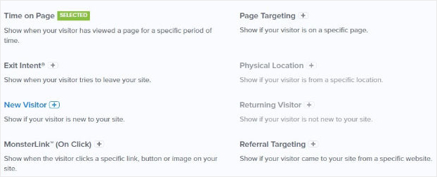
OptinMonster’s Display Rules lets you set up rules for how your ebook popups will appear based on your visitor’s behavior on your site.
Here’s a snapshot of OptinMonster’s Display Rules:
Examples of the types of targeted campaigns you could create include:
- Personalize popups based on the site the visitor came from
- Offer a discount for the exact product your site visitor is looking at
- Show popups after a user has scrolled down your page for a certain time
Publishers and online store owners use these rules to show popups right when site visitors are most engaged.
In this tutorial, we’ll use some of these rules to create popups to increase your ebook downloads.
How to Create an Ebook Popup
Ready to create ebook popups with OptinMonster?
Let’s get started.
Step 1: Create Campaign
First, you’ll log into your OptinMonster dashboard where you’ll create your campaign.
Next, choose your campaign type.
In this tutorial, we’ll focus on Popup.
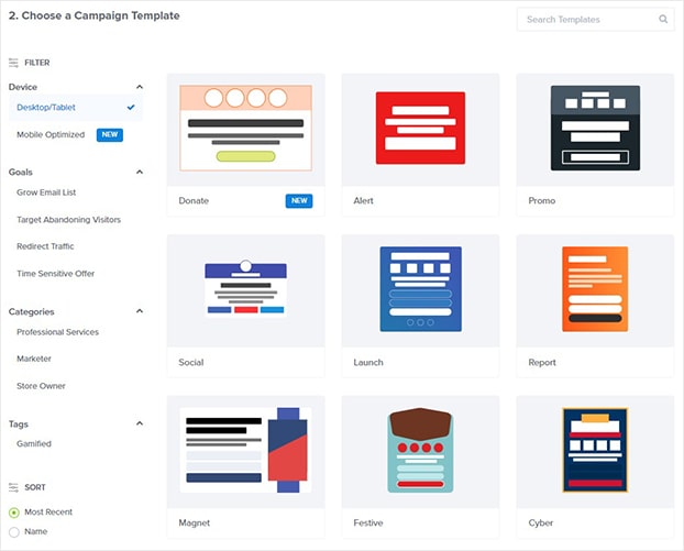
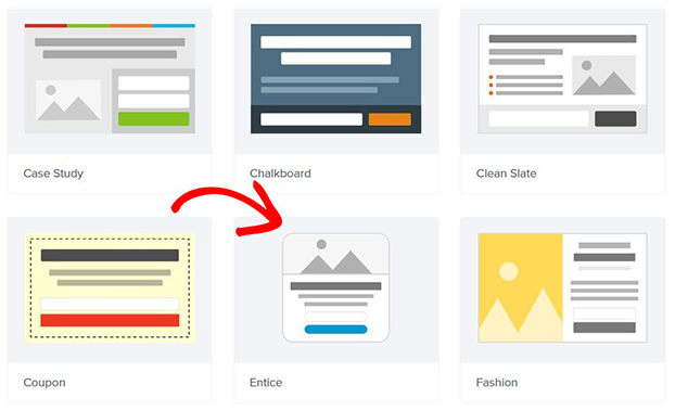
Choose your campaign template.
Today, we’ll go with the Entice template. And this is perfect for an ebook popup because you have the space to add a striking image and compelling copy.
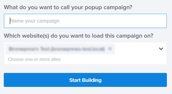
Name your campaign and add your website.
Step 2: Design Your Ebook Popup
Ready to design your popup?
The best thing about designing your popup in OptinMonster’s drag and drop builder is that it’s just so easy.
You can change any aspect of your campaign with a few clicks.
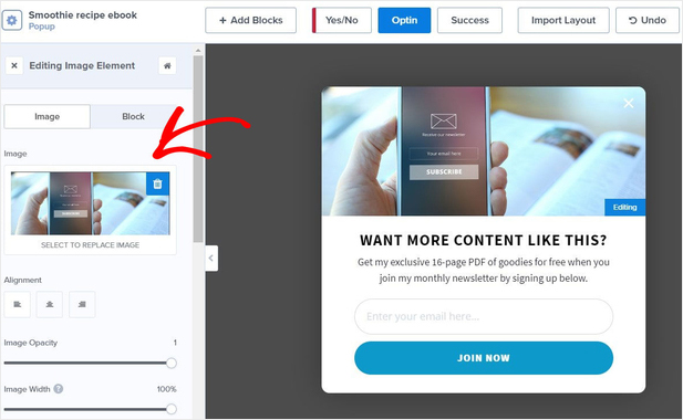
All you need to do is click on the element you want to change. Then, head over to the left side where you’ll see the editing tools.
So, to change the image, we’ll click on it. On the left, we’ll be able to upload a new image.
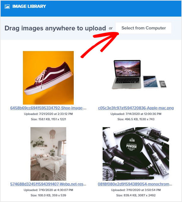
Now, you can upload the image you want to use to OptinMonster’s image library.
You can also edit the text and edit the button color to match our brand.
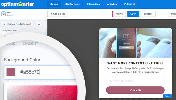
When we click the Join Now button on our popup, the Editing Fields Element tools appear on the left. Scroll down to Background Color and edit.
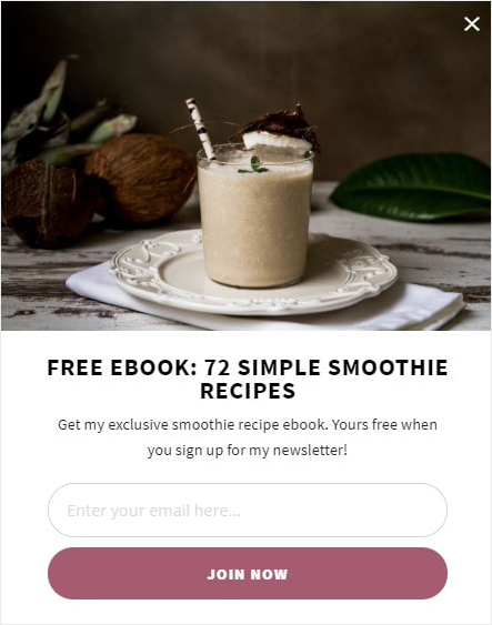
And that’s it. After all customization, our popup looks like this:
We’ve covered the only most basic editing options in this section of the tutorial. You can edit and adjust so much more. For more details, you can refer to our guide on creating your first OptinMonster campaign.
On top of editing the existing elements, you can add things like video, HTML, and text to your popup campaign.
If you want to add a new element, go to the top of the drag and drop builder and click Add Blocks.
But, for now, let’s look at how we’ll display our ebook popup.
Step 3: Set Display Rules for an Exit Intent Popup
When it comes to popups, timing matters. The more relevant the offer, the more likely the visitor will complete your optin form.
In this section of the tutorial, we will focus on exit intent.
Exit-intent ® technology tracks the movement of your site visitors. It can tell when they’re moving their mouse towards the browser bar, and you can show them a targeted campaign as they’re about to leave.
You might be wondering, “Do exit popups work?”
It’s how Brian Tracy increased their email list by 150%. And some of the publishers who use OptinMonster are seeing up to a 600% increase in email signups. You can use exit popups to turn between 2% and 4% of visitors into email subscribers and paying customers.
Use exit popups to ask visitors to:
- Sign up for free training
- Book a free consultation call
- Redeem a timed discount
Here you’ll find some examples of exit-intent popups.
It looks like this in action:
For this example, we’ll use an exit intent popup to encourage visitors to provide their email in exchange for our ebook.
It’s simple to create an exit popup in OptinMonster.
So, we’ll head over to Display Rules.
Find and select Exit-Intent.
You’re all set. Now your popup will appear when your site visitor tries to leave your site.
Step 4: Integrate Your Popup With Email Service Provider
Integrating your email service provider with OptinMonster is easy.
Head over to Integrations at the top of your editor.
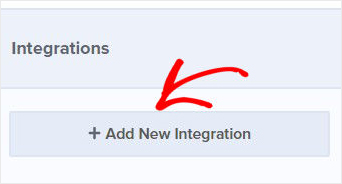
Select Integrations, and choose Add New Integration.
Then, find your email service provider and follow the prompts.
Learn how to connect to an email service provider.
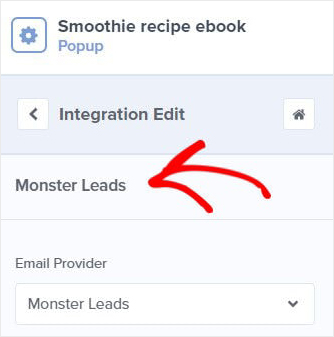
If you haven’t selected an email service provider, your emails will automatically go to MonsterLeads.
Go ahead and click Save at the top of your editor.
Finally, head over to Publish.
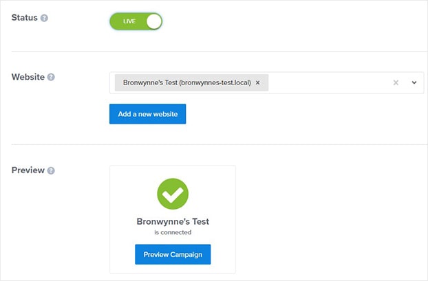
On the next page, you’ll be able to switch your campaign to live and check that your site is selected and connected.
Is your site not connected yet? Don’t worry. It’s simple to integrate your site with OptinMonster.
Check out these quick articles:
Next, we’ll have a look at a few ebook popup examples to inspire your own campaign.
Ebook Popup Examples
Below, we’ll look at other templates and how you can use them to add more subscribers to your mailing list.
All of our popup examples took only about ten minutes or less to create.
Example 1: Marathon Training Ebook Popup
What’s going to persuade your site visitor to give you their email address?
A strong headline that clearly describes the value of your offer is a great place to start.
And crafting that headline begins with a deep understanding of your audience.
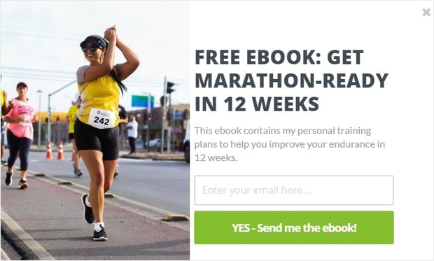
So, for this popup we’ll pick the Camber template.
Here’s the ebook popup we created:
Who doesn’t want to get marathon-ready in 12 weeks?
To increase the chances of our visitor downloading our book, we’ve included the following popup design best practices:
- Strong headline
- Includes a visual
- Clear call to action
There’s a few more things we can do to encourage more people to download this ebook.
One of the most effective ways to increase your conversion is to use 2-step optins.
OptinMonster makes it really easy to do that with our MonsterLinks ™ feature. Using MonsterLinks, you can turn any link or image into a MonsterLink.
MonsterLinks is based on a psychological trigger called the Zeigarnik Effect. That’s the theory that people are more likely to finish an action they’ve already started.
SaaS company used Stays.net used MonsterLinks to increase their monthly sales by 10%.
So, once your site visitor clicks on the link, they’ll be taken to your optin.
Click here to learn more about MonsterLinks.
Example 2: Viral Blogging Ebook Popup
Which popup best practices can you use to skyrocket your conversions?
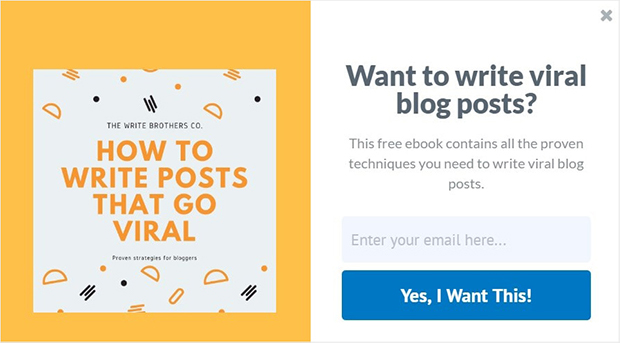
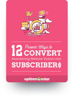
One proven strategy is to include a mockup of your ebook in your optin.
For this example, we’ll target bloggers.
Here we’ve selected the Split template. It has all the elements we need to add a mockup of our ebook.
To make our ebook offer even more targeted, we’ll use the Time on Page display rule. This is how the Eczema Company uses their ebook to convert 13.76% of mobile visitors.
Experiment with time on page for your own ebook popup campaign:
- Go to Display Rules
- Pick the time on page condition
- In the second box, choose either is at least or no more than
Consider changing the default time to longer than 5 seconds, so that you know only engaged site visitors are seeing your campaign. Of course, the longer someone is on your site, the more likely they are to complete your opt-in form.
Click here to learn more about the time on page rule.
Example 3: Growth Hacking Guide Popup
Imagine you could make your popup appear right when your visitors were most interested in its content.
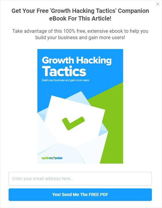
Well, there’s an easy way to do just that with OptinMonster’s Hustle template.
Here’s the ebook popup:
The Hustle template is built for displaying content upgrades at the right time. But to do this, you’ll need to pair this ebook popup with page-level targeting.
Using page-level targeting, you can make your ebook popup appear on specific pages.
Here are a few examples:
- On a post about sleep tips for toddlers, display an ebook for sleep training
- On a page discussing conversions, offer an ebook with steps for doubling conversions
Check out this article to learn more about using page-level targeting to acquire more leads.
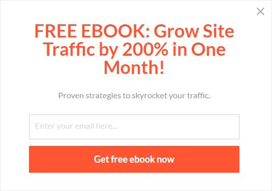
Example 4: Double Site Traffic Ebook Popup
Sometimes you want to keep things simple.
The Simple template does just what you need.
In this example, we’re attracting our visitor’s attention with a strong headline and brief description. If your ebook solves a common reader problem, this is enough to get them to download your ebook.
Worried about using a text-only popup? Lilach Bullock converted 57% of website visitors with this approach.
That’s it. You’re on the way to creating your first ebook popup campaign.
Ebooks are powerful lead magnets. They can help you boost your conversions. If you’re looking for more ideas for generating leads and growing your list, you’ll want to read the following articles:
- 69 Lead Magnets to Increase Subscribers
- Email Marketing Made Simple: A Step by Step Guide [+ Examples]
Ready to start using OptinMonster? Sign up for an OptinMonster account today to start converting your site visitors to customers.












Add a Comment