Do you have an awesome product to sell, but you’re having a hard time getting customers to buy it? If so, we have just the tool you need to get the ball rolling:
A tripwire funnel.
Tripwire funnels are a super powerful strategy that can turn cold traffic into big spenders within minutes. And, today, we’re going to show you exactly how to create a tripwire funnel for your website using OptinMonster.
Before we get into that, though, we’re going to look more closely at:
- What are tripwires in marketing?
- Why are tripwire funnels so powerful (with 3 examples)?
By the end of this article, you’ll have a simple tripwire funnel template that drastically improves your marketing strategy and increases your sales.
And to help you navigate this post more easily, feel free to use this table of contents to jump to the section you’re looking for:
- What Is a Tripwire Funnel?
- Why Are Tripwires Such a Good Mareting Strategy?
- How to Create a Tripwire Funnel With OptinMonster
Let’s dive in!
What Is a Tripwire Funnel?
A tripwire funnel is a simple marketing strategy that entices customers to make a small purchase to get them to make larger purchases in the future.
By creating a low-ticket offer that your audience truly can’t refuse, you’re able to get clients in a funnel where you can upsell, downsell, or send to a confirmation page.
A typical 2-step tripwire funnel has four parts:
- An original low-ticket offer
- A one-time-only high-ticket offer
- A one-time-only mid-ticket offer
- A thank you/confirmation page
You should know that there’s some confusion around the difference between a tripwire funnel and a 2-step tripwire funnel. Tripwire funnels technically don’t try to downsell after the one-time-only high-ticket offer.
But for the sake of simplicity, we’ll use the two terms interchangeably because they function in the same way.
So now for the big question: How do tripwires work?
They’re actually surprisingly simple:
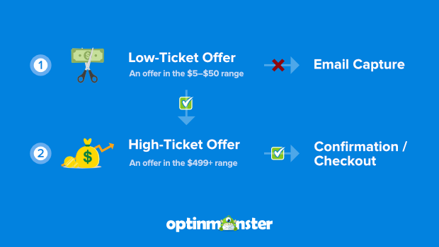
First, you start with a low-ticket tripwire offer. Usually, that’s a product you have at a price point between $5–$50.
This is the perfect example of what the term “tripwire” means in business: getting the customer to take one small action to set off a larger process.
If the customer decides to make the purchase, they’ll go to the purchase page, and then they’ll see your upsell. If they don’t make the purchase, you still have a chance to capture their email:
Once your customer makes a purchase, you deliver a one-time-only offer for something at a higher price point. This product is one of your more expensive products, typically in the range of $499 and up.
You can send customers this high-ticket offer immediately after the low ticket item was purchased or wait 24 hours to send out an email campaign.
If the customer opts into your high-ticket offer, you redirect them to the product page, complete the purchase, and send them a warm confirmation message.
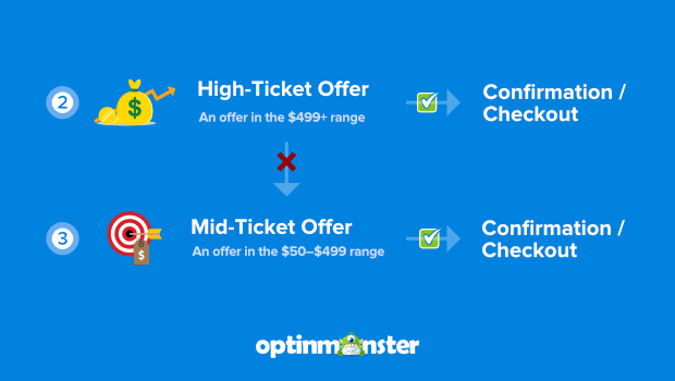
If your client decides not to opt-in, you send another one-time-only offer for a mid-ticket product. This is something more expensive than the original purchase, but less expensive than the high-ticket offer they just saw.
In other words, you drop your high-ticket offer down to a mid-ticket offer. Typically that’s at the $99–$500 price point.
But the best part? Even if your client doesn’t opt into your mid-ticket item, they’re still on your email list from their initial purchase. That means you can contact them for:
- Sales and promotions
- Seasonal products
- Product launches
Or anything else you think would both add value to your customers’ lives while creating revenue for your business.
As you can see, once you set up your tripwire, you always come out ahead.
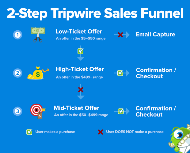
Here is a tripwire template that shows how the funnel works in its entirety:
But now that we know what a tripwire funnel is, let’s take a look at how effective they can be at increasing your overall sales.
Why Are Tripwire Funnels a Good Marketing Strategy?
Tripwire funnels are so powerful because they do 3 things to move your business forward:
- Pay for themselves
- Grow your email list
- Boost your sales
Let’s quickly look at all 3.
1. Pay for Themselves
One of the best parts of a tripwire marketing funnel is that it doesn’t cost you anything. That’s because you should price your original low-ticket offer to cover the advertising costs that it requires to bring in cold traffic.
Or, if you’re getting loads of organic traffic through content marketing, your low-ticket offer will more than pay for the software you’re using to create your sales campaigns.
OptinMonster, for example, starts at $14/month. And as you’ll soon see, you can build every part of your tripwire funnel with OptinMonster.
This means that just one low-ticket purchase would cover the cost of your campaign creation tools for the entire month.
Again, whether you’re relying on organic or paid traffic, the best tripwire funnels cover their own costs.
2. Grow Your Email List
The next reason tripwire funnels are so great is that they grow your email list. It’s no secret that we believe email marketing is the best method for making your business succeed.
That’s because email marketing has unique benefits not shared by other marketing strategies:
- Your email service provider is less likely to be shut down, suspended, or lose popularity with your audience than any social media platform
- You can backup your contact list on your computer on the off-chance your email service provider does shut down or suspend your account
- Email is the only platform that gives you control of the conversation
Once your traffic has made the initial low-ticket offer, you’ll have a new lead for all of your automated email series. From there, the sky truly is the limit.
Then, when someone has made an initial purchase from you, they’re much more likely to make a second in the future. Which brings us to our next benefit for tripwire marketing.
3. Boost Your Sales
Tripwire funnels are one of the best ways to create more revenue. Not only do they pay for themselves, but their entire purpose is to get people to make more expensive purchases over time.
And you can start seeing those higher streams of revenue more immediately, too.
Imagine you have 3 products:
- Low-ticket item at $10
- Mid-ticket item at $200
- High-ticket offer at $997
Let’s say your marketing strategy attracts 500 people per month to your site. From there, 25% take up the lower-priced offer at $10. That’s $1,250 per month just to get things rolling.
Out of the people who opt into your irresistible offer, 5% decide to buy your high-ticket offer instantly. That’s another $5,000 of revenue for the same month.
But out of the 119 people who don’t opt into your high-ticket offer, 10% take you up on your mid-ticket item. That’s an added $2,000 per month.
If you’ve been doing the math, this simple tripwire funnel has now earned over $8,000. If you subtract a generous $1,000 for marketing tools and advertising, you’re still at $89,000 in profit per year from one easy-to-build tripwire funnel.
And none of this takes in the inevitable revenue you’ll create from future product releases by growing your email list.
It’s no wonder why some of the biggest companies in the world use this strategy to get more sales. And, today, we’re going to teach you how to build your own tripwire funnel using OptinMonster:
OptinMonster is the world’s #1 lead generation software. We give you all the tools you need to create powerful optin campaigns in a matter of minutes.
Our drag and drop builder lets you make stunning popups that engage your site’s visitors. And with our powerful targeting rules, you can make sure that all your campaigns appear to the right people at just the right time in their customer journey.
Ready to see how it works?
Creating a 2-Step Tripwire Funnel
We’ll break this tutorial down into 2 parts:
Let’s start with that low-ticket offer.
Part I: Create Your Tripwire Low-Ticket Offer
Step One: Select Your Campaign Type and Template
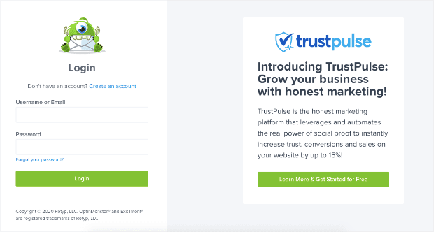
The first thing you need to do is log into your OptinMonster account:
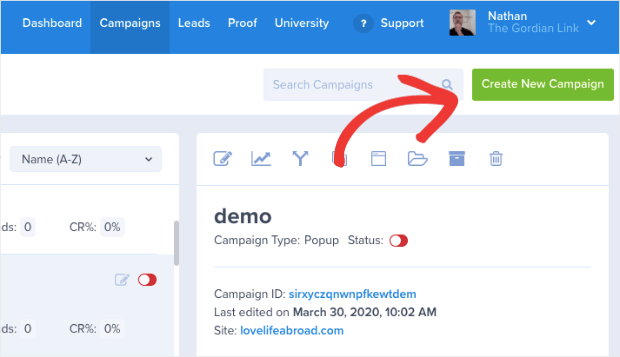
Then in the upper right-hand corner of your dashboard, click Create New Campaign:
For today’s demo, we’ll be selecting a Popup campaign:
That said, you can really choose any type of campaign for low-ticket tripwire offers.
Remember, your goal at this first stage is to grab your visitor’s attention. Your irresistible offer will do the rest. Since all of our campaign types are designed to get your audience’s attention, any of them will work just fine.
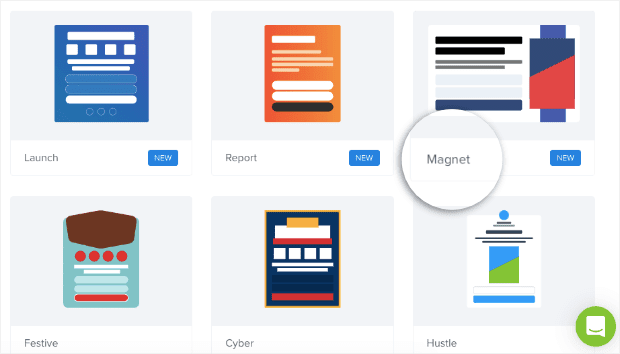
Next, you need to select your template. OptinMonster has over 50 templates to choose from and can be filtered on the side according to your goals.
For today’s tutorial, we’ll choose the Magnet template:
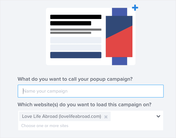
Then you’ll simply need to name your new campaign and assign it to one of your websites:
Now we’re ready to get started.
Step 2: Design Your Campaign
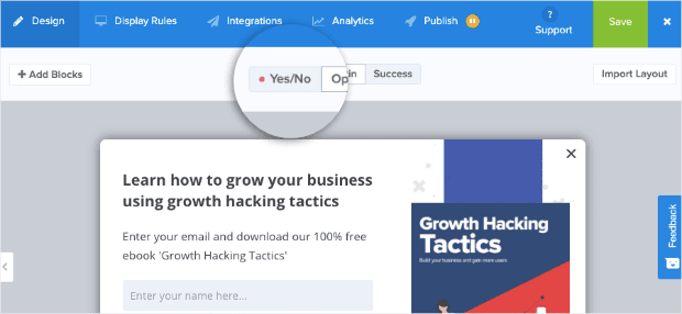
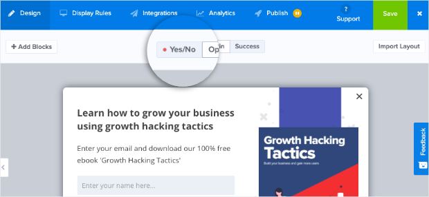
When your campaign is in the OptinMonster editor, the first thing to do is to activate a Yes/No form. To do that, click the Yes/No button at the top of your OptinMonster editor:
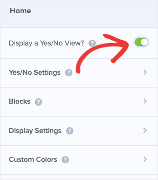
Then activate the toggle switch next to Display a Yes/No View?:
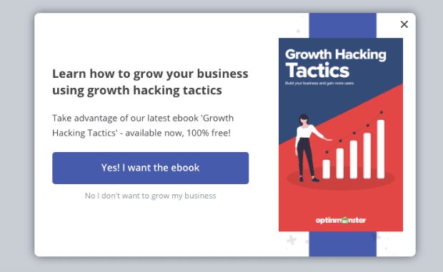
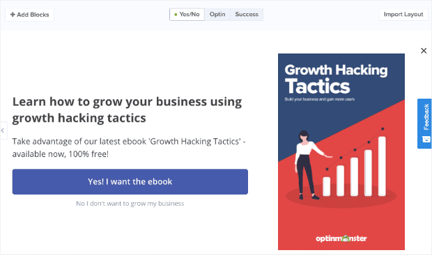
And now you have the Yes/No form ready to modify in your campaign editor:
You’ll notice that this form doesn’t have an optin field asking for your customer’s name and email address. That’s because the goal of a Yes/No form is to get your visitors to take one small positive action: clicking Yes.
This is effective because of a psychological principle known as the Zeigarnik effect, which we’ve written extensively about on our blog. In short, the Zeigarnik effect suggests that people are more likely to finish an action once they’ve started.
So by getting your visitors to click Yes, there’s a much better chance that they’ll finish by opting into your offer.
But for the first part of this tripwire funnel, you want to treat your Yes/No form like a sales page with a low-ticket offer.
If you’ve never written a sales page in the past, don’t worry. Just be sure to check out this article on how to write a sales page that converts.
But here are the biggest takeaways that will help strengthen this part of your tripwire funnel:
- Write a strong, catchy headline to grab your user’s attention
- Show the tangible benefits your product will have for consumers
- Explain why this product is worth so much more than the price tag
- Create high-quality photos or images for your product
We won’t be getting into too much detail on how to modify your campaign in this tutorial. There are frankly too many design options to cover in just one post.
Fortunately, OptinMonster’s editor is incredibly intuitive.
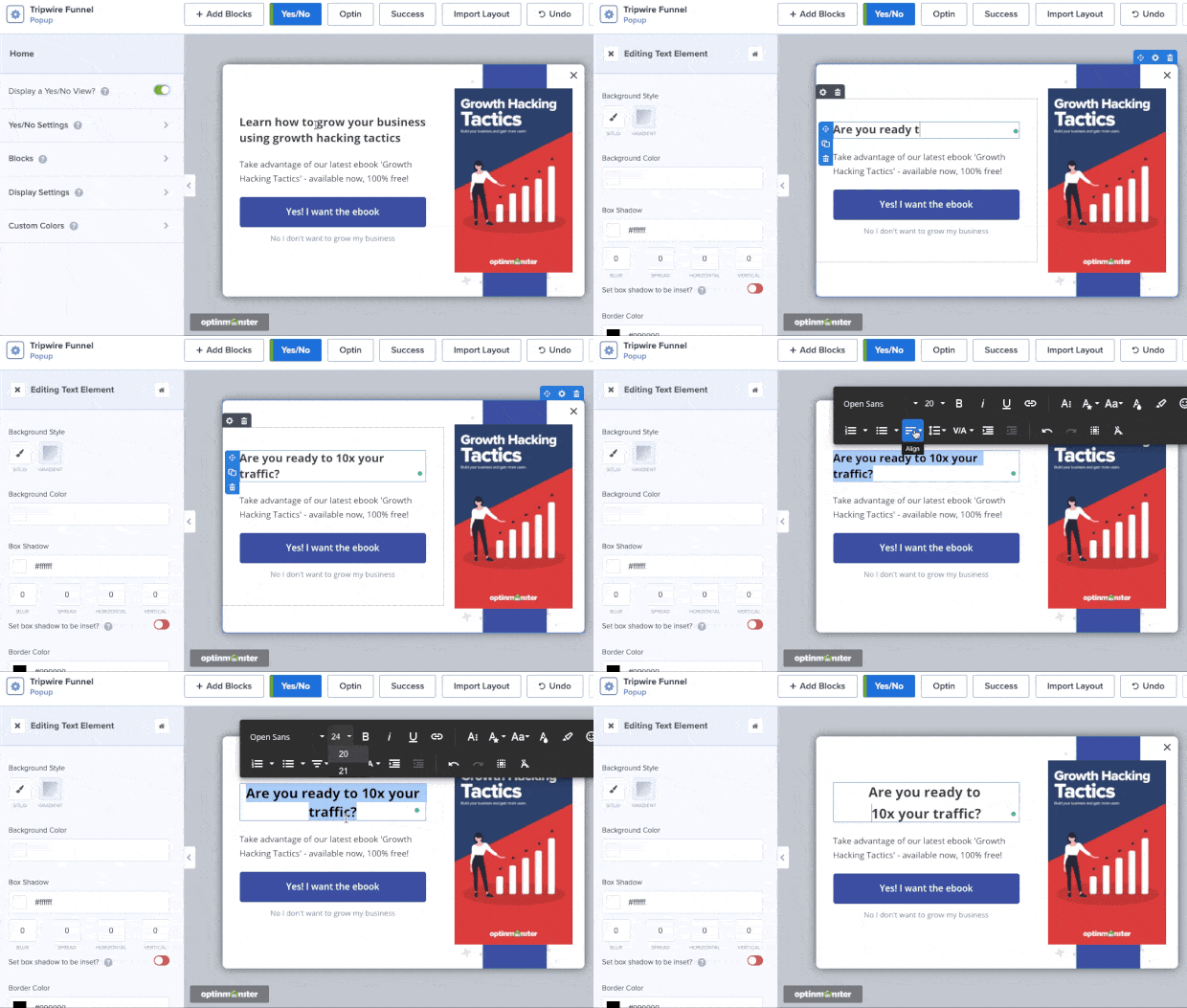
For example, you can use our inline editor to make changes directly to your template’s text:
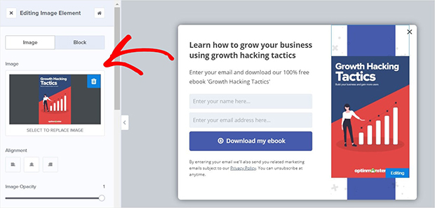
To change other parts of your campaign, click on the element you want to modify, and use the left-hand side editor tools to make the changes you want:
This lets you quickly and easily change your campaign’s:
- Colors for background, text, and buttons
- Images
- Optin field forms
- Button actions (which we’ll do below)
- And much more
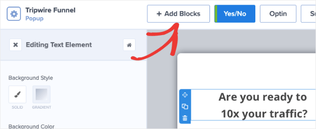
Plus, you can add elements like videos, images, text, optin fields, icons, and more. To do so, click + Add Blocks at the top of your editor menu:
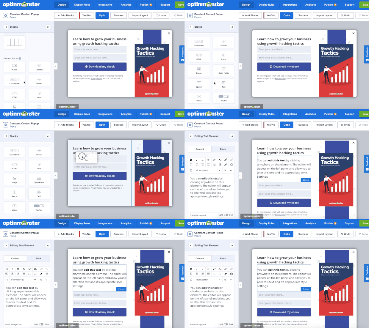
Then locate a new block element in the left-hand side menu and drag and drop it into place in your campaign:
For a more in-depth overview on how to design your OptinMonster popup, check out our resource on creating your first campaign.
Today, though, we simply need to remember that your Yes/No form for the tripwire funnel needs to make a truly irresistible lead magnet.
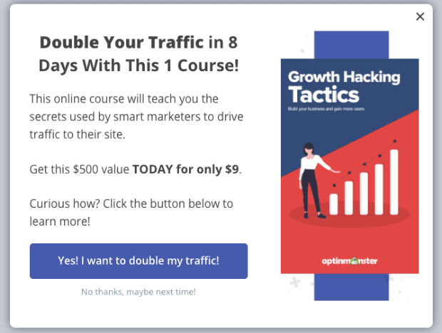
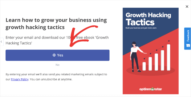
Here’s a quick example of what your campaign could look like with just 3–5 minutes of modifications:
Note the strong headline showing tangible benefits for the user. The value proposition shows the low price point (at just $9).
Everything in this campaign is prepping the visitor to click Yes. But what happens when they do?
For that, you’ll want to redirect your clients to the product page where they can go through with checkout. Here’s how you do that.
Step 3: Configure Your Tripwire Funnel’s Button Actions
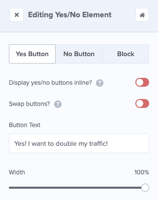
Click on the Yes button element in your editor to pull up the editing tools in the left-hand side:
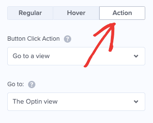
Then scroll down and click the Action button to edit what happens when people click your Yes button:
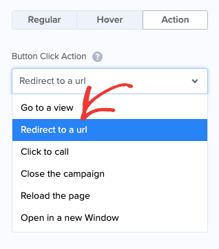
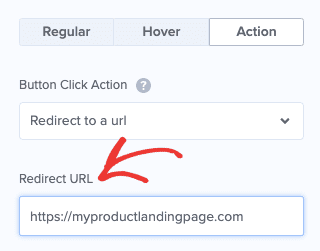
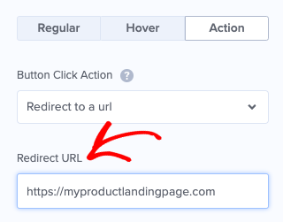
Under Button Click Action, select Redirect to a URL:
Then simply insert the URL for your product’s sales page in the field below:
When people click on your Yes button, they’ll be redirected to your sales page and are likely to go through with checkout.
But there’s one more thing that we want to do with our campaign because some of your visitors may click the No button. And if they do, you’ll still want to try to get their contact information and grow your email list.
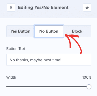
To do so, scroll to the top of your left-hand side editor and click the No Button option:
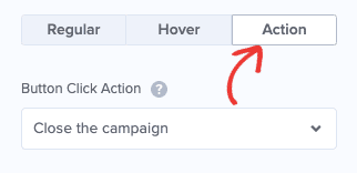
Then scroll down as you did before and click the Action option:
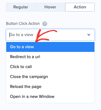
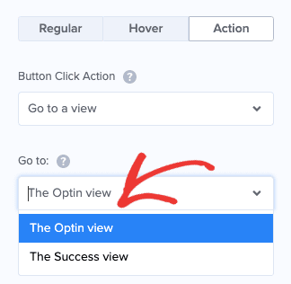
By default, you’ll notice the No button’s action is to Close the campaign. We want to change this option to Go to a view:
And finally, under the field Go to, select The Optin view:
Why are we doing this? Because we want to be sure that even if your visitors select your No option, you’ll still have the chance to capture their email.
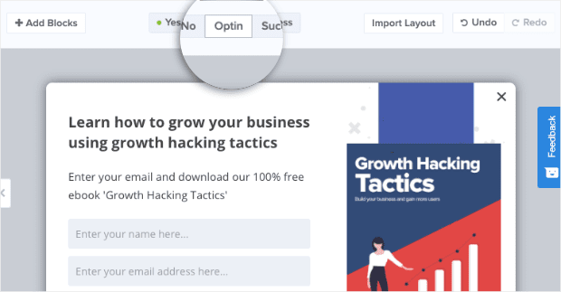
So back in your editor, select Optin at the top to edit your Optin form:
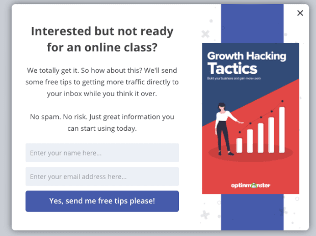
Then you can design your optin form. Here’s a simple example of how we changed our default template:
You’ll want to take some time to make your Optin form as enticing as possible. That means using powerful and persuasive language to connect with your audience.
And from there, everything is all set.
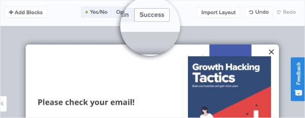
When customers enter their name and email address and click Yes, they’ll be redirected to your Success view. You can modify this by clicking Success at the top of your editor:
For the most part, our default Success view works the majority of our clients. But it’s nice to know that you can make changes if you’d like.
Now it’s time to make sure you’re showing this campaign to the right people at the right time.
Step 4: Configure Your Display Rules
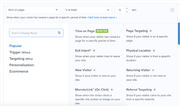
By default, the campaign will show on every page of your website after your visitor has been there for at least 5 seconds.
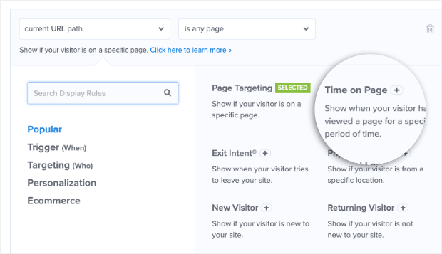
If you’d like to change those campaign triggers, you can click Display Rules at the top of your campaign editor:
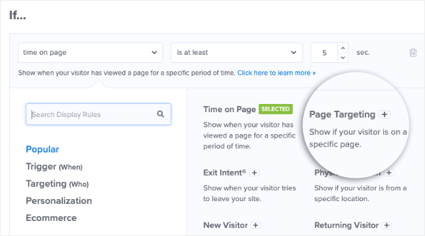
Then you can use one of our many targets and triggers display your campaign to the right segment of your audience. These targets and triggers include:
- Time on page
- Exit-Intent®
- Page Targeting
- And much more
While we don’t have time to go in-depth into each of our targeting rules, we highly recommend trying an exit-intent popup if you’re just starting out.
Exit-intent popups are incredibly powerful at engaging your visitors as they’re about to leave your site. And once you recover customers who were about to leave, you can put them into your funnel and create long-term clients.
Just check out some of these success stores that real OptinMonster users have found with our exit-intent popups:
- Crossrope exploded its email list by 900%
- Rich Page increased conversions by 316%
- Bonjour Lisbonne doubled its conversions and increased sales by 30%
You can have the same success by adding an exit-intent trigger to your tripwire popup.
But remember, one of the most important parts of this funnel is capturing your traffic’s email address. For that, you’ll need to integrate your email service provider (ESP) with your popup campaign.
Step 5: Integrate Your ESP With OptinMonster
And if you haven’t already, you’ll want to set up your email service provider with OptinMonster.
At the top of your editor menu, click Integration:
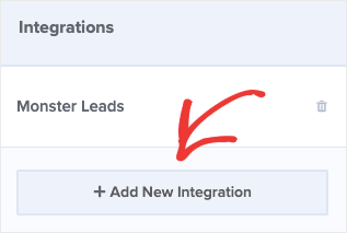
Then click + Add New Integration:
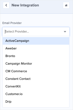
And select your email service provider from the dropdown list:
From there, the exact steps for connecting OptinMonster with your ESP will depend on which email service you’re using. But, for the most part, it’s as simple as copying/pasting your email account’s API key.
Don’t see your email service provider listed? No worries. Here’s an in-depth resource on how to hook up an email service provider to your OptinMonster account.
Finally, you’ll need to save and publish your campaign.
Step 6: Publish Your Campaign
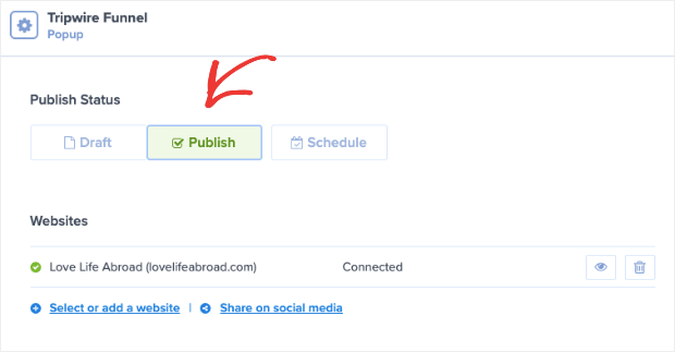
And it’s time to publish the first part of your tripwire funnel. Go to Publish in the top of your editor:
And switch your campaign from Draft to Publish:
Is your site not currently connected to your OptinMonster account? No problem. Check out one of these resources to embed OptinMonster with your website:
- Connect OptinMonster to WordPress
- Sync OptinMonster With Your Shopify Store
- Embed Your OptinMonster Campaign on Any Website
At this point, we’re halfway done with our tripwire funnel. You now have a campaign that will display a low-ticket offer that your site’s traffic can’t refuse.
But now comes the really fun part: making your one-time-only offer.
Part II: Building Your One-Time-Only Upsell and Downsell
We’ve got some great news for the rest of this tutorial. You’ve already done all the hard work, and you know what to do for the rest.
Simply create a new campaign in your OptinMonster account, as you did earlier in this post. When it comes time to choose a campaign, you have two options that work best for tripwire funnels:
- Lightbox Popups
- Fullscreen Welcome Mats
This is really up to you, but these are the best campaigns for upsell or downsell offers. That’s because while all our campaigns capture your audience’s attention, lightbox popups and fullscreen campaigns are less subtle.
And that’s exactly what we want.
Now, let’s dive into the second part of this tutorial.
Step 1: Select and Create Your New Campaign
For this part of the post, we’re going to go with a fullscreen campaign:
The benefit of a fullscreen campaign in this use-case is that it can act as a floating landing page.
You can put more information on it, add video, add more images, and fill out the entire page with quality information about your upsell product.
In other words, this fullscreen campaign can act as a full-fledged sales page.
And because it doesn’t have a fixed URL, it can be used for a variety of marketing campaigns. Not just your tripwire funnel.
Now it’s time to choose your template. In this tutorial, we’ll use the same template Magnet:
Then name your campaign, assign it to your site (like before), and click Start Building. Then you’ll be ready to design your new fullscreen campaign.
Step 2: Design Your Campaign
The first thing that you’ll want to do is activate the Yes/No form as we did earlier. Click Yes/No at the top of your editor:
And activate the Yes/No form by switching the toggle On next to Display a Yes/No View?:
You now have your fullscreen Magnet template in your editor:
Like we said, you already know exactly what to do for this step. You’re simply repeating certain processes to put new pieces into place for your tripwire funnel.
The first thing that you want to do with your Yes/No form is to turn it into a sales page for your high-ticket offer.
Since this is a more expensive offer, you’ll want to strengthen your campaign to make it more enticing. For example, you may want to include:
- A video demonstration of the product
- Video or text-based testimonials
- Clips from actual reviews
- Any trust signals you can add such as free shipping offers, free trials, or money-back guarantees
The goal is to create a compelling offer with a strong call to action (CTA) and tons of social proof.
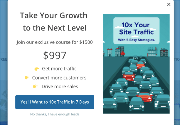
Here’s an example of the compelling high-ticket offer we made for today’s tutorial:
This took less than 5 minutes to create. You can make your own campaign to be specifically targeted to your audience.
The next step is to modify your Yes Button Action to redirect your visitors to a sales or product page, just as you did with your low-ticket offer.
Step 3: Modify Your Campaign’s Button Actions
Again, we’ve already gone through this step earlier in the tutorial. That means you’ve already done all the hard work!
But in case you forgot how to change your button’s action, here’s a quick refresher: click on the Yes button element in your editor, scroll down and click Action in the left-hand side editor, change the button action to Redirect to a URL, and insert the URL in the field below:
Then repeat the same process for changing you’re No button action as you did with your low-ticket offer.
Click the No button element in your editor, scroll down and click Action in the left-hand side editor, select Go to view under Button Click Action, and select Optin View:
Now you have a high-ticket upsell ready to go.
When your visitors click Yes, they’ll be redirected to a sales or product page. If they click No, they’ll head over to the Optin form, which we’re about to convert to a mid-ticket offer.
Step 4: Create Your Mid-Ticket Offer
At the top of your editor, click Optin to get to your Optin form:
Then create a sales page in the same way you did for your low and high-ticket offers. However, you’ll need to remove the optin field from the template and add a Yes/No button block.
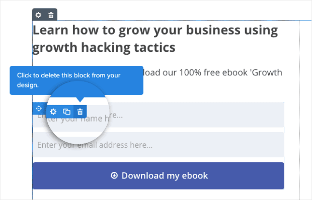
Luckily, doing so is easy. First, click on the optin field in your editor, and click the little trashcan icon in the corner:
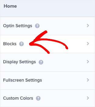
Now it’s time to add a button. In the left-hand side menu, click Blocks:
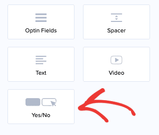
Scroll down until you find the Yes/No block:
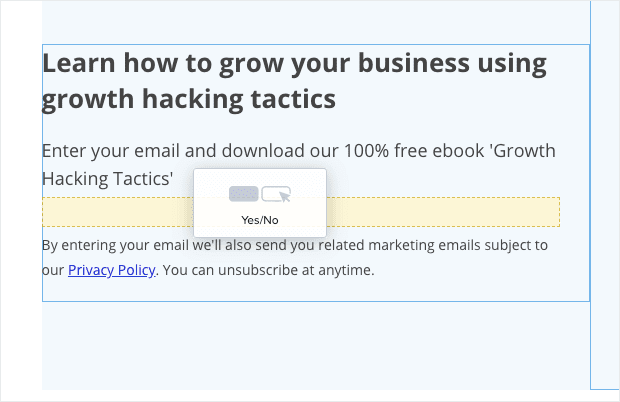
And drop it into your Optin form template where the optin form block used to be:
Your campaign should now have the default template with a Yes/No button block in the campaign editor:
Now you can modify this form in the same way that you did with your low and high-ticket offers.
You’re changing the optin form to a mid-ticket pre-sell page as one last chance to upsell your customers after they purchased the low-ticket item.
The reason that this page is particularly effective is that you just showed a high-ticket item on the form before. By comparison, people who weren’t interested in the high-ticket offer are more likely to be interested in this mid-ticket offer.
However, both offers are a large increase from your initial low-ticket tripwire campaign.
Once you’ve modified the mid-ticket offer campaign, you need to redirect the Yes button action to your product’s sales page as you’ve done for the two other campaigns:
But the good news is that you don’t need to change anything for your No button action.
Since you already have your client’s email address from your low-ticket offer, the campaign will simply close if your visitors select the No button in this campaign.
But there’s just one last step: setting up the display rules for your upsell offers.
Step 5: Triggering Your Upsell and Downsell Campaign
For this next part, you’ll need to decide how soon you want to show your upsell and downsell campaigns to visitors after they’ve made the initial purchase.
If you want to display your upsell and downsell campaigns immediately after your visitors purchase the low-ticket offer, then you’ll need to target your campaigns to the order confirmation page.
The good news is that, with OptinMonster, this is easy.
That’s because each confirmation page has 2 parts to it:
- A fixed URL path that’s the same for every customer
- A unique slug that changes for each order
To target your upsell and downsell tripwire campaigns, you need the fixed URL path from your order confirmation pages.
Then, in your OptinMonster dashboard, you can go to Display Rules:
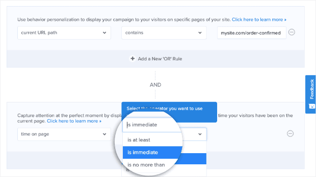
And change the first rule under the If condition. By default, the rule is set for time on page. Let’s change that to current URL path by selecting the rule Page Targeting in the display rule’s menu:
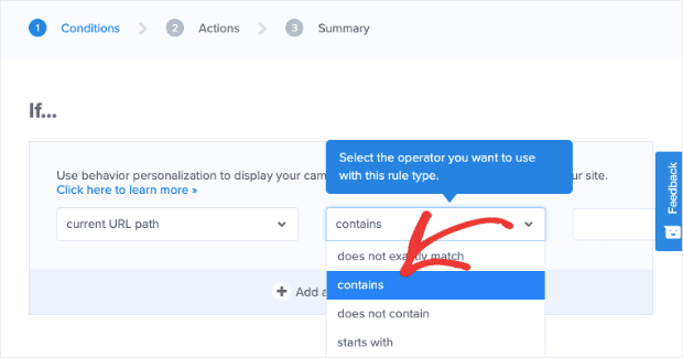
And in the field next to current URL path we need to change from is any page to contains:
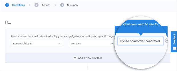
The final field for this display rule will be where you insert the fixed part of your site’s confirmation page URL:
Then scroll down below to your secondary condition. Right now, it’s set to current URL path which we’ll change to time on page:
And in the next field, change the option from 5 seconds to immediate:
All that’s left is to save and publish your upsell and downsell tripwire campaign. Your campaign will appear immediately after your visitors make their initial low-ticket offer purchase.
And that’s it! We covered a lot of ground in this article, though we certainly hope you found it as valuable as we do.
If you did enjoy this post, we recommend you check out the following resources:
- 18 Proven Ways to Increase Your Conversion Rate Throughout Your Sales Funnel
- How to Nurture Leads With Mid-Funnel Marketing
These posts will have even more information on how you can improve your sales funnel and generate more profits.
Want to drive more sales? Get started with OptinMonster today!












Add a Comment