Inline optins make it easy to target your most engaged visitors to build your email list. But it’s not just about throwing an optin form onto the page.
With inline optins, you can turn any post into a content upgrade, lock part of your content, and increase email signups with precise campaign targeting.
In this article, we’ll show you 8 ways to use inline optins to build your email list strategically.
But first, are inline optins worth it?
The Power of Inline Optins
There are so many different ways to use inline optins successfully. Here are a few real-life uses that netted big wins for our customers.
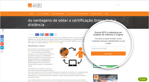
Escola EDTI increased conversions 18% using a combination of fullscreen optins and the sidebar optin shown here:
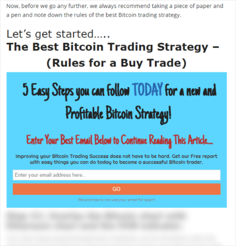
Trading Strategy Guides converted 17% of readers using targeted inline optins and added nearly 7,500 subscribers in a little over a month with a content locking optin like this:
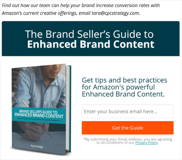
CPC Strategy used this after-post inline optin to convert 1.46% of readers who reached the end of the article:
Photowebo increased optins up to 3806% using inline, content locking optins like this:
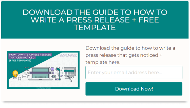
Lilach Bullock converted 28.32% of visitors with this single inline optin repeated four times throughout the content of a single page:
As you can see, inline optins do a lot of work!
How You Can Use Inline Optins
Now that you’ve seen just how well inline optins perform, let’s get into some ways you can enjoy success with this versatile optin.
Before you begin, sign up for OptinMonster. Then, create a campaign using the Inline campaign type.
Now, you’re ready to start growing your email list. Let’s take a closer look at how you can do so.
1. Use Popular Blog Posts as Content Upgrades
To start, you’ll need to identify your most popular posts you’ll turn into content upgrades.
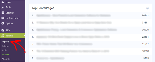
Using the MonsterInsights plugin for WordPress is the best way to find your popular posts. After you install and link your account, you just go to Insights » Reports to see your top posts and pages.
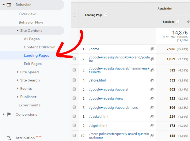
Not using MonsterInsights? Log into your Google Analytics account and head to Behavior » Site Content » Landing Pages. This will show you your popular posts:
Now that you know your most popular posts, you just set up a content lock in your inline campaign so visitors have to sign up to read your valuable content.
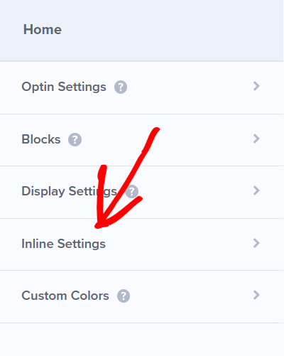
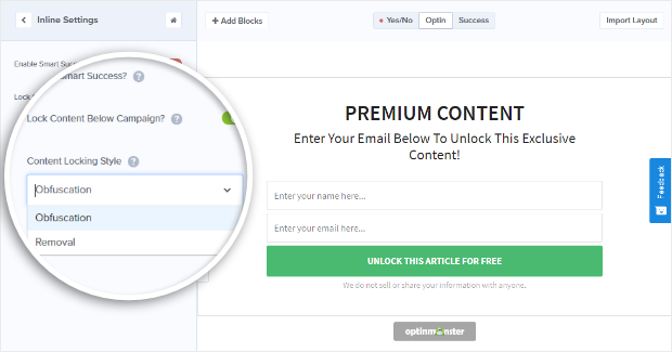
To add content blocking to your inline optin, go to the Inline Settings tab in your OptinMonster campaign.
Then, toggle Lock Content Below Campaign? to green. This will bring up Content Locking Style.
NoteContent locking requires a Plus Plan or higher.
You have 2 options:
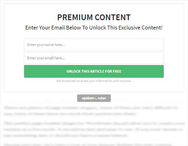
- Obfuscation blurs content below the campaign
- Removal removes content below the campaign
Choose the Content Locking Style you want and publish your campaign.
Now, when visitors land on one of your most popular posts, they’ll see a content locking campaign like this:
And they’ll have to sign up to your email list to get access.
2. Make Offers While Visitors Are Reading
You have a couple of options for using inline campaigns to show visitors offers while they’re reading.
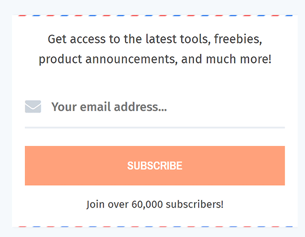
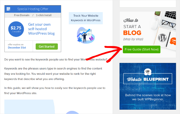
First, you can use a sidebar optin widget like this:
Adding a sidebar widget is a great way to boost your signups. It’s the most common spot to put an email signup form, so visitors are going to be looking for it there.
You can use the sidebar widget to offer things other than a signup for your email newsletter, too.
WPBeginner uses inline campaigns in their sidebar to offer lead magnets:
You could also use this to advertise products, sales, or whatever you want!
If you use WordPress, adding your sidebar widget is ridiculously easy.
Once you’ve published your campaign, log in to WordPress and select OptinMonster from the menu. Then, click on Refresh Campaigns.
After that, go to Appearance » Widgets and drag the OptinMonster widget to your WordPress sidebar.
Choose the campaign you want to show and you’re done
Even if you don’t use WordPress, you can put your fancy new inline optin on your site by using the Campaign Embed code for your campaign.
3. Increase Engagement With 2-Step Optins
One of the most effective ways to capture emails and keep visitors happy is to let them initiate the signup process.
How do you do that?
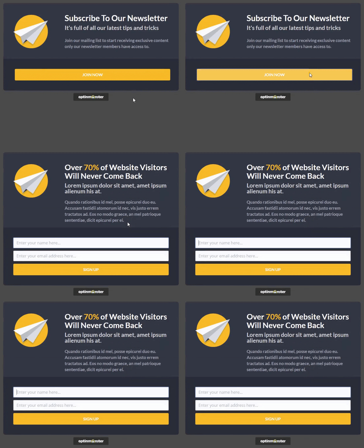
Easy! Just don’t show the contact form until after the visitor clicks on your inline campaign:
To do this, start by creating a Yes/No form. These forms require a Pro Plan or higher.
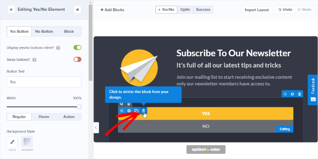
You’ll need to delete the Yes/No buttons from your optin and add a single button block. In the Yes/No view, hover over the Yes/No buttons to bring up the small, blue icons in the upper left corner of the element:
Click on the trash can to delete the element.
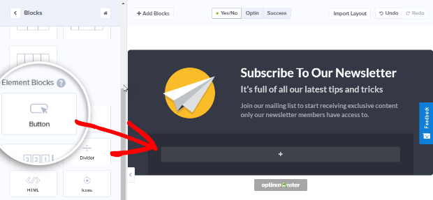
Then, click + Add Blocks and drag and drop the Button block to where you want it:
You’ll design your Optin and Success views as usual.
This inline campaign lets you advertise offers or lead magnets and get qualified leads who are really interested in what you have to offer.
4. Use Attention Activation™ to Draw Attention
Attention Activation™ is going to turn heads. It’s available for Plus Plans and higher.
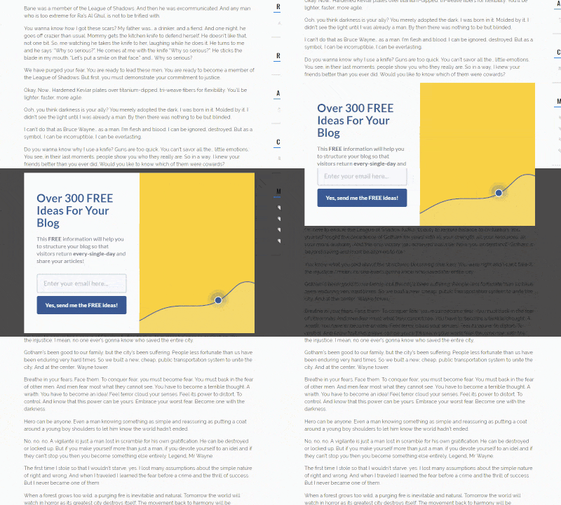
When your visitor scrolls through a page with an inline campaign that has Attention Activation™ enabled, the rest of the page will fade to gray once they hit the campaign.
The campaign itself stays normal, so it pulls the visitor’s focus, making the inline campaign the focus of the page.
As visitors scroll past the campaign, the page will return to normal.
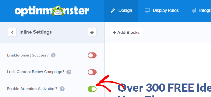
Adding Attention Activation™ is as simple as going to your Inline Settings and sliding the toggle for Attention Activation™ from red to green:
5. Create an After-Post Inline Optin to Reach Engaged Readers
The bottom of your post is a great place to offer a content upgrade or another perk that keeps readers engaged.
If someone makes it to the bottom of a post, they’re pretty committed to your content. Reward them with an offer!
We recommend using the 2-step method we show in #3, above. And, if you’re offering content upgrades, it’s nice to include them near the beginning of your post and at the very end.
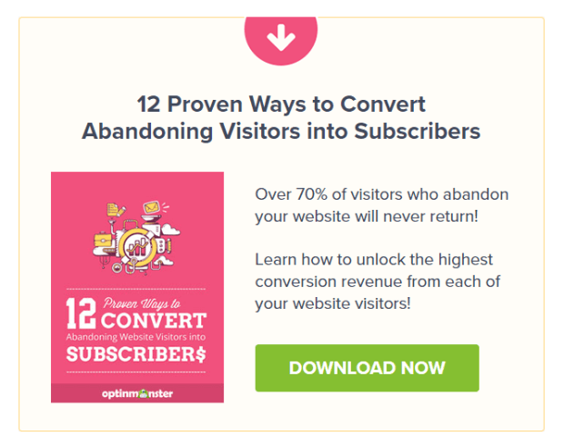
Here’s an example you might see on the OptinMonster blog:
6. Use Inline Optins to Lock Content After Multiple Pages Are Viewed
You know how WSJ.com, NYTimes.com, and even Medium limit the number of posts you can read before you join?
You can do that with OptinMonster’s inline campaigns, too.
Follow the same steps from #1, above, to create an inline campaign with content locking.
Then, to lock content after multiple pages are viewed, just go to the Display Rules and add these rules:
- If current URL path is any page
- If pages viewed is at least 2 (or whatever number of pages you want to allow)
Publish your campaign and add it to your highest-performing content for the best results. Then, when a visitor tries to view more than the number of pages you’ve allowed, they’ll be locked out until they opt-in.
Pro TipThe amount of time your content stays locked is set by the success cookie duration.
7. Use a Feature Box Inline Optin for Above the Fold Engagement
A feature box is a highly effective optin form that marketers use to collect email subscriptions above the fold on their site. They usually show up just below the navigation header but above your blog posts.
Here’s an example from Michael Hyatt:
If you’re a WordPress user, make sure you have the OptinMonster plugin installed and activated.
Then, go ahead and create your inline campaign. Once you have your campaign created, click OptinMonster in your WordPress menu and refresh your campaigns.
Finally, go to the part of your WordPress theme where you want to add your feature box. Paste the following shortcode (replace “OPTIN_SLUG” with your unique slug):
The feature box will now show up on your page.
For non-WordPress users, just add the Campaign Embed code wherever you want your feature box to load.
8. Add an Inline Optin to Your Facebook Page
This use of inline campaigns is for advanced users.
After you’ve created your inline campaign, you’ll need to add this domain: raw2.statichtmlapp.com. If you need help adding a domain, follow our domain guide.
Now, add an iFrame application to your Facebook page. For our setup, we’re using the Facebook App called Static HTML – Thunderpenny. This app is easy to set up and provides HTTPS security.
NoteFacebook is no longer allowing Pages with fewer than 2,000 likes to install custom tabs.
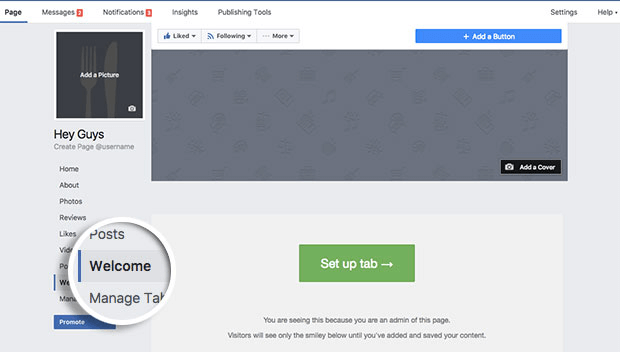
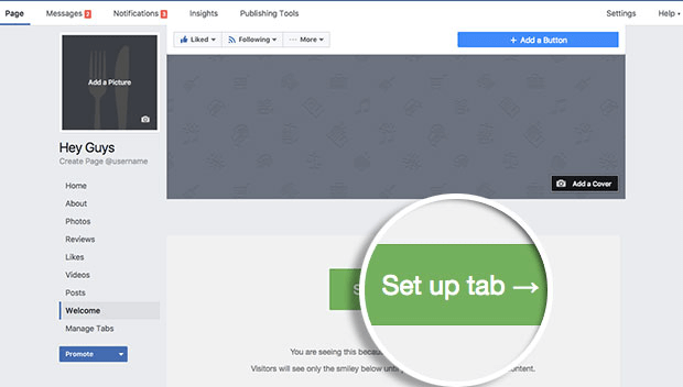
After your app is ready to go, head to your Facebook page and find the Custom iFrame App you installed. It will be on the left-hand side above Manage Tabs, likely named Welcome.
Click Setup Tab to add content.
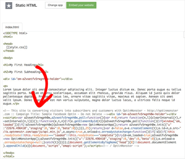
Add your Campaign Embed Code in the index.html section before the closing tag.
Here’s an example of what your HTML could look like:
</pre>
<pre><!DOCTYPE html>
<html>
<head>
  [[style.css]]
</head>
<body>

<h1>My First Heading</h1>

<h2>My First Subheading</h2>

<!-- Enter Campaign Embed code here -->

Lorem ipsum dolor sit amet, consectetur adipiscing elit. Integer luctus dictum ex. Donec porta augue eu tellus sagittis porta. Nullam et arcu scelerisque, accumsan elit rhoncus, gravida risus. Aliquam id justo quis dolor pellentesque dapibus. Praesent lacus leo, ornare vitae sagittis vitae, maximus et sapien. Aenean sit amet velit ipsum. Donec placerat, est non varius vulputate, magna dolor luctus lacus, a ultrices felis neque id augue.

</body>
</html></pre>
<pre>
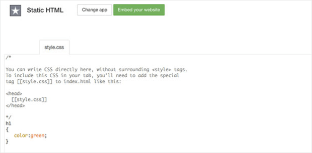
In the Thunderpenny Application, you can style your Facebook tab’s content area by adding Custom CSS to the style.css area of Thunderpenny’s editor:
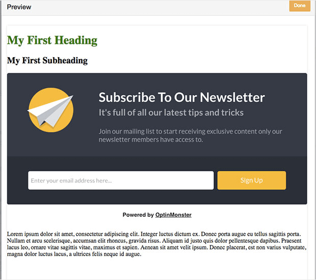
On Facebook, click Preview and your campaign should appear:
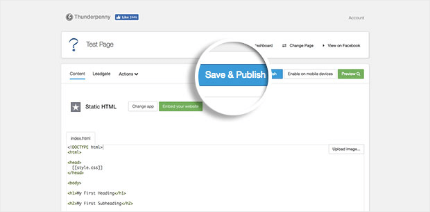
Click Save & Publish:
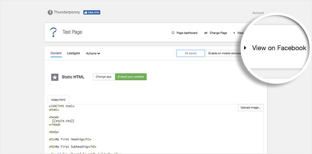
Click View on Facebook to see your campaign in action.
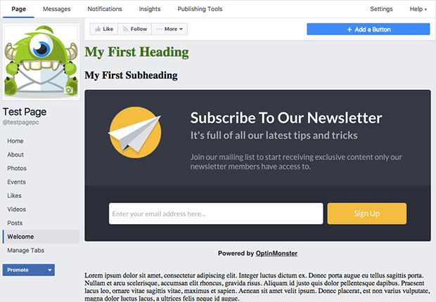
The next screen will show your inline campaign in your Facebook tab:
There you have it! Eight awesome ways to use inline optins for strategic email list building. Which one do you like best? Let us know in the comments!
And, if you liked this article, be sure to check out these OptinMonster hacks to boost your conversions. Exit popups more your thing? Here are 40 exit-popup hacks to grow subscribers and revenue.
For even more killer marketing tips, subscribe to our YouTube channel and follow us on Facebook and Twitter.
Oh, and if you’re still not an OptinMonster customer… What are you waiting for? Join OptinMonster today!










Add a Comment