Have you ever dealt with a rusty door hinge? Every time the door opens, it creaks and cracks until, eventually, it just stops working.
There’s too much friction between each part for any of them to function properly. So what do you do?
You pull out the WD-40, of course.
Funny enough, it’s the same concept with converting your site’s traffic into paying customers. Sometimes people land on your product page, but they aren’t ready to buy anything yet.
There’s still too much friction in your funnel.
But when you learn how to create a pre-sell page, you grease up the entire process and make everything run smoothly again. No more creaks. No more cracks.
Just higher conversions.
In this article, we’re going to cover everything you need to create a killer pre-sale page. More specifically, we’ll be asking:
- What is a pre-sell page?
- Why should you have a pre-sell page?
- What makes a good pre-sell page?
- What are some good pre-sale page examples?
- How can you use a pre-sell page even if you have nothing to sell?
- How can you build a creative pre-sell page in minutes?
At the end of this article, you’ll have all the tools you need to warm up your cold leads, increase your conversions, and turn casual traffic into paying customers.
But first things first…
What Is a Pre-Sell Page?
A pre-sell page is exactly what it sounds like: a landing page your visitors view before they’re shown an actual product or offer.
In many cases, the pre-sell page is the middleman between an advertisement (like Google Ads, for example) and your shopping cart.
NotePre-sell pages go by many names. You have pre-cart pages, pre-lander pages, bridge pages, and advertorials. For the sake of consistency, this article will strictly use pre-sell pages.
That said, a lot of people confuse the terms “pre-sell page” and “landing page” by using them interchangeably. Unfortunately, this isn’t always accurate.
A pre-sell page is always a landing page, but a landing page isn’t always a pre-sell page.
“Ok, great. But how does that actually work,” you ask?
The difference is in the overall purpose and goal of the page itself. Landing pages have one of two goals: lead generation or pre-selling.
When it comes to lead generation, your landing page collects information about your visitor. This is usually in the form of an email address for a future email marketing campaign. When a landing page is used specifically for lead generation, it’s typically called a “squeeze page.”
Your pre-sell page, on the other hand, has a different purpose: to warm up your cold traffic and prepare them for a sale.
As the saying goes, pre-sell pages help your customers buy into a product before they actually buy the product.
Why Should You Have a Pre-Sell Page?
If you’re running an online business and you’re serious about generating revenue from your website, you need to start using pre-sell pages. And the reason is simple.
They work.
It turns out that when consumers click an advertisement for a product, 96% of them still aren’t ready to make a purchase. A good pre-sell page drastically helps increase your odds of making an immediate sale.
Advertising firm Tier 11 claims to have increased its return on advertising spend (ROAS) by 77% with pre-sell pages.
And while pre-selling pages are super effective, they aren’t magic. They’re simply designed to help customers better understand a product, and ease them into your call to action (the sale).
They’re also easy to make. All you need to know are what pieces to include.
What Makes a Good Pre-Sell Page?
Your pre-sell page is going to change depending on your audience and your product. But all pre-selling pages have enough similarities that you can rely on to create an effect regardless of your niche.
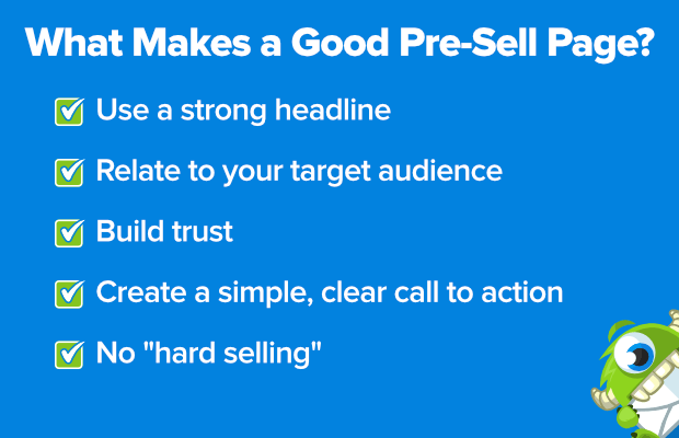
Every good pre-sell page will:
- Have a strong headline: A great headline is the first thing people see. It should be short, catchy, and match the tone of your brand. Plus, it never hurts to throw in some power words!
- Relate to the targeted audience: Does your audience come from mobile or desktop? Do they prefer videos or text? Do they drink Pepsi or Coke? Ok, that last one probably doesn’t matter, but you get the point. You need to know your audience and their preferences to make sure your pre-sell page can effectively communicate your message to them.
- Build trust around your company and product: This is where social proof comes into play. People (80%) actually prefer social proof over advertising. Show the logos of companies that have been successful with your product or give direct testimonials. These small signals let your customers know you have a quality product and you’re a reliable authority on the topic at hand.
- Create a simple, clear call to action: Once your visitors reach the pre-sell page, they should be led to a single call to action. For many SaaS companies, that would be a “Try It Now” offer (like a free trial or freemium plan). For others, the call to action may lead them to the product page or directly to the shopping cart. Whatever the case may be, make sure your call to action is clear and concise.
- Shy away from “hard selling”: This is the number one rule when it comes to pre-selling pages. Don’t be too pushy. Again, your goal is to educate the visitor on who you are, what you offer, and how your product solves their problem. Your visitors shouldn’t feel pressured into a sale.
Now, knowing all the parts of a great pre-sell page is helpful, but it’s even better seeing it in action.
What Are Some Good Pre-Sell Page Examples?
1. HelloFresh
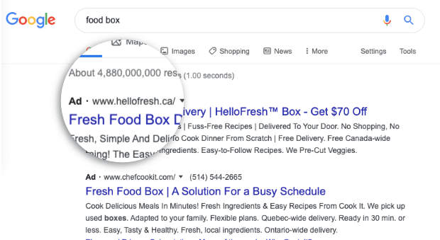
Here’s a company that checks off all the boxes when it comes to pre-selling pages. If you type the term “food box” into Google, you see a paid ad for HelloFresh:
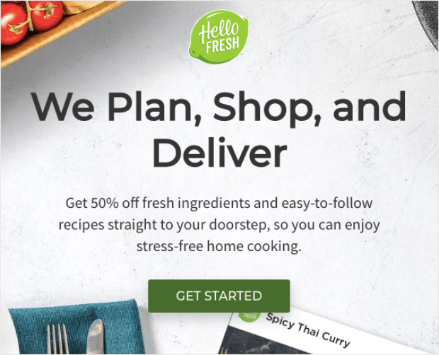
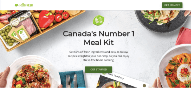
Click it, and you’re taken to the pre-sell page:
Right away, you see a large headline that tells you a bit more about them. Then you have a subheading that goes into more detail about why they’re so great. And all that leads down to a clear call to action, “Get Started.”
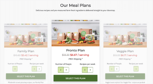
When you click on their call to action, you’re taken directly to the sales page where you can choose your plan:
But what about cold traffic who isn’t ready to buy yet? They can just continue to scroll through the page and learn more about the company. There is some added social proof with testimonials from happy customers:
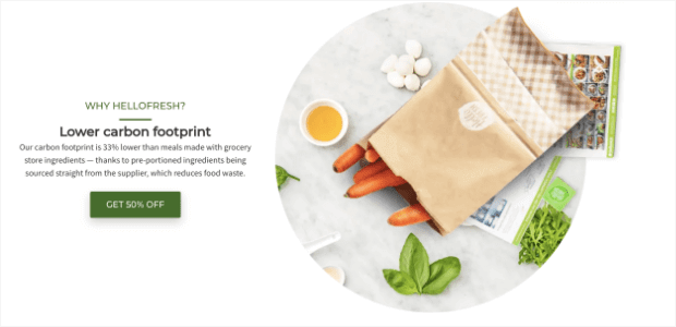
You also have several small pieces of web copy that address the question, “Why HelloFresh?” Here’s one about how the company also cares about the environment:
Finally, HelloFresh has taken the time to consider their audience. If you type in the same term (“food box”) from a Canadian IP address, you get a more targeted headling on the same page:
Again, details like this aren’t random. They are strategically placed to make people trust the brand and ultimately buy the product.
2. Audible
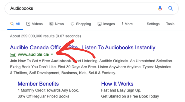
When you search for “audiobooks” in Google, the first result is a paid ad by Audible:
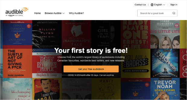
From there, you’re taken to their pre-sell page, which is structured in a similar way to HelloFresh. You have a headline and a subheader leading to a call to action to try the product for free:
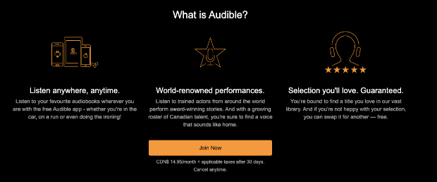
Still not ready to buy? Just keep reading! They tell you a bit more information about Audible (and even include a copy of the call to action):
Then more information about everything you get when you sign up:
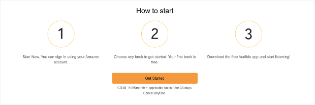
And they finish with clear directions on how to get started:
Once you optin, you’re sent to Amazon’s sign-in page where you can test out the product.
The only thing missing is social proof, but with a world-renowned company like Amazon, the brand has a unique ability to speak for itself.
3. Moz
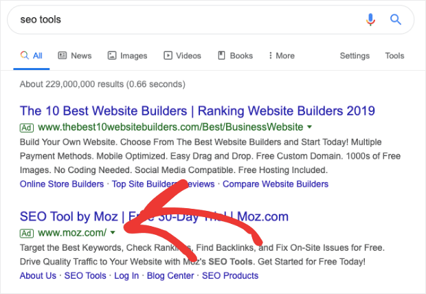
If you were looking for ways to optimize your site’s SEO, you may search for something like “SEO tools” to get started. From there, you’d see Moz’s paid ad in Google:
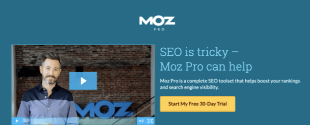
When you click that link, you land on Moz’s pre-sell page. Right away, it has some great features. Not only are the headline, subheading, and call to action clear, there’s also a video:
Video is a wonderful addition to pre-selling pages because it allows you to get more information to your audience without cluttering your webpage with too much text. Plus, considering 83% of marketers say that videos increase their sales, it’s a good call to incorporate them.
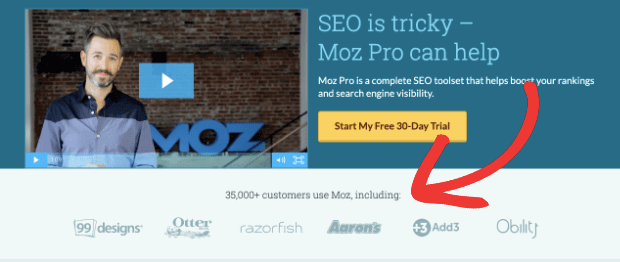
Moz’s pre-sell page also relies on social proof from brands that use their software:
They describe the product in more detail and highlight its benefits:
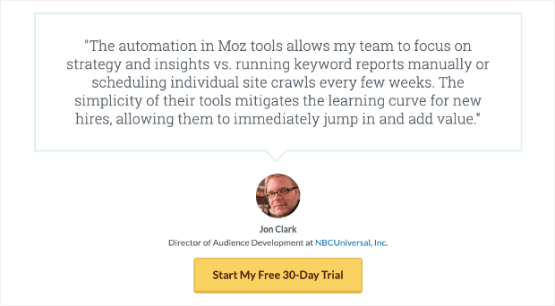
And give one more piece of social proof through the form of a personalized testimonial (and they repeat the call to action at the end):
Overall, this is an excellent example of a pre-selling page and the video is one of the best features.
4. SEMrush
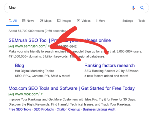
This is an interesting pre-sell page example because it shows how well the tool can be used to move customers away from your competitors and to your site. If you’d heard about Moz in the past, perhaps you would type “Moz” into Google for more information.
Surprisingly, the first thing you would see is actually an advertisement for SEMrush:
That’s because they’ve set up a Pay Per Click (PPC) campaign for this targeted keyword since their product is similar to Moz.
Then SEMrush’s pre-sell page works to convert customers who were initially looking at another software. They do this with a strong headline that shows a tangible benefit of using SEMrush (saving time).
And they mention how many tools are included with their product and make a hard-to-resist call to action with a free trial:
As you scroll down, you see social proof in the form of famous companies that use SEMrush. You’ll also see awards won by SEMrush (building brand authority):
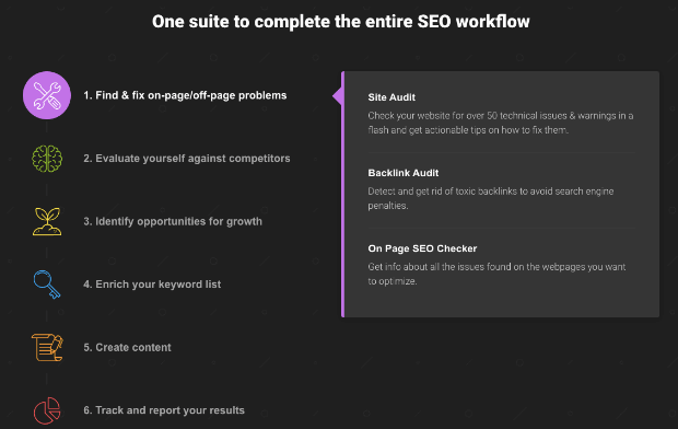
And they give visitors a clear, visually appealing breakdown of what their services do:
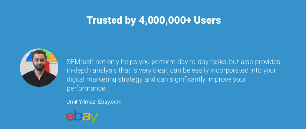
Finally, they load up on more social proof with testimonials:
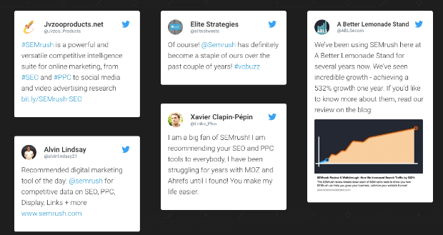
And screenshots of praise from happy customers on Twitter:
This is a great pre-sell example in itself, but it gets bonus points for being used to draw potential customers away from their direct competition.
How Can You Use a Pre-Sell Page Even If You Have Nothing to Sell?
So you love the idea of a pre-sell page, but there’s just one problem: you’re a blogger.
So you have nothing to sell.
No worries! Pre-selling pages can still be a valuable asset to increase your site’s overall revenue. How?
With affiliate marketing.
If you’re making money through your blog, chances are you’re already promoting affiliate links. If that’s the case, you can actually create pre-selling pages that also function as original content.
Examples of this are product comparisons or product reviews.
This content teaches your readers about a particular product and gets into the benefits and drawbacks of the product’s features. Then, shows your audience where they can buy the product with your affiliate link.
It’s part content marketing, part advertising. And totally effective.
But there’s another option if you don’t want to go back and create tons of new product reviews and comparisons on your site.
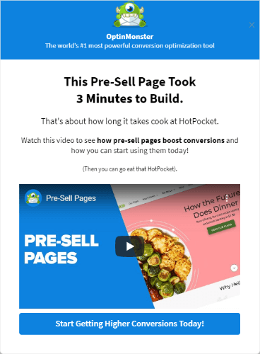
You can create a pre-sell page in the form of a fullscreen popup that shows up on pieces of content where your affiliate link appears.
Then your headline would cleverly talk about how a certain product solved a specific problem you were having. Finally, you’d close with a call to action to visit the product’s website.
Pro TipFor pre-selling pages in the form of popups, you should also use video. Videos allow you to connect with your audience, explain who you are and what problem you were having without relying on too much text.
How to Create a Pre-Sell Page in Minutes with OptinMonster
Here’s the campaign we’re creating (click to see it in action):
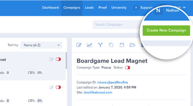
Creating a pre-sell page with OptinMonster couldn’t be easier. Just head over to your dashboard and click Create New Campaign:
Then choose the type of campaign you want. For pre-selling pages, your best bet is a standard popup or a fullscreen campaign.
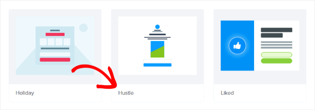
Next, you want to choose your template. For this demo, we’ll use the Hustle template:
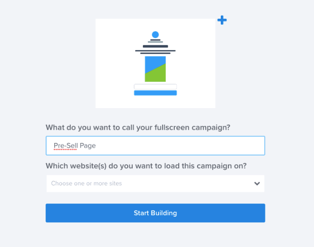
Give your campaign a name and choose which website you would like it to appear on:
Then you can start editing. At the top of this template, you can upload your picture:
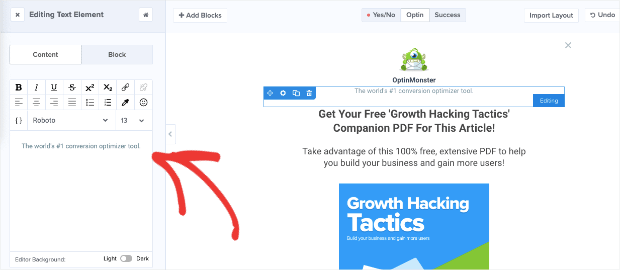
And change the text underneath to represent your brand and slogan:
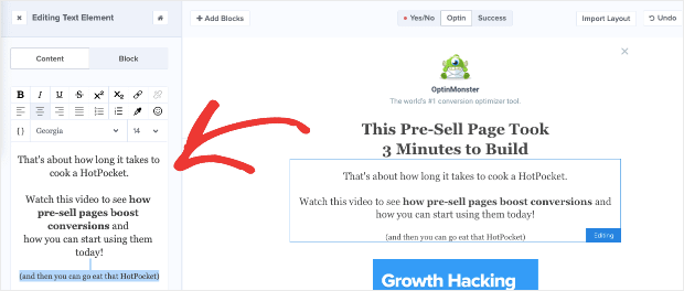
Next, change the heading and subheading to give more information about why your visitors are seeing that page. To do this, you can click on the block of the text you want to change and edit it in the left-hand side menu:
Remember to keep the heading and subheading short and to the point.
As we mentioned earlier, one great way to avoid a pre-sell page with too much text is by using video. We’ll be doing that in this demo.
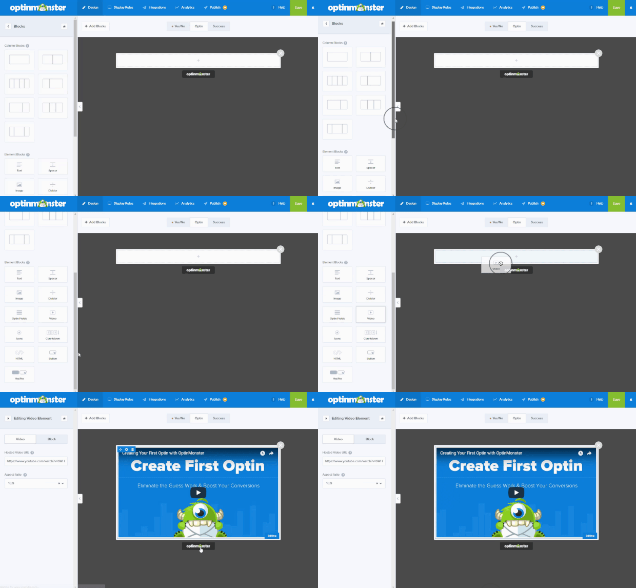
To add a video, click + Add Blocks:
Scroll down until you locate the Video block. Then, drag and drop it into place:
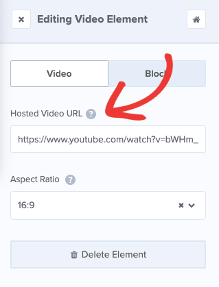
Once you’ve got your video block in place, you can add the URL for the video you would like to appear and change its aspect ratio.
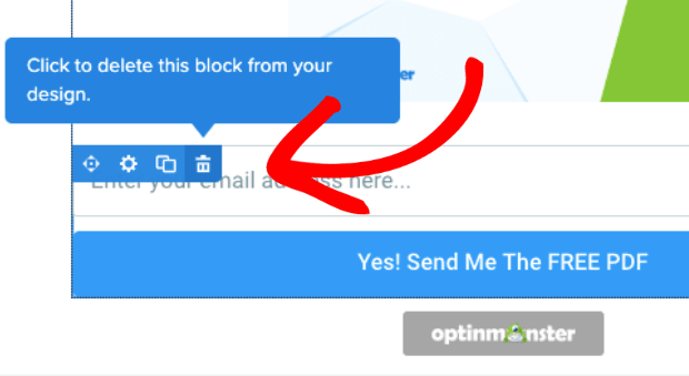
Finally, delete the optin field block.
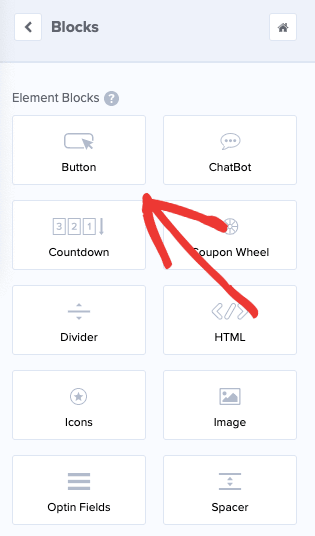
Now, let’s add a Button block. Just drag and drop this block the same way you did with the video:
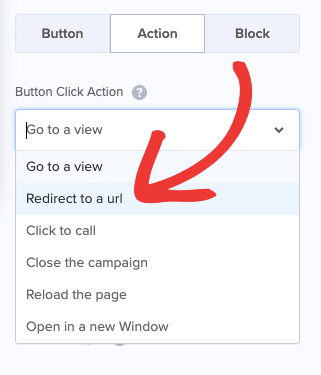
Then, click on Action in the left-hand menu to edit what happens when your visitors click the button. Under Button Click Action choose Redirect to a url.
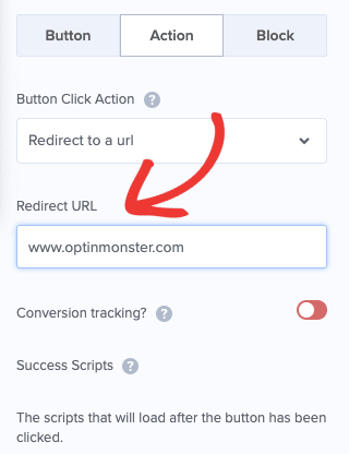
Then in the Redirect URL field, you can enter the affiliate link or product page where you want to send your visitors.
And that’s it! Well, almost. The only thing left is to hit save. ?
NoteOnce your pre-sell page has been created, you’ll need to set the display rules. Check out how to use display rules to customize when a campaign will appear.
You can always customize your fonts, colors, and pretty much anything else you’d like. But in just a few minutes, you’ve created a fully functioning pre-sell page that works whether you are selling a product or making money through affiliate marketing.
We hope you enjoyed this post and we look forward to seeing and hearing about your success. For us to really celebrate with you though, we have to know about it. Leave us a comment and tell us how it went!
If you enjoyed this tutorial, head on over to our YouTube channel to learn more about driving traffic, capturing emails, and converting more customers. Just don’t forget to like those videos afterward.
But wait… are you still not signed up with OptinMonster? What are you waiting for? Join the OptinMonster family today so you can be on your way to higher revenue tomorrow!













Add a Comment