Wondering if you need a nonprofit newsletter to boost your charity marketing? Or, do you want to start a nonprofit newsletter and just don’t quite know where to begin?
Either way, we’ve got you covered.
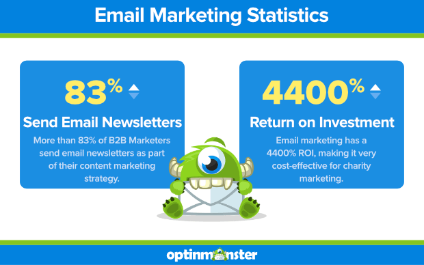
More than 83% of business-to-business (B2B) marketers send email newsletters as part of their content marketing strategy. And your nonprofit can benefit from them, too.
With a return on investment of around 4400%, email marketing is a very cost-effective way for nonprofits to engage in charity marketing, reach donors and volunteers, and generate interest in their cause.
In this post, we’re going to cover the benefits of charity marketing with email before getting into 7 common nonprofit newsletter mistakes and 5 nonprofit newsletter best practices.
We’ll wrap up with a look at some great nonprofit newsletter examples to give you some inspiration.
Why Email for Charity Marketing?
As we already mentioned, email marketing has a 4400% ROI. That means that every marketing dollar you spend on email marketing has the potential to return $44. Basically, email marketing, when done correctly, can pay for itself.
As a nonprofit, you can use your newsletter to connect with donors and volunteers, encouraging them to take action.
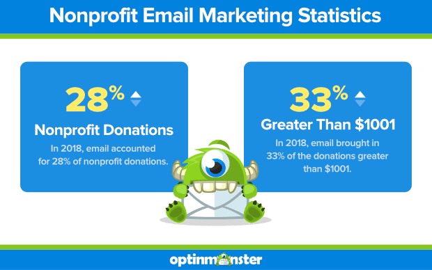
In charity marketing, your nonprofit newsletter can have a huge impact on donations. In 2018, 28% of nonprofit donations were attributed to emails.
It also makes a difference in the amount of the donation, too. Social media tends to bring in more donations overall, but they’re usually small dollar amounts.
Email, on the other hand, brought in 33% of donations greater than $1001 in 2018.
Of course, email marketing has to be done well. Otherwise, your email newsletter will fall flat. Let’s talk about how you can avoid some of the most common nonprofit newsletter mistakes.
7 Common Nonprofit Newsletter Mistakes (and How to Avoid Them)
Here are 7 things you need to watch out for when planning, creating and sending your nonprofit newsletter.
1. You Didn’t Get Permission to Send It
You absolutely cannot email anyone without their permission. Not only is it just bad etiquette, but it’s also illegal!
Don’t worry, it’s really easy to build an email list full of people interested in hearing about your mission and the work you do.
Start by using an optin. OptinMonster has tons of beautiful templates to choose from. Plus, they’re all fully customizable, so you can match them to your own branding.
Check out how WholeWhale doubled their email list using OptinMonster.
You may be wondering about buying an email list as a quick way to get subscribers. Our recommendation: don’t do it.
Related Content8 Reasons Why You Should Never Buy an Email List
Another no-no? Adding emails from business cards that you’ve collected. Unless you have express permission to send someone your email newsletters, your emails are spam.
And it doesn’t serve your business anyway. Here’s why:
The people who are engaged with your cause are the ones who have expressly opted-in to receive communication from you. If they haven’t said, “Yes, give me your news,” anything you send them is wasting your energy.
Does this mean you shouldn’t contact people if you’ve gotten their business card? Not at all. But send them an email and ask them if they want to be added to your newsletter list.
2. Your Design Is Ugly
There, we said it.
Nonprofits have a lot of work to do, often with limited funds. That means that some nonprofits treat charity marketing as a luxury, not a necessity.
After all, you have a development team, right? Can’t they just create the emails you need using the templates that you’ve always been using?
No, they can’t.
Not if you want to continue increasing your donations and drawing in more volunteers. Want to know why?
51% of email recipients unsubscribe from newsletters that don’t look good.
You can see why it’s so important to spend some time to create and send beautifully-designed, eye-catching emails. And it’s really not hard to do.
Here are a few things to focus on:
Subject Lines and Sender Names
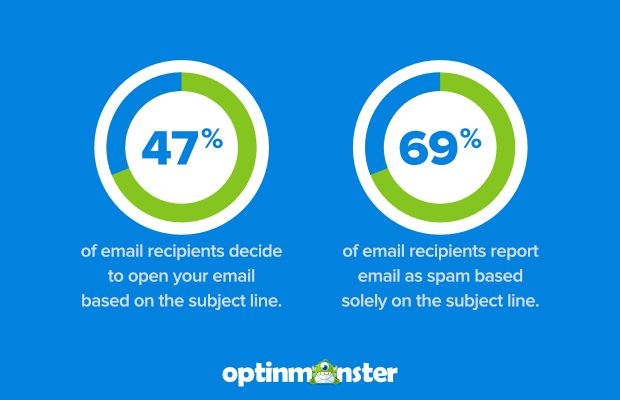
Subject lines matter. To really catch attention and get your email opened, you should use enticing, original, mobile-friendly subject lines.
And don’t be afraid to throw in a couple of emojis. They can increase open rates by 45%!
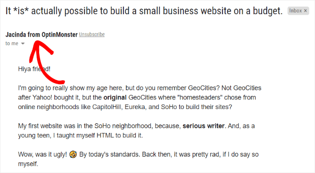
Your sender name is also important. More than 42% of us check out the sender name before opening an email.
If your nonprofit is well-known (like United Way, Humane Society, American Red Cross, etc.), you can probably just use your nonprofit name as your sender name. However, we recommend taking a personal approach and including the name of an actual person with your organization.
And, if you want to go a step further, don’t use a “no-reply” email. You’re trying to build relationships, right? Letting people reply to your emails is a great way to encourage communication.
Branding and Colors
Your email newsletter should look like it’s part of your brand. At the very least, include your logo, but you may want to include the same photo you use across social media.
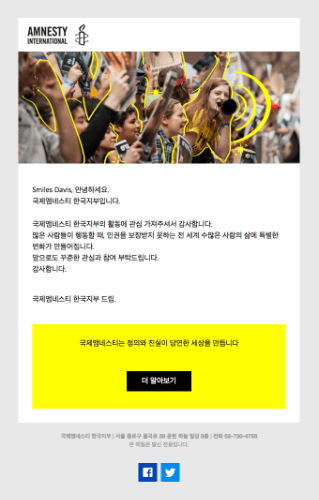
Here’s an example from Amnesty International:
They not only include their logo in the email header but also use their yellow brand color that appears all over their website.
When subscribers can recognize you, it boosts trust and engagement.
Fonts and Images
Email newsletters show up differently on different email clients and web browsers, so your best bet for a consistent look is to use web-safe fonts.
You have plenty to choose from, and there’s a list here to help you get started.
You’ll want to choose a font for headlines, body text, and maybe a third font for occasional contrast.
Formatting
People aren’t going to read your nonprofit newsletter. Don’t take it personally, people don’t read anything. What do they do?
They skim or scan.
This means that your email should be scannable. You can do that by breaking content into sections, using bullet points, and including a few images to draw their eyes.
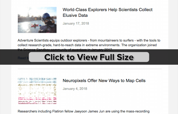
Here’s an example from the Simons Foundation:
You can see that their newsletter is broken into sections, with the headlines acting as headers and images to draw the eye down the page.
Check out our email newsletter design tips for more ways to design the perfect nonprofit newsletter.
3. Your Email Copy Is a Snoozefest (and TOO Long… and Not Useful)
Your emails must meet your readers’ expectations, not yours. If subscribers aren’t getting the information they want from you, they’re going to unsubscribe.
So, what information do subscribers to your nonprofit newsletter want from you?
Stories. Especially, stories about how your nonprofit, thanks to donors and volunteers just like your subscriber, made a difference and solved a problem.
They don’t want letters from your Executive Director or Board Chair.
Save that for your annual report.
Take a lesson from Gillette Children’s Hospital. Even though their nonprofit newsletter is in print, not digital, there are still valuable lessons to learn.
For starters, their newsletter was award-winning. And the staff all loved it.
But, they just weren’t getting a return. In fact, they were losing tens of thousands of dollars every year.
Then, they made some changes that led to a 1,000% increase in revenue from their newsletter.
How?
- Instead of focusing on all the great work done by the hospital and its staff, they focused on the impact that donors make.
- They ditched the scholarly articles they were using and focused on telling the stories of the people they were helping.
- They changed the formatting drastically, using shorter articles and tons more images (of the people they serve).
Penelope Burk, the author of Donor-Centered Fundraising, sums it up easily: donors want prompt and personal thank-yous and information about the impact their donation made.
Here are some ideas of content to include in your nonprofit newsletter:
- Stories of impact
- Donor and volunteer highlights
- Links to your blog posts
- Brief updates about your organization (like upcoming events, goals reached, etc.)
4. You Don’t Stick to a Schedule
In order to build and maintain relationships, you have to stick to a schedule. Choose a frequency (at least monthly, but no more than once a week) and be consistent.
Every organization is different, so you may have to do some testing to figure out the frequency that gets the most subscriber engagement for your nonprofit. Here’s a guide to split testing your email campaigns to help you.
Also, don’t be afraid to come right out and ask your subscribers about their preferred frequency. You can also offer an “opt-down” option for subscribers that love your emails but maybe don’t want them as often.
5. You Treat Your Newsletter as an Ask… Every Time
What if you had a friend who asked for money every single time you talked to them?
You’d quickly start avoiding that person, right? Yeah, your subscribers feel the same way.
This doesn’t mean that you stop asking. Wait, what?
Your asks can be made in more subtle ways than “donate now” calls to action all over the place.
For example, link to your donation page in the impact story. You can include wording like “with the help of donors like you” as the anchor text for the link.
Do the same thing whenever you thank donors: “click here to increase your impact.”
You can also set up your email template to include a regular call to action section at the bottom of your newsletter, just before the footer. This would include a few stats about your impact and a distinct “donate now” call to action.
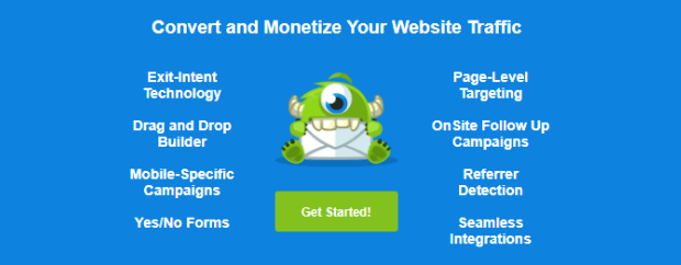
Here’s what we do at the bottom of our newsletters at OptinMonster:
Your subscribers signed up because they’re interested in the impact that your organization has for the people that they care about, too. When you start showing your subscribers that donors make a difference in the lives of real people through impact stories, they’re going to want to continue donating or volunteer.
You can ensure that your newsletter appeals to subscribers by only including content that shows the impact donors and volunteers have. Ask yourself if the content highlights that the donor’s action makes a difference. If it doesn’t, it doesn’t belong in your nonprofit newsletter.
6. You Don’t Have Any Other Content
We mentioned earlier that you should include links to your blog posts in your newsletter.
If you don’t already have a blog, you need to start a blog. Your blog is the perfect place to share tons of stories that appeal to potential donors.
But, it doesn’t stop there. Blog posts are only 1 type of content that you should be creating. There’s also articles, podcasts, and videos to think about.
Video marketing is a powerful tool that can make getting donations a lot easier. It brings the impact stories that you’re sharing to life in a way that words on a page just can’t.
When you have other content to link to, you can keep your newsletters short, improving the odds of them getting read all the way through.
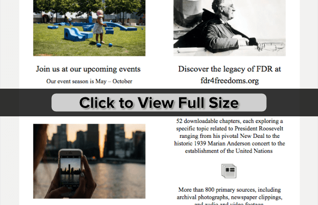
Here’s an example from Four Freedoms Park Conservancy:
You’ll notice that they include compelling images with the links that go to their website so subscribers can read the full articles that they’re interested in.
If you don’t have content outside of what you send in your email newsletter, you’re not going to keep donors’ attention for long. Remember, stories sell. This doesn’t just apply to commercial businesses.
7. You’re Not Giving Subscribers a Way to Contact You
Communication goes 2 ways. There are going to be times when subscribers want to contact you. Make it easy for them.
You can include links in your footer that point to any page of your site that you want. Also, include links to your social media pages.
If you use a telephone number, include that info. And, don’t use an email address that just goes into a “no-reply” mailbox.
The best and easiest way to help donors and volunteers contact you is to include a contact form on your site (you can link to your contact page in your newsletter footer). Check out our pick for the best form plugin (WordPress) and make it ridiculously easy for those important messages to get to you.
5 Nonprofit Newsletter Best Practices
We just covered how to get past 7 common mistakes that folks make in charity marketing. Here, we give you 5 best practices to help you give subscribers a reason to stay engaged.
1. Make Your Donors and Volunteers the Star
Your donors and volunteers should be the stars of the show. But to write to them, and about them, in a way that resonates with them, you have to first know them.
Who are you writing to? We recommend creating a buyer persona and writing to that specific person.
Pretend you’re writing to just one person and use “you” language. Subscribers don’t want a form letter.
Remember Gillette Children’s Hospital from earlier? They started speaking directly to their donors, using “you” everywhere (headlines, quotes, body copy).
This showed their donors that the donors were responsible for the impact… the hospital was just the service provider.
When you mention your organization at all it should be in terms of the things you were able to accomplish thanks to this subscriber.
But, what if you have subscribers who aren’t yet volunteers and donors?
Easy, segment your list.
Yes, it requires more work. Yes, it will be worth it.
Once you’ve segmented your list, you can fine-tune the messaging of your emails. This will likely mean sending a slightly modified version of your newsletter to subscribers who aren’t yet directly involved with your organization.
At OptinMonster, we send different emails to customers than we do the folks that haven’t yet signed up. It just doesn’t make sense to send an email filled with “get started with OptinMonster” to people that are already loyal customers.
2. Include a Success Story & Share an Impact Update
Your nonprofit newsletter should start out with a compelling and emotional story about a life that’s been made better through your nonprofit.
The easiest way to tell subscribers about the change is through a “before & after” story. You can layout a short but impactful story that shows what life was like before your organization’s actions. Then, finish your story with the new and improved life that someone you serve now enjoys.
You don’t need to include tons of details. If you want to write the full story you should do that on your blog and link to the full story from the newsletter.
Be sure to include an image that will resonate with your subscribers.
Your impact story should have everything that a literary work has: a beginning, middle, and end, tension and resolution, etc.
If you’re an OptinMonster customer, take advantage of your free access to OptinMonster University to learn more about creating your story while keeping the focus on your subscriber. The execution plan, How to Create a Welcome Email Series That Sells includes tons of downloadables that teach you everything you need to know!
Donors want to feel connected and be reminded that they’ve trusted the right organization with their time and money.
3. Add a Clear Call to Action
A call to action (CTA) is your final instruction to your reader. What do you want subscribers to do after they’re done reading?
Your nonprofit newsletter should be written with your CTA in mind. If you want to recruit volunteers, your newsletter should include stories that show the importance and impact volunteers have on the people you serve.
Here’s how to create a strong call to action that inspires readers to take the next step.
4. Make Your Newsletter Mobile-First
About 70% of your subscribers will be reading your nonprofit newsletter on their mobile device. If you’re not optimizing for a mobile audience, you could be missing out on tons of donations.
Here are some easy ways to make sure that your emails are ready for mobile readers:
- Use simple formatting. A single-column email, no more than 600px wide, is great for mobile.
- Use a larger font size. Small fonts are difficult to read on mobile.
- Make it work without images. Some smartphones (Android) turn off email images by default, so make sure it looks good without them.
- Pay attention to load time. Use smaller images to reduce load time.
- Use a large call-to-action button. Larger buttons are easier to tap with a finger or thumb.
- Give links some space. Don’t put 2 links next to, or on top of one another. That way, readers won’t tap the wrong one by accident.
5. Use an Email Service Provider
When you collect email addresses using OptinMonster, you can set up your optins to use Monster Leads. This gives you a nice backup of the subscribers you’ve gotten through your optins. Plus, it means you can get started even if you haven’t yet chosen an email service provider.
However, using an email service provider is vital to the success of your nonprofit newsletter.
For starters, a good email service provider is going to help you stay in compliance with anti-spam regulations. You don’t want to be blacklisted; it will devastate your communication efforts.
Most email service providers also include email marketing automation features that make it really easy to send bulk emails that are still personalized and targeted.
Your email marketing service should also make it ridiculously easy to manage contacts, segment your list, and track the performance of your campaigns.
Related Content11 Reasons Why Your Emails Go in the Spam Box (and How to Make Sure They Don’t)
We highly recommend Constant Contact for your charity marketing needs. It’s beginner-friendly while still providing the features you need to succeed.
Examples of Good Nonprofit Newsletters
Now that you know what to do, and not do, let’s take a look at some examples of nonprofit newsletters that do it right (more often than not).
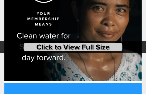
Charity Water: “A New Way of Life for Srey”
What we love:
- Great imagery
- Directly addresses supporters by stating “Your membership means…”
- Heavy focus on the impact
- Powerful “before & after” photo
- Includes contact info, and a way to change email frequency
- A clear call to action (“Share This Update”)
What could be improved:
- Include personalization
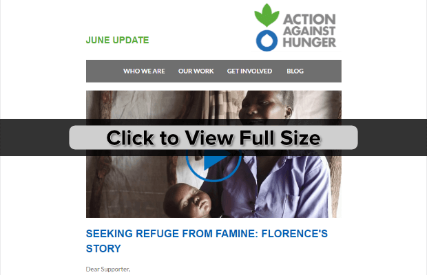
Action Against Hunger: “How your support helps mums to create healthier futures for their children”
What we love:
- Powerful imagery
- Includes a video
- Links along the top make it easy for readers to get more info
- Clear and powerful call to action (“Help Save Lives”)
What could be improved:
- Include personalization
- Might have issues on mobile devices
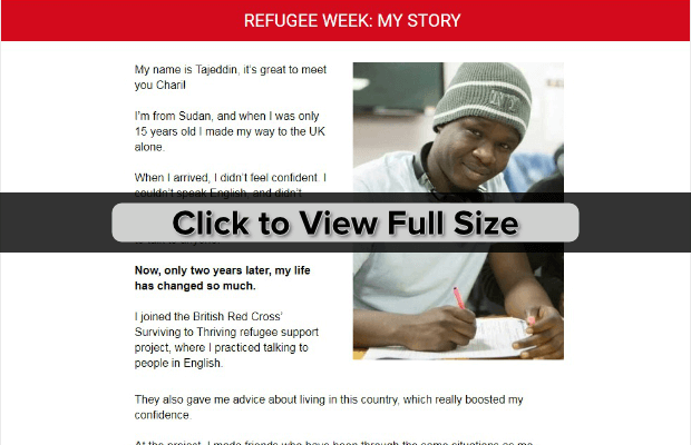
British Red Cross: “I’m here to tell you my story Chari”
What we love:
- Nice imagery
- Powerful story from someone personally impacted
- Lots of personalization
- Includes social proof in the footer (“Registered with Fundraising Regulator”)
What could be improved:
- Call to action is there (“Find out more…”) but needs to be stronger
- Email is sent from a no-reply email
- Footer is REALLY large
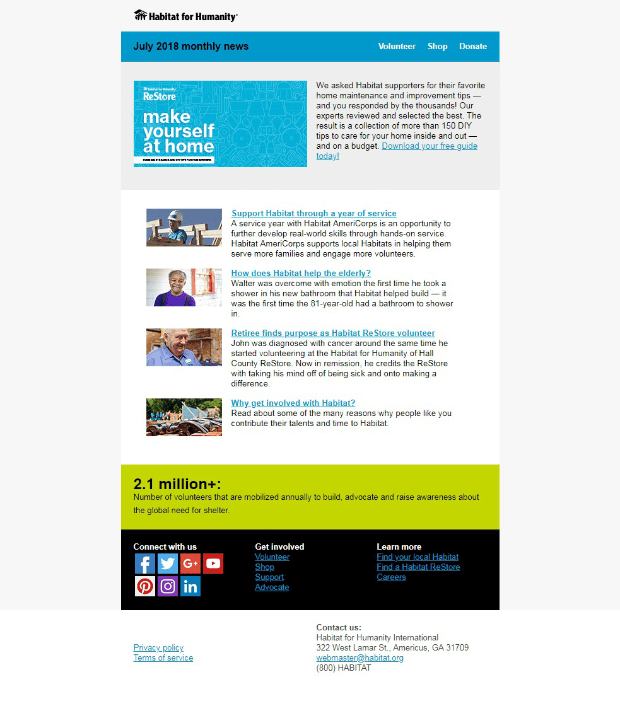
Habitat for Humanity: “Why get involved with Habitat?”
What we love:
- Nice use of images
- Uses multiple impact stories
- Includes links to the full story
- Call to action is a value to subscribers (“Download your free guide today!”)
What could be improved:
- The design might not work for mobile
- Too many links too close together in the footer
The Royal Marsden Cancer Charity: “The difference you make: May news”
What we love:
- Nice use of images
- Lots of “you” language
- Uses multiple impact stories & donor stories
- Includes links to the full story
- Includes a list of upcoming events
- Includes social proof in the footer (“Registered with Fundraising Regulator”)
What could be improved:
- The design might not work for mobile
- Stories should be more personal
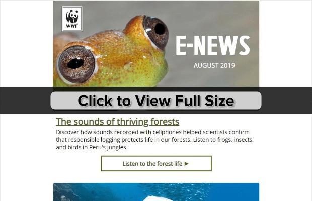
World Wildlife Fund: “Listen: Sounds of a rain forest”
What we love:
- Lots of fun images
- Includes links to the full story
What could be improved:
- Not enough focus on donor impact
- No clear call to action
Wrapping Up
You have everything you need to create an awesome nonprofit newsletter that’s sure to drive donations! If you want to do more to boost your fundraising efforts, learn how to add a fundraising progress bar to your site so you can show off your progress toward your goal.
And, be sure to check out our tips to boost year-end fundraising with popups.
Did you know that OptinMonster offers 20% off for our nonprofit friends? Just use NP20OFF at checkout!











Add a Comment