Are you looking for an easy-yet-eye-catching way to show off your fundraising progress to current and potential donors? People just love seeing those fundraising thermometers and knowing that their donations are making a real impact.
In this post, we’re going to show you how to add a fundraising progress bar to OptinMonster using our floating bar template, Yes/No buttons, and a teensy bit of custom CSS.
And, even if you’re not a nonprofit with fundraising goals, you can still use this type of campaign for lead generation goals or campaigns:
Customer Satisfaction Score
You can use the skills from this tutorial to show off your commitment to customer satisfaction.
Special Content
A progress bar can also be used to incentivize social media sharing or create buzz around a lead magnet.
With a little creativity, you can use progress bars to keep visitors engaged and informed in a fun, unique way.
Let’s get this party started!
Create a Campaign
Here’s the campaign we’re going to create:
To get started, you’ll need an OptinMonster account. Since we’re using the Canvas template. Signing up for OptinMonster is quick, easy, and worth it. Also, it only takes about 60 seconds.
Sign up for an OptinMonster account (nonprofits use code NP20OFF at checkout for 20% off!) and come back to continue with the tutorial. We’ll wait. ?
Once you’re signed up, log in to your OptinMonster account.
When you first log in you’ll see your dashboard. If you’re brand new to us, it’ll be empty. If you’ve been around, you’ll see the campaigns you’ve already created.
Click the Create Campaign button to create a new campaign.
Select your Campaign Type. We’re using Floating Bar for this campaign.
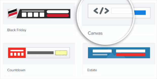
Next, select the Canvas template.
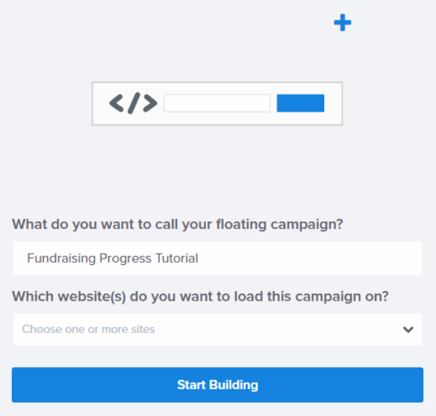
Now, name your campaign and click Start Building.
The Campaign Builder
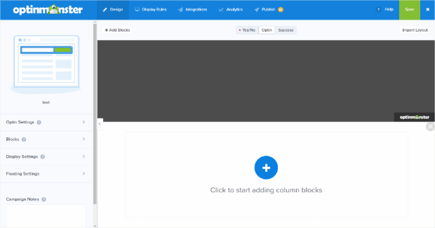
After you click the Start Building button, you’ll be taken into the campaign builder. Here, you’ll see the default Canvas floating bar campaign.
Make note of the green button in the top right corner. That’s the Save button. Use it often.
Here’s where the fun really begins and you get to start creating the campaign of your dreams! ???
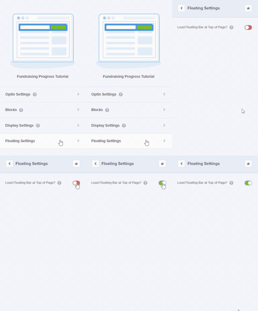
First, let’s move the floating bar to the top so our fundraising progress meter shows up there. To do that, click on Floating Settings then toggle Load Floating Bar at Top of Page? to green.
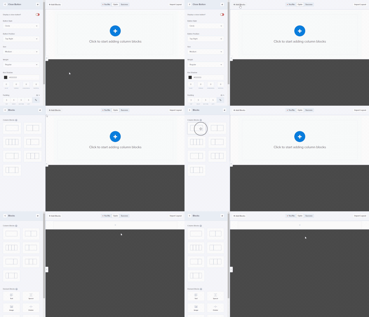
Next, let’s remove the close button from the campaign. To do that, click directly on the close button in the live preview of the campaign on the right side of the campaign builder. This will bring up the editing tools for that element on the left side of the screen.
If you have a Pro subscription, you can also remove the “Powered by OptinMonster” branding following this same process.
Adding Blocks to Your Campaign
Click Add Blocks, click the block you want and just drag and drop it onto the live preview of your campaign. We’re going to use the large, single rectangle.
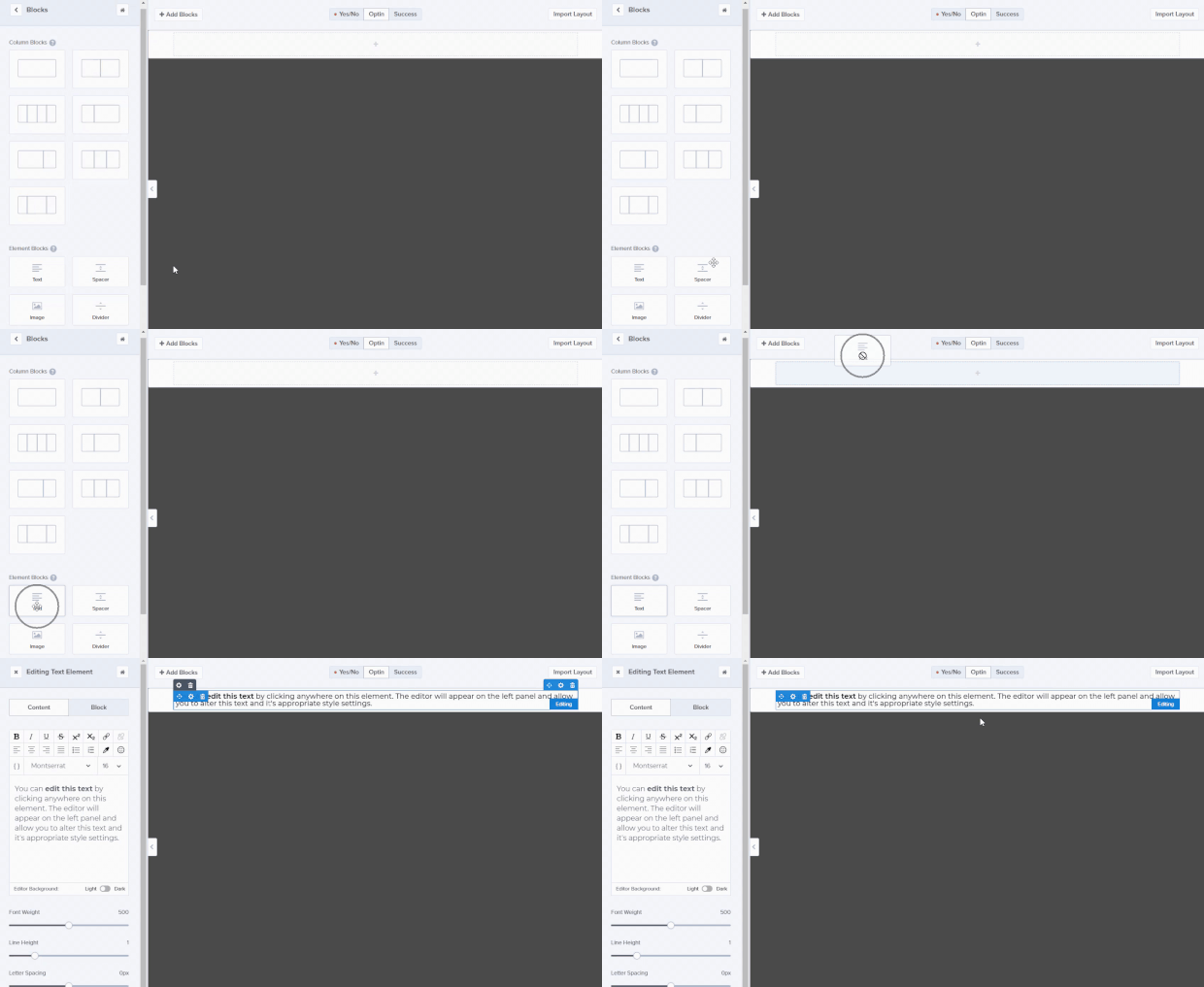
Next, add a text block to your campaign by dragging and dropping the text element right on top of the block you just added.
Editing Campaign Blocks
You can easily edit the blocks you add to your campaign by clicking directly on the block you want to edit in the live preview. This will bring up the editing tools on the left side of the screen.
Design Your Campaign
Here’s what we added to our fundraising progress bar example for this tutorial:
- 1 single rectangle block (you’ve already added this)
- 2 text blocks (you’ve added 1 text block already)
- 1 Yes/No block
Go ahead and add the remaining text block and Yes/No block. For reference, your campaign should look like this:
Now that we have the framework, it’s time to make it pretty. Below you’ll find detailed notes for each change we made to every section of the campaign to create the final version.
Text Box 1
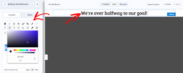
We used text box 1 to create the headline of our campaign. We wanted our headline text to be larger and contrasting, but not to detract from the fundraising progress meter.
Here’s what we did:
- Text: “We’re halfway to our goal!”
- Font: Bree Serif
- Size: 35
- Alignment: Center
- Color: hex code #DF6A0D
Everything else was left at its default value.
Text Box 2
We used this text box as an appeal. We kept the text smaller and added a call to action with instructions on how to donate.
Here what we did:
- Text: “We need your help to make it all the way. Just click on the progress bar below to make a donation right now!”
- Font: Arial (sans serif)
- Size: 18
- Alignment: Center
Everything else was left at its default value.
Yes/No Button Styling
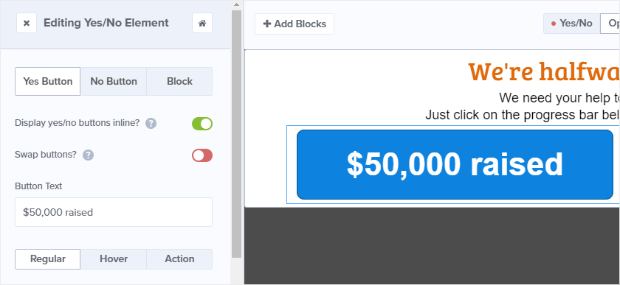
This block is our amazing fundraising thermometer. We’re going to make some design changes to customize the look of our buttons and then finish them off with a little bit of custom CSS.
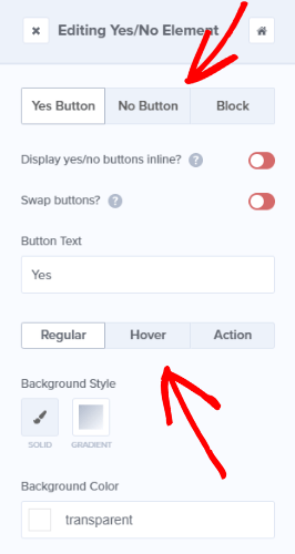
You have to edit each button individually, but it’s super easy to do. Simply bring up the editing tools for the buttons just like you would for another block, by clicking on the block in the live preview.
You’ll have the option to edit the regular and hover look of each button, as well as the button’s action.
Let’s start by setting the Display yes/no buttons inline? option to green.
Here’s how we set up our Yes button:
- Text: “$50,000 raised”
- Background Color: hex code #0d82df
- Font Family: Arial (sans serif)
- Font Color: hex code #fff
- Font Size: 43px
- Font Weight: 600
- Border Width: 0
- Border Style: None
- Border Radius: 10px
- Padding: 25 20 25 20 px
- Margin: 0 0 0 0 px
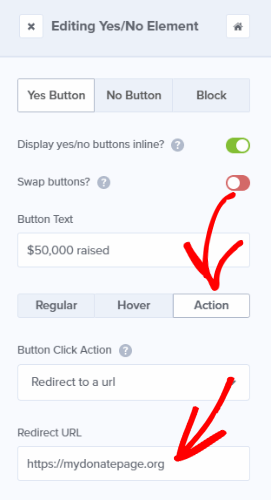
We also need to set up the Action for our button. The action is what happens when someone gives the button a click.
In our body text, we told visitors to click the fundraising progress bar to donate, so we’ll want to set up the button action to send visitors to a donation page.
To set up the button action, click into the Action tab and set the Button Click Action to Redirect to a url and enter your donation page URL in the Redirect URL field:
Now it’s time to set up our No button. Here’s what we did:
- Text: “Goal: $100,000”
- Background Color: transparent
- Font Family: Arial (sans serif)
- Font Color: hex code #b2b2b2
- Font Size: 43px
- Font Weight: 600
- Line Height: .5
- Border Width: 0
- Border Style: None
- Border Radius: 10px
- Padding: 25 12 25 12 px
- Margin: 0 0 0 0 px
We’re going to customize the hover styling for the no button, so click into the hover section and toggle Customize Button hover styling? to green. From there, simply click on Copy Regular Styles.
Set the No button action to redirect to the same URL as the Yes button. This way, no matter where on the fundraising progress bar your visitor clicks they’ll be taken to the donation site.
Format the Yes/No Block
There’s one last thing we need to do before we add our custom CSS and that’s to edit the entire block around our buttons.
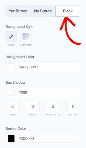
Right now, the buttons are just sort of floating without borders or anything containing them, but we’re going to fix it right now. To do that, click on Block to go into the block editing tools.
We want to make the buttons look like a single fundraising progress bar that goes from left to right without interruption. Here’s how we did it:
- Box Shadow: hex code #888888
- Spread: 10
- Border Radius: 10px
- Padding: 0 10 0 0 px
- Margin: 5px
It will look a little weird right now:
Don’t worry; we still need to add our custom CSS to finish this off. Let’s do that now.
Save your campaign (why not, right?) and click on the Design tab or the Home button in the campaign builder to get back to the main menu.
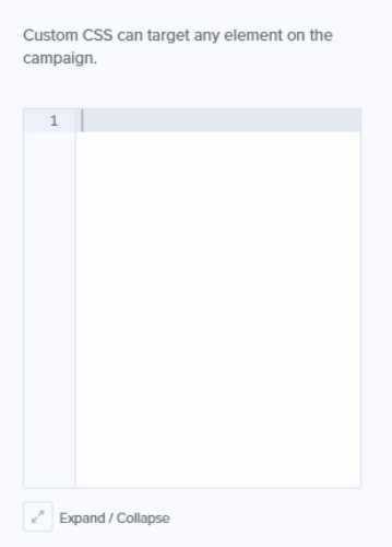
From the main menu, click on Display Settings then scroll down to the CSS section:
Here’s the code that we used:
html div#om-{{id}} .{{ns}} .{{ns}}-YesNoElement--wrapper {
box-shadow: inset rgb(136, 136, 136) 0px 0px 10px !important;
}
html div#om-{{id}} .{{ns}} .{{ns}}-YesNoElement--content button.{{ns}}-YesNo--Yes {
width: 50% !important;
}
html div#om-{{id}} .{{ns}} .{{ns}}-YesNoElement--content button.{{ns}}-YesNo--No {
width: 50% !important;
}
Design-wise, our fundraising progress meter is done! Our next step is to decide when we want the campaign to display.
Set Display Rules
To get to the display rules, just click on the Display Rules tab. You’ll see that the default rules are set to show your campaign on any page after a visitor has been on your site for at least 5 seconds.
For this campaign, we’re going to leave the rule to show the campaign on every page so it shows up throughout our site. However, it’s really easy to show it only on specific pages by changing the Current url path condition:
To remove a condition from your display rules, simply click the minus button next to the condition you want to remove:
If you want to show a separate campaign to desktop viewers and mobile viewers, you can do that with display rules too! Just set a condition to show your optin based on your visitor’s device:
Publish Your Campaign
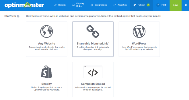
Now you’re ready to publish your campaign! To do that, click on the Publish tab and change the Status to Live:
OptinMonster campaigns can easily be published anywhere:
Updating Your Fundraising Progress Bar
You can follow the steps above to edit your fundraising progress bar at any time, making it incredibly easy to target your campaign throughout your fundraising efforts!
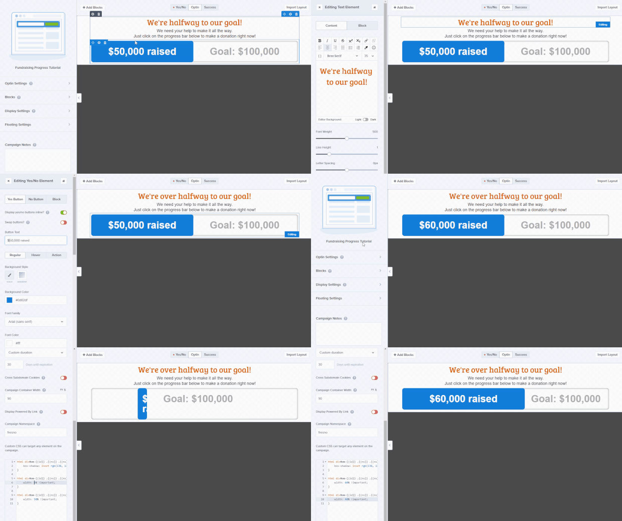
Whenever you want to update your fundraising numbers, you can do so by simply changing the text on your Yes button, and changing the percentages in the custom CSS.
Depending on how much of your text you change, the entire process takes around 20 seconds:
There you have it, folks. A fully customizable fundraising progress bar for your website, powered by OptinMonster. Pretty cool, right? ??
If you’re interested in more cool stuff, you should definitely add Google Analytics to track your campaign’s performance. Or, see how a different design might impact visitor response to your campaign with A/B testing (don’t forget that you’ll have to update numbers and text in 2 places if you try this). And, be sure to check out these best practices to make your nonprofit newsletters connect and convert.
Are you looking for more actionable tutorials like this? Check out OptinMonster University!


















Add a Comment