In this article, we share 15 mobile landing page best practices that you can use to increase mobile conversions.
Did you know that 51% of shoppers say that they use mobile devices to find new brands and products? Since “smart” mobile and portable devices came onto the scene they have been steadily taking traffic from desktops.
So why do mobile conversions still underperform desktop conversions?
Well, there are a few reasons. Some of those reasons, like shopper concern about the safety of their information, you have little control over. One of the reasons mobile conversions still lag behind desktop conversions you have complete control over is your mobile landing pages.
What Is a Landing Page?
A landing page is a single web page that shows up when clicking on a search result or online ad. These pages typically have a single call to action or purpose and minimal design and navigation.
In this article, we’re going to walk you through 15 mobile landing page best practices that will boost your mobile conversions. We’ll wrap up with some mobile landing page examples that will inspire you to create your own.
Mobile Landing Page Best Practices
The best mobile landing pages grab attention, demand action, and get a conversion. Done and done.
When you find yourself on a well-crafted mobile landing page something inside of you probably sighs happily because it just “feels” right and is oh-so-easy to use.
You can make your own landing pages just like this with these 15 mobile landing page optimization tips, so let’s get into it.
1. Create a Separate Mobile Landing Page
It’s not enough to be mobile-first or responsive anymore. Your mobile landing pages have to be designed specifically for mobile use or they aren’t going to convert the way you want them to.
The problem with responsive design is that all of the elements were still designed for desktop, not mobile. Even the flow of the page was created for desktop use. Since mobile users search and browse sites differently than desktop users, your landing pages need to be customized for each device that will be used throughout the customer’s journey.
It’s important to map out the customer journey and build your site optimized to the devices that will be used along the way.
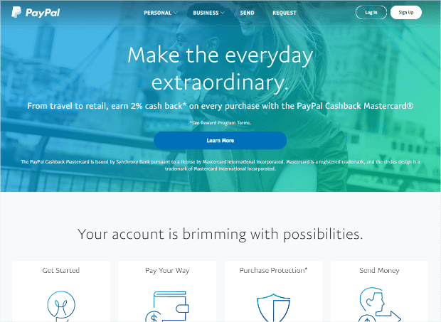
PayPal does a great job of creating an entirely different experience for mobile and desktop users. Their desktop landing page, while still minimalist, is visually engaging and appealing.
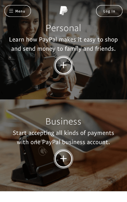
Their mobile landing page is very simple. There’s an option to log in and a menu in case you want to see additional options, but the primary focus is two buttons that will take you to more information about using PayPal for personal use or business use. This eliminates the need for a mobile visitor to scroll through the site to find the information they’re looking for.
As you can see, both landing pages are visually appealing and both handle very different visitor needs. The mobile landing page is built to help visitors find information or complete tasks quickly while the desktop landing page is geared more towards visitors with time to spend.
2. Use Click-to-Call
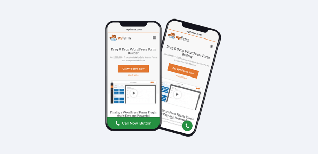
If key data like inventory, business hours, and pricing isn’t going to be easily accessible on your site, your contact information needs to be. For a mobile site, this means using a click-to-call button that’s easy to spot and big enough to click.
Mobile users are interested in getting the data they’re looking for right now. If they can’t find it quickly on your site they will look for an easy way to contact you to get the info they need.
Not only can you add a click to call button quickly and easily to your OptinMonster campaigns, but you can do it anywhere on your WordPress site using the WP Call Button plugin.
This static call button generator shortcode works seamlessly with the Classic Editor. Plus, if you’re using Gutenberg, you can use the built-in WP Call Button Block to easily create and customize beautiful click to call buttons in minutes.
Top Tools AlertNeed a way to manage your calls? Check out the best business phone systems and VoIP providers we’ve found.
Most importantly, WP Call Button seamlessly integrates with all top business phone services across the world, as well as working seamlessly with other popular WordPress plugins like WPForms, Elementor, WooCommerce, and more.
Check out how to get more calls from your website and get those visitors the info they need to make the connections and sales you want.
3. Implement Click-to-Scroll
Most of the time a shorter landing page is better. There are times, however, that users will want to browse through your inventory or read something on your site. In these cases, you can use click-to-scroll.
Click-to-scroll means that you set up navigation buttons that a user can click to take them to a longer, scrolling page. Rather than forcing scrolling on your site’s visitors, you allow them to make the decisions.
String Automotive did their own A/B testing for their mobile landing page and found that adding click-to-scroll functionality reduced their bounce rate by 37%.
4. Use Sticky Headers & Footers
Even though screen real estate is precious on mobile landing pages, it’s important to keep your call to action or whatever navigation you’re using for your mobile landing page easily accessible. Sticky navigation lets visitors find what they’re looking for about 22% faster, which is a big deal for mobile landing pages.
Also, literally everyone prefers sites with sticky navigation, even when they can’t explain why.
5. Use Mobile-Optimized Popups
Popups can be useful and effective for lead generation on mobile landing pages if you make sure that they’re optimized for mobile. A big part of that optimization means keeping them as simple as possible, so limit your form to just a few fields or even just an email address. You can always reach out to the visitor at the provided email address for more information later.
The popups used for mobile should match your mobile landing page size and not be a burden for the visitor to close or opt-out.
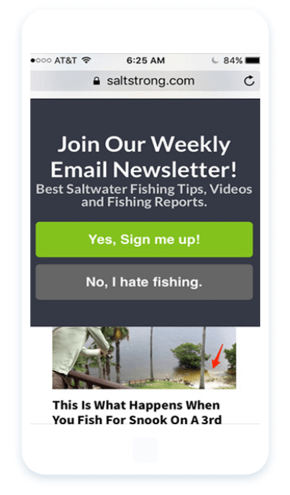
There are those who will tell you that mobile sites should never have popups, but several OptinMonster customers have seen great success with theirs:
- ChinaImportal increased leads by 18%
- The Advisor Coach saw 3X sitewide conversions
- Salt Strong converted 3.8% of mobile visitors
When used correctly popups are an awesome addition to your conversion rate optimization strategy.
6. Craft Shorter Copy
Your mobile landing page shouldn’t contain all of the copy from your desktop site. This is a place to use a shorter, abbreviated copy. You can and should still be clever and colorful, but you’ll want to get to the point quickly or your visitors will get frustrated with you and leave.
Here are some ways you can reduce the text on your mobile landing page:
Cut Anything You Can, Without Sacrificing Clarity
The goal is to be brief and succinct, not to cut out key points that will make or break your message. If something adds value, leave it.
Use Bullet Points
Bullet points are great for getting key points across in smaller chunks without having to use supporting copy around them. They also have the added benefit of drawing the visitor’s eye, making them less likely to be overlooked.
Keep Sentences and Paragraphs Short
Sentences and paragraphs should both be short and easy to read. There should be no walls of text on your page. Breaking up the text keeps the visitor interested and makes it easier to find key points.
Don’t forget that you’re working with less space on a mobile landing page than a desktop site. A 10-word headline can end up being 7 lines of text like this ill-conceived mobile landing page from HubSpot:
7. Go Easy on Visuals and Videos
Images and videos take data. Not all users reaching your mobile landing page are going to be on WiFi; some will be using their limited cellular data. Keep images to a minimum and be sure to optimize the images you do use to ensure that they’re compressed.
If you’re going to be using videos you definitely don’t want them set to auto-play. This means that your visitors will have to click them to play them, which could distract them from your primary call to action.
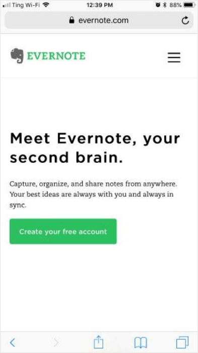
A landing page doesn’t have to be bogged down with images and videos to be visually appealing. Just look at this beautiful mobile landing page from Evernote:
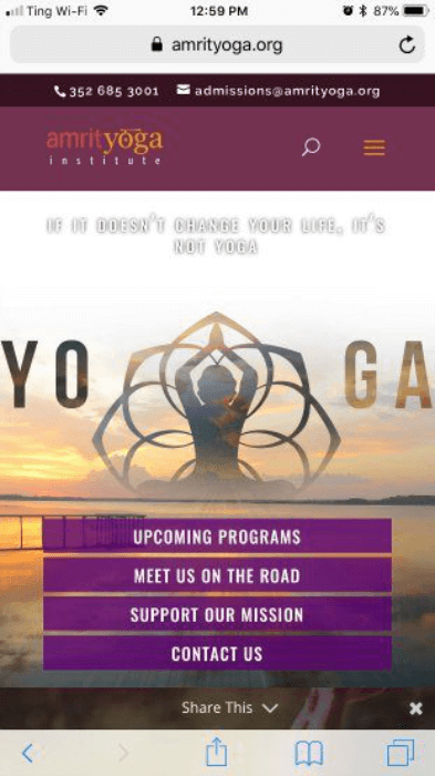
It’s simple, there’s no question about the call to action, and it loads really fast. It’s also very eye-catching due to its lack of heavy imagery. Compare that to this mobile landing page from Amrit Yoga:
Sure, it’s a very pretty page, but it’s filled with images and is entirely too resource-intensive to load. Amrit Yoga could’ve conveyed the peace and calm of yoga just as well with a minimalist design using limited images and ended up with a site that loaded much faster.
8. Make it Fast
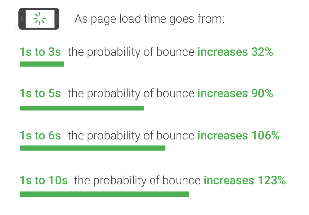
Paying attention to load times is super important because as page load times increase, bounce rates also increase. And, when a visitor leaves a site because of slow load times, almost 50% of them never come back.
Here’s data that Google uncovered in their research in 2018:
Interestingly, the average time it takes to fully load a mobile landing page is 15 seconds. When you consider that 53% of mobile site visitors will bounce if a site takes longer than 3 seconds to load, the average site takes far too long to load.
If you took note of the advice in the previous tip then your site should already be loading faster since images and videos tend to be the number one problem with slow sites. You can also upgrade your hosting plan to a faster one.
One of the quickest and easiest ways to keep your website speedy is by using a Content Delivery Network (CDN). Find the right one for you on this list of the best CDN providers to speed up your website.
9. Stick to Single Column Layouts
Mobile devices don’t need multiple columns. They don’t have room for them and anything more than a single column makes navigation and scrolling feel really cumbersome and clunky.
Of course, rules are also made to sometimes be broken. If you are trying to catch visitor’s attention it may be beneficial to occasionally misalign content. For the most part, however, single-column is the way to go.
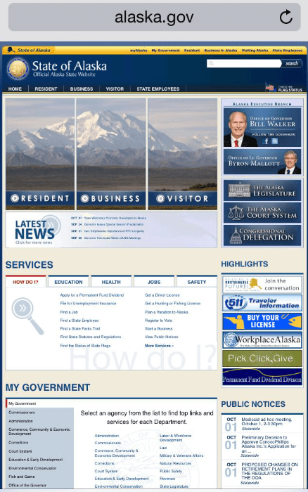
Let’s take a look at the difference in action. First up, the official government site for the state of Alaska seems to not actually have a mobile landing page and is just using their regular website homepage, but it works for our example:
The multiple columns that work on a regular webpage just do not work on a mobile site. Can you imagine how difficult it would be to navigate this site in a space of about 3X5 inches?
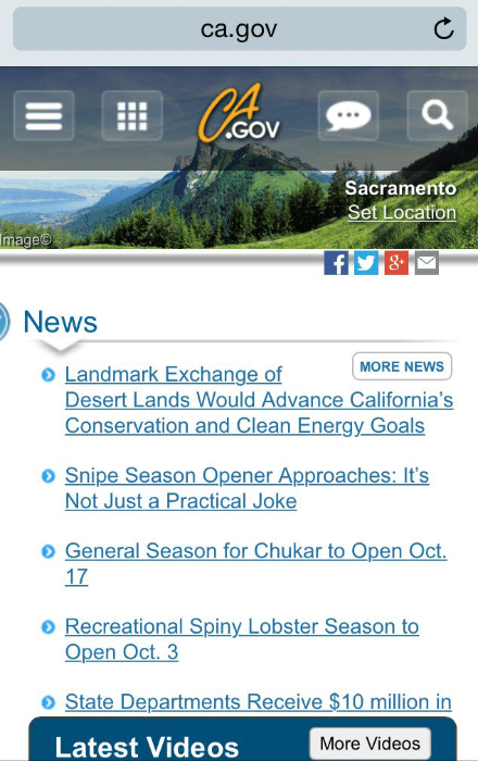
Now let’s look at California’s mobile landing page:
Not super exciting, but definitely much easier to use.
10. Rethink Navigation
Did you know that some marketing thought leaders think that we should do away with navigation altogether on mobile landing pages and focus on pushing visitors toward the primary call to action that we want them to complete on the page?
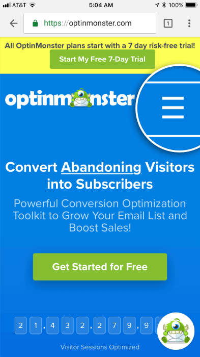
Many mobile landing pages use a “hamburger” for navigation to save space on smaller screens. Most visitors have grown used to seeing this symbol and know that clicking it will bring up navigation options.
Some sites use the sticky headers that we talked about in #4 to include a couple of main navigation links that are related to the primary goal they have for the mobile landing page.
11. Optimize Forms for Mobile
It is so very important that you optimize your forms for mobile visitors. Filling out forms on a mobile device actually has a negative net fun value, so make sure that you get the bare minimum information you need to accomplish your goal. You can always follow up later for more information.
Quick TipIf you have a WordPress site, you can use a plugin like WPForms to help you quickly and easily build responsive forms that are going to work beautifully for your mobile visitors.
This form from Learn Jazz Standards is a great example of what a mobile form should be:
They set you up with what they’re offering. It’s a little wordy, but the form makes up for it. Three fields: first name, email address, and a dropdown to select the instrument you play. Boom. Click subscribe and you’re on your way to learning jazz standards.
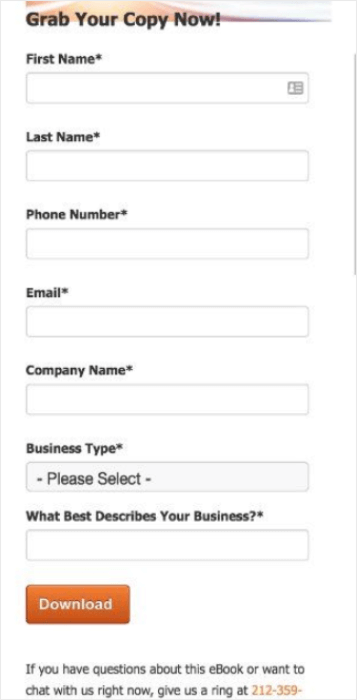
Likeable Local is another story entirely.
We’re sure they’re lovely, but we’re not sure we like them enough yet to spend the time it’s going to take to fill out 6 text fields and a dropdown on a mobile device before we can download their lead magnet.
If you need help crafting just the right optin, check out this post all about how to create mobile optins that win more business.
12. Use High Contrast
High contrast colors serve a two-fold purpose for mobile landing page optimization.
First, they’re eye-catching and even people who don’t have the design bug can sometimes find beautifully designed buttons irresistible to click.
Second, people use their mobile devices everywhere and natural outdoor light can make it hard to see what’s on the screen if it’s a low-contrast design.
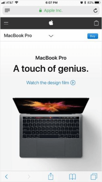
Apple does an excellent job using high contrast with darker text and images on a bright white background.
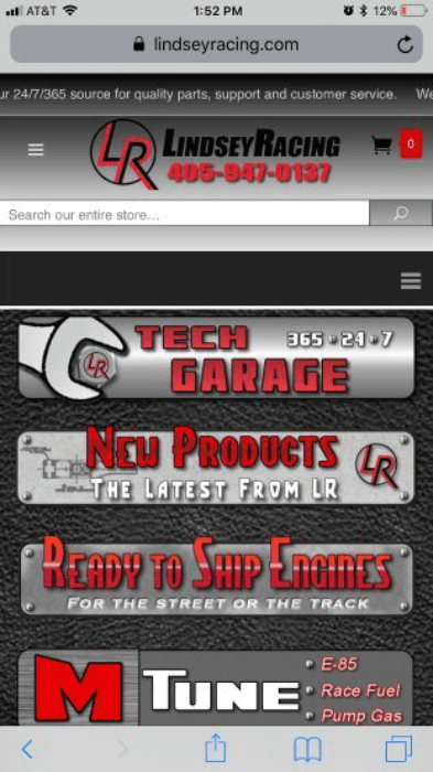
Lindsey Racing, well, doesn’t.
The black, gray, and red design looks edgy which we assume is what they were going for, but everything just turns into mush under the harsh light.
You want to make sure that you’re using colors that convert well and that show up under whatever type of lighting your visitors happen to be using.
13. Use White Space
As we’ve already seen with Evernote and Apple, the use of white space is a wonderful thing. It creates interest and makes the mobile landing pages look modern. It also gives the eyes room to read the words that are on the page.
White space also makes touchscreen interactions easier for visitors and keeps accidental clicks to a minimum.
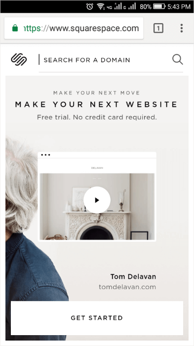
For a creative take on white space let’s take a look at Squarespace.
Squarespace’s white space shows that white space doesn’t really mean “white” space. We’re looking for white as in “free from distraction.” Squarespace does this beautifully.
14. Place Calls to Action at Top of Page
“Above the fold” still applies to mobile landing pages. Yes, mobile users are conditioned to scroll, but 80% of a mobile visitor’s attention is still spent at the top of the page, before the first, instinctual scroll. This is where your primary call to action needs to be.
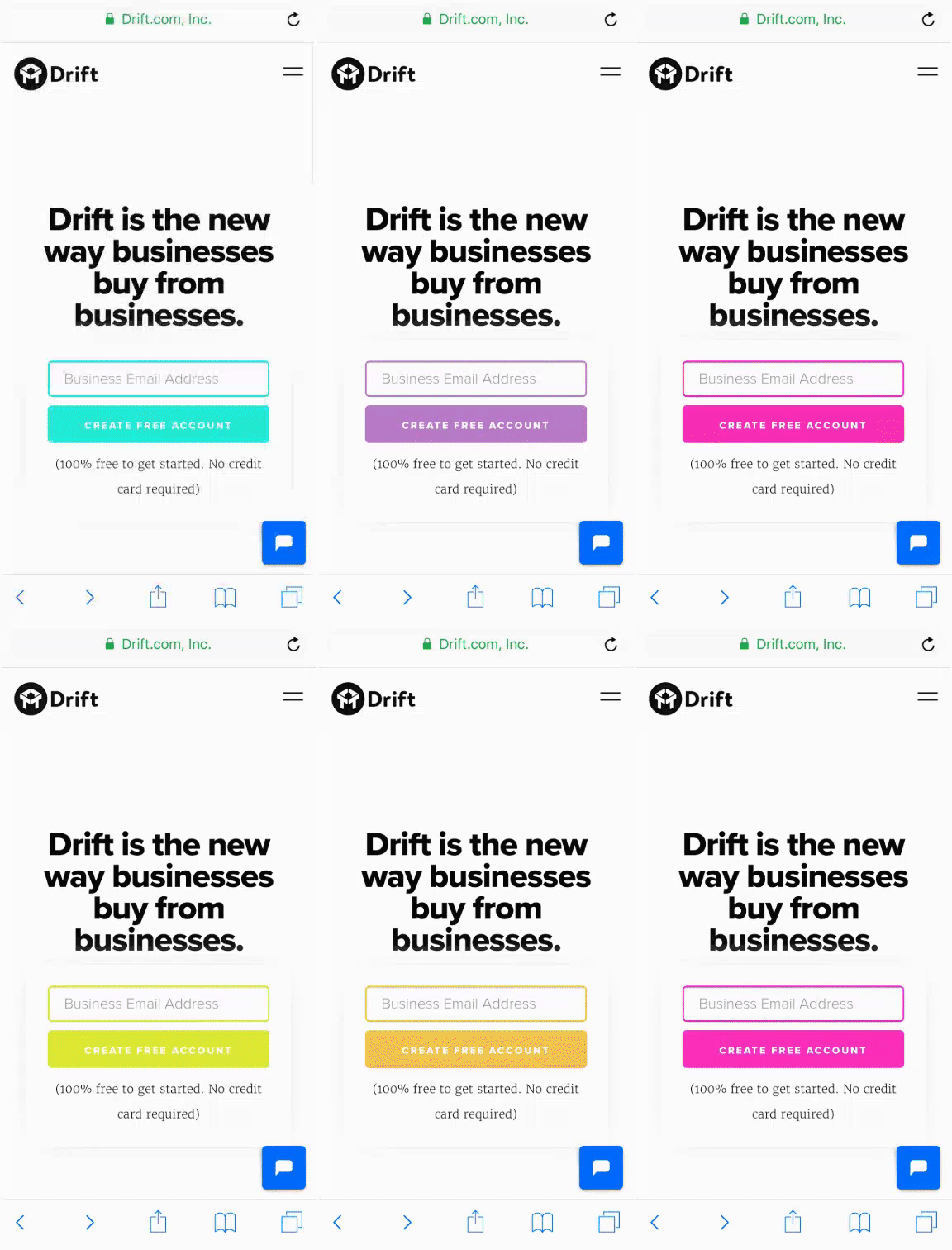
Drift does a great job of keeping their call to action toward the top of the page and draws attention to it with a little color-changing action. They’ve since changed this cool feature, but we wanted to use it here to show you what can be done.
As you scroll down Drift’s page you get the same call to action (without the colors) about midway to remind you why you’re there.
If you’re unsure about what makes a great call to action, we can help you create the perfect call to action.
15. A/B Test
We saved the most important mobile landing page best practice for last: A/B testing. You will get so much information that you can use to make your site better, increase conversions, and boost your revenue just by making subtle changes.
Here’s the basic format of running an A/B test:
- Decide what issue you want to solve, such as increasing conversion rates.
- Determine what you want to compare; for example, would 10% off convert better than free shipping?
- Perform the test by creating two versions of the landing page, the only difference being the item you want to compare.
- Figure out the winner by analyzing your data and reviewing the results of your A/B test.
- Revise and re-rerun your experiments.
There are literally thousands of ways to break apart your site to split test it. For some ideas, take a look at this post of 11 best practices for A/B testing.
Best Mobile Landing Pages That Convert
Now that you’re an expert on designing and testing, let’s look at some mobile landing page examples, shall we? You’ve already seen some of our favorites in the examples above, but here are a few more of the best examples we’ve found.
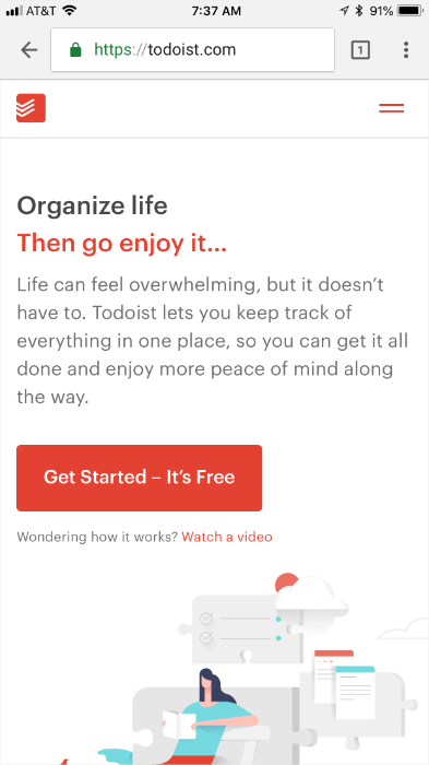
Todoist
Why We Love it:
- High contrast
- Call to action toward the top of the page
- White space
- Minimal graphics
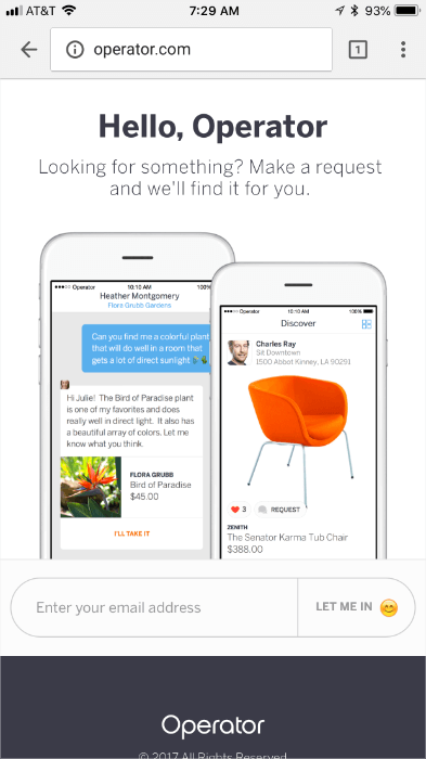
Operator
Why We Love it:
- Fun use of graphics
- Super simple form
- High contrast
- No giant wall of text
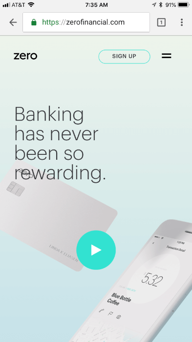
Zero Financial
Why We Love it:
- Uses video, but doesn’t autoplay
- Call to action is top of page
- Great imagery
- Excellent use of white space
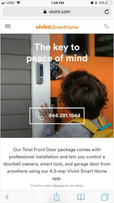
Vivint
Why We Love it:
- Emotional graphic pulls at the heartstrings
- Great contrast
- Click-to-call button
- The copy is to the point
There you have it! 15 mobile landing page best practices and optimization techniques to boost your conversions and engagements on mobile. If you’re looking for more ways to increase your mobile conversion rate, check out these 19 proven methods. Want to try your hand at creating a landing page? Check out our tutorial to create a simple landing page in under 5 minutes!
Looking for more ways to create a great landing page? Here’s a list of landing page ideas to get you started.
Or, you may want to check out this article on landing page optimization (7 tips + 5 case studies).
OptinMonster can be the lead generation partner you’ve been looking for. Join us today. What are you waiting for?













Add a Comment