Do you have an eCommerce website or a blog that isn’t getting you the expected results?
Building a website is one thing. But making it engaging for your visitors requires a completely different beast.
Maybe your goal is to get new subscribers to your blog or newsletters. Or perhaps you want your website visitors to create an account on your website or buy from your eCommerce store.
If you’re struggling to see the results, your website engagement is likely to blame. In this post, we’ve rounded up 15 simple ideas you can apply to improve your website engagement strategy.
What is Website Engagement?
Website engagement is the level of interaction that users have with your website. It’s often measured by how long visitors stay on your site and whether they’re clicking your links and calls to action (CTAs).
Elements such as page loading speed, design, user experience, content, copy, or even type fonts contribute to making your website engaging.
Website engagement improves when these elements work together to persuade the site visitors to spend more time on the website and take specific actions. If visitors abandon your website mid-way or bounce off to different pages, it implies that your engagement is lacking.
If you have spent a lot of time and energy building a website that isn’t driving enough engagement, it isn’t living up to its full potential. Better engagement means more website traffic, better website ranking, improved conversions, and increased sales.
In short, to make your website more engaging, you need to get the website visitors to:
- Spend more time on your website
- View more pages on the website
- Share your content in their network
- Take the desired action before they leave
6 Types of Website Engagement
The goal for website engagement is usually mapped to higher conversion rates. These 6 different types of engagement that can help you get there.
1. Reading Content Published on Your Site
People landing on your website and consuming your content is a good indicator of an engaging website. It means that the content catered to their specific intent and helped them find answers to their questions.
Imagine searching for “how can I increase my website engagement” in Google and discovering this blog as an example. If you like what we have published in this post and read it until the end, you can say this blog was an engaging read.
2. Sharing Your Content on Social Media
People sharing your articles or products on social media is a testimony of a website that’s beyond engaging. Most people don’t usually share everything that they come across on the Internet. But when they do, it means that they found the content valuable and irresistible.
Many brands use gamification techniques on their website to create built-in virality and improve their user engagement.
3. Signing Up to Your Email List
Most brands these days design their website as a way to grow their email audience. Let’s say you run a blog or publish a weekly newsletter. To keep growing your email list, you can create a popup on your website encouraging new readers to subscribe to your blog or newsletter.
Nowadays, eCommerce brands invest heavily in email marketing so that they can build an audience they can market to later. Research shows that 83.7% of the top 1,000 eCommerce brands use email to connect with their target audience.
Later, you can use the lead data collected through the sign-ups in your email segmentation strategy. This will let you create targeted marketing campaigns and improve customer count.
A growing number of people signing up for your blog or newsletter every month is one of the best measures of a highly engaging website.
4. Interacting with Service Agents or a Chatbot
A tell-tale indication of good engagement is when users start a chat with either your sales or support staff or interact with an automated chatbot. People wanting to talk to human agents or chatbots means that they find your website engaging and intend to engage further through a 1:1 conversation.
Maybe they want to clarify a piece of information they saw on your product pages or have a customer service query before they make a purchase. Whatever their reason for engagement may be, it usually means that the users are ready and willing to do business with you.
5. Engaging with Media on Your Website
People who watch the videos or download infographics from your website is yet another metric to measure website engagement rate.
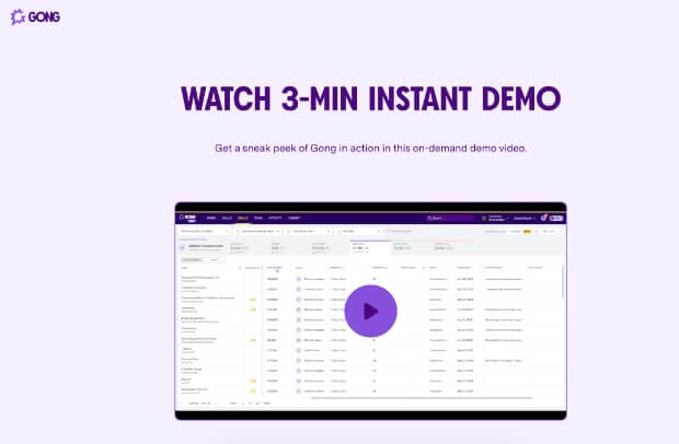
Consider this example of Gong, a B2B SaaS brand, that has a 3-minute-long demo video of their product on their website.
The number of people watching the demo video in its entirety is the measure of its engagement. Good engagement on the video can guide site visitors into either converting as leads or making a purchase. Poor engagement often causes a drop-off or premature exit.
6. Browsing Across the Website
Some visitors find your website design so compelling that they start exploring multiple pages. A website with high engagement piques visitors’ curiosity and leads them to dig for more information about the brand.
For instance, you may discover this blog through a Google search and decide to check out OptinMonster’s plans and pricing after reading the blog.
The opposite is true, too. It can be a turn-off when a website throws too many popups, asks you for cookie consent, launches a chat widget, and displays ads all at once. Such elements pose challenges to self-service customer experience and can lead to website drop-off.
15 Ideas to Improve Website Engagement
Here are 15 actionable website engagement strategies to help you make your website more attractive for visitors.
- Track Your Website Engagement Metrics
- Create Helpful Content
- Make Your Website Mobile-Friendly
- Improve Your Website’s Loading Time
- Add Social Proof on Your Website
- Add Push Notifications
- Offer Freebies
- Create a Quiz or Poll
- Run Giveaways
- Add Live Chat to Your Website
- Collect Email Addresses
- Suggest Related Resources
- Add a Social Media Feed
- Run Usability Testing
- Analyze Data to See What Works
1. Track Your Website Engagement Metrics
The first step to optimizing your website engagement rate is to measure where it currently stands. There are specific metrics that can tell you how good or bad your site’s engagement is.
- Average time on page is the time users spend on your website or page.
- Page views is the number of views a page gets over a set period of time.
- Returning users is the total number of visitors that have previously visited your website.
- Bounce rate is the number of users who abandon your website without visiting any other page.
- Exit rate is the number of people who abandon your website from a particular page.
- Average session duration is the time that a user spends on your website during a single session.
Understanding and routinely monitoring these metrics will tell you where you’re lacking in your website engagement journey. Alternatively, these metrics will also help you identify your strong areas and double down on them.
A tool like Google Analytics gives you a comprehensive understanding of these metrics under the same roof. You can also configure Google Analytics to generate custom reports specific to your preferences to keep a close tab on certain metrics over others.
2. Create Helpful Content
Having a blog is a great way to get users to engage with your website. According to a finding by DemandMetric, businesses with blogs generate 67% more leads per month than ones without them.
If you’re providing useful content like tutorials, users will think of your site as a trusted resource. They’ll know that if they have a question or want to learn something new, they can always visit your blog for help.
Plus, giant tech companies have been making sweeping changes to encourage higher-quality content. These shifts make it more important than ever to publish helpful content.
Google recently launched a helpful content update as part of its algorithm refresh. Google describes the update as “a signal used by our automated ranking systems to better ensure people see original, helpful content created for people in search results.”
To make your content helpful, always try to cater to your audience’s most pressing concerns. You can also make your content share-worthy by including eye-catching images and making it easy to read.
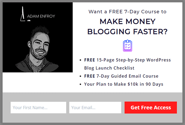
Adam Enfroy runs an online blogging site that educates its target audience on how to run a profitable blog, and he’s seen amazing results. After launching in 2019, Adam’s blog reached 250,000 monthly readers and generated over $35,000/month in revenue within 9 months.
OptinMonster played a big role in helping Adam achieve his revenue milestone. Adam used OptinMonster to create an exit-intent popup and grew his email subscribers by over 11,300 in just 1 year.
Adam also used OptinMonster’s A/B testing feature to experiment with various campaigns and double down on high-performing popups. Here’s one of the popups he published on his website after testing it with OptinMonster’s split testing functionality:
3. Make Your Website Mobile-Friendly
On average, 63% of all organic searches in Google originate from mobile devices. If your website isn’t optimized for mobile users, you’re losing web traffic and the potential to convert more visitors into customers.
Responsive web design is more mobile-friendly, easier to maintain, and offers better ranking potential.
But how do you make sure your website is mobile-friendly? If you have a WordPress site, here are some tips to follow:
- Choose a responsive WordPress theme
- Hide pop-ups for mobile users
- Avoid using too many plugins that slow down your website loading time
- Downscale your media (e.g. images and design elements) for mobile
- Test your site’s mobile-friendliness using tools like PageSpeed Insights.
4. Improve Your Website’s Loading Time
Page loading time is critical for user engagement as well as SEO rankings. This study by Google explains how the difference in page loading time has varying effects on user behavior:
- If a web page’s load time increases from 1 second to 6 seconds, the bounce rate grows by 90%.
- With an increase to 10 seconds, the bounce rate probability increases by 123%.
The longer the page load time, the higher the likelihood of users bouncing off your website. Fortunately, you can easily improve your page loading speed in WordPress. Here are a few tips on how to do it:
- Choose a reliable website hosting provider.
- Optimize images for faster loading. Use tools like Compressor.io or Compress JPEG.
- Minimize your URL redirects since it triggers too many HTTP requests and responses.
- Use a browser caching plugin like WP Rocket to improve your site’s performance.
- Use a trusted content delivery network (CDN) to optimize web page speed.
- Reduce the number of plugins on your website.
5. Add Social Proof on Your Website
Social proofs like customer testimonials, case studies, or user reviews go a long way in building credibility for your website. They encourage people to engage with your brand.
As one of the 7 key principles of persuasion, social proof helps online businesses increase familiarity and shape the public perception in their favor.
This is important because, according to TrustPulse, 98% of visitors leave a website without taking any action, and 70% never return because they don’t trust the brand.
You don’t necessarily have to create a dedicated landing page to showcase your social proof. If you want to boost engagement through social proof, you can trigger real-time personalized notifications using advanced targeting.
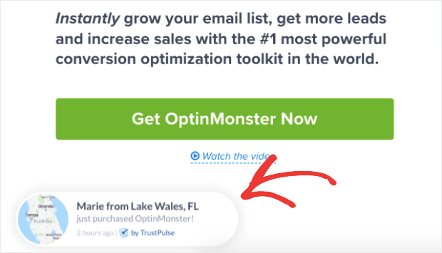
Social proof notifications are real-time updates of recent sign-ups or purchases from other buyers to encourage potential customers to convert. Here’s an example of a real-time social proof notification that we use on the OptinMonster website using TrustPulse.
TrustPulse is a standalone social proof notifications app that uses FOMO (Fear of Missing Out) to boost your conversions and sales.
Social proof notifications work wonders on pricing pages by encouraging uncertain buyers to go through a checkout process. Other times, showing real-time social proof on a website triggers FOMO in potential customers and convinces them to make a purchase.
6. Add Push Notifications
Web push notifications are one of the most effective automation tools to boost website engagement both on desktop and mobile devices. In terms of click-through rates (CTR), push notifications outperform emails because they evoke a heightened sense of urgency and personalization.
A push notification is a short, interactive message that pops up on a user’s mobile device or browser, and users can click on it for deeper engagement. They’re effective because they can be personalized and triggered to appear based on specific user behavior.
Wicked Weasel, an Australian swimwear and lingerie brand, uses push notifications to prevent cart abandonments and generate $2K–$4K revenue every week. After launching the push notification campaign, their sales from the abandoned cart campaigns started converting at 9.58%.
It became the biggest source of Wicked Weasel’s weekly revenue, helping them turn a crisis into a sales opportunity.
PushEngage is the best web push notification tool that helps you trigger notifications based on user behavior and send cart abandonment reminders in real-time. Over 10,000 businesses use PushEngage to send 15 billion+ targeted push engages each month.
Want to try push notifications on your website? Get started with PushEngage.
7. Offer Freebies
Let’s face it, people are more inclined to share their email address if they know they’ll get something in return.
Offering freebies to your website visitors is a great way to improve your lead generation and promote your paid products and services. When you offer your website visitors a free trial or a free ebook download, it’s an opportunity for them to get to know your business better. Then you can convert them into paying customers.
You can pique the interest of your visitors using OptinMonster’s 2-Step Optin functionality. When visitors click the link or button to check out your free offer, they’ll want to finish the process by subscribing.
Here’s a great example. The US Student Loan Center used OptinMonster to offer a free student loan forgiveness guide and saw a 10% increase in monthly sales. The popup shown below is one of the 2-step optin campaigns that they used to convert 34% of readers into subscribers.
See our list of content upgrade ideas and lead magnet ideas to get inspiration about what kind of freebies will work for your site visitors to increase website engagement.
8. Create a Quiz or Poll
The first step to growing your business is understanding the needs of your target audience. Creating a customer feedback popup or poll is incredibly easy. A quiz allows you to gain insights into what your customers are looking for and get feedback on how your business is doing.
People love quizzes and most don’t mind taking a couple of seconds to fill one out. Because it’s a favorite among many people, quizzes are a great addition to your marketing strategy.
Offering fun quizzes or polls can help decrease your bounce rate. And if you ask for users’ email addresses before you reveal the results, you get another bonus way of growing your email list.
9. Run Giveaways
Everyone loves to win an awesome prize! Running giveaway contests is the perfect way to get users to engage on your website.
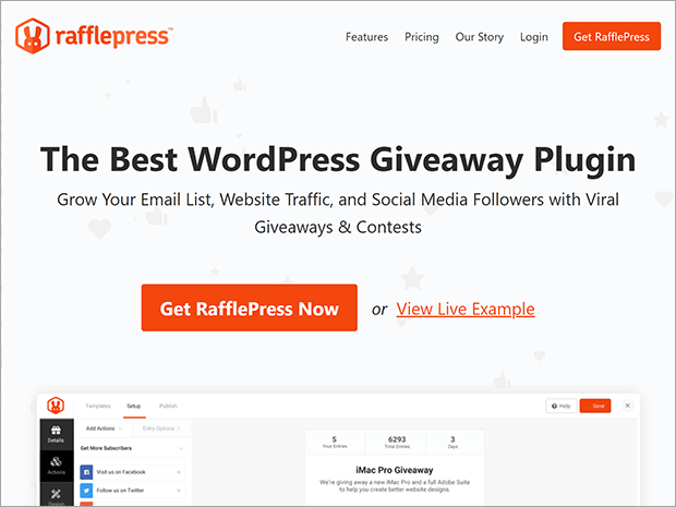
But the key to boosting engagement with a giveaway is using the right giveaway tool. That’s why we recommend RafflePress.
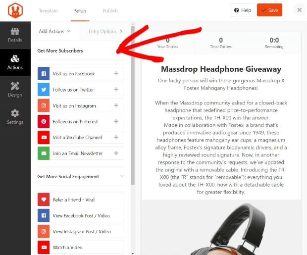
RafflePress is the best WordPress giveaway plugin on the market. Its drag-and-drop giveaway builder and viral giveaway templates make it easy to create exciting giveaways in no time. Plus, where RafflePress stands out is with its verified bonus actions.
These bonus actions let you reward users with extra contest entries for performing specific actions like leaving a comment, watching a video, or clicking on a call-to-action (CTA) button.
Users will be more than willing to take action on your website when they’re offered a better chance of winning a reward.
10. Add Live Chat to Your Website
Customer churn is a common challenge that troubles most eCommerce websites. And long wait time is one of the biggest contributing factors that negatively affects churn.
Research by HubSpot finds that 90% of buyers rate an immediate response from brands as an essential factor whenever they have a customer service query.
The sooner you respond to buyers, the more likely they are to engage with your brand. And the best way to respond to your customers immediately is to add a live chat widget on your website.
Live chat offers real-time assistance and can be automated for different scenarios. Adding a chat box to your website is an easy way for users to connect with your brand. They can have all their queries answered in real-time.
This helps them perceive your brand positively and buy from your brand. Besides bringing down your website’s response time to customers, live chat offers many other advantages:
- Live chat can increase conversions by up to 20%.
- 41% of customers prefer live chat over phone, email, and social media.
- The average satisfaction rating for live chat support across the retail sector is 86%.
- You can set up a chatbot to respond to customers 24/7, even during offline business hours.
The ability to engage with visitors on your website makes the chatbox an essential customer service tool. Make sure to include a name and photo so visitors feel like they’re talking to a real person and not a robot.
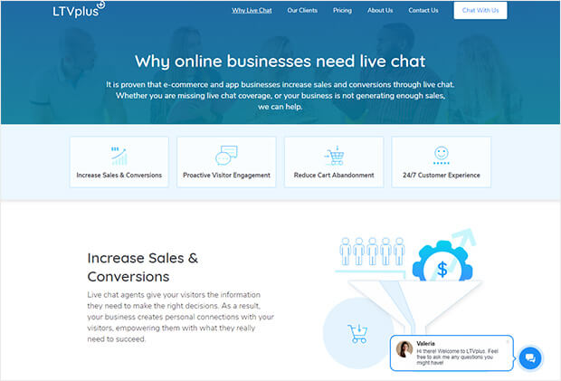
You can staff your live chat by using tools like HubSpot’s free live chat or LTVplus.
Top ToolsWant to add live chat to your site? Here are our picks for the best live chat plugins and software to use!
11. Collect Email Addresses
Blog traffic won’t help you if your readers leave and never return. That’s why it’s important to capture their email addresses so you can stay in touch.
Growing your email list is essential to building a community for your business. And email marketing is one of the best ways to increase your revenue potential.
Collecting email addresses will let you speak to them directly any time you have something to say. If you want to promote a product or announce a sale, an email list is the best way to do it.
But how do you get people on your email list? Targeted popups are the most effective way.
A lightbox popup grabs the attention of your visitors and fades your other content into the background, which is why it converts so well. It’s a stellar way to grow your email list at lightning speed.
You might be thinking that popups suck and you’d never use them on your site. Generic popups that interrupt you right when you land on a page are, indeed, annoying.
That’s why using exit intent popups is a better option. OptinMonster’s Exit-Intent® Technology detects user behavior and prompts them with a targeted campaign at the exact moment they are about to leave.
With the leads that you generate, you can create personalized marketing campaigns based on user behavior and segmentation.
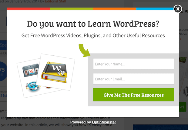
The example from Adam Enfroy mentioned above shows how well this works. Here’s another example from DateID. The online dating website increased subscriptions by 175% using popups like this one:
12. Suggest Related Resources
Showing users other relevant content on your site is another great way to keep them engaged. This is especially useful for blog websites and eCommerce stores that want to bring down their bounce rates or reduce cart abandonments.
Your suggestions will keep them on your site longer and increase pageviews. The longer a visitor stays on your site, the more likely they are to convert.
For blog websites, you can simply use internal linking to suggest related posts to help readers discover relevant topics on your website. And it doesn’t always have to be blog recommendations. You can recommend other types of content pieces like ebooks, podcasts, or videos for people to delve deeper into a topic.
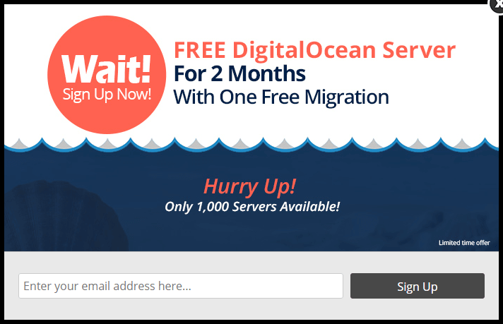
When you want to recommend relevant products or content to visitors based on their user behavior, triggering an OptinMonster popup with a scroll trigger is most effective. Cloudways used this technique to increase free trials by 120% and grow their email list by 229%.
13. Add a Social Media Feed
Another way to boost engagement on your site is by adding a social media feed.
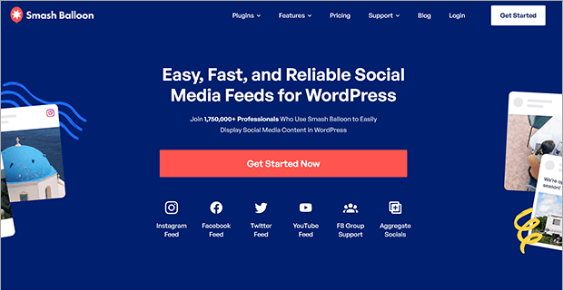
Using a plugin like Smash Balloon, you can easily embed an Instagram, Facebook, X (formerly Twitter), or YouTube feed anywhere on your WordPress site.
Smash Balloon is super simple to set up. Just install the plugin and connect your social media account, and in less than 30 seconds, you can display a beautiful social media feed on your site.
This lets you keep your site automatically updated with fresh new content for users. Plus, they can interact with your social media content right from your website, which keeps them around longer.
Smash Balloon feeds are responsive, SEO-friendly, and super customizable as well. You can decide which content you want to display, how your feed looks, and whether to show or hide comments.
14. Run Usability Testing
Usability testing is a way for design and development teams to survey users, collect their feedback, and implement their suggestions to improve the user experience.
The testing helps online brands identify gaps in the customer experience so that they can get rid of the friction points. You can run your own usability testing by launching online surveys among your website visitors, analyzing the findings, validating the data, and incorporating feedback.
Brands like Satchel have applied usability testing to identify their users’ frustration about locating pricing information on their websites. When they acted on the feedback, Satchel increased their demo requests by 34%.
Website engagement tools like Hotjar and MonsterInsights give marketing and product teams insights into user behavior on specific pages of your website.
A/B testing is another way to measure user feedback on your website. If you’re launching holiday campaigns this year to increase sales, you can test multiple popups across different sets of audiences to see which messaging or CTA performs better. OptinMonster makes it easy to run split tests on all your popup campaigns.
This lets you identify the campaigns that resonate with your audience and set it as a best practice to replicate their successes in future campaigns.
15. Analyze Data to See What Works
You can try all the ideas listed above. But how can you engage users on your website if you don’t know what’s working and what’s not? That’s why it’s important to use analytics tools to see if these tips are working for you.
With MonsterInsights and Google Analytics, you can track your conversion rate. You’ll be able to find out what campaigns are performing the best and do more of the same. You can also determine the weak areas of your website so you can make changes that will improve user engagement.
Transform Your Website Engagement Targeted Popups
And that’s it! Apply these ideas to your next marketing campaign to engage visitors on your website and convert them into paying customers.
For more ideas and inspiration, check out these ultimate guides:
- Ultimate Beginner’s Guide to Content Marketing
- Ultimate Guide to Growth Hacking for Exponential Success
- Ultimate eCommerce Optimization Guide: 13 Steps to Instantly Boost Revenue
Want to take your website engagement to the next level? Get started with OptinMonster today! Choose from 100+ ready-to-use campaigns, create visually appealing lead capture forms, and run A/B tests between different popups to identify the best campaigns.











Add a Comment