Are you looking for email popup examples to grow your email list?
Email popups are incredibly useful for generating new leads and increasing your email subscribers effectively.
Whether you’re just starting with email popups or looking for new and creative email sign up examples, you’ve come to the right place.
This blog has compiled the best email popup examples and practices you can use.
To help you navigate this in-depth post, feel free to click on the section that interests you most:
- What Is an Email Popup?
- 25 Best Email Popup Examples
- 15 Email Popup Best Practices
- Build Email Popups With OptinMonster
Let’s begin with first explaining what we mean by the “email popup.”
What Is an Email Popup?
An email popup is a type of website feature that displays a small window or dialog box to visitors, usually to capture their email addresses.
These popups can appear during a visitor’s interaction with a website, such as upon entry, after spending a certain amount of time on the site, or when the visitor is about to leave the page (known as exit-intent popups).
The primary purposes of email popups include:
- Email List Building: They are a popular tool for growing a website’s email subscriber list. By encouraging visitors to subscribe, site owners can build a database of potential customers or interested readers.
- Marketing and Promotions: Email popups often offer incentives like discounts, free ebooks, or access to exclusive content in exchange for the visitor’s email address. This can be an effective way to boost marketing efforts.
- User Engagement: They can promote specific content, events, or announcements to engage visitors and encourage them to interact more with the site.
- Feedback Collection: Some popups are designed to gather feedback from visitors, helping website owners improve their site or understand their audience better.
- Customization and Targeting: Modern email popups can be highly customized in terms of design, content, and timing. They can also be targeted to specific segments of a website’s audience based on their behavior or other criteria.
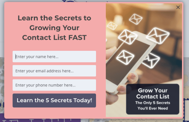
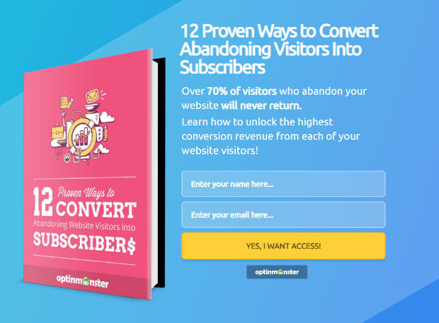
Here’s an email popup example that we made in just a few minutes with OptinMonster:
Over time, people have called email popups with many different names, such as “newsletter popups” and “email subscription popups.” They all mean the same thing.
Email popups are the most popular and effective way for successful email capture campaigns and lead generation.
Now that you know what an email popup is, here are 25 best email popup examples.
25 Best Email Popup Examples
1. Crossrope
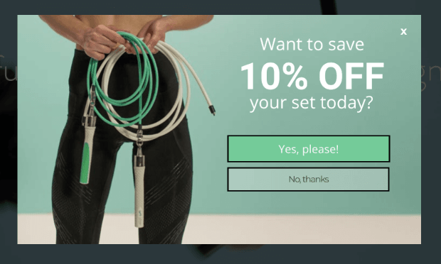
Crossrope is a fitness company that used this simple (but effective) email popup:
Doing so helped Crossrope EXPLODE their list by over 900%.
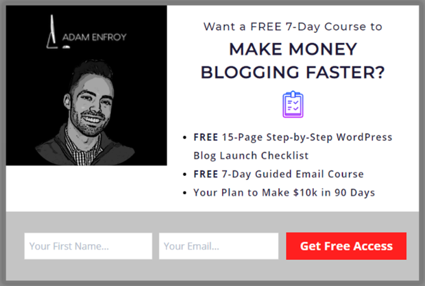
2. Adam Enfroy
Adam Enfroy is an entrepreneur and professional blogger. In 2019, he used OptinMonster to add over 11,000 newsletter subscribers to his list in just 1 year!
With the newsletter popup example above and others like it, he’s now grown his list to over 500,000 newsletter readers.
And in 2020, he made $812,718 from his online blog and mailing list.
3. Fastrack
Fastrack is a digital marketing agency that wanted to generate more leads. They did so with this simple email popup:
This email sign up popup not only grew their list but also recovered 53% of their abandoning visitors.
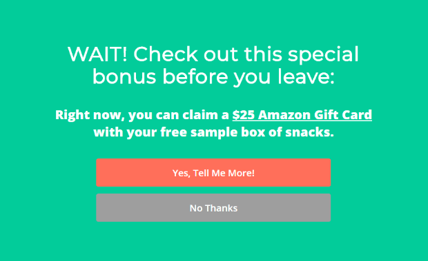
4. Snack Nation
Snack Nation is a subscription service that delivers healthy snacks to your home or office. Here’s the discount popup they used to add 1,200 subscribers to their list every week:
It uses a 2-step optin which poses a simple Yes/No question to the audience. When readers click Yes, they’ll likely finish the signup process.
It’s a great way to use popups that free gifts to persuade shoppers to finish checking out.
This email popup example also recovers over 30% of their abandoning visitors and converts 15-20 leads into paying customers daily.
5. Shotkit
Shotkit is a website for professional and amateur photographers wanting to get the highest-quality gear. Here’s one of the email popup examples they used to get more leads:
The result? Shotkit now adds over 40 new leads to their list every single day.
6. Human Food Bar
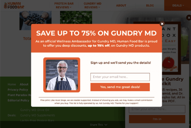
Human Food Bar is a niche website that focuses on nutrition and energy bars. Here’s the lightbox popup they recently used:
This campaign saw incredible results. Now Human Food Bar adds over 1800+ new emails to their list every month. Plus, they saw average sales shoot to $17,000 and a 35% increase in retention rate.
7. DateID
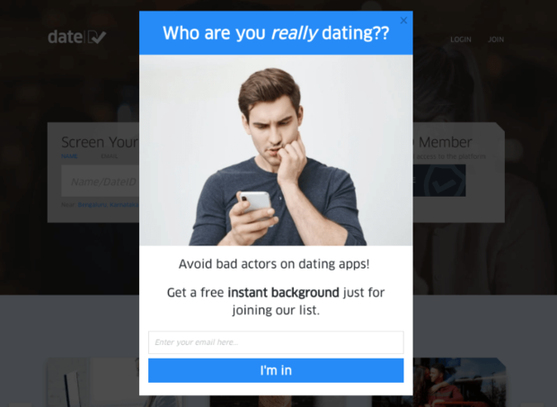
DateID helps online daters verify their new connection before meeting in person. This adds a layer of protection to online dating and is an incredibly valuable service to that niche.
With this email popup example, DateID saw their email list grow by 175%. They also saw over 75% increases in sales and conversions.
8. Woodside Communities
Woodside Communities has three real estate developments. And the developer of these properties also owns many other small businesses, like a private club, a construction company, a design company, and more.
Needless to say, the developer knows a thing or two about business. But digital marketing can be a totally separate beast.
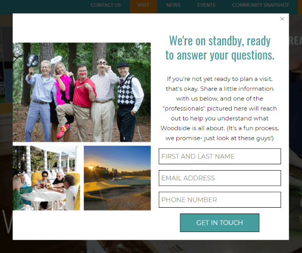
Luckily, OptinMonster helped them put together email popups like this one:
That email signup popup above led to a sale of $294,435 in just two months. It also increased leads by 476%.
9. Medstar
Medstar is a digital marketing agency specializing in private spas and providers of aesthetic medicine.
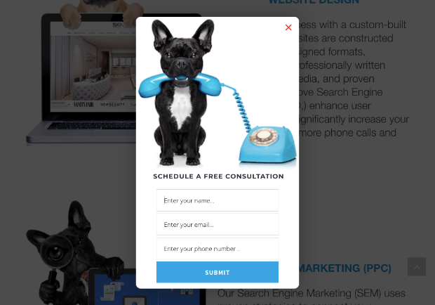
They started using lightbox popups on their site to book more free consultations.
As a result, Medstar saw a 500%+ increase in client conversions and generated millions of dollars with the leads they attracted.
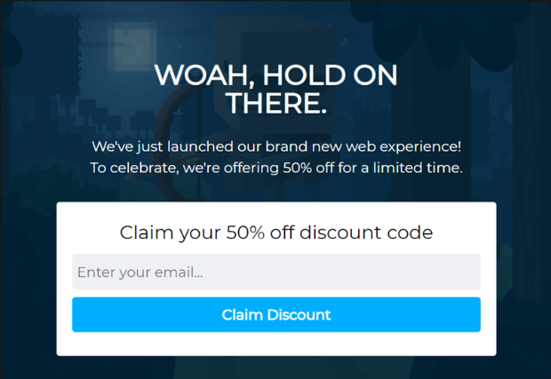
10. Shockbyte
Shockbyte is a game server provider. They provide hosting services for games like Minecraft, ARK, Survival Evolved, and more.
Popups like the example above led to an increase in revenue by 52% (all of which can be tracked back to OptinMonster campaigns) and a 10x growth of their business.
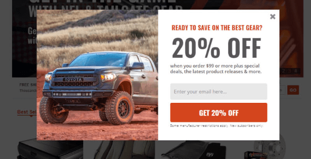
11. AutoAnything
AutoAnything is an auto parts store that sells the bulk of its products online. They used email popups to grow their email list. That way, they could run more promotions and generate more sales.
They used popups that looked something like this:
These email subscription popup campaigns led to AutoAnything seeing a 2.5x increase in daily email options. They were also able to account for over 20% growth in revenue from email marketing.
12. Cosmetic Packaging Now
Cosmetic Packaging Now is an incredible niche site: they create and distribute laboratory-grade cosmetic packaging containers.
By deploying email popup examples like above, Cosmetic Packaging Now increased its subscribers by 758% and saw sitewide revenue explode by 2,326.72%.
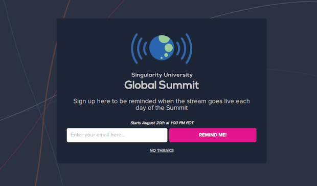
13. Singularity University
Singularity University trains global leaders and corporations on how to thrive and lead to the most change.
This one email subscription popup brought in 967 new leads. And since it was made with OptinMonster, this kind of newsletter popup can be built in under 5 minutes.
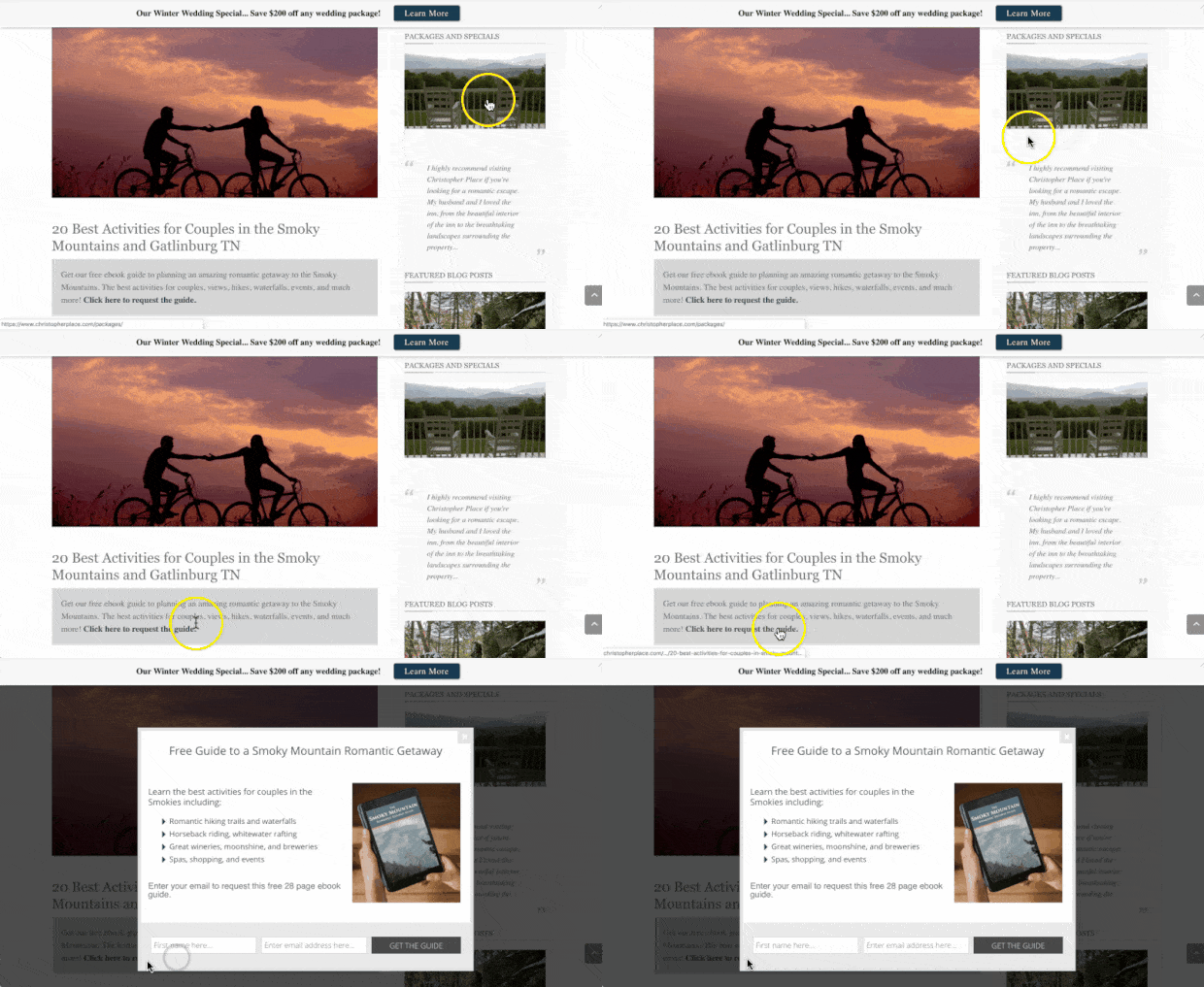
14. Christopher Place
Christopher Place is an upscale B&B/wedding venue that overlooks the Smoky Mountains.
They used MonsterLink™ to show their email popup. This triggers the popup to appear when a user clicks a link or button, like so:
This MonsterLink™ campaign led to a 60% conversion rate (and 6% conversions for more targeted leads into customers).
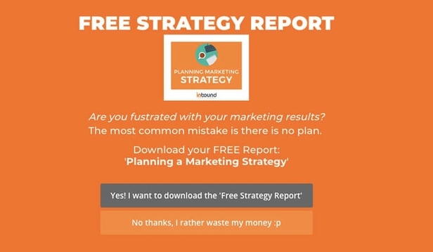
15. Inbound Marketing
This Australian-based marketing agency helps its clients boost traffic, leads, and sales. They do this through a combination of SEO, PPC, email marketing, and social media strategies:
This fullscreen campaign increased conversion by 189% and recovered 3.59% of abandoning visitors.
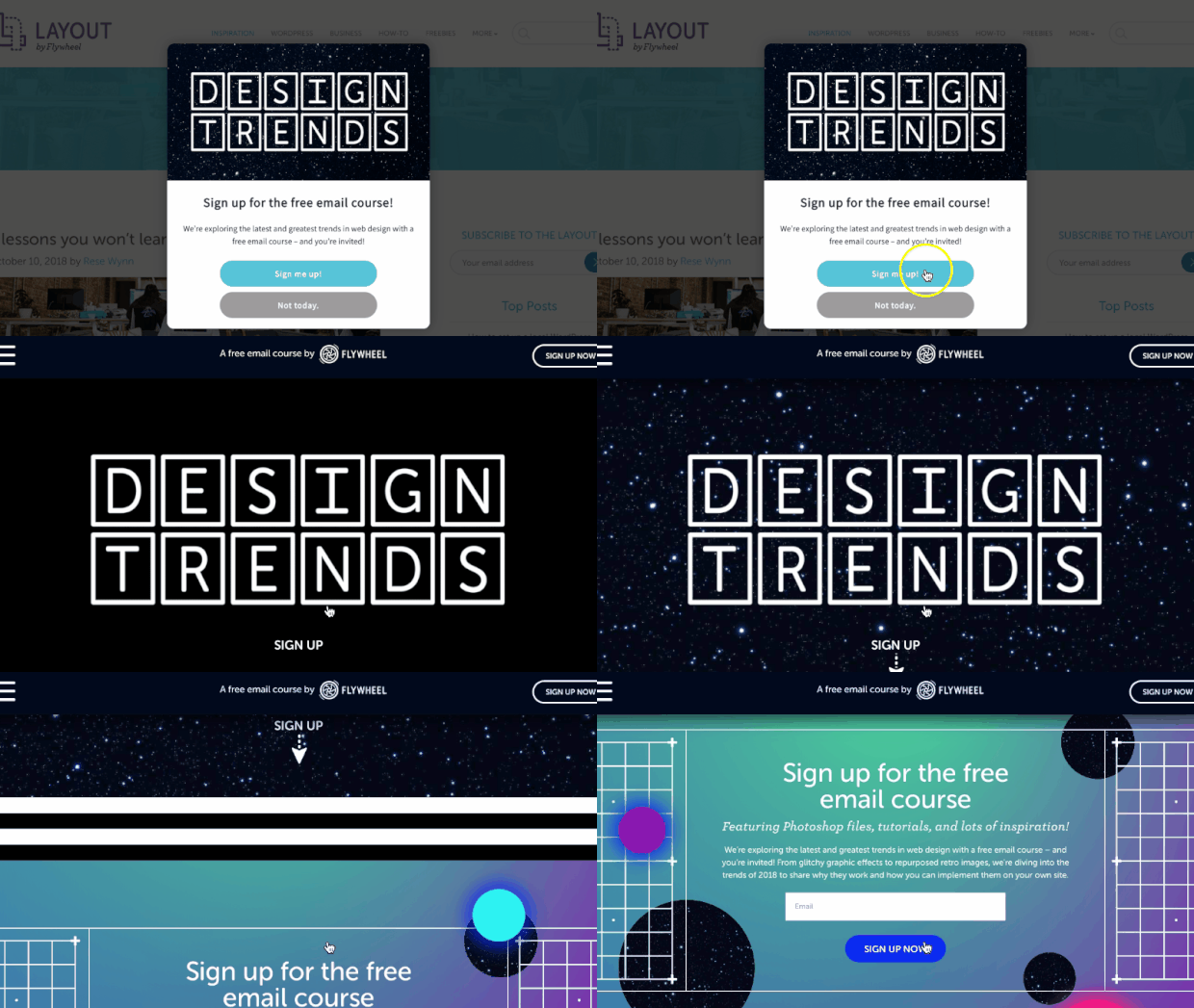
16. Flywheel
Flywheel is a managed WordPress hosting company. They use OptinMonster on their blog to increase conversions and boost engagement with their audience.
From campaigns like the email popup example above, Flywheel saw 660% MORE impressions than they were getting and converted 4.7% of their targeted users.
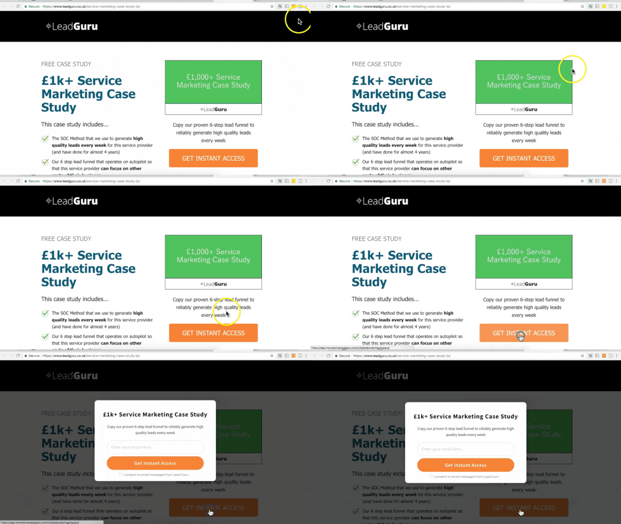
17. Lead Guru
Lead Guru is an online digital agency that helps companies generate new leads and increase sales.
The MonsterLink™ campaign used to make this email popup example had an 81.8% conversion rate.
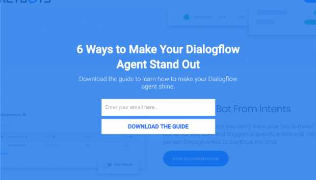
18. RocketBots
RocketBots is an AI platform that allows companies to increase conversions and sales through live chat. This software allows users to manage, respond to, and automate their business’s live chat.
With OptinMonster’s email popups powered by OnSite Retargeting®, they were able to recover 7.33% of their site’s abandoning visitors and convert 2.65% of their website visitors.
That led to an overall list growth of 680%.
19. Cosmetic Capital
Cosmetic Capital used a variety of email popups to get more leads for their business. They specialize in selling trendy (but affordable) cosmetics around the world.
With this floating bar email popup example, they could boost leads by 300% for a total of 18,000+ new subscribers.
20. Top 6 Digital
Top 6 Digital is an agency that focuses on getting high-converting leads for online advertisers.
They used this email subscription popup to improve revenue by 30%, redirect 62% of abandoning visitors, and convert 17.32% of targeted subscribers.
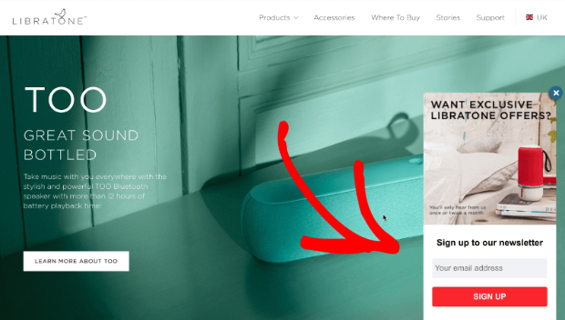
21. Libratone
Libratone created one of the first wireless speakers. They take pride in these speaker’s sound quality while maintaining a minimalist design.
Using this slide-in scroll box email popup, they were able to grow their list by 400% and recover 3.8% of their abandoning visitors.
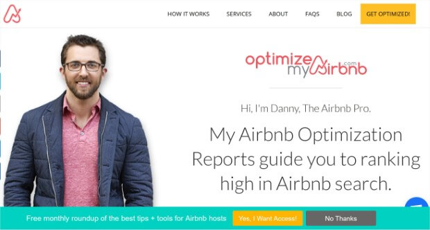
22. OptimizeMyAirbnb
This company is run by Danny Rusteen, a consultant who helps people understand how to make their Airbnb listings stand out.
With this email popup example, they added 1500 new subscribers for a total list growth of 600%.
23. Cole’s Classroom
Cole’s Classroom is a website dedicated to helping and supporting new photographers. It gives tips, tricks, and gear suggestions to help amateur photographers improve their game.
With campaigns like the one above (and other similar email popups), they converted 6.9% of their visitors for a total of $55,949 in increased sales.
24. Guido’s
Guido’s is a Spanish and Italian restaurant in Saint Louis, MO. They used the marketing agency Insite Advice to work on their marketing strategy. When they began using OptinMonster, they made an email popup like this:
With the help of OptinMonster’s email popup examples, they converted 16.74% of their site’s visitors and added 1,000+ emails to their list in under four months.
25. Urban Southern
Urban Southern makes high-quality leather bags for women from all walks of life.
Using email popup examples like the one you see above, Urban Southern increased their sales by 400%. It’s hard to argue with that kind of success!
Now that you’ve gone through our list of the best email popup examples, let’s have a look at some of the email popup best practices with which you can achieve the same results as our OptinMonster clients.
15 Email Popup Best Practices
We’ve identified 15 email popup best practices that will get you on your way to a thriving email list filled with high-quality leads:
- Create a clear call to action
- Personalize your popups
- Offer an irresistible incentive
- Use an eye-catching design
- Create targeted campaigns for desktop and mobile
- Use Exit-Intent® to capture visitors before they leave
- Show a popup or inline campaign at the end of your post
- Keep your request noticeable with a floating bar
- Build a dedicated landing page
- Create a friendly slide-in request
- Use a fullscreen welcome gate
- Ask for visitor feedback
- Add a sidebar
- Use progressive profiling to make forms easier for users
- Create a plan for new subscribers
Let’s take a closer look at each of these best practices.
1. Create a Clear Call to Action for Your Email Popup
Don’t muddy the waters. An email popup should contain a single, clear call to action (CTA).
Remember that the visitor on your site is reading or browsing, and the popup will interrupt that activity. You want to get in, get the email address, and get out as quickly as possible.
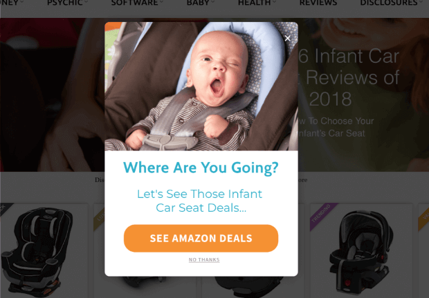
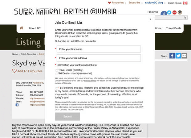
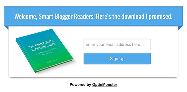
Which pop-up message example do you think will get the response you’re looking for?
This?
Or this?
Definitely not trying to popup shame here, but the popup from exploreBC is way too much. It seems like they want us to sign up for their email marketing, but there may technically be 2 or 3 newsletter popups.
And what’s with the fine print?
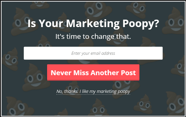
In the first popup, there’s no question about what they want you to do: sign up to get notification of new posts.
Keep your email popup design simple with clear copywriting and a prominent CTA button.
2. Personalize Your Email Popups
Personalization makes a popup feel more friendly and less of an intrusion. Since we’re trying to build our email list, we won’t have personal information for our target visitors.
How do we personalize them, then?
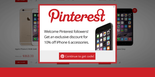
One really cool way is to personalize the popup based on the referral source. By using referrer detection technology, you can detect when a visitor is coming from a specific domain and use that information to customize your popups.
There are several ways to use this type of personalization. For instance, if you’ve written a guest post or been featured somewhere recently, you can create an email popup specifically for that audience.
Get a lot of Pinterest traffic? Create a newsletter popup targeting just those visitors!
Personalization makes visitors feel like the popups are offering something exclusive, just for them.
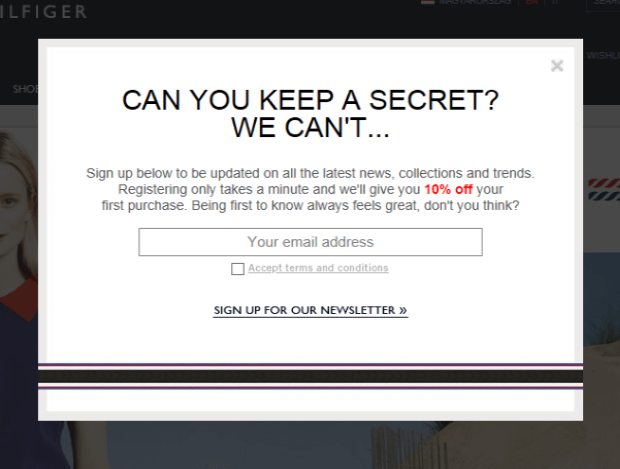
3. Offer an Irresistible Incentive
People love incentives. This makes incentives and special offers like coupon codes, giveaways, and free shipping really good at helping you build your email list.
This doesn’t mean you just offer a discount to every visitor all day. Incentives can be anything of value; they don’t have to mean dollars.
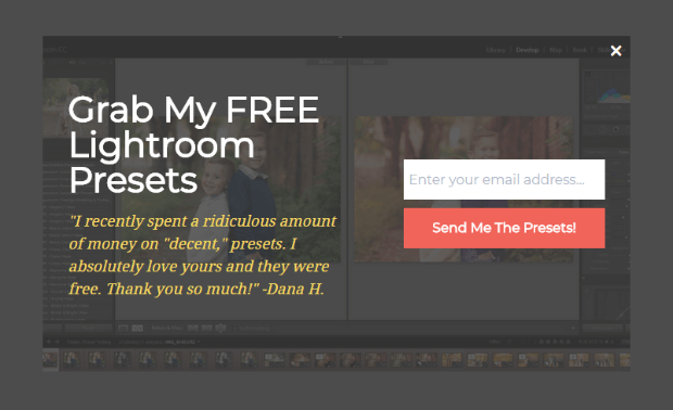
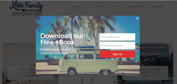
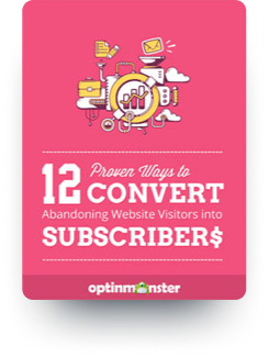
If you have a killer lead magnet, offer it up! Check out the email pop up example below:
Not sure what to offer? Here are 9 lead magnet ideas you can use to increase your site’s subscribers.
4. Use an Eye-Catching Design for Your Email Popup
The email popup has the tough job of meeting two seemingly conflicting ideas simultaneously: it should blend into your site’s existing design and stand out enough to draw your visitor’s attention.
Lightbox popups work really well because you can create a design that stays on brand. When the popup appears, the rest of the site fades into the background, leaving the popup as the point of focus.
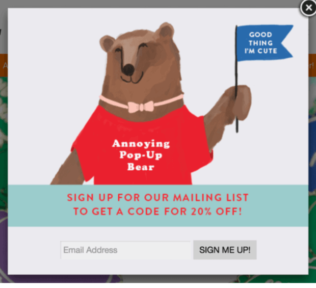
The “Annoying Pop-Up Bear” below aligns perfectly with the whimsy and fun of the host website. It’s eye-catching and fun but stays on brand.
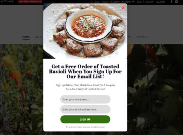
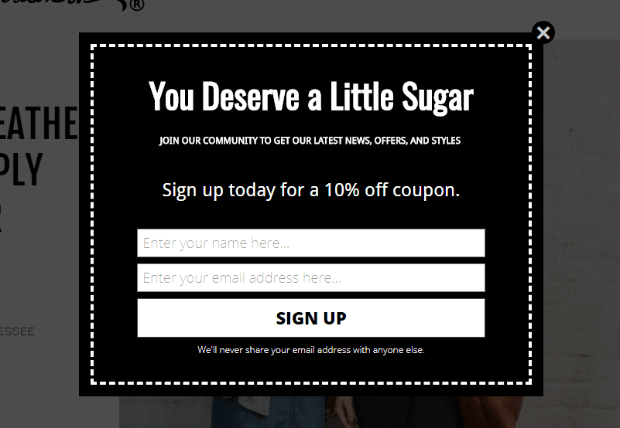
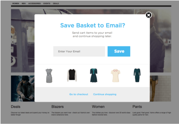
Here’s another email popup example. The popup isn’t as adorable as the bear, but it does a wonderful job of staying on brand and creating interest.
5. Create Targeted Email Popup Campaigns for Desktop and Mobile
A few key differences between desktop and mobile user experiences can make email popups behave differently. Mobile users are limited to touch controls, bandwidth, and certainSEO rules.
We recommend creating platform-specific campaigns to ensure that your visitors are able to fully engage with your site and popups.
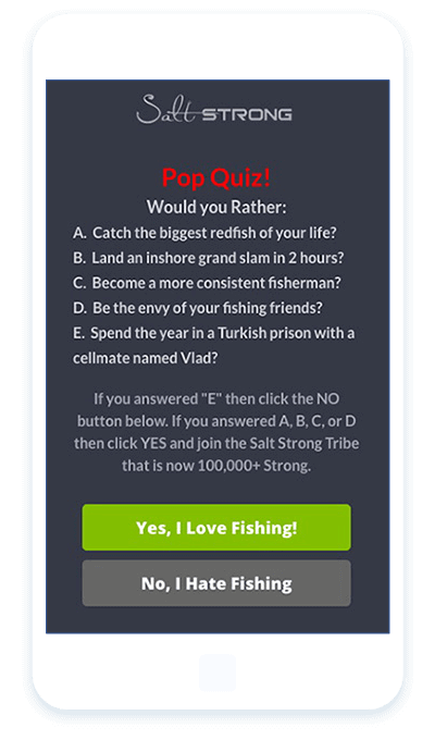
Salt Strong was able to get a 185% increase in conversions by creating an email popup designed for mobile platforms.
Check out our mobile popup gallery for some design inspiration.
6. Use Exit-Intent® to Capture Abandoning Visitors Before They Leave
Did you know that 95% of visitors who abandon your site will never come back again?
You can convert an additional 2-4% of visitors into email subscribers and customers by using an email popup triggered on exit-intent.
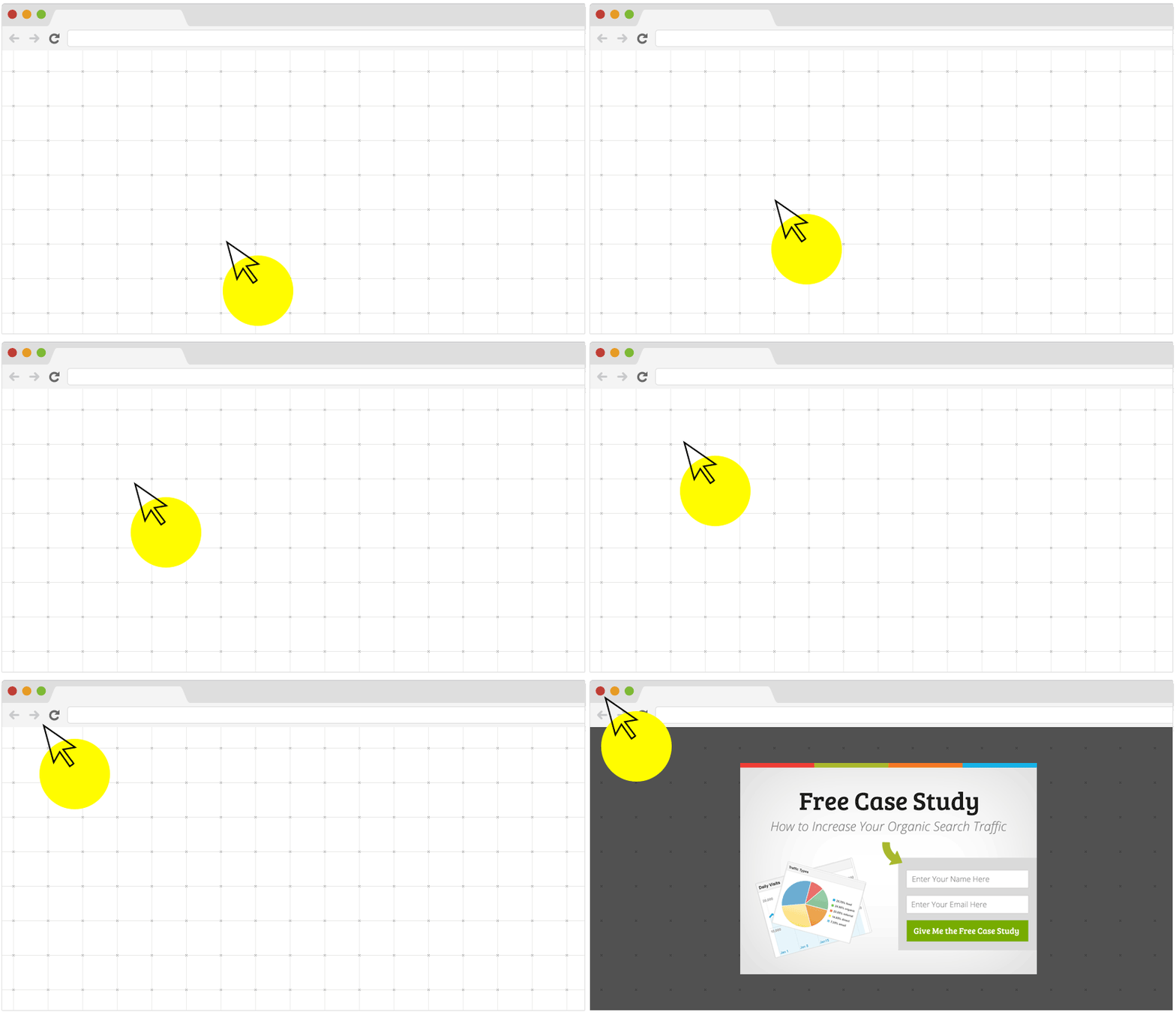
OptinMonster’s Exit-Intent® technology allows you to track your visitor’s mouse movement. When they gesture quickly to the top of the page, your popup appears, giving visitors one more chance to opt in before they leave your website.
Here’s what it looks like in action.
Exit-intent doesn’t take your visitor prisoner; they can still close the popup and leave without sharing any information. It just lets you have one more interaction with the visitor before they go.
For more about exit-intent lightbox popups, check out these exit popup hacks.
7. Show a Popup or Inline Campaign at the End of Your Post
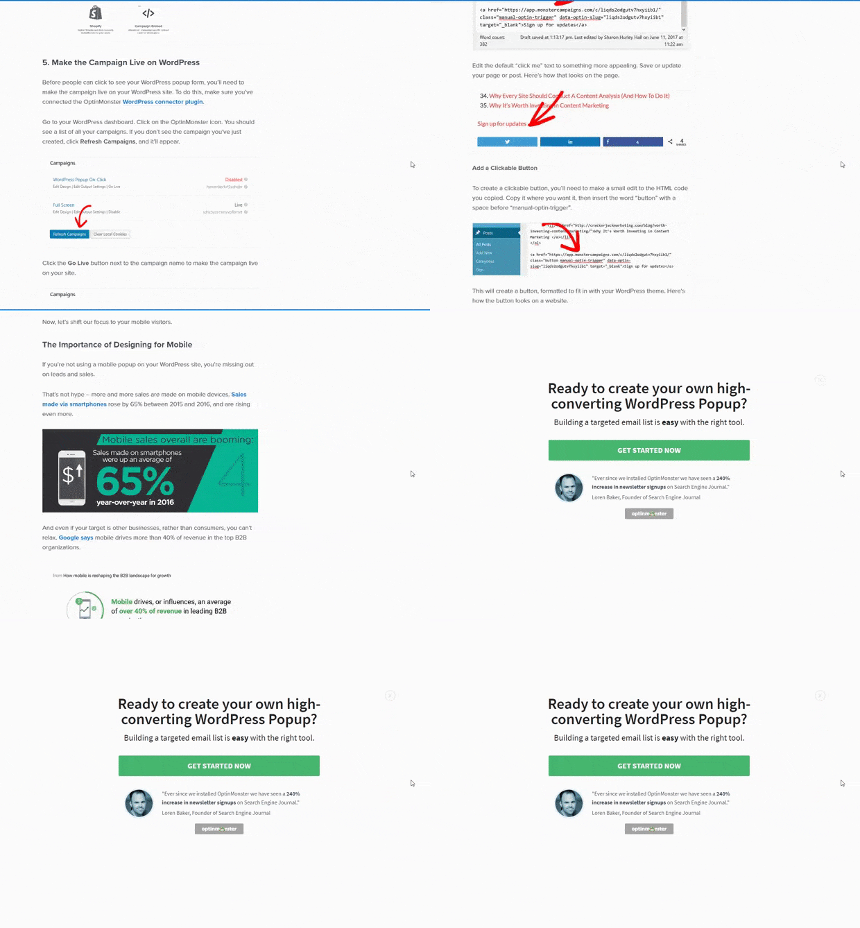
Visitors who get all the way to the end of your post are interested. That makes the end of your article the perfect time to ask them to join your mailing list.
Add a popup that triggers once they reach the end of your content (or about 80% of the way down the page) and ask for a commitment right away.
Learn more about OptinMonster’s killer display rules engine!
8. Keep Your Request Noticeable With a Floating Bar
Floating bars are a great way to make sure your call to action stays in clear view at all times without getting in the way of your visitor’s enjoyment.
You can place the floating bar at either the top or bottom of the page, and it stays there as your visitor scrolls.
Floating bars are also known as hello bars. Here are 13 creative hello bar examples you can take inspiration from, and here are 6 simple floating bar hacks to improve conversions.
9. Build a Dedicated Landing Page
Fullscreen email popups give you a ton of flexibility and space to show off a brilliant design to really wow your visitors. A truly amazing way you can do that is by turning a fullscreen email popup into a landing page.
A landing page focuses on a single, very specific call to action. It’s an excellent lead generation tool because visitors aren’t distracted by everything that’s on a typical home page; they’re just encouraged to provide their info in exchange for your offer.
You can create a landing page in less than 5 minutes with OptinMonster.
10. Create a Friendly Slide-in Request
Slide-in campaigns are a gentle way to collect visitor information without interrupting the user experience.
These email popups don’t appear until your visitor has already viewed some of your content; even then, they simply slide in from the side of the page.
This makes them eye-catching but unobtrusive.
OptinMonster has several professionally-designed themes you can use for your slide-in campaigns. Create a new optin and select the Slide-in type.
To set your slide-in to show up only after your visitor has scrolled a certain distance down the page, go to Display Rules » If… distance scrolled and enter a percentage or the number of pixels.
Easy, isn’t it? Here are 10 ways to use scroll-based triggers with your slide-in campaigns to boost your conversions. And you’ll definitely want to check out these high-converting ways to use slide-in optins.
11. Use a fullscreen welcome gate
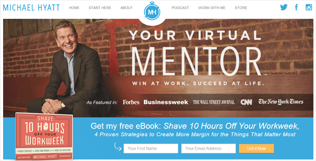
Create a welcome gate on your home page with a feature box.
A feature box is an optin form that is placed at the top of your website, usually just below the header navigation and above your blog posts. This is a highly effective optin form that you can use to collect email subscriptions above the fold on your site.
Add a feature box to your own site with our step-by-step tutorial.
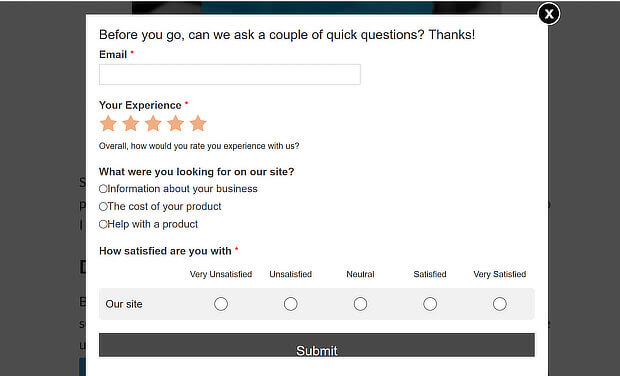
12. Ask for Visitor Feedback
A popup survey can help your business in so many ways:
- Discover how your visitors are interacting with your site
- Figure out potential problems that are getting in the way of conversions, leads, and sales
- Get real-time feedback from visitors and customers
- Reduce site or cart abandonment and increase conversions by interacting with visitors before they leave your site
- Segment your visitors for future digital marketing
- Grow your email list
With OptinMonster and WPForms, you can create a popup survey like this:
Using the field mapping feature, you can easily add custom fields like:
- Text Areas
- Radio buttons
- Checkboxes
- Dropdowns
- And more!
Read How to Use Field Mapping to Add Extra Fields to Your Campaign Form.
13. Add a Sidebar
Always include an email sign up form at the very top of your website or blog’s sidebar. This is the most popular place for an email sign up form, so visitors will be looking for one there.
This is easy to do with an inline campaign from OptinMonster:
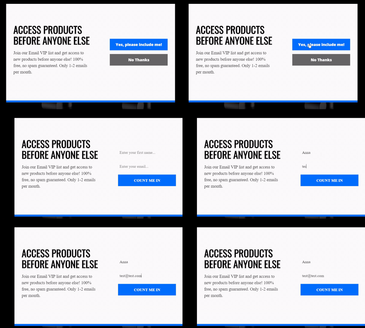
14. Use Progressive Profiling to Make Forms Easier for Users
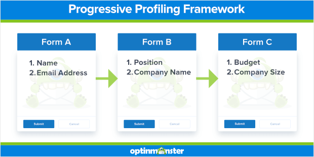
Progressive profiling collects information on your leads in smaller pieces, using fewer input fields instead of asking for everything all at once.
When using progressive profiling, ask for a name and email address on the first signup, then request more information about the lead throughout their customer journey.
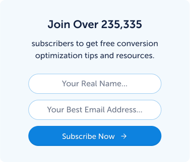
Here’s an example of the progressive profiling framework:
15. Create a Plan for New Subscribers
It’s important to have a plan for your new email leads. This involves:
- Sending a Welcome Email Series.Welcome emails get 86% higher open rates than other emails. We recommend sending a welcome email series of 5-7 emails to introduce new subscribers to your brand. Check out OptinMonster University’s execution plan, How to Create a Welcome Email Series That Sells, to build the perfect welcome email series for your brand (free to OptinMonster customers).
- Onboarding new customers or users. Onboarding actively guides users and customers to find new and ongoing value in your product and service. Learn onboarding best practices to boost customer success.
- Segmenting your email list. Personalized emails deliver 6X higher transaction rates. You can get that type of personalization only by segmenting your email list. Here are 50 smart ways to segment your list.
Once your plan is in place, you’ll be able to grow your list faster and more effectively.
Now let’s look at some different types of popups from real OptinMonster clients.
That way, you can get more inspiration for your own business.
Building an Email Popup With OptinMonster
Some email marketing services, such as Mailchimp, come with a built-in popup feature. But those built-in popups are usually not as feature-rich, targeted, and effective.
And this is why you need a specialized email popup form generator like OptinMonster.
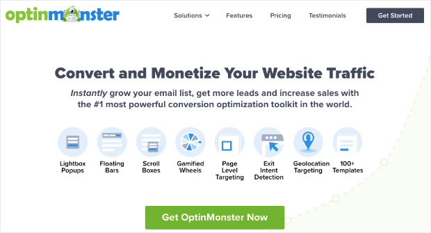
OptinMonster is the best lead generation software on the market and the tool you need for faster growth.
It allows you to build “optin campaigns,” like popups, floating bars, fullscreen welcome mats, and more.
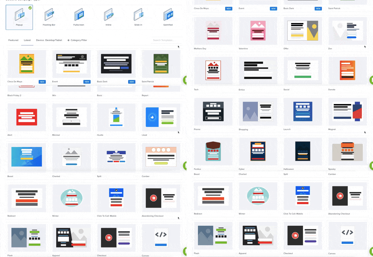
OptinMonster makes everything about creating email popups campaigns easy. That’s because it comes with 50+ pre-made templates that you can use to create your campaigns:
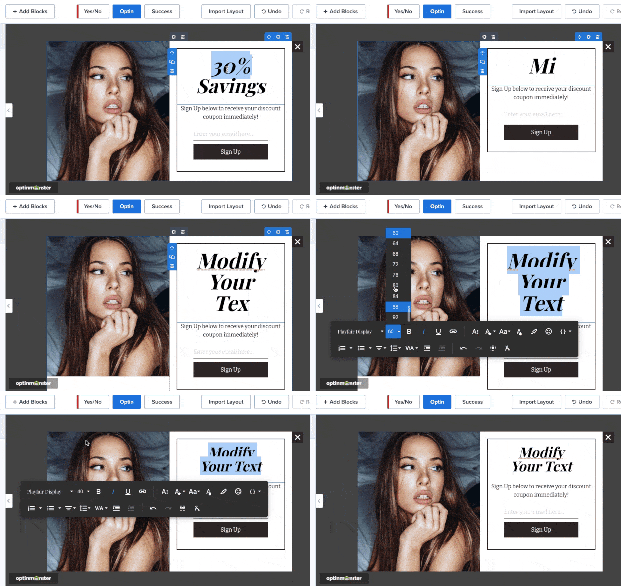
From there, you can quickly make changes to your template with OptinMonster’s inline text editor or drag-and-drop builder.
If you want to change any aspect of your text, for example, you can do so directly in the campaign editor:
This feature gives you 100% control over your brand’s messaging and email popup design. You can easily add colors, fonts, alignment, and other design factors.
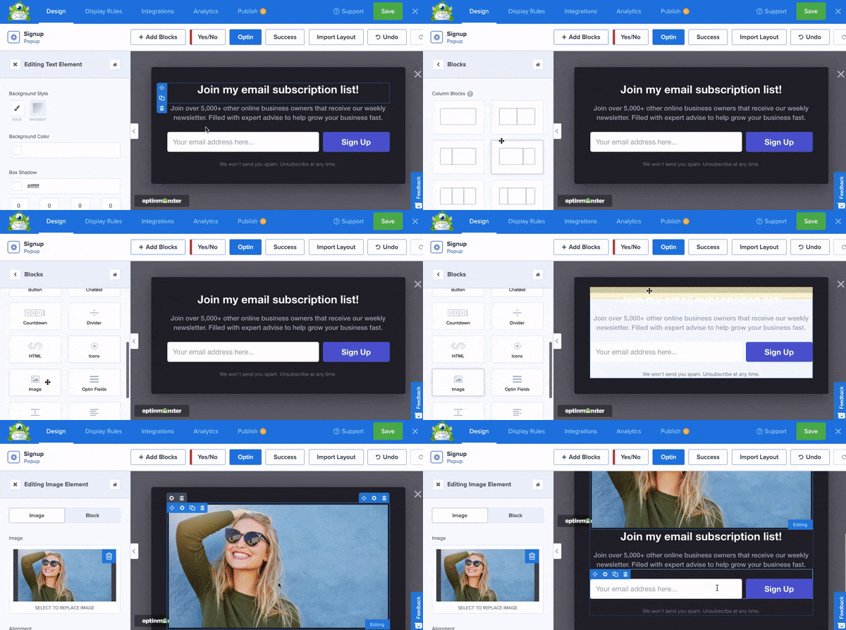
Want to add a new feature to your campaign, but you’re not a coder? No problem at all.
You can select one of the many features offered by OptinMonster and drop them into place:
This requires no coding skills. And since all our campaigns are built with “blocks,” everything falls into place as it should.
That means you don’t have to be a professional designer to make stunning and high-converting email popup designs in minutes.
Finally, OptinMonster gives you plenty of targeting rules. This helps you show these campaigns to the right people, in the right places, and at the right time in their customer journey.
Some popular targeting rules include
- Exit-Intent® Technology: Display campaigns to users as they leave your website.
- OnSite Follow Ups®: Show fresh campaigns to returning visitors based on how they interacted with your campaigns in the past.
- Geolocation: Personalize your offers by targeting users based on their physical location.
Though many others exist, these are just a few of OptinMonster’s targeting rules and triggers.
To build newsletter popups that grow your list, you should sign up for OptinMonster.
It’s risk-free with our 14-day money-back guarantee. Ready to get started? Just click below:








Add a Comment