Does your homepage have an unusually high bounce rate? Do new visitors typically leave your site without taking an action? In this case study, we’ll learn how ClickBank used OptinMonster to recover 32.67% of abandoning visitors, increasing sales of ClickBank University over 100%.
Meet ClickBank
As one of the largest online retailers, ClickBank harnesses the awesome power of their digital marketing partners combined with a vast library of over 6 million unique products to reach 200 million customers around the world. Justin Atlan from ClickBank University talked with us about how they’re using OptinMonster to explode sales of ClickBank University.
Their goals were to redirect abandoning traffic on their most heavily trafficked pages to their sales pages. Most people leave the site because they aren’t clear about the first steps to take when getting started using ClickBank. To combat this, ClickBank created ClickBank University to help their clients learn the platform and how to succeed with it.
How ClickBank Uses OptinMonster
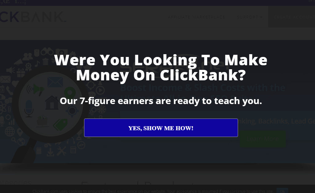
ClickBank uses OptinMonster’s exit-intent technology to redirect new visitors to ClickBank University.
Optins using exit-intent only display when the visitor’s mouse motions towards the browser bar, a sure sign they’re about to leave the site. Abandoning visitors can often be returned to the site with an enticing offer that speaks to the reasons they were leaving in the first place.
ClickBank wasn’t the first OptinMonster customer to increase sales using an exit-intent optin. Wild Water Adventures increased sales $61,000 using an exit-intent optin that simply asked, “Would you like help planning your trip…”
ClickBank’s offer is similar. It acknowledges that the new visitor might be a little confused about exactly how to get started, and offers them help.
They also used our Yes/No feature to drive clicks. Our Yes/No feature replaces the traditional optin form with one or two buttons. Each button can either close the optin, launch an optin form, or redirect to another URL. ClickBank uses a single button to redirect visitors to the University sales page.
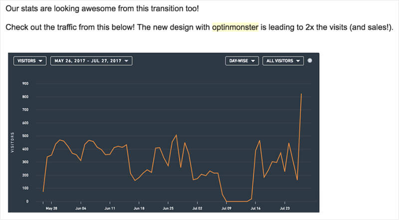
The optin converts a whopping 32.67% of new visitors. Here’s what Justin shared with his team shortly after the optin launched:
ClickBank increased clickthroughs to ClickBank University from 15% to 27%, essentially doubling traffic to the University. Using OptinMonster has added several thousand extra visitors per week to the University sales pages.
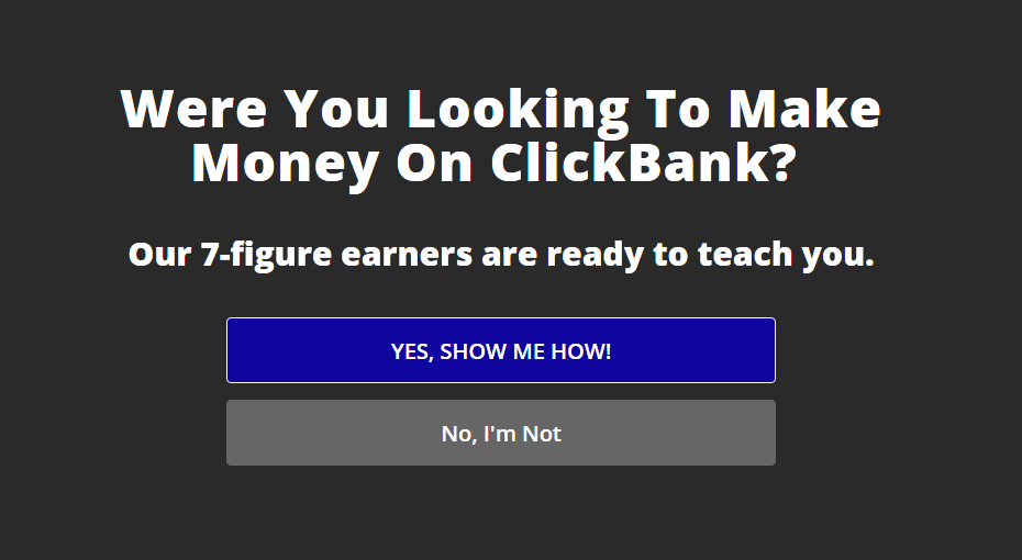
They didn’t have the same results to start with, though. At first, they created an optin using both the Yes and No buttons. The Yes button redirected to the sales page, and the No button closed the optin.
This version of the optin converted only 21.06% of new visitors. It wasn’t until ClickBank decided to split-test it against the single-button version above that they arrived at 32.67% conversions.
Justin had this piece of advice for other OptinMonster customers,
Test! Test! Test! OptinMonster gives you incredible tools, designs, and styles to implement. Make sure to tweak and test and you can find huge improvements!
Results
ClickBank University used OptinMonster to turn confused, abandoning visitors into action-taking buyers.
- ClickBank University converted 32.67% of abandoning visitors.
- ClickBank University increased conversions 11.61% by split-testing optins.
- ClickBank University increased sales 100% as a result.
Summary
Consider the reasons a visitor might leave your site without taking action. Then, tackle that problem head-on using an exit-intent optin. Be sure to split-test your optins. You might be surprised by the results!
Simply put, OptinMonster is my absolute favorite tool for digital marketers. Exit intent is genius and OptinMonster has helped us double our clickthrough rates when we switched from their competitors (who were 5-10x more expensive!).
Justin Atlan, Co-Founder, ClickBank University


