Are you trying to increase your mobile conversion rates but not sure the best strategies for doing so?
As consumers increasingly use their smartphones to access their favorite stores and content, most website owners have made an effort to make their site mobile-friendly.
But that’s only half the equation. The other half is making sure that your lead generation strategy is mobile-friendly, too.
That way, you aren’t leaving any conversions on the table by creating a poor mobile user experience (UX) on your site.
To help you out, we’re going to cover 11 concrete strategies for increasing your mobile conversions. Before we do, though, let’s get clear on what mobile conversion rate optimization is and why it matters.
What is Mobile Conversion Rate Optimization?
Mobile conversion rate optimization is the process of improving your lead generation strategy for mobile to increase the number of people who convert from their mobile devices.
These conversions can include:
- Signing up for a newsletter
- Attending a webinar
- Making a purchase
Or any other call to action (CTA) that you put in your mobile optin campaigns.
The goal is to ensure that you’re not neglecting your mobile audience as you craft a lead generation strategy. Your optin forms should look good across various smartphone sizes, your load times need to be lighting fast, and users should be able to navigate your forms on mobile with as much ease as they do on a desktop.
In this guide, we’re going to teach you 11 strategies for increasing your mobile optimization rates. But to help you even more, we’ve broken this post down into 2 categories:
Ready to dive in? Let’s get started.
How to Increase Mobile Conversions
Like any task at hand, using the right tool will usually be the factor in making or breaking your success. That’s why, before we dive into our 11 tips, we want to make sure you have the right mobile optimization tool to get started.
That’s where OptinMonster comes in:
OptinMonster is the world’s #1 lead generation software. It’s also your best bet for designing mobile campaigns that convert.
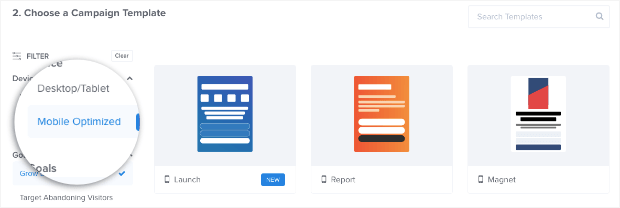
That’s because OptinMonster allows you to select mobile-optimized campaign designs during the creation stage:
We also offer more targeting rules and triggers to engage your mobile audience and make sure you’re not leaving any conversions on the table.
Want to see for yourself? Click below to start your risk-free OptinMonster account and start building mobile optin campaigns today:
Creating Mobile-Friendly Optin Campaigns
1. Design a Mobile-First Optin Campaign
The first step is to make sure that your optin campaigns are mobile-optimized. That means you don’t want to take an optin campaign designed for desktops and show it to mobile users.
This could lead to ugly campaign designs on smartphone screens, a poor user experience (UX), and a loss of conversions.
That’s why you need a lead generation tool like OptinMonster that allows you to create mobile-first optin campaigns.
Right from the start, you can rest assured that your optin forms will display beautifully on your user’s mobile device. And the best part is that designing your mobile campaign is just as easy as designing it for desktop.
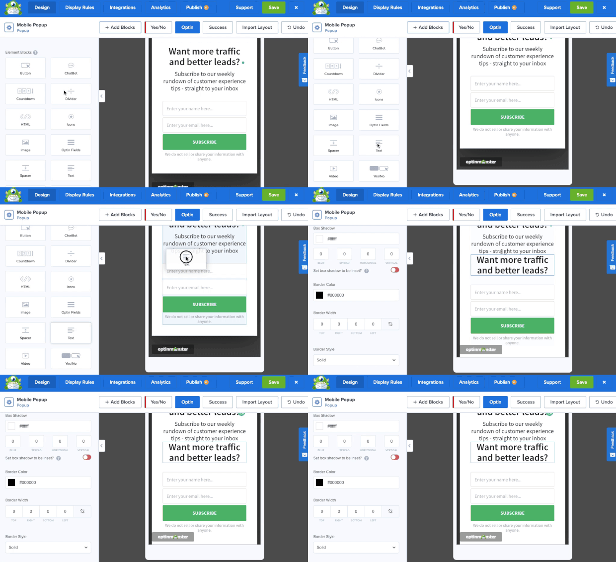
For example, you can quickly add new elements to your mobile templates with our drag and drop editor:
You can also customize your mobile campaign’s:
- Background
- Text
- Font
- Color
And much more. You can create mobile designs perfectly tailored to engage your audience and get more conversions from your mobile visitors.
In fact, mobile-optimized popups are how Salt Strong increased conversions by 185% while getting over 1000 new leads each week.
2. Use Multi-Step Optins
In that past, we’ve written a lot about how effective 2-step optin forms are.
But for mobile, it’s even more important.
That’s because you want your site’s visitors to be able to quickly and easily begin the optin process. By showing them a campaign with a large button that allows them to do so, you’ll encourage more people to opt into your offer.
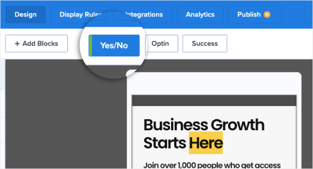
And activating a multi-step optin is easy. Simply click the Yes/No button at the top of your OptinMonster editor:
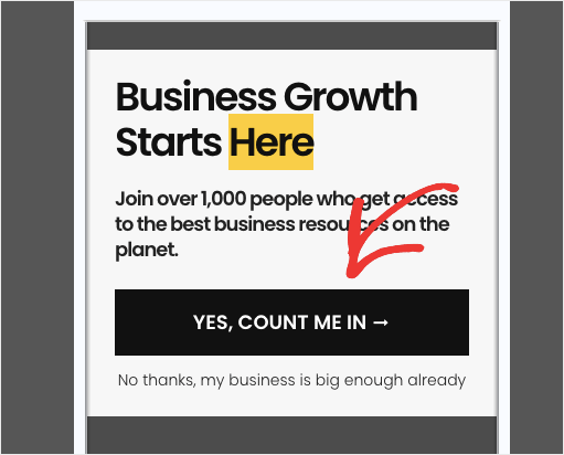
Then, you’ll get a new form that shows a large button rather than an optin field:
This lets users more easily begin the optin process. And once they’ve started, they’re more likely to finish.
That means with just a few clicks, you can increase mobile conversions across your site.
3. Recapture Abandoning Visitors With Mobile Exit-Intent
In the past, exit-intent popups were limited to desktop use. But now, you can harness all the power of Exit-Intent® technology for mobile users.
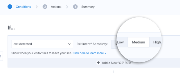
That means you can trigger your optin forms as people are actively leaving their browser page. With mobile, you do this by selecting an exit-intent trigger and choosing the sensitivity level:
Low and Medium sensitivity levels will create a scroll up trigger. That means when your mobile users are scrolling up the page after reading your content, the campaign will appear.
High sensitivity will create a back button trigger. So your campaign will display when users click the back button on their phone.
Exit-intent campaigns are incredibly effective at capturing users who were planning on leaving. It’s actually the same strategy that Crossrope used to grow its email list by 900%.
You can get similar results for your mobile campaigns to increase conversions.
Want to learn more about how mobile exit-intent works? Check out this post on how to create mobile exit-intent popups that convert.
4. Re-engage Users With an Inactivity Sensor™
Another trigger that can help you get more mobile conversions is using an Inactivity Sensor™. If your users haven’t engaged with your content for a specified amount of time, this will trigger your campaign to appear.
Inactivity Sensors™ are an excellent way to bring your optin forms back to your visitors’ attention.
Plus, you can add animation and sound effects to make your campaigns all the more effective.
As you know, the online world is full of distractions. Inactivity Sensors™ allow you to bring the focus back to your content and boost conversions from mobile.
For more on how this works, read this post on how to engage mobile visitors by showing a popup after inactivity.
5. Unlock the Power of Push Notifications
So far, we’ve discussed a few ways that you can use traditional optin campaigns to get higher conversion rates for mobile devices.
But there’s another method that’s super powerful, too: push notifications.
Push notifications are small messages that appear on your desktop or mobile web pages to nudge users into a certain action. You can use these notifications to direct your site’s visitors to a certain page with a concrete call to action.
From there, you’ll see conversion rates soar. That’s because people who allow push notifications are typically more interested in your niche, your brand, and your content.
In other words, they’re more likely to convert.
And to create the best push notifications, we highly recommend checking out PushEngage:
PushEngage is the best push notification software on the market. It lets you quickly create push notifications for your website with no coding skills required.
With its advanced features, you can:
- Reduce cart abandonment
- Notify users about sales or price drops
- Track your eCommerce goals
And much more. Again, if you’re looking to increase mobile conversions for your website, push notifications are a strategy you can’t ignore.
Get started with PushEngage today!
And for more information, check out this post on how to add push notifications to WordPress.
6. Leverage SMS Notifications
Another strategy that you may want to use is SMS marketing. You can greatly increase your mobile conversion rates by sending messages to your users via text.
Once you create an optin form on desktop that’s designed to capture your visitors’ phone numbers, you can add them to your SMS contact list.
From there, you’ll be able ot instantly communicate with your contact list. Plus, 90% of text messages are read within the first 3 minutes of being received.
That means you have a tool on your hand that can instantly get you higher conversions and drive more sales.
Want to learn how to get more phone numbers for your list? Read this step-by-step guide on how to create an SMS popup.
7. Promote Your Mobile App
If you’ve built a mobile app for your brand, online store, or website, then you need to promote it.
And if you haven’t built a mobile app yet, then you really should.
Mobile apps are a great way to keep your audience connected with your brand. You can also use these apps to create loyalty programs, keep users informed, and, you guessed it, increase conversions from mobile devices.
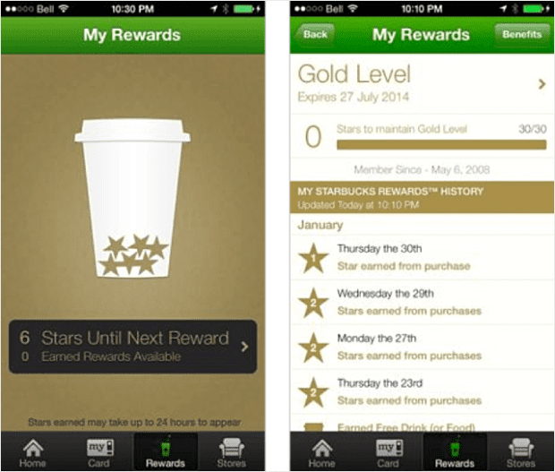
Starbucks, for example, created an app that consistently keeps customers returning back to their stores. They used gamification to give gold tokens for purchases and can give discounts or promotional offers directly through their app:
You can create an app to keep your customers engaged and have more people opt into your offers to encourage repeat business.
Not sure how to promote your app and get more users? Here are 7 concrete ways to get more app downloads today!
Using Mobile Marketing Best Practices
So far, we’ve looked at how to increase conversions by designing, creating, and displaying optin campaigns specifically for mobile.
But now, our list is going to continue with tips to make sure your website is encouraging mobile sign-ups in the first place. This means using the most current mobile marketing best practices.
Let’s dive in!
8. Build Trust With Mobile Users
When you’re trying to increase conversions from desktop users, you probably know the importance of using trust badges on your site.
Trust badges are small icons or symbols that show your brand is legitimate, credible, and trustworthy. Without this trust, users will be more hesitant to do business with you or opt into your offers.
And the same principle applies to mobile.
To get more conversion rates, you need to make sure that your mobile site still displays trust signals to give your site’s visitors more confidence in your brand.
One trust signal that we highly recommend are social proof notifications with TrustPulse:
TrustPulse is the #1 social proof software and plugin on the market. It lets you create social proof notifications to show your audience when other consumers are positively interacting with your brand.
Here’s an example of a mobile social proof notification:
When users see these notifications on their smartphones, they can click directly on the message itself. Then, they’ll be redirected to your optin form or landing page and will be more likely to convert.
Get started with TrustPulse today!
9. Simplify Mobile Checkout or Optin Forms
One thing that you need to remember is that filling out forms is much harder on mobile screens than it is on desktop.
That means you need to make your mobile checkout or optin forms as easy to fill out as possible for your users.
Remember the rule of thumb: every new field you add to your online forms gives mobile users a new reason to abandon the form or checkout process.
For your mobile checkout flow, you should make everything as easy as possible with things like:
- Limited fields
- Large navigational buttons
- Guest checkout
- Autocomplete
And other mobile checkout best practices.
For more information on how to optimize your checkout flow for both desktop and mobile, check out this helpful post: Checkout Page Optimization: 22 Best Ways to Recover Lost Sales.
This is also true for your optin or payment forms on your website. If you’re using a lead generation software like OptinMonster, you can quickly and easily customize the number of fields you ask for while designing your optin campaign.
That way, your optin forms will be more effective at increasing mobile conversions.
And if you’re using other forms on your website, you need to make sure that you have the ability to limit the form fields as well. That’s why we highly recommend using a form builder like WPForms:
WPForms is the world’s best form builder plugin for WordPress. With its drag and drop editor, you can modify what information you ask for and sync it with all your favorite marketing tools like email service providers, payment gateways, and more.
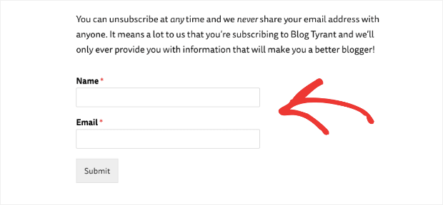
Check out this very simple sign-up form used by Blog Tyrant to boost conversions:
They used WPForms to make the most simple sign up form possible. And if a user comes from their mobile device, this means it’ll be much easier to sign up.
Again, typing can be tougher on smaller screens, so if you want to increase mobile conversions, make sure all of your forms are simple, short, and mobile-friendly.
10. Speed up Your Mobile Site
Slow page speeds are incredibly detrimental to UX. This is true for desktop users but seems to be even more crucial with mobile devices.
That’s why it’s important for you to focus on your site’s load times for mobile.
Be sure to test your mobile page loads with a tool like Google Search Console to make sure everything is working quickly.
One of the other benefits is that fast load times will improve your site’s SEO efforts. You can track this using a plugin like MonsterInsights:
MonsterInsights is the world’s best analytics plugin for WordPress.
It will let you access data from Google Analytics, Google Search Console, and more to make sure that your site is totally optimized.
You can then track your keyword improvements over time to see how page speeds are affecting your content. Plus, you’ll get all this data straight in your WordPress admin dashboard.
To learn more about how to speed up and track your site’s performance, you can read this article: How to Improve Your Website’s Loading Speed Using a CDN.
Try out MonsterInsights risk-free today!
11. Make Your Site Easier to Navigate for Mobile Users
Lastly, don’t forget to overlook your mobile site’s design. You need to test out how your website displays over various screen sizes.
You should then follow some mobile page design best practices to ensure that your users can more easily navigate your content.
This means using design tips such as:
- Large buttons
- Bigger font sizes
- Navigational drop-down menus
And more.
If you have no web design experience, no worries. Check out this resource on mobile marketing best practices.
And there you have it. This article has 11 actional tips you can use to take your mobile marketing game and design to the next level.
But if you’re truly serious about increasing mobile conversions across your site, click below to use the best lead generation tool for mobile:
And that’s it!
We hope you found this article helpful. Often times, you’ll be using your mobile optin forms to grow your email list. If that’s the case for you, we recommend reading through the following articles:
- How to Run a Successful Email Marketing Campaign
- Email Marketing for Beginners: A Step by Step Guide
- How to Create an Effective Email Autoresponder Series
These resources can help you drive higher conversions, boost email susbcriptions, and drive more sales fast!
Ready to get started? Sign up for your risk-free OptinMonster account today!









Add a Comment