Did you add a sidebar optin to your site, only to be disappointed by the low conversion rate and then give up? It’s very possible you quit too soon. In this case study, we’ll exactly how the US Student Loan Center used two step optins to increase conversions 300% and monthly sales 10%.
Meet The US Student Loan Center (USSLC)
USSLC offers provide assistance to American consumers who need help taking advantage of the opportunities the federal government provides for repayment of student loans. They are the number one Federal Student Loan educational resource.
The sales process for USSLC requires a phone call, but starts with educating readers long before they’re ready to make a call. To do this, USSLC offers many pieces of content as downloadable PDF’s, known as lead magnets. A lead magnet is a valuable piece of content provided in exchange for contact information.
USSLC wanted to increase the number of leads they received through the use of these lead magnets. Even with great lead magnets, they were disappointed in the conversion rates for those offers. In fact, they called them “mediocre at best” and hoped OptinMonster could help change that.
Why USSLC Uses Four Optin Types, Including Two Step Optins
The USSLC has developed a system for launching new lead magnets that has yielded great results. For every lead magnet, they place a total of four optins:
- an exit-intent optin
- a sidebar optin
- a MonsterLink, otherwise known as a two-step optin
- a mobile specific optin or floating bar
Presenting your offer multiple times like this gives the reader time to make a decision. If the offer is presented only once in a sidebar or lightbox, it can more easily be ignored or overlooked.
Let’s take a look at this series of optins for one of their lead magnets, an income based repayment guide.
A sidebar is often the first place OptinMonster customers add an optin. It’s important to keep in mind that sidebar optins are often the lowest converting optins, which is why it’s important to include several other opportunities for visitors to convert.
Related ContentHow to Create a Sidebar Widget in WordPress to Get More Subscribers
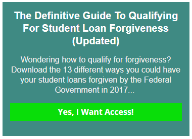
The optin below utilizes our Yes/No feature, displaying a button which when clicked, reveals the subscription form itself. It is one type of two step optin offered at OptinMonster. The first step is clicking the Yes button, the second step is completing the subscription form.
This sidebar two step optin converts a modest .26% of readers.
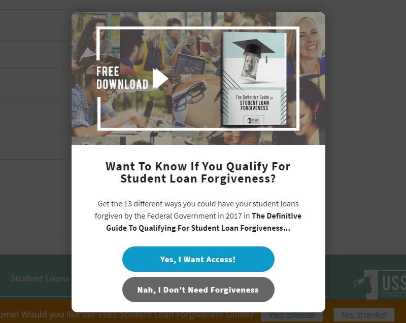
The two step optin below appears only when the reader attempts to exit the site, using our patented exit-intent technology. It draws on the reader’s sense of hope (often lacking for those with student loans). It promises an opportunity to see if they qualify for student loan forgiveness and 13 ways that might work for them.
This two step, exit-intent lightbox converts around 4.26% of readers.
USSLC paid special attention to their mobile readers by offering a mobile specific optin. It appears only to readers viewing the website from a phone or tablet.
The mobile optin converts 7.82% of visitors. Again, they used two step optins instead of displaying the subscription form first.
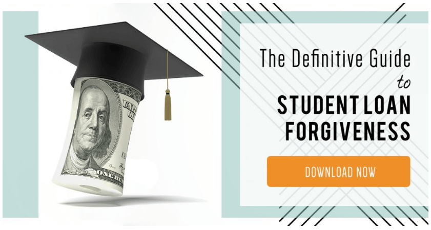
USSLC found the most success using one of our most powerful features: MonsterLinks. MonsterLinks allow you to turn any link, button, or graphic into a two step optin. When a reader clicks a MonsterLink, a lightbox optin appears. The lightbox contains an optin form the reader can use to subcribe.
The graphic below was placed several times throughout one article, and turned into a MonsterLink.
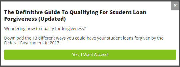
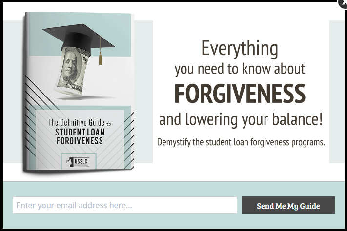
When clicked, it launched this optin:
This two step optin converts 34% of readers. That’s a huge increase in targeted subscribers.
MonsterLinks are so successful because they don’t interrupt the reader’s attention in the same way other optin types do. They can be contextualized to the paragraphs and sentences immediately surrounding them. Using MonsterLinks, you can make an offer multiple times throughout a single page just by using different copy or different images for each MonsterLink.
Even when compared to inline optins which show the entire optin form within the content, MonsterLinks most often perform better. USSLC tested inline optins first, and found the MonsterLinks converted 25% better.
Need more ideas for how to increase your email list? Here are 12 strategies for adding 100,000 subscribers to your list in just five months.
Each of the four optins above use very simple OptinMonster templates. In most cases, the USSLC only changed colors and font choices to match their brand, which is easy to do using our campaign builder.
Results
The US Student Loan Center made sure readers saw their lead magnet offers multiple time on each page, and their conversions show the results.
- USSLC increased lead generation by 300% using OptinMonster.
- USSLC increased conversions 25% by testing two step optins against inline optins.
- Monthly sales increased 10% as a direct result of leads generated through OptinMonster.
Summary
Different optins convert at different rates just by the nature of the placement of the optin itself. A sidebar optin doesn’t command the same attention as an exit-intent optin or a two step optin but should still be an important part of your overall lead magnet strategy. If your first optins are not as successful as you’d like, try another optin type or adding multiple optin types.
Organic traffic plays a huge role in lead generation for us now that we have started using OptinMonster. They’ve helped us increase our onsite lead acquisition by 300% which in turn now constitutes about 10% of our monthly sales. OptinMonster is a powerful tool to fuel your business, and with all the cool targeting options and easy-to-use templates, OptinMonster is how marketers nerd out!
USSLC


