Are your email newsletters helping, or hurting, your business? Since 51% of recipients unsubscribe from newsletters that don’t look good, you can’t afford to neglect your email newsletter design.
In this article, we share our best email newsletter design tips to get your customers to engage and click. Not only will this help you build a better relationship with your customers, but you’ll also be able to make more sales.
Use the table of contents below to easily navigate our newsletter design tips.
- Write a Great Subject Line
- Choose the Best Sender Name
- Use the Right Email Template
- Brand Your Emails
- Use Web-Safe Fonts
- Pay Attention to Images
- Set the Mood with Color
- Keep Text Short
- Make It Scannable
- Make Your Emails Accessible
- Create an HTML Email That Looks Like Plain Text
- Nail the CTA Design
- Test Your Email
What Is Email Newsletter Design?
Email newsletter design is everything that goes into creating an email newsletter or promotional email. This generally includes:
- Subject lines and sender names
- Branding and colors
- Fonts and images
- Formatting
Those things go into building an engaging newsletter design template, but that’s not where it ends. Your newsletter design also includes things that you can’t see, like the goal of the newsletter.
That’s right, your newsletter design depends on the goal you’re trying to accomplish. For example, if you’re putting together your weekly newsletter your goal may be to educate your readers. This newsletter design might look a lot different from an email with the goal of boosting sales.
The newsletter design tips that follow can be used to create a killer email newsletter, no matter the goal. So, let’s jump in!
Resource: 5 Best WordPress Newsletter Plugins in 2023 for More Engagement
1. Write a Great Subject Line
Subject lines have the power to make or break your email marketing campaigns.
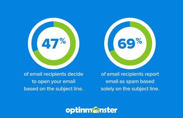
About 47% of email recipients open an email based on the subject line alone. At the same time, a whopping 69% of email recipients will report email as spam based solely on the subject line.
Here are some things you can do to make sure your subject lines are clickable:
Make subject lines mobile-friendly
People check email on mobile devices more than webmail or desktop. Use a free tool like Zurb’s TestSubject to make sure your subject line and preheader look great across mobile devices.
Keep subject lines original
Subscribers get bored easily. Use a variety of subject lines to keep their interest.
Use emojis
Using emojis in your subject line can ? increase open rates by 45% ?. Get creative with it!
Related ContentEmail Subject Line Statistics To Help You Maximize Your Open Rates
2. Choose the Best Sender Name
If you get an email from someone you’ve never heard of, do you open it or just delete it automatically?
At least 42% of us check out the sender name before opening an email. If you’re a well-known brand you can probably get away with just using your brand name as the sender name. Or, take the personal approach and include the name of a real person.
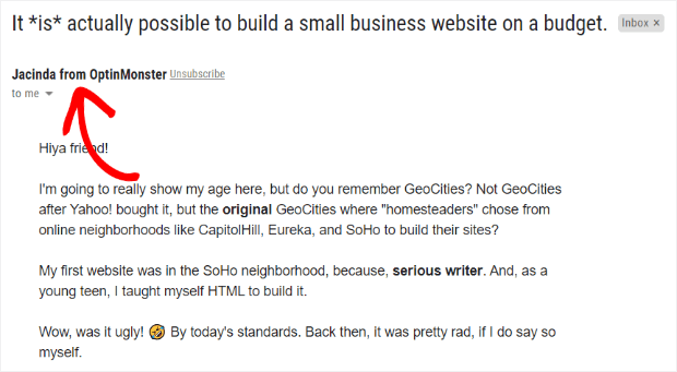
For instance, if you sign up for the OptinMonster newsletter, you’ll start getting emails every week that are full of marketing tips and updates about the OptinMonster product. The sender on those emails is “Jacinda from OptinMonster.”
Plus, when you use a real email address rather than a “no-reply” address, subscribers can respond to your email, which is good for sender reputation and future email deliverability.
3. Use the Right Email Template
To make sure your email newsletter looks good in the inbox, you’ll need to follow a few key specifications.
According to countless studies, the gold standard for email width is 600px.
The good news is that if you’re using a professional email service provider like Constant Contact and Brevo (formerly Sendinblue), all their email design templates already use this width.
In addition, you’ll want to make sure that your email looks great on mobile. With more than half of all email opened on mobile devices, you’ll need to go for responsive email design templates that resize images and text according to the screen where they’re displayed.
Finally, you’re going to want email newsletter templates that you can easily edit to fit your branding and your content. The best email marketing services make this really easy to do.
4. Brand Your Emails
Ideally, your email newsletter is going to look like it’s part of your brand. In other words, you’ll include your logo, and may also include the same photo or avatar you use across social media. That’ll help recipients recognize you, which boosts trust, and therefore engagement.
The State of Mobile Email Engagement: What You Need to Know
For subscribers, consistency is key, so don’t switch email newsletter design templates randomly. Instead, use the same template for the same type of email so they know what to expect, can become familiar with it, and even look forward to it.
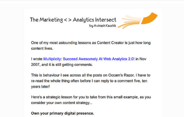
Here are a couple of examples of branded email newsletter design. Analytics expert Avinash Kaushik keeps it simple with a single column template and a header that includes his name and the name of the newsletter:
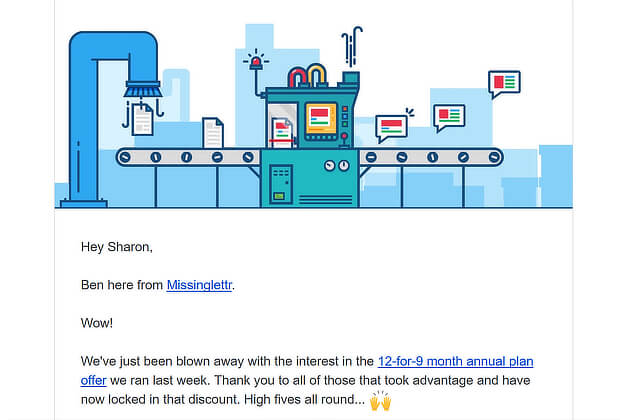
And Missinglettr uses its home page graphic as a header image:
5. Use Web-Safe Fonts
One thing to pay attention to when seeking email newsletter design inspiration is typography. The fonts you choose can have a huge impact on how your newsletter’s perceived. Here are a couple of email newsletter design tips on fonts to help you create email newsletters that look great.
First, since email newsletters display differently on different email clients and web browsers, your best bet for a consistent look is to stick to web-safe fonts. You still have plenty to choose from, and there’s a list here to help you get started.
Second, don’t use too many: less is more. You need headline and body text fonts, and possibly one more for occasional contrast.
Some people use regular and bold versions of the same fonts for body text and headlines, while others use different fonts. Whatever you choose, keep it simple and opt for readability over trying to make your newsletter look fancy.
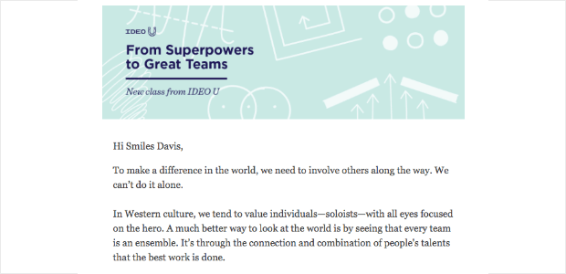
At all costs, you want to avoid having your email newsletter look cluttered and uncoordinated. For example, Ideo U uses just two main fonts in its monthly email newsletter:
Third, if you already use certain fonts as part of your branding, keep it consistent and use those same fonts in your email newsletter. This’ll help with brand recognition.
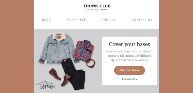
Here’s an example from Trunk Club; since they’re a Nordstrom company, they use the Nordstrom font in their header.
6. Pay Attention to Images
It’s tough working out the right balance of images in email newsletters. On the one hand, two-thirds of subscribers prefer emails that are mostly images, says Litmus research.
On the other hand, 43% of people disable images, and some email clients don’t display background images. That’s why you should:
- Consider whether a background image is really necessary for your email newsletter. If it isn’t, just leave it out, as many marketers do these days.
- Ensure that your email looks good and works without images. Use alt text to describe any images you use so that even with images disabled, it will still make sense.
- Avoid hiding key information in images. As we’ll see later, that’s an email accessibility no-no.
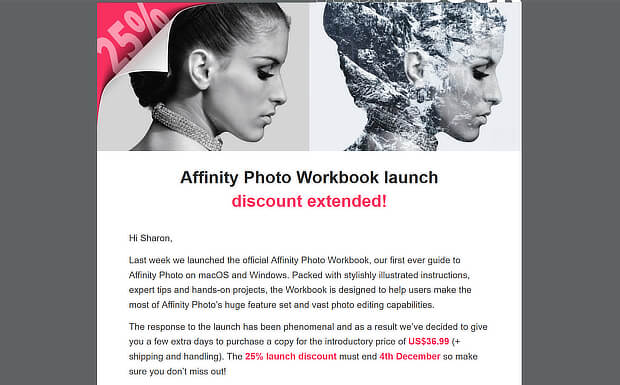
Here’s a good example from Affinity Designer. At the top of the email, there’s an image with a 25% discount sticker, but that information is repeated in the text so even those who don’t see the image know what’s on offer:
However, images can help readers to connect with the content of your email and can keep their attention focused on the right area. So if you are using images, make sure you choose attractive images that are crisp and clear.
If you need images for your email newsletter, start with the free images sites in our roundup.
7. Set the Mood With Color
Color’s an important aspect of any email newsletter design. That’s because color:
- Helps with brand recognition
- Is aesthetically pleasing
- Can influence purchases
Though you’ll want to be true to your brand, you can use color to set the mood. So, while your logo will stay the same, you might use seasonal images within the body of your newsletter. This can help your subscribers buy into the emotions associated with particular colors.
To choose the right colors for your newsletter, you can use tools like Coolors to select contrasting or complementary colors that make your email newsletter design pop.
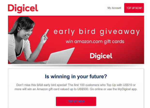
Here are a couple of examples. Digicel keeps it simple by using its brand colors:
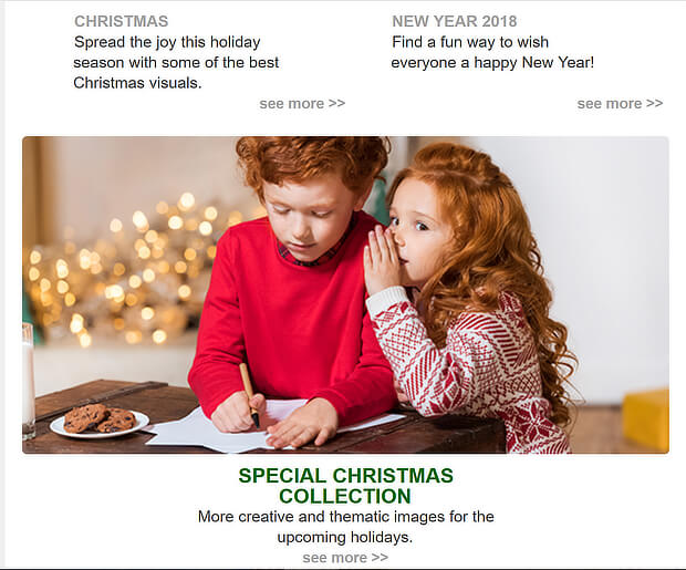
DepositPhotos uses Christmas colors of red and green in photos and text to evoke that holiday feeling:
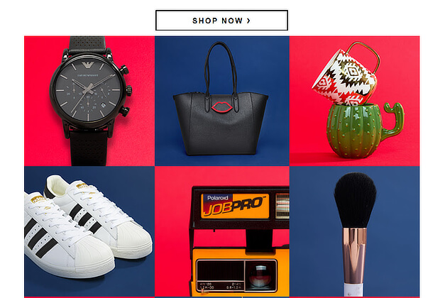
ASOS uses contrasting boxes to highlight items on sale:
8. Keep Text Short
When you’ve got website visitors, your goal is usually to keep them on the site and engaged with your content. With an email newsletter, it’s the opposite. Your ultimate goal is to get them out of their inboxes and onto your site or landing page.
That’s why it pays to keep text short.
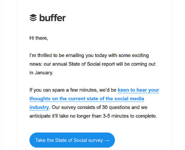
How short? Constant Contact says that emails that are about 200 words long have the best click-through rate. Here’s an ultra-short example from Buffer:
But, as we always say, the best way to find out what works for your audience is to test your email WITH your audience. We’ll talk more about testing in a minute.
Even with shorter text, there are a few tips you can use to make your copy more effective. If you want to make people click through, you have to:
- Lead with a great headline.
- Avoid being too promotional. Copyhackers recommends sending just 1 promotional email for every 3 educational emails.
- Share your best content.
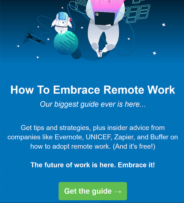
Here’s an example from Trello, which includes a background matching the brand colors, a short introduction and the call to action:
9. Make It Scannable
Even with short emails, recipients may not read all of them. That’s why it’s important to make them scannable.
The way you structure your email newsletter will help with this. Since images draw the gaze, where you put them will affect what people see.
You can place the content in sections, so it’s visually clear where the most important pieces of content are.
And of course, you can use subheads and bullet points to keep people reading and lead them to your call to action.
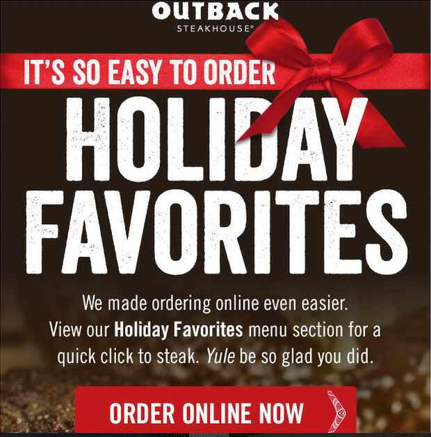
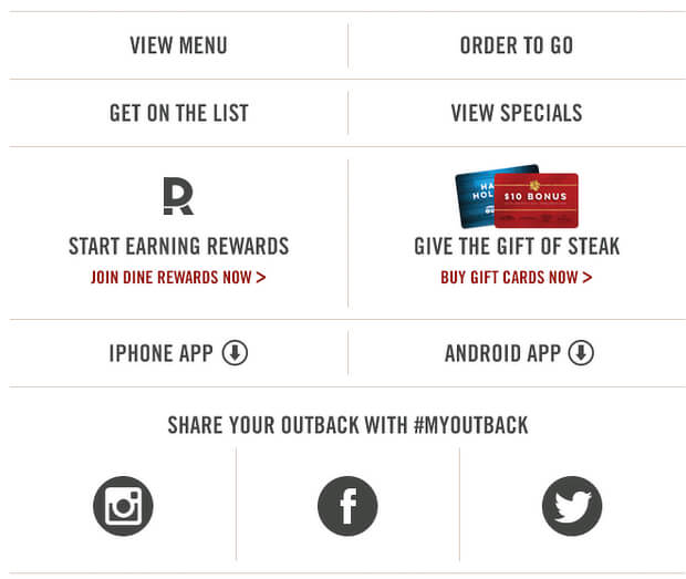
For example, this Outback Steakhouse email is divided into three sections. The first shows the most important part of the email, which is a new holiday favorites menu:
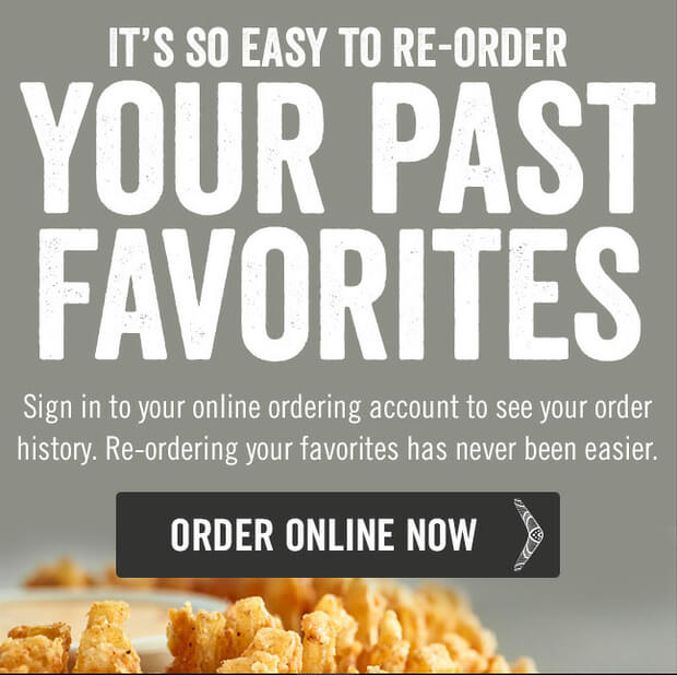
The second section lets subscribers see past favorites, with another call to action:
The last section includes links to important areas of the site, including the full menu.
10. Make Your Emails Accessible
As our article on email accessibility says, millions of people worldwide have visual and hearing impairments and other disabilities. It’s a legal requirement in many places, and good practice anyway, to make sure people with disabilities can easily access your communications.
If you’re building accessibility into email design templates, consider:
- Using accessible fonts at a large size
- Avoiding walls of text
- Using alt text for all images to subscribers with disabilities know what you’re showing them (we said it before, but it’s worth repeating)
- Paying attention to formatting
The truth is, well-designed emails are accessible emails, so don’t neglect this part of your email newsletter design.
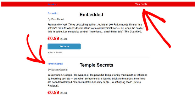
Here’s an example from BookBub. Even with images disabled, you can still get the main information:
11. Create an HTML Email That Looks Like Plain Text
One question some people ask is how to include plain text in HTML emails. While it’s good practice to have an actual plain text email, mimicking the effect of plain text provides a couple of benefits.
As Aweber points out, the problem with plain text is you get ugly links, it’s hard to track clicks, and there’s not a lot of room for design tweaks.
In contrast, when you create a plain text HTML email you can:
- Be flexible with design
- Make your links look pretty
- Easily track email click stats
And those hybrid HTML plain text emails get more clicks, too.
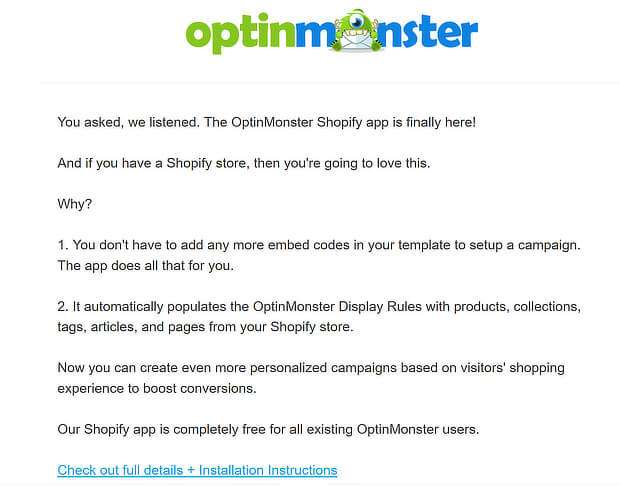
Here’s an example from our own email newsletter. It’s relatively plain, but includes a single properly formatted link.
12. Nail the CTA Design
In the end, the success of your email newsletter design will come down to whether it wins the clicks. The call to action (CTA) is a critical part of getting subscribers to engage.
A well-designed call to action:
- Is visible and actionable
- May appear in different formats, say as a link and a button
- Will be included multiple times in an email, most likely 3
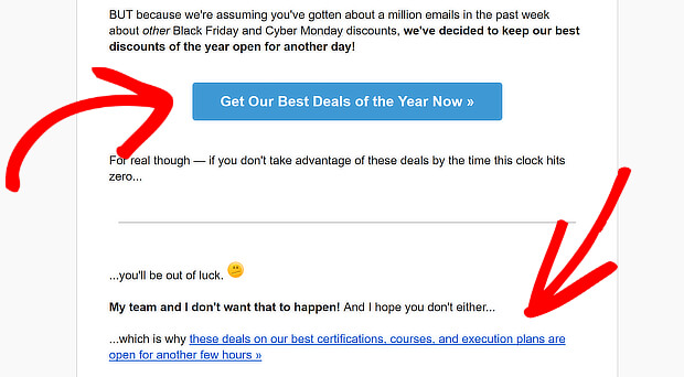
Here’s an example from DigitalMarketer of including the CTA as both a button and a link:
To learn more about getting your CTA right, read our guide to creating the perfect call to action.
Color’s also important when creating call to action (CTA) buttons. For example, you can use red for urgency, black for luxury, or blue for trustworthiness. You’ll have to experiment to see which CTA color works best for your subscribers.
13. Test Your Email
Our last tip is to test your email.
As we’ve mentioned before your email newsletter will look different in different email clients. That’s why your goal is to create emails that work in most of them.
If you’re unsure where to start, research from Litmus shows that Apple Mail and Gmail have the lion’s share of the email market, so that’s a good place to start.
An easy way to test your email newsletter design is to send a test email, then minimize your browser window to see how it looks.
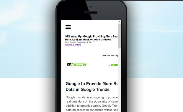
You can also paste the URL into a tool like MobileTest and check it there. For example, here’s how a newsletter from Search Engine Journal looks on an iPhone 7, according to MobileTest.
Follow these email newsletter design tips and you’ll soon have a beautifully engaging email newsletter.
Next, check out our tips on writing high-converting email marketing copy and boosting your email click-through rate.
And don’t forget to follow us on YouTube, Twitter, and Facebook for more email marketing tips and guides.





Add a Comment