Are you struggling to get enough conversions on your sales pages?
Or, like a lot of new marketers, are you scratching your head right now wondering, “Wait… what is a sales page?”
A sales page is your best opportunity to explain your products and services to visitors and make them want to buy. It needs to be attention-grabbing, informative, and persuasive, all at the same time.
And if it’s not optimized for conversions, you’re losing money. That means any marketing and advertising budget you’re spending to promote your products will be wasted.
But wouldn’t it be great if you knew the secrets of writing high converting sales pages so you could funnel a steady stream of revenue straight to your bank account?
Or if you knew how to design a sales page to maximize your customer growth?
That’s what we’re going to share in this article.
By the end, you’ll know how to write a sales page that converts like crazy, so your business revenues stay healthy and growing.
Plus, we’re going to teach you how to create the perfect sales letter funnel. This specific funnel will easily allow you to upsell different products and boost your bottom line.
So if you’re already confident with writing sales pages, then jump straight to the sales letter funnel section of this post. It’s easy, fast, and super profitable.
Need more information about writing a sales page that converts? Here are 19 tips that will get you ready to go.
- Understand Your Audience
- Create a Value Proposition
- Get the Price Right
- Determine the Right Length
- Nail the Headline and Subheadings
- Describe Your Product
- Show the Benefit of the Benefit
- Get the Language Right
- Handle Objections
- Prove Visitors Can Trust You
- Incorporate Images and Video
- Make Your Copy Scannable
- Eliminate Distractions
- Design a Dynamic Layout
- Use Responsive Design
- Make a Clear Offer that Impels Action
- Use Multiple Calls to Action
- Make It Urgent
- Use Exit-Intent
Ok, let’s get started.
1. Understand Your Audience
First things first: You can’t write good sales copy unless you know who you’re talking to.
Before putting pen to paper (or fingers to keys), it’s essential to understand who your audience is and what they’re looking for when they consider buying your product or service.
One of the best ways to do this is to create a customer avatar or buyer persona. That’s a fictional person who represents your ideal customer. While the persona may be fictional, it’s based on real data collected from:
- Customer surveys
- Web analytics
- Social media analytics
- Other online research
Once you’ve got a buyer persona, you’ll understand your prospective customer’s influences, pain points, challenges, and motivations so you can create copy that addresses them.
And you can use this information in your copy to specify the audience you’re targeting,
Here’s our guide to creating a concrete buyer persona to help with this.
2. Create a Value Proposition
When you know who your customers are, you’ll be able to articulate your value proposition. That’s a statement of the benefit you provide and the problem you solve for your customer, and why you’re the best person to do so.
Ideally, this will be a single sentence or short phrase that’ll guide the rest of your copy. Here’s a straightforward fill-in-the-blank value proposition template by Steve Blank:
We help [X] to [Y] by [Z].
If you fill it in for OptinMonster, you could get something like:
We help marketers and business owners to build their email lists and boost sales by providing high-converting marketing campaign software.
Try it for your own business, then check out our article for more value proposition templates and examples.
3. Get the Price Right
One last thing to determine before you start writing: How much does your product or service cost?
One of the big sticking points for many prospective buyers is the price. To succeed in winning the value vs. cost argument, it’ll help if you can make your product’s price less of a sticking point.
Some proven techniques to try include:
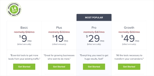
- Offering more than one price point
- Labeling your price points with descriptive names to help users to self-select
- Make sure your price ends with the number 9 because research shows that more people gravitate towards this
OptinMonster uses several of those pricing strategies:
Learn more about pricing strategy in our article on pricing page tips.
4. Determine the Right Length
After you understand your target audience and what you have to offer them, it’s time to start writing your sales page.
But how long should a sales page be?
The short answer is: as long as it needs to be to get the job done. That’ll vary depending on what the copy is for, and how your visitors respond.
As QuickSprout points out, long copy lets you deal with more customer objections, so that when people click the call to action (CTA), they’re definitely convinced. Long copy is also useful for products and services that need a lot of explanation.
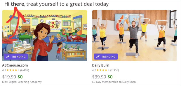
But if you can explain your offer simply, then you don’t need to add more copy. For example, Groupon explains its purpose in a sentence and takes you straight to the deals.
Even long sales pages will include both short and long copy.
The short copy caters to those who are already convinced. It’s usually accompanied by a call to action near the top of the page. The long copy helps you make a case for those who are less easy to persuade and will include a couple more CTAs.
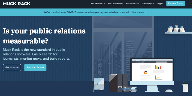
For example, here’s the short copy for Muck Rack’s landing page:
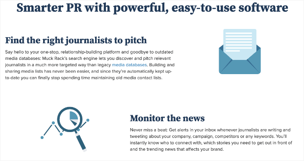
And here’s some more detail further down the page:
The page also includes testimonials and a final CTA.
How do you know which type of sales page will work for your audience?
In the end, the decision will come down to A/B testing. That’s the best way to separate sales pages that convert from those that don’t.
5. Nail the Headline and Subheadings
Now you’re ready to start writing.
The first step is to create the headline. This is the most crucial part of your sales page because if you get it wrong, your visitors will be quick to leave.
The best headlines are short and to the point. For example, here’s one headline from marketing expert Neil Patel:
This is a sales page for a consultation with Neil, but that headline doesn’t waste any space. In some cases, you’ll need a subheading to add a bit more context if your message is more complex.
OptinMonster, for example, uses a large headline with a subheading to convey more information to the reader:
Check out our guide to creating high converting headlines for help with this tip.
Or, if you really want to level-up your headlines, go visit OptinMonster’s headline analyzer today.
6. Describe Your Product
Now, it’s time to go into more detail about what your product is and what it does. This is where you’ll reiterate the core problems your visitors face, and break down your solution.
The more descriptive and unique you can get, the better your description will be. By writing detailed descriptions of each feature, you’ll not only have an easier time convincing shoppers to convert, but you can also get some SEO ranking benefits in the process.
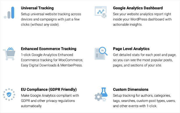
For example, here’s part of the sales page for MonsterInsights, showing how it provides the key features users want:
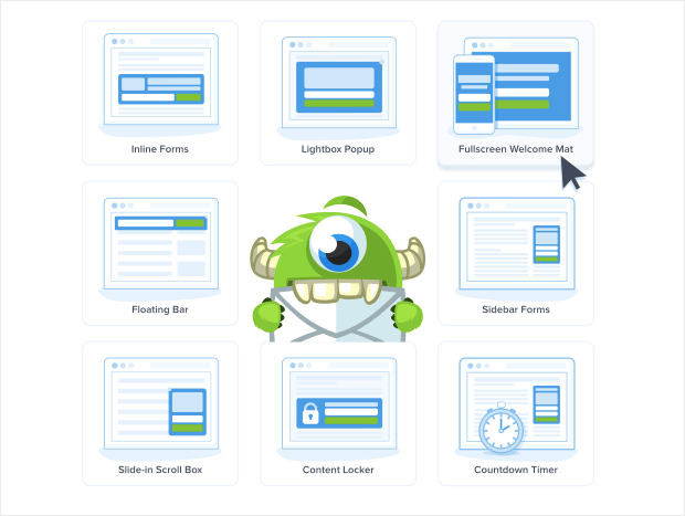
OptinMonster does the same with all of our features, such as this showing the many campaigns you can build:
Describing the ins and outs of your product like this can give your potential customers more confidence. Just make sure you can deliver on all the promises your product descriptions make.
7. Show the Benefit of the Benefit
Anyone wondering how to write a sales page that converts has to understand the principle of features vs. benefits. Your visitors care more about what your product or service will do for them than they do about all its fancy attributes.
That’s why when you look at sales page copy templates, they focus on benefits and not features.
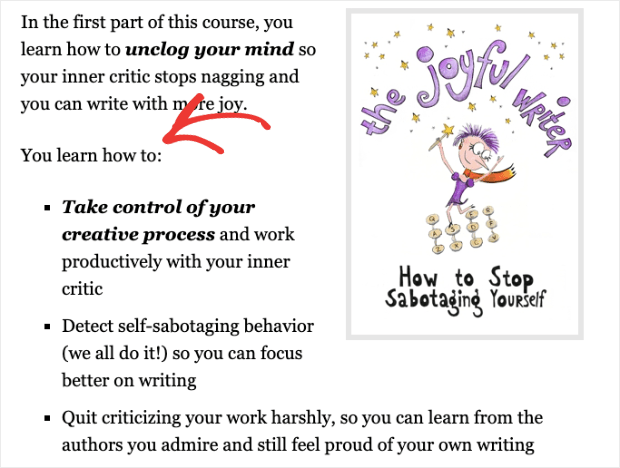
Your benefits will often be listed on your sales page as bullet points, as in the example below from Enchanting Marketing:
Charles Ngo suggests you go one step further and focus on the benefit of the benefit. For example, if you are selling diet pills, the benefit is weight loss, but the benefit of the benefit could be that you’ll be more confident.
Whenever you think you have your benefit nailed down, try to take it one step further. Will your product save time, money, or effort for your clients? And after that, what will your client be able to do with the time, money, or effort saved?
8. Get the Language Right
One of the questions we often get is, “how do you write a sales landing page?”
Our response? Use the right language. Visitors want to know you understand them, so you can use techniques like:
- Addressing your customer directly, using “you”
- Making them feel like part of the family by using “we”
- Showing that you empathize
- Telling a story that they can relate to
- Using power words to elicit and show emotion
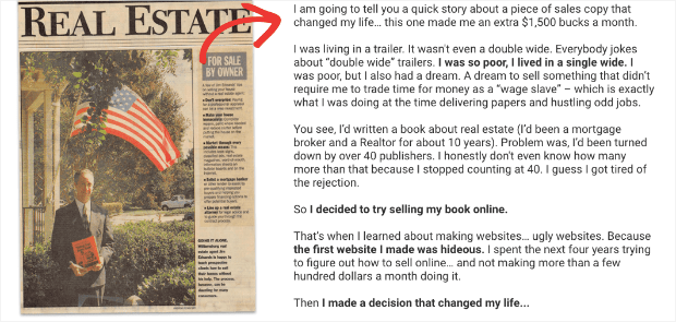
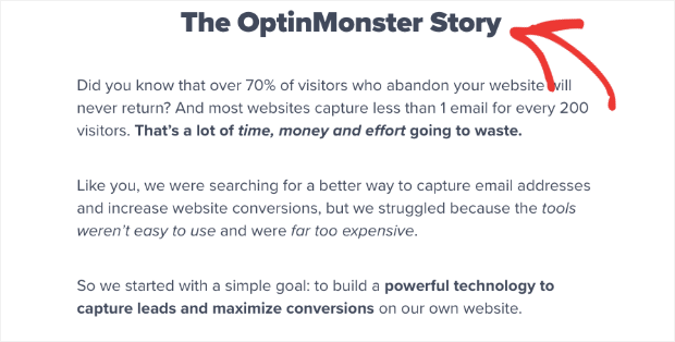
Here’s a storytelling example from Jim Edwards, copywriting master. He uses storytelling for the sales page of his book Copywriting Secrets:
OptinMonster devotes an entire section to telling our story, too:
This helps people connect with your brand on a deeper level.
You can make your sales page copy even more targeted by including a “who is this product/service for” section. This allows you to make sure you’re talking to the right people.
9. Handle Objections
As we said at the start, some people will be willing to buy the minute they land on your sales page. However, others will need more convincing to part with their cash.
The truth is, people can always think of reasons NOT to buy. The best sales pages blow their objections out of the water. Here are some ways to do that.
To address visitors who are unsure why they should buy now, a time-limited discount or offer can help make the sale. WPForms does an excellent job of this on their pricing page:
You can also create a popup coupon with OptinMonster to highlight this offer.
If you’ve explicitly explained who your product is for, then you’ll dismiss the objection that your visitor doesn’t think it’s right for them.
If price is the issue, you can address this by highlighting the value of your product to them, and by using some of the pricing strategies we’ll discuss a bit later.
And if they don’t trust you, you can handle this with social proof and other trust builders, which we’ll discuss in the next tip.
Our article on lead capture has more information on overcoming objections.
10. Prove Visitors Can Trust You
Did you know that 90% of companies only buy from companies they trust? And that 78% of consumers go to brands they trust FIRST when shopping for products and services?
Those are just two reasons why trust factors are so important for creating sales pages that convert. Ways to build trust on your sales page include:
- Offering proof of any claims you make
- Highlighting testimonials from happy customers
- Including other forms of social proof that help to enhance your reputation, such as social media mentions and expert endorsements
- Giving customers’ peace of mind with a money-back guarantee
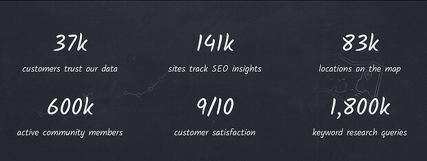
Moz showcases its key stats as part of its sales page:
When you help customers to trust you, it’s easier for them to make the decision to buy.
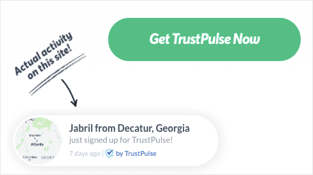
To really kick your sales into high gear, check out TrustPulse. With TrustPulse, you can further leverage the power of social proof. They do that by adding recent activity popups to your screen. Those look something like this:
When people see that other people have signed up with or purchased your services, it builds instant trust.
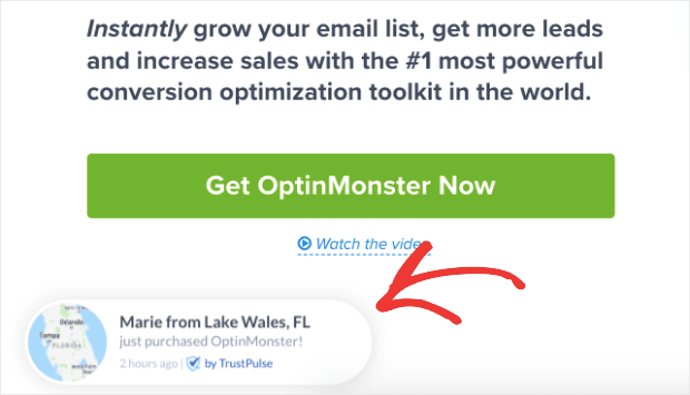
And, adding TrustPulse to your site can give you an instant lift in site conversions by up to 15%. We were so impressed with the results that we’ve kept these recent activity popups on OptinMonster’s site:
For such a small modification to your site, you can see the same big results in sales.
11. Incorporate Images and Video
Done writing your sales page? Not so fast.
Don’t forget about the impact of visuals.
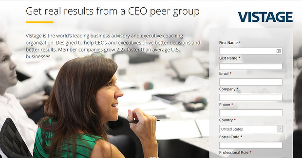
Even still images grab attention, and you can use them to cleverly direct your readers’ gaze to the most critical areas of the page. Here’s the perfect example from Vistage:
You can also kick it up a notch by using video. Wyzowl’s State of Video Marketing report revealed that 81% of businesses who used video in marketing reported an increase in sales.
Other video marketing statistics show that 84% of consumers have made a purchase after watching a video.
An excellent way to use video on your sales page without reducing your page load speed is to have the video pop up at the right time. You can do this with OptinMonster by following the steps in our tutorial on boosting engagement with a video popup.
You can also check out our roundup of sales promotion examples for design inspiration.
12. Make Your Copy Scannable
Once you have your content ready to go, you’ll need to make sure your audience can easily read it.
One of the most important design tips for any piece of online copy is to make it scannable. That means breaking up the text to make readers pause as they skim the page.
In other words, there are no walls of text to make people’s eyes glaze over. In fact, at a glance, your sales page should look like it’s broken into easily digestible sections.
The best sales pages include:
- A combination of short and long lines
- Lots of paragraphs
- Lists, usually with bullet points
- Subheadings
- Quotes
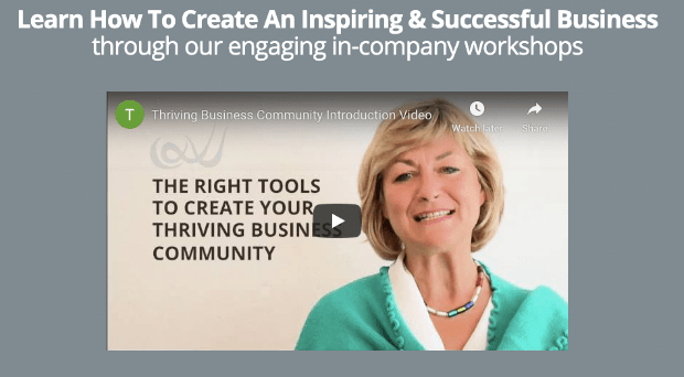
You can highlight these by adding design elements like boxes and outlines where appropriate. Here’s an example from Thriving Business Community.
Sales pages that convert will also use a font that’s easy to read. It needs to be legible and large enough for those reading on small screens. Google recommends a minimum font size of 16px.
Check out this list of readable and web-safe fonts to help with choosing fonts to make sure your sales page is scannable.
13. Eliminate Distractions
If you want visitors to focus on your sales copy, you’ve got to use design to help them.
That means removing any distractions from the core purpose of the page to inspire readers to click through and convert by making a purchase.
The best sales page examples have no sidebars, and often have minimal headers and footers, or none at all. Everything that’s on the page is related to what the site is trying to sell.
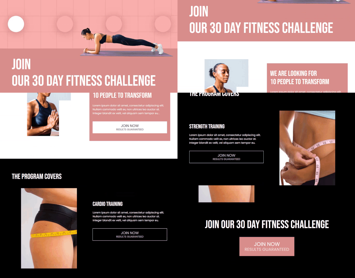
Here’s an example from SeedProd, it’s one of their sales page templates:
All header menu options have been removed, and there is nowhere else for the reader to go except to continue reading and sign up for a 30-day fitness challenge.
A good starting point for nailing your sales page design is this list of WordPress sales page templates.
14. Design a Dynamic Layout
ConversionXL’s Peep Laja points out that novelty keeps visitors’ attention. That’s why it’s important to mix things up a bit in terms of design. For example, you can:
- Vary the placement of images, so they’re not all on the same side of the page
- Break up the page with different layout elements and styles
- Changing the on-page messaging
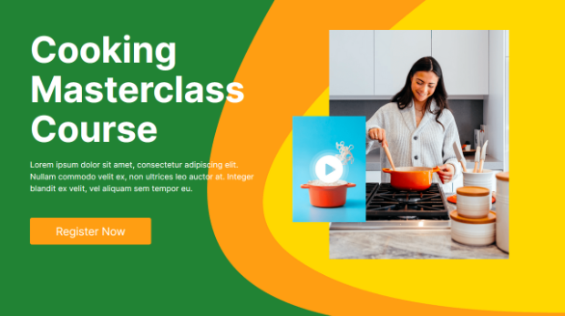
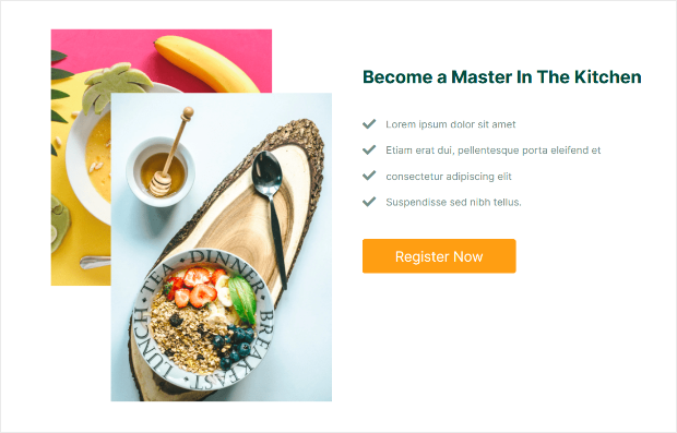
Here’s a great example of what we mean. SeedProd uses multiple images with colorful shapes in the background to maintain visual interest.
As you scroll down, you see similarly designed images in different positions on the page.
Do this, and your page is more interesting visually, keeping visitors engaged. The longer they’re engaged, the better your chances of making the sale.
You don’t have to be a professional designer to create a dynamic sales page layout either.
With SeedProd, you can easily build a visually-appealing landing page like the one above, without having to touch a line of code.
SeedProd is the best landing page builder for WordPress. With the user-friendly drag and drop builder and the hundreds of beautiful landing page templates to choose from, you can create a professional-looking sales page in minutes.
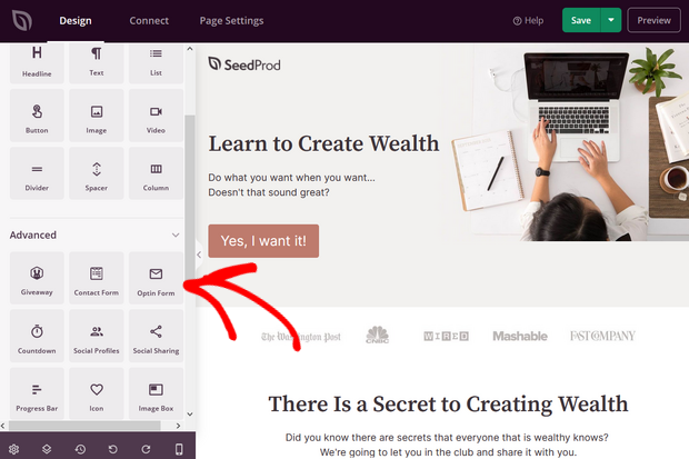
Simply drag ready-made landing page blocks and drop them into place to create a custom high-converting sales page. You can add blocks like optin forms, contact forms, buttons, images, videos, countdown timers, star ratings, and much more.
15. Use Responsive Design
With mobile devices responsible for 60% of holiday shopping traffic and 42% of holiday purchases, you’ve got to make sure your sales page still works on small screens.
That’s where responsive design comes in. It’ll make sure your page resizes (and still looks good) no matter what size screen your visitor uses.
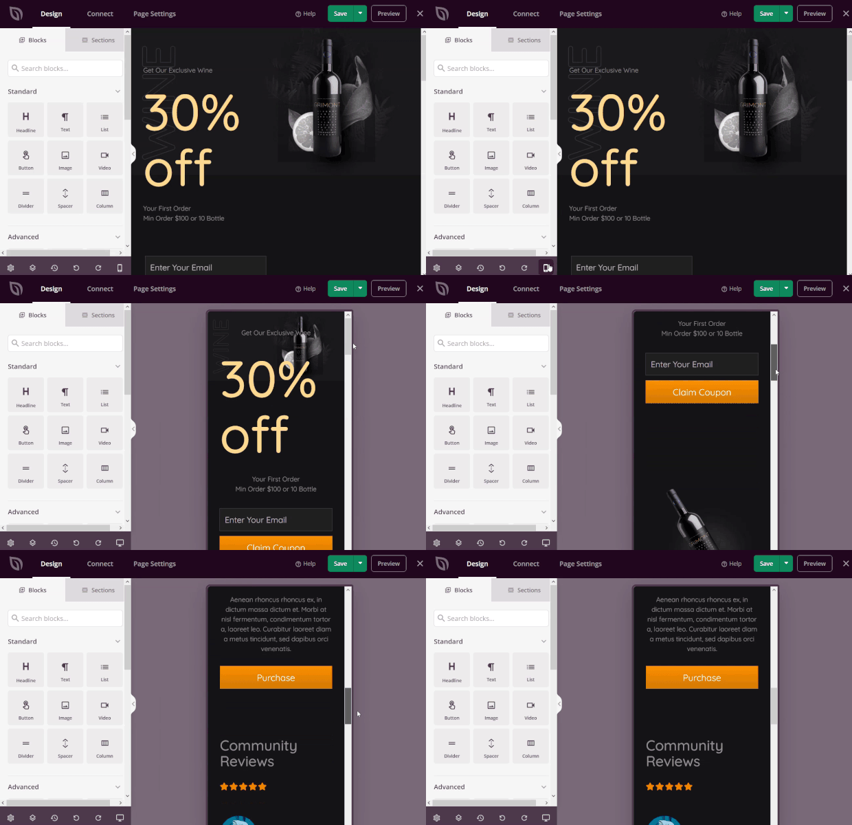
Luckily, if you use SeedProd, any page you create will be responsive and mobile-ready.
For example, here’s how a sales page made with SeedProd looks on a phone screen:
And when marketing your sales page, you can use OptinMonster for well-designed, responsive mobile campaign templates that make your sales page even more effective.
Here’s how you create a high-converting mobile popup.
16. Make a Clear Offer that Impels Action
Finally, your sales page can’t do its job without a clear call to action.
Remember, your visitors are only interested in WIIFM (what’s in it for me?), so now’s your chance to tell them again.
It’s the sentence that’s going to seal the deal for you, such as this one on Envira Gallery.
It reminds people that publishing is quick, and it’s a great way to showcase photos in one tidy sentence that sits next to the CTA button.
17. Use Multiple Calls to Action
Look at any sample sales page, and you’ll likely see at least three CTA buttons, maybe even more, depending on the length of the page.
The purpose is to make it easy for visitors to buy at whatever point they become convinced.
At the very least, you’ll have a CTA button at the top of the page where your headline and summary copy is. And at the end of the page, you’ll also include a button anywhere you give a compelling reason to buy.
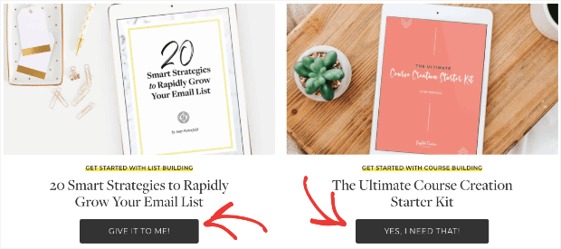
Amy Porterfield, for example, has a few calls to action to get users to begin a relationship with her:
But as you scroll down the page, you see more CTAs along the way, each pushing you toward a sale.
A good CTA:
- Shows the benefit of clicking
- Uses action words and power words
- Highlights value
For help with getting your CTA just right, read our guide to writing the perfect call to action.
Finally, you can add a few finishing touches to compel your readers to take action if they’re still on the fence …
18. Make It Urgent
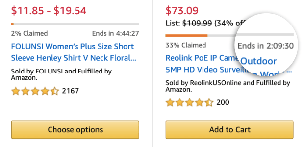
If you really want your sales page to convert like crazy, you’ve got to use urgency. Human beings hate missing out on anything, and a time-limited offer fuels that fear, increasing conversions and sales.
You can have time-based urgency, where there’s a discount or offer that’s only available for a short time. And then there’s scarcity-based urgency, where there’s a limited supply of whatever’s on offer.
Amazon uses scarcity-based urgency all the time by highlighting products that are about to be sold out in red, by showing when deals are almost fully claimed, and adding a countdown timer for deals:
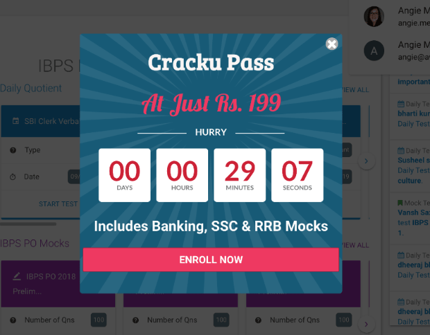
You can do the same on your sales page by using an on-page countdown, or by using OptinMonster to create a countdown popup. Here’s an example used by a Cracku:
With this little popup, Cracku was able to increase conversion by 300%. Just imagine what a countdown timer can do for your sales pages, too!
19. Use Exit-Intent®
Sometimes, visitors need a little extra help, or can’t find the information they’re looking for. When this happens, you can save the sale by prompting them to get in touch with you before they leave the site.
One of the best ways to do that is to use OptinMonster’s Exit-Intent® technology, which detects when people are about to leave and shows your campaign at just the right time.
We use it here on the OptinMonster site to encourage visitors who’ve been browsing for a while to ask us their questions:
This is a powerful tool for re-engaging customers who are leaving your sales page.
And that’s all! By putting these tips into practice, you’ll see a boost in your conversions and your bottom line.
To help you even more, we’ve lined up a few more sales page examples you can use as inspiration.
Sales Page Examples
Sometimes, one of the best ways to figure out, “what is a sales landing page?” is stepping away from the theory and seeing some live examples.
Here are 5 short examples of great sales pages.
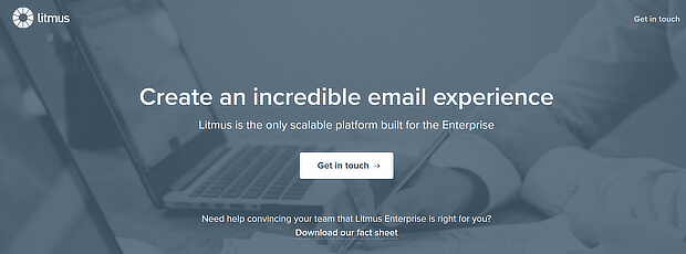
1. Litmus
Litmus keeps it simple with a clear statement of purpose and a subhead that underlines its advantage. The page includes two CTAs. Can you spot them?
The calls to action here are Get in touch and Download our fact sheet. Both will lead you toward purchasing one of their products.
2. Sterling and Stone
Sterling and Stone uses three boxes to segment its users, so they’ll end up with the right information for their needs. That sets the subsequent landing pages up for higher conversions:
3. Udemy
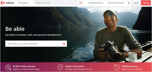
Udemy keeps the headline and subhead short, and shows its key benefits in a band in a contrasting color further down the page:
The colors for the main image draw the eye to the box What do you want to learn? to get you started. They’re leveraging one psychological trick by marketers that suggests once a user starts a process, they’re more likely to finish.
When potential visitors start searching for courses, they’ll be one step closer to signing up for Udemy’s services.
4. The Productize
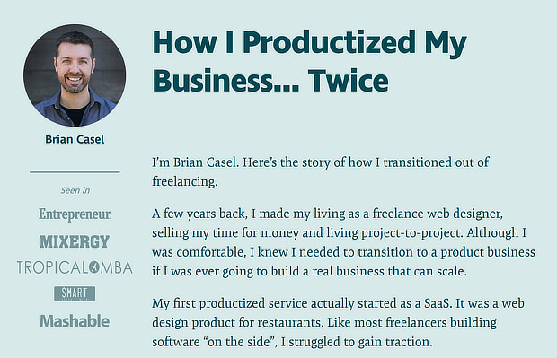
The Productize about page uses storytelling, but also builds trust with a photo and logos of companies the writer has worked with:
This is a great sales page template for entrepreneurs who sell a personal service like Brian Casel.
5. CloudApp
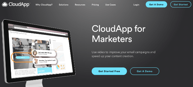
CloudApp’s sales landing page highlights key features, reinforced with attractive images:
At the top of the page, they have their calls to action. You can either get started for free (which is a great value proposition) or get a demo. The emphasis, however, is on the call to action that will more likely lead to an eventual sale.
That’s it. With these resources and sales page examples, you can head off and build your own!
But now, let’s take things one step deeper. Let’s build a sales letter funnel that allows you to upsell your other products and increase your total revenue.
How to Create a Sales Letter Funnel
The term “sales letter” was introduced by Russel Brunson, entrepreneur and founder of ClickFunnels. In laymen’s terms, a sales letter is simply a long sales page. It has tons of information about your product, it’s benefits, and usually has some back story about why it was created.
Using all the tools from this post, you’re ready to build a sales page that converts. Now, we want to put that long-form sales page to work in a finely-tuned funnel that drives sales.
You’ll need a few things:
- A product to upsell that is at a higher price point than your original offer
- A product to downsell that is at a lower price point than your upsell, but more expensive than your original offer
Without those two things, your sales letter funnel won’t work. So make sure you have them before getting started.
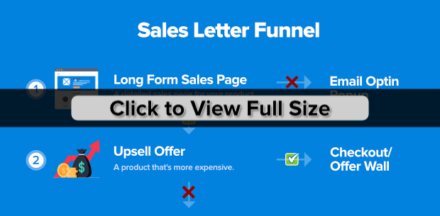
Here’s an overview of what your sales letter funnel will look like when it’s done:
You may notice that a sales letter funnel is similar to a 2-step tripwire funnel. And you’re right. The biggest difference is in the initial offer.
In a 2-step tripwire funnel, you offer a low-ticket item that’s nearly impossible to turn down.
With a sales letter funnel (which we’ll cover today), you aren’t using a low-ticket offer as bait. You’re using any product that you have a custom sales page built for.
Ok, now let’s break things down a bit.
Once your visitors reach your sales page, they’ll move to purchase the item. Once they’ve made their purchase, they get a one-time offer for a related product at a higher cost.
That’s your upsell.
At this point, your visitor has 2 options:
- Purchase your upsell
- Pass on the offer
If they purchase your upsell, congrats! Now they go to the offer wall (receipt) and flow into your email marketing funnel.
NoteYour offer wall is a confirmation page that has related products on it, which your customers can choose to buy as well. It’s simply another form of upselling through your confirmation page.
If they decide to pass on your upsell offer, however, you show them another one-time-only offer at a price lower than the product they just saw, but higher than their initial purchase.
That’s your downsell.
Again, they can either make the purchase or choose to move on.
The good news? Regardless of if your customers make a follow-up purchase, they’ll still be added to your email list from the initial sale.
That way, you can reach out to them for seasonal offers, online courses, product launches, and so on.
Plus, creating a sales letter funnel is easy with OptinMonster. All you need to do is build a Yes/No campaign, make a few modifications to its design, and trigger it from your first product’s confirmation page.
And in just a few moments, that entire process will be crystal clear.
Creating the Upsell Offer
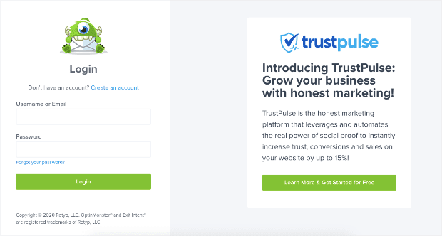
Head over to your OptinMonster account and log in:
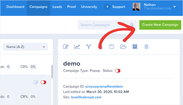
Then click Create New Campaign in your dashboard:
Select your campaign type. For a sales letter funnel, your best bet is with a popup or fullscreen campaign. Both of these are excellent at grabbing your customer’s attention.
Let’s use a popup campaign for this tutorial:
Select your template. Since you can build Yes/No campaigns out of any template with OptinMonster, choose whichever template suits your needs best.
For today’s tutorial, we’ll use the Magnet template:
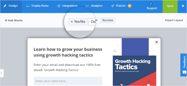
Once you’ve named and assigned your campaign to a website, you’re ready to start editing. The first thing you’ll want to do is activate the Yes/No feature of the campaign.
At the top of your editor, locate and click the Yes/No button:
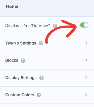
Then in the left-hand side menu, click the toggle switch next to Display a Yes/No View:
Now you can edit your Yes/No view to function as a sales page for your upsell.
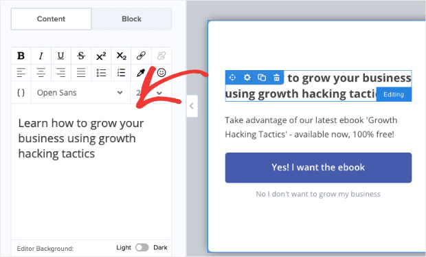
We won’t be getting into how to edit your campaigns in this tutorial. Luckily, OptinMonster’s editor is very intuitive. You simply click on any element you’d like to edit and change it in your left-hand side editor:
Or you can drag and drop different elements if you want to add something to your campaign like video, images, icons, text, and so on.
If you need more help, don’t worry. Just read this short article from our documentation to learn how to create your first campaign.
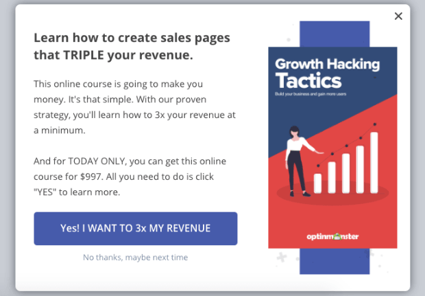
Here’s a quick example of an upsell sales page we created in under 5 minutes for this tutorial:
Remember, your campaign should look at little different. Well, it should actually look a lot different.
Spend some time to craft your message and use language that connects with your audience. Even though this is a popup campaign, it’s acting like a sales page.
So use the best practices you learned in this article while creating it.
When you’re happy with your upsell campaign design, you’re ready for the most important step:
You need to link your Yes and No buttons to specific pages.
Your Yes button should be linked to another sales page for your upsell product or directly to a checkout page. So if your user clicks Yes, they’ll be finished with this campaign.
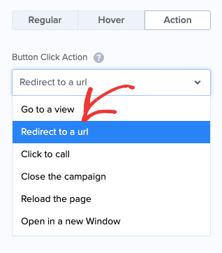
To do that, simply click the Yes button element in your campaign editor. Scroll down to click Action in the left-hand side menu.
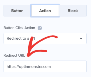
Select Redirect to a URL under Button Click Action:
And enter the URL of your upsell sales page in the Redirect URL field:
But if your user clicks No, what happens?
This is one of the most important parts of your sales letter funnel.
Because by default, if your customer clicks No in your campaign, then the entire popup will close. But since we’re building a sales letter funnel, we want to change those settings.
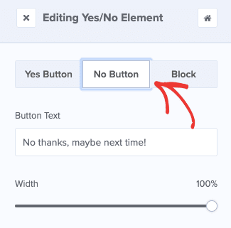
Click on the Yes/No button element in your campaign editor to pull up the editing options on the left-hand side. Then click on No Button:
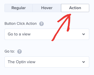
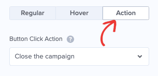
Again, scroll down to Action:
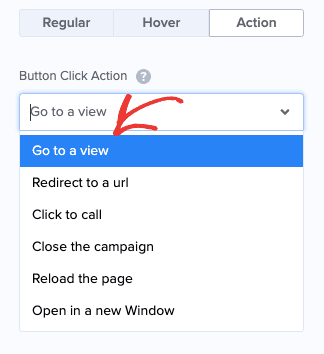
And change the settings under Button Click Action to Go to view:
This means that when your customer clicks your No option, they’ll be redirected to your downsell.
Speaking of which, let’s edit your downsell offer.
Creating the Downsell Offer
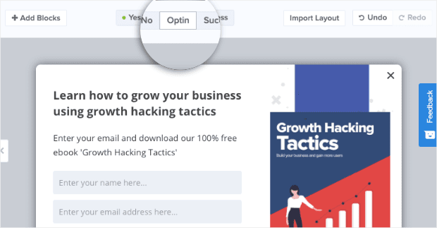
At the top of your editor, locate and click the Optin View button:
Remove the optin field in this campaign. Remember, you already have your customer’s email address if they’re seeing this campaign. You likely got it when your client made their initial purchase.
Redesign your Optin view to function as another sales page for your downsell product.
Again, follow all the best practices on creating a sales page that converts from earlier in this article. You can add videos, testimonials, reviews, or anything else that will make your product more appealing.
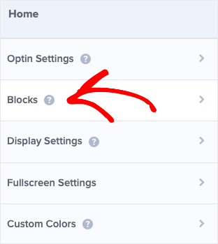
Then, at the bottom of your campaign, add a Yes/No block. You can do this by clicking Blocks on the left-hand side of your editor:
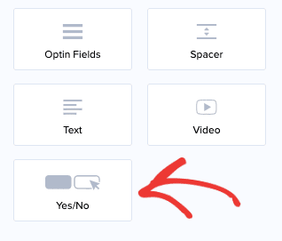
Then scrolling down to the Yes/No block:
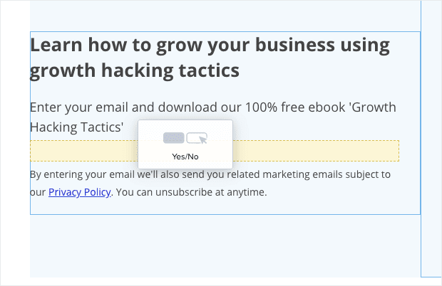
And drag and drop it into your campaign:
This Yes/No button allows you to redirect customers to a sales page, a product page, or to close the campaign altogether.
In other words, you’re recreating the sales page you made for your upsell but for a different product.
As you did earlier, make sure to edit your Yes button option to redirect to your sales page or product page.
The only difference is that you don’t need to change your No button’s action this time. By default, it will simply close the campaign, which is exactly what you want.
Once you’re happy with the copy and design of your upsell and downsell campaign, there’s just one more thing to do.
Link Your Campaign to the Original Offer’s Confirmation
In this article, we taught you how to create a sales page that converts like crazy. Now, you’re ready for the final part of creating a sales letter funnel that will drastically boost your sales.
First, it’s important to understand who we want to see this upsell and downsell campaign:
Customers who made a purchase from your original sales letter.
That means you need to link this campaign to a confirmation page from that purchase. Most confirmation page URLs have 2 parts:
- A fixed URL
- A unique slug that is assigned to each purchase
For this portion of the tutorial, you simply need the fixed URL of your original offer’s confirmation page.
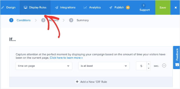
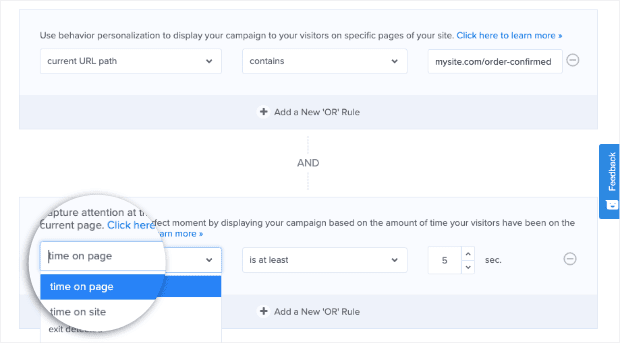
Ok, now we’re 100% ready to put everything together. Go to the top of your OptinMonster editor and click Display Rules:
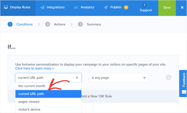
Under your If condition, change the first field from time on page to current URL path:
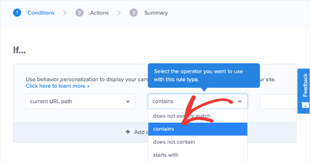
Change the next field to contains:
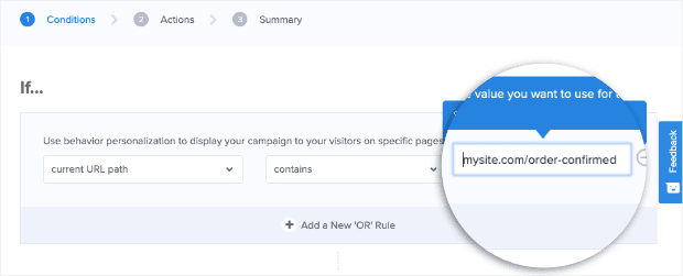
And type in the fixed portion of your confirmation page’s URL:
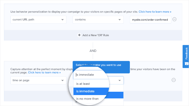
Scroll down a bit to your second condition, which is how long your visitor needs to be on the confirmation page to trigger the upsell:
And change the next field from is at least to is immediate:
That’s it! All that’s left is to publish and save your campaign. Now, here’s what will happen with your funnel:
- Your customers will see your first sales page that is super awesome because you used the tips from this blog post
- They’ll buy the product and get an upsell campaign at the confirmation stage
- Clients who purchase the upsell product will go through to checkout
- Customers who decline the offer will get a one-time-only downsell offer
- This group will be redirected to checkout (if they click Yes) or the campaign will close (if they click No)
Either way, everyone will be added to your email list for future sales.
We really hope you had as much fun reading this article as we had writing it. If you’re interested in these types of marketing tips, we’ve got lots more for you.
A great place to start would be with our articles on boosting eCommerce conversions and improving eCommerce email marketing.
And now let’s pass the conversation over to you:
Do you have any cool sales page tips or tricks to share?
If so, reach out to us on Facebook, Twitter, or in the comment section below. We’d love to hear from you.
But if you’re more of a visual learner, we’ve got you covered there, too. Head over to our YouTube channel for tons of cool videos on how to boost your conversions and increase sales.
Want to build awesome funnels like we covered in this tutorial and make more money in less time? Join OptinMonster today risk-free with our 14-day money-back guarantee.











Add a Comment