What do you get when you cross the unassuming and good-natured slide-in campaign with impossibly powerful display rules?
Conversion gold, friends. Let us show you what we mean.
Slide-in campaigns are often overlooked for their much louder, life-of-the-party sibling, the popup. But the truth is slide-ins can be incredibly powerful tools for converting engaged visitors into subscribers and customers.
They’re more polite, less intrusive, and don’t annoy visitors by covering up the content they’re trying to read. Slide-in campaigns make it easier to:
- Leave visitors alone until they’re already engaged in your content
- Let visitors get value from your site before you try to offer or sell them something
In this post, we’ll show you how to get more leads and sales from your own scroll-triggered slide-in campaigns with 11 hacks to help you really target your audience.
Plus, we’ve broken down the steps to creating your first slide-in campaign so you can start taking advantage of this clever tool even if you’ve never created an optin before.
1. Target the Right Scroll Depth the Easy Way
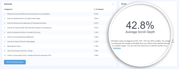
If you want to know how far visitors are scrolling down on your blog articles and landing pages, MonsterInsights is the easiest way to find out.
Sure, you could do the same thing with Google Analytics, but do you really want to mess around with installing Google Analytics and the Google Tag Manager on your website, then still having to set up a scroll depth trigger?
Sounds exhausting.
Fortunately, with MonsterInsights, you can install the plugin and scroll depth tracking is ready to go. If you want to make sure you’re all set, go to Insights » Settings » Engagement in your WordPress menu.
Once you’re all set up, you can check your scroll tracking stats in the MonsterInsights Publishers Report page by going to Insights » Reports » Publishers from your WordPress dashboard. The report shows up at the bottom of the page, next to the Interests section.
For an in-depth look at the scroll depth tracking feature from MonsterInsights, check out How to Use Scroll Tracking in WordPress with Google Analytics.
Now you know exactly how far your readers scroll which means you can add scroll triggered boxes at the perfect place!
2. Target High-Value Users With Two Display Rules
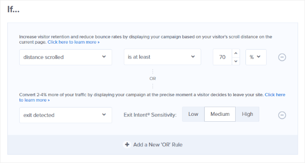
We start with the low-hanging fruit. By combining two OptinMonster display rules, scroll detection, and exit intent, you can target visitors who’ve shown interest in your content but are about to leave your site for good.
It’s no surprise that showing offers to those most likely to convert results in higher conversions.
You can target these visitors easily with OptinMonster’s display rules, which allow you to precisely target and trigger your campaigns.
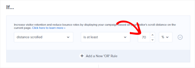
To set this up, go to Display Rules » If… distance scrolled » is at least and set it to a high percentage like 70%. This will allow you to target those who are truly engaged with a particular page.
Then, click + Add a New ‘OR’ Rule, select exit detected from the dropdown, and choose the sensitivity you want. This will trigger your pop up box or slide in to show up just as visitors are about to leave your site.
When visitors meet both conditions, they’ll see your offer. We’ve seen many customers get an extremely high conversion rate with this combination, with at least one-third of visitors taking their offer.
3. Combine Multiple Rulesets
As we mentioned in the last tip, one way to boost conversions from scroll triggered boxes is to use multiple display rules to focus on high-value users who are most likely to convert.
In the last example, we showed how you could combine rules within a single ruleset.
But you can also use more than one ruleset with OptinMonster. This allows you to show your scroll box campaign to visitors who meet either of the conditions, instead of both.
It also gives you multiple chances to win your visitor over.
For the default ruleset, enable the scroll trigger as described in tip #1.
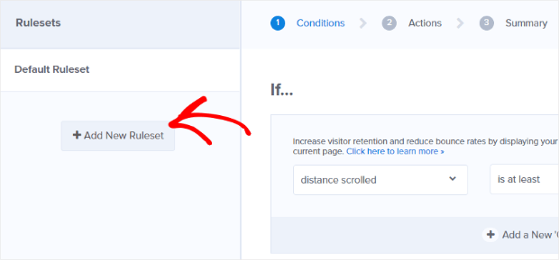
Then click on Add New Ruleset.
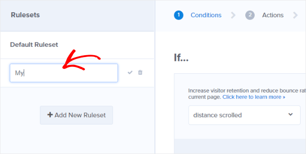
You’ll see a text box where you can give your ruleset a name.
Once you save the ruleset you’ll be ready to add new display rules in that ruleset.
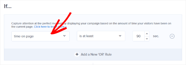
For example, go to Display Rules » If… time on page » is at least and put in 90 seconds. This way, the optin will appear in the situations you set up in your first ruleset (70% scroll, on exit-intent) and it will also appear if the user has been on the page for at least 90 seconds.
Your campaign will display either when people have reached the scroll percentage you’ve set, OR when people are about to leave.
4. Give Visitors a Choice With Yes/No Campaigns
While too much choice can be overwhelming, reducing choices to just two is a definite conversion booster. And believe it or not, having two choices is more effective than having just a single option.
That’s because of the “Zeigarnik Effect.”
People who start a process are more likely to finish it. Since visitors only see the campaign after clicking the Yes button, that makes them more likely to take the next step, and enter their email address.
And there’s more: when you give people a choice, the feeling that they’re free to choose makes them more likely to make the choice you want. Isn’t that just delightfully clever?
Another reason this hack is so successful is that you’re not just marketing to people who’ve demonstrated their interest by scrolling. You’re also providing two calls to action, giving you two opportunities to win conversions.
OptinMonster customers have successfully combined scroll triggered boxes with Yes/No buttons to achieve huge increases in conversions.
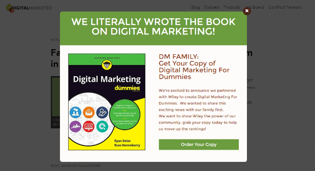
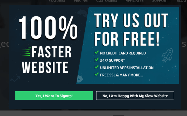
For example, Digital Marketer got a 7.9% conversion rate for its campaigns by changing the scroll percentage and using Yes/No buttons.
And Cloudways combined a 50% scroll trigger with Yes/No buttons to increase conversions by 1700%.
Here’s how you can put this hack in place. First, go ahead and change the scroll percentage as described in tip #1.
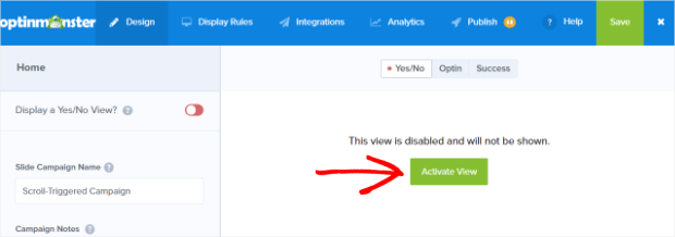
Now, let’s activate Yes/No view by going to the Yes/No tab and clicking on the Activate View button.
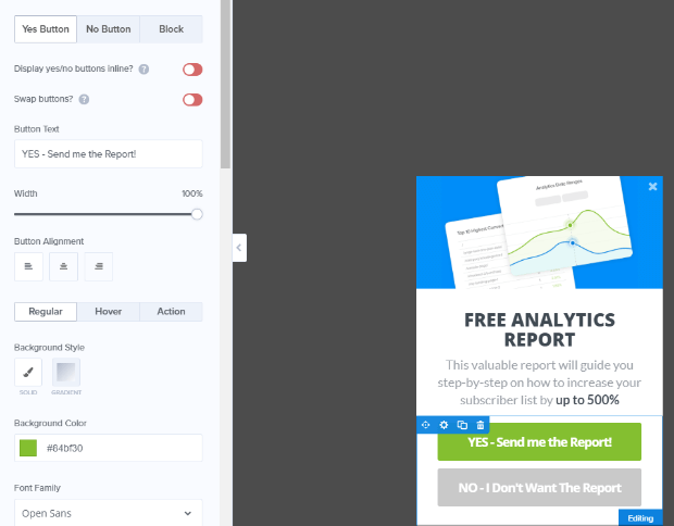
Click on the Yes Button in the live preview section (the right side of the screen) to bring up the editing tools in the lefthand panel.
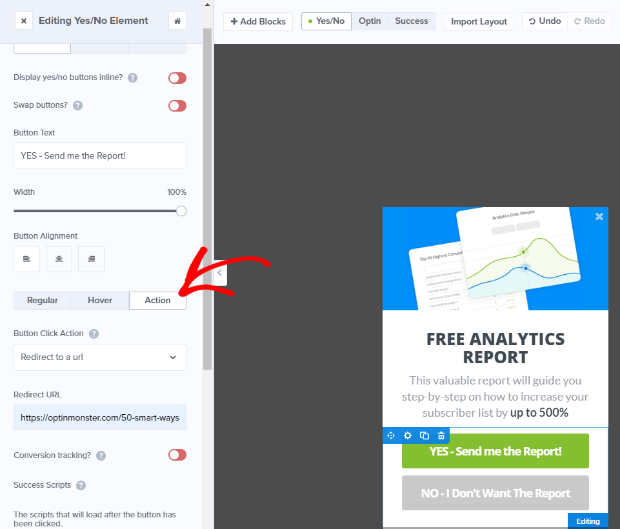
Choose a Yes Action. For example, you can redirect visitors to a new page, and show another offer there.
Then, edit your No Button the same way.
Save and Publish your campaign.
5. Segment Your Audience
Here’s another cool way to use Yes/No buttons: to segment your audience.
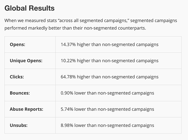
Segmenting divides your subscribers into smaller groups, so you can send more targeted marketing campaigns to each segment. According to MailChimp, email list segmentation results in 14% more opens and better results all around.
With Yes/No buttons, audiences effectively segment themselves. Once your email list is segmented, you can target different promotions to different groups, increasing conversion opportunities even more.
OptinMonster customers have successfully used yes/no optins to boost sales and improve lead generation.
Here’s how you could use this hack. We’ll use the example of someone doing restaurant email marketing, with different lists depending on whether patrons preferred eating in or takeout.
Create your campaign and set your scroll percentage as described in tip #1.
Go to the campaign builder and enable the Yes/No buttons, as in the previous tip.
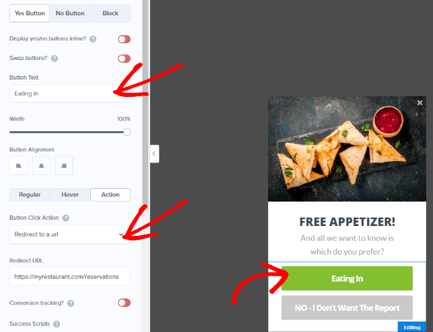
Edit the Yes button to say Eating In. Change the Yes redirect URL to the reservations page.
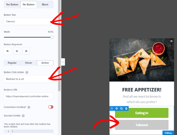
Use the same method to edit the No button to say Takeout. Change the No redirect URL to the landing page for online orders.
Adding a deal in exchange for participation in the self-segmenting process tends to grease the wheels a bit. ?
Like the look of this slide-in optin? Check out these high-converting ways to use slide-in optins to boost conversions.
6. Boost Social Media Subscriber Numbers
Social media can be a huge referral source for online business. That’s why increasing your social media audience can also help to increase conversions.
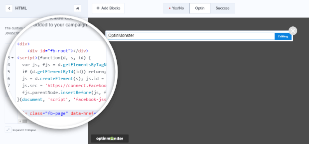
One way to do this is to combine a scroll trigger with a Facebook Page box. This shows a snapshot of your Facebook page to people who are already interested and makes it easy for those visitors to take the next step in connecting with you.
Here’s how you do it.
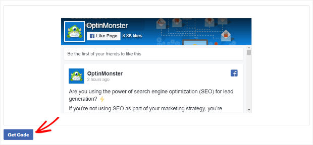
First, go to the Facebook Page Plugin generator and type in the URL of your Facebook page. Edit your page display settings as desired, then grab the code with the Get Code button.
Next, you’ll need to use OptinMonster’s Canvas template with your chosen campaign type. Here’s how you create a campaign in Canvas.
Go to the campaign builder and select the Optin tab. Scroll down and paste the code into Canvas Custom HTML field.
Enable the scroll trigger as described in tip #1. You now have a Facebook page box that shows only to visitors who have scrolled.
Want to do the same for Twitter? Here’s how you can create a Twitter follow campaign in Canvas.
7. Avoid Annoying Regular Visitors
You know what really annoys your website visitors?
Content that’s irrelevant to them.
Almost two-thirds of people prefer to see relevant content, and many leave if they’re not convinced content meets their needs.
One kind of content that’s definitely irrelevant is a campaign your visitors have already seen and ignored. If you want to pique their interest, you’ll need to show them something new.
Luckily, there are several ways to do this when creating scroll triggered boxes in OptinMonster.
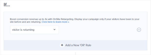
One of the easiest ways to show special promotions to returning visitors is via OptinMonster’s display rules.
Go to Display Rules » If… visitor is returning
Select is returning to show different scroll triggered boxes to returning visitors. For example, if your visitors are interested in technology, you can use MonsterChains to show them subsequent campaigns featuring a series of cool gadgets.
Another way to achieve this is via OptinMonster’s Smart Success feature. Smart Success lets you present special content and offers to people who’ve already opted in.
You can use Smart Success to:
- Tell new subscribers how to whitelist your email address so they get your emails.
- Deliver a download immediately.
- Show video content
- Customize your success message
Here are some more tips on using OptinMonster’s Smart Success feature.
There are also about a million other ways you can show or not show campaigns to visitors: based on cookies, if they have or haven’t opted into a campaign, or even if they’ve seen another campaign!
8. Create Page-Specific Offers
To get incredibly high conversions, make your scroll triggered boxes relevant to the content visitors are viewing at the time.
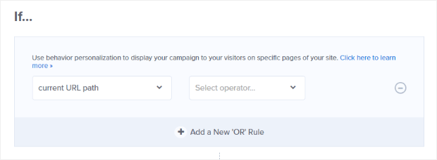
The best way to do this is with OptinMonster’s page level targeting feature. Instead of displaying a generic offer for an item on sale, trigger a specific offer or coupon for the item people have been looking at after they’ve scrolled down the page to demonstrate their interest.
To do this, enable the scroll trigger as described in tip #1.
Then go to Display Rules » If… current URL path is and select your criteria from the dropdown.
You can include or exclude your site’s homepage, and can also include or exclude particular URLs.
OptinMonster users say that page level targeting increases the effectiveness of their email marketing, with higher open and click-through rates. Learn more about how page-level targeting improves conversion rates.
9. Target Visitors in Particular Locations
Still on the subject of relevance (can you tell that being relevant is kind of a big deal?), we’ve got one more cool hack for you: targeting your campaigns by location and timezone.
This lets you switch out your scroll triggered boxes depending on where your visitors are. For example, people celebrate different year-end holidays, so you could show different boxes for Christmas, Hanukkah, Kwanzaa, and Diwali.
To change location and timezone rules, go to Display Rules » If… visitor’s location and from there you can target visitors whose location is/is not a particular location or include/exclude visitors in the EU.
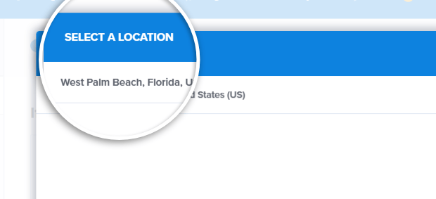
Select is from the dropdown, then type the desired location into the onscreen text box. Press Validate.
The validation box will pop up so you can select the location. Click on the location you want.
As we mentioned, you can also exclude countries using this display rule. For example, you might want to show Thanksgiving messaging in the US, but show a different campaign for visitors from other countries. To do this, simply select is not, enter the country name, and use the validation process described above.
10. Split Test Your Campaigns
Split testing is an essential part of conversion optimization. That’s why it’s built right into OptinMonster.
Done right, split testing can give you a HUGE boost in conversions. Escola EDTI used split testing to get a 500% increase in conversions. And Logic Inbound boosted conversions by 1500% by using split testing to improve their campaigns.
When using split testing, you can test:
- Headlines
- Images
- Body copy
- Calls to action
- Literally anything
To split test your scroll triggered boxes, go to the OptinMonster dashboard, and find the campaign you want to test.
Click on the three dots on the right to show a dropdown menu.
Select A/B Split Test to see the split test creation screen.
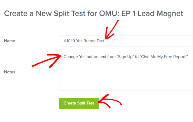
Give your split test a name, and add some notes about your planned changes. For example, you could say “scroll box campaign – new headline”.
Click the Create Split Test button. That will create an exact copy of your existing campaign, and take you to the campaign builder to edit it.
Edit the element you want to test. Save and Publish the campaign.
Your split test will run automatically, and you’ll be able to compare conversion rates for both versions in your OptinMonster dashboard.
Learn more about creating split tests and avoiding split testing mistakes.
11. Use Urgency
One of the best ways to skyrocket conversions for scroll triggered boxes is to use urgency.
Urgency is part of a powerful psychological trigger called the fear of missing out (FOMO). Basically, humans don’t like missing out on the good stuff and hate the thought that something they want will disappear before they can get it.
That’s why smart marketers use time-limited offers.
To use urgency with scroll triggered boxes, enable the scroll trigger as shown in tip #1.
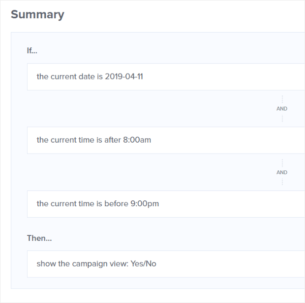
Then go to Display Rules » If… the current date and select the option you want from the dropdown. You can choose a single date, a date before or after a single date, or a date on or before or on or after a single date.
Use is on or before or is before to set an end date for your campaign. You can also combine that with is on or after or is after to set both start and end dates.
Make sure your campaign copy says that it’s a time-sensitive offer. You can also create a countdown timer campaign to hack your conversion rate even more.
Learn more about scheduling your campaigns with OptinMonster.
That’s it! Ten hacks for scroll triggered boxes that’ll help you convert more visitors into subscribers and customers.
If you’re excited about trying them with your own scroll boxes, here’s how easy it is to create your first one:
How to Create a Scroll Triggered Box (Step by Step)
1. Create Your Campaign
Login to your OptinMonster dashboard.
Choose a campaign type. We’re using the OptinMonster Slide-in campaign for this tutorial.
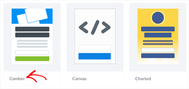
Select a template. We’re using the Camber template.
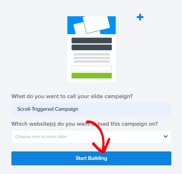
Name your campaign and press Start Building to go to the campaign builder.
2. Customize Your Campaign
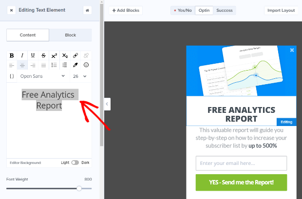
Next, it’s time to customize your campaign. The campaign builder loads with a pre-filled example, but you’ll want to change that to match your offer and brand.
Select the headline and type to change it to the headline you want. This is the most important feature or benefit of your offer.
Edit the body copy in the same way.
If your theme has an image, click on the image box, then upload the image you want. Stuck for inspiration? Check out 39 Places to Find Images for Better Conversions.
You can also change your campaign’s color scheme. Just click on the item you want to edit in the live preview to bring up the editing tools.
3. Set Up Your Success Action
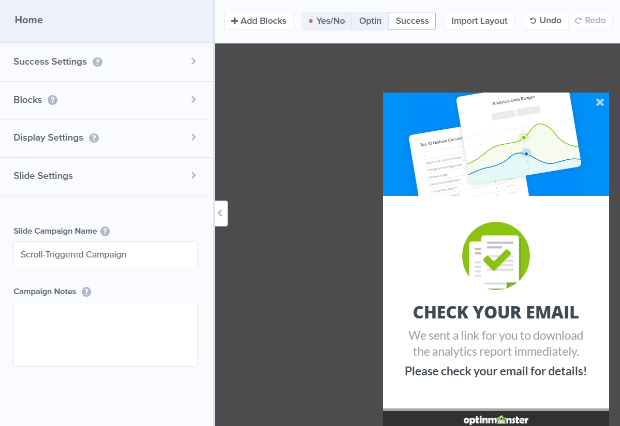
Next, you’ll need to decide what people will see when they opt in to your campaign. Go to the Success tab. That will show the default success message, success action and success theme. Each template has its own professionally designed Success view that you can customize just like the Optin and Yes/No views.
4. Enable Display Rules
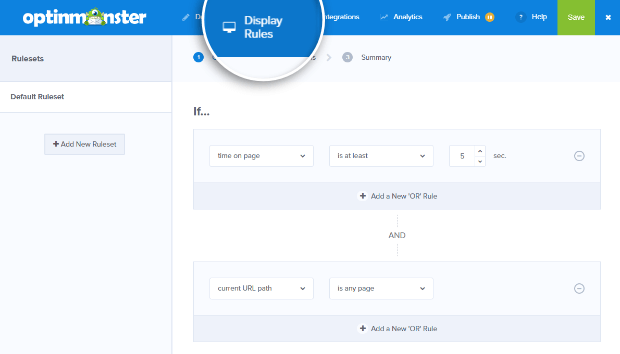
To schedule your marketing campaign, go to Display Rules. The default rules are to display your optin after the visitor has been on the current page for at least 5 seconds.
However, as we’ve seen above, you can change the display rules as needed to increase conversions.
5. Publish the Campaign
Finally, save your changes and publish your scroll box campaign. Click on the Publish button to see publishing options, then click on the status button to make your campaign live.
To use your scroll triggered boxes on a WordPress site, you’ll need to install our WordPress plugin, and make your campaign live.
You can also use OptinMonster’s sitewide embed code. Grab this by clicking on a button in the campaign builder. Install the code by following this guide, or give it to your web developer for installation.
You can also embed your new marketing campaign with the campaign-specific embed code, or use a shareable MonsterLink.
That’s it!
If you enjoyed these tips on maximizing conversions from scroll triggered boxes, check out our guide on how to create a popup coupon that boosts sales.
Not using OptinMonster yet? Get started today and start converting more visitors into subscribers and customers!














Add a Comment