Do you want to create mobile optins for your audience, but you’re not sure how to get the highest conversion rates?
Every year, more online consumers visit their favorite stores from their mobile devices. And yet, too many business owners are still only optimizing their optin campaigns for desktops.
That leads to poorly designed mobile popups and, ultimately, lower conversion rates.
That’s why, today, we’re going to teach you step-by-step how to create mobile optins that generate new leads for your business.
But before we dive into the tutorial, let’s take a quick look at why you should be optimizing your lead generation strategy for mobile.
Why Create Mobile-Optimized Optin Campaigns?
You need to make sure that your optin campaigns are mobile-optimized if you want to get the highest conversion rates possible from your audience.
That’s because the internet is increasingly taking a mobile-first approach. Take Google, for example. The most popular search engine on the planet recently announced that they’ll be indexing a site’s mobile content before the desktop version.
Why? Because more and more people are visiting their favorite sites and online stores from mobile devices.
It’s a trend that’s been growing for nearly a decade and doesn’t seem to be letting up any time soon. In 2016, eCommerce sales from mobile devices were just under $1 trillion. In 2019, that number grew to $2.3 trillion and is expected to reach over $3.5 trillion in 2021.
That’s why clever business owners have redesigned their site’s content for mobile–they don’t want to leave any potential revenue on the table.
But there’s another aspect that only the best eCommerce merchants understand: if they don’t want to leave any other conversions on the table (like email subscribers, webinar attendees, and so on), then they need to rethink their optin campaigns for mobile, too.
That’s where OptinMonster comes in:
OptinMonster is the world’s #1 lead generation software. It allows you to quickly and easily design optin campaigns specifically for mobile with zero coding skills required.
In just a matter of minutes, you can build an optin campaign that gets you new leads, higher conversions, and more sales. And you can make that optin campaign look stunning across mobile devices just as easily as you would for a desktop browser.
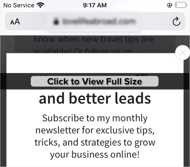
Here’s a quick peek at the demo mobile optin campaign we built for today’s tutorial:
Ready to get started? Just click below to sign up for your risk-free OptinMonster account:
How to Create Mobile Optin Campaigns
We understand that not everyone learns the same way. That’s why we also made this helpful video tutorial for visual learners:
Step 1: Select Your Mobile-Optimized Template
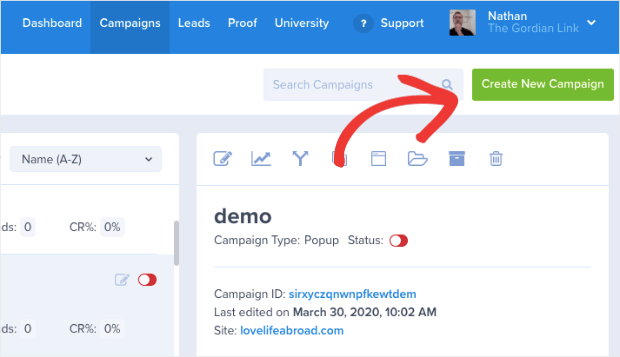
When you’ve signed up for OptinMonster, the first thing you’ll do is click Create New Campaign in the upper right-hand side of your dashboard:
Then you’ll need to select your campaign type. With OptinMonster, you’ve got loads of options, including:
- Lightbox popups
- Floating bars
- Slide-in scroll boxes
- Fullscreen welcome mats
And much more. You can make any of these campaigns mobile-first with the click of a button. So, today, we’ll go with a simple Popup campaign:
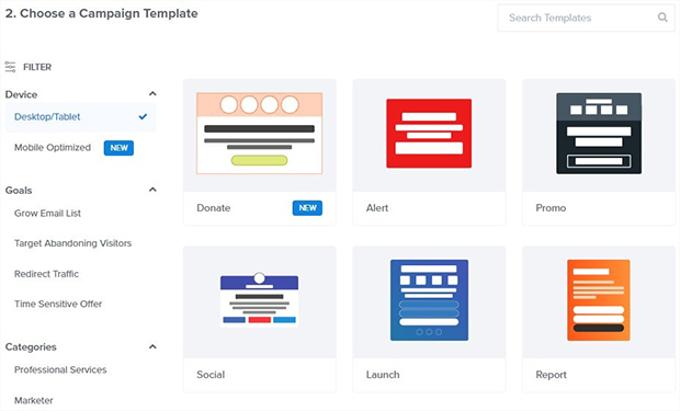
Now it’s time to select your template:
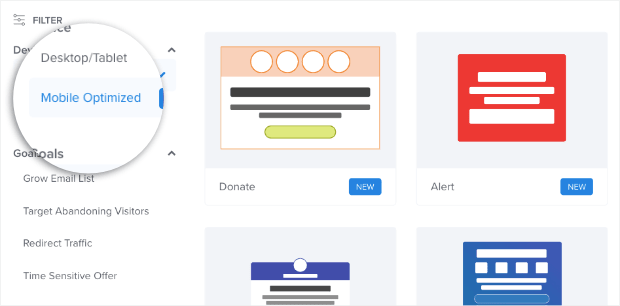
OptinMonster gives you over 50 pre-built templates to choose from, all of which look and work great across multiple devices. But we want to be mobile-first in design this time. Click Mobile Optimized in the left-hand side menu:
Doing this will now ensure that your optin campaign specifically works well across mobile devices. From there, creating your mobile-optimized popup is just like creating any other popup for your site on desktop!
That’s because all of our templates are now taking a mobile-first approach. We just need to select our template. Today, we’ll choose Basic:
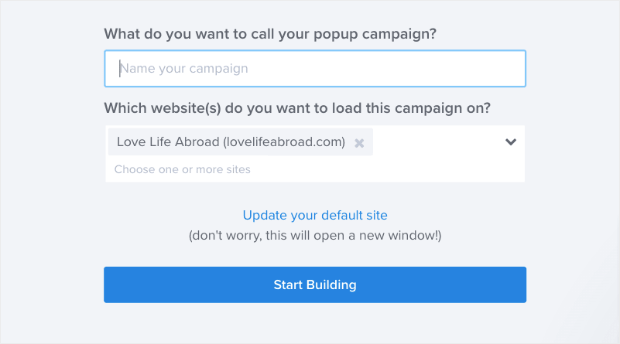
And then we need to name our popup, assign it to our website, and click Start Building:
Then we’ll be ready to design our mobile popup.
Step 2: Design Your Campaign
Like we said before, designing your mobile-first campaigns with OptinMonster is just as easy as designing campaigns for desktop.
OptinMonster’s drag and drop editor allows anyone to create beautiful and highly effective campaigns in a matter of minutes.
We won’t get into how to design every aspect of your mobile popup for this tutorial. That’s because there are too many customization options to cover in a single post.
If you need some help getting started, we recommend checking out this article: How to Create and Design Your First OptinMonster Campaign.
For today, you simply need to know the basics.
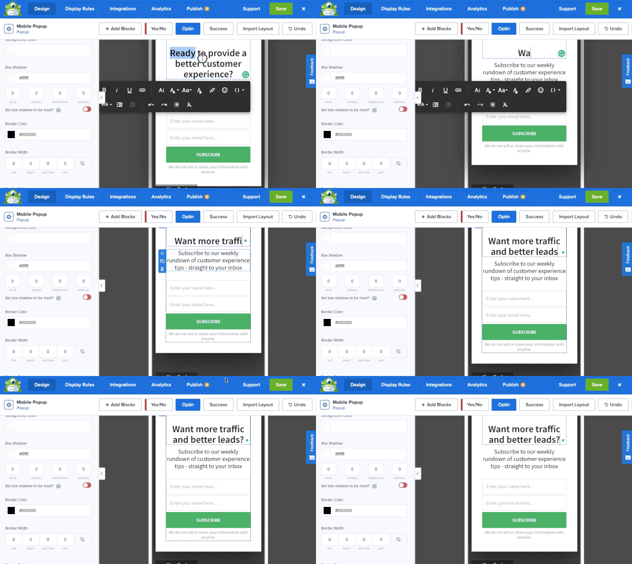
To change any text in your mobile popup, all you need to do is click on the text you want to modify. Then you can use our inline editor to make changes to the text in your campaign:
With the inline editor, you can change the:
- Text
- Font
- Size
- Color
- Alignment
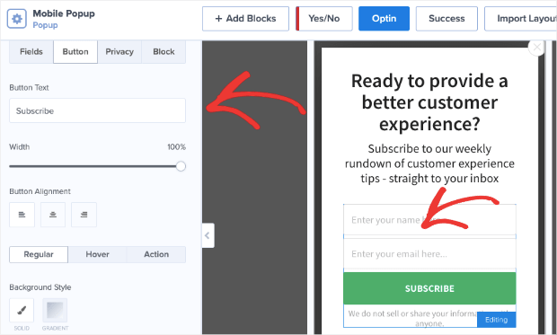
And much more. Then, if you want to change any other aspect of your campaign, you simply need to click on it in your editor. That will pull up the editing tools on the left-hand side:
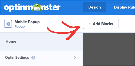
And if you want to add a new block element to your campaign, that’s no problem at all. Click + Add Block at the top of your editor menu:
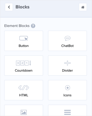
You’ll see a list of block elements you can add to your campaign, like:
- Button
- ChatBot
- Countdown timer
- Divider
- HTML
- And more
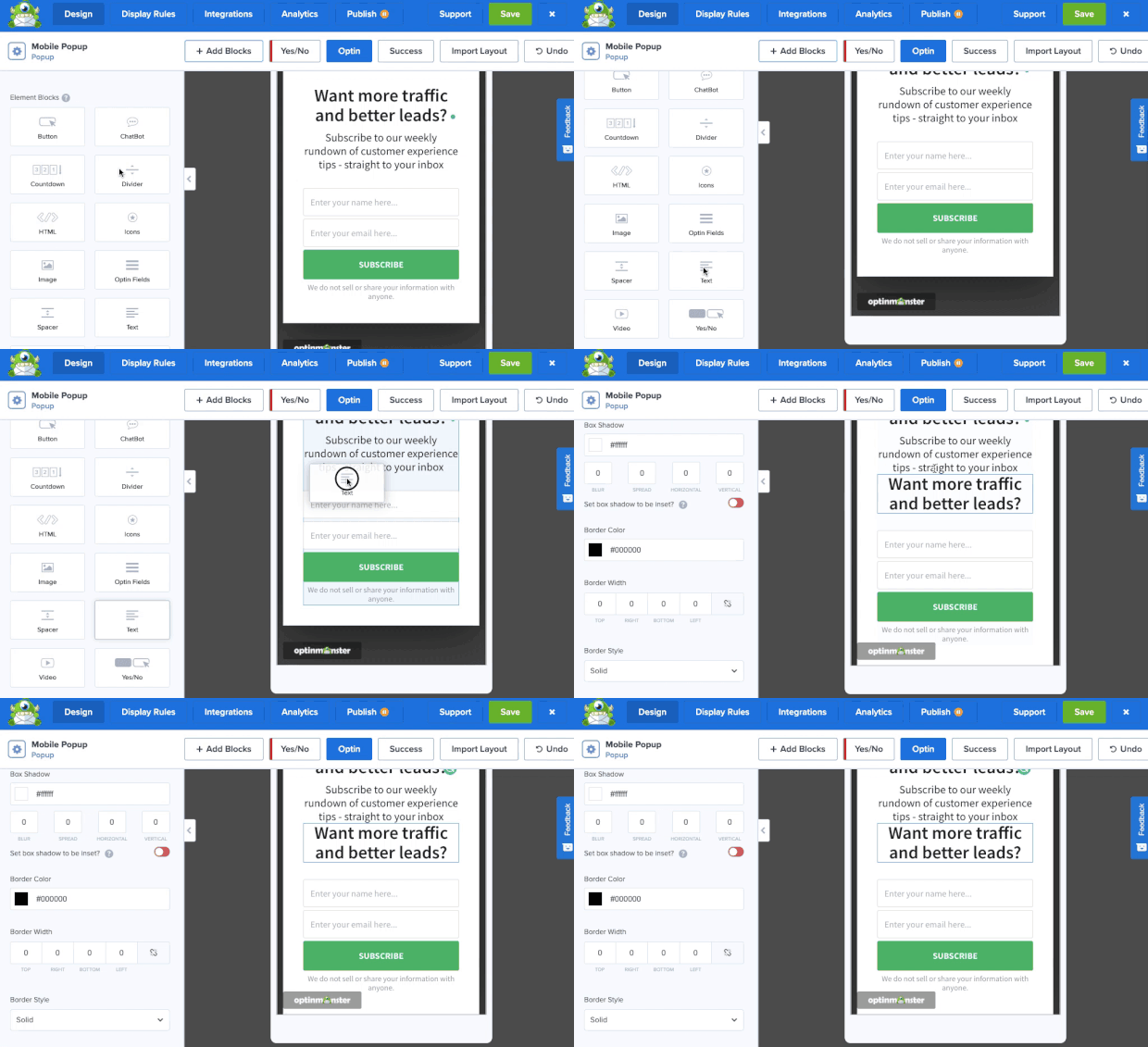
Select the new block element you want to add to your campaign, then drag and drop it into place:
And it really is as easy as that! Here’s the campaign we built for today’s tutorial:
This took less than 5 minutes to design and embed it on our site.
Once you’ve designed the perfect optin campaign for your company’s goals, it’ll be time to configure your display rules.
Step 3: Set Your Display Rules
Creating a mobile-first popup is one thing. But the trick is to make sure they’re only seen by your audience visiting from their smartphones.
Otherwise, you end up with people seeing ugly optin campaigns on their desktop (which is the opposite of the problem you were trying to solve in the first place!).
That’s why OptinMonster offers loads of display rules that you can use to show the right message to the right people at just the right time in their customer journey.
We have two types of rules you can use:
- Triggers
- Targets
Triggers rely on the user’s behavior to determine whether or not the campaign will appear. This would be things like how long the user is engaged with your content (Time on Page), how far down the browser page they scroll, or if they’re trying to leave your site altogether (Exit-Intent®).
These are just a few examples of triggers we offer, though there are many more.
Targets, on the other hand, will show your campaign based on the user’s profile or characteristics. This would be like where they’re physically located, what page they’re browsing, or what device they’re using.
Again, these are just a few examples that you can choose from.
Today, though, we’re going to create an exit-intent popup that can only be seen by visitors coming from mobile devices.
Start by clicking Display Rules at the top of your editor:
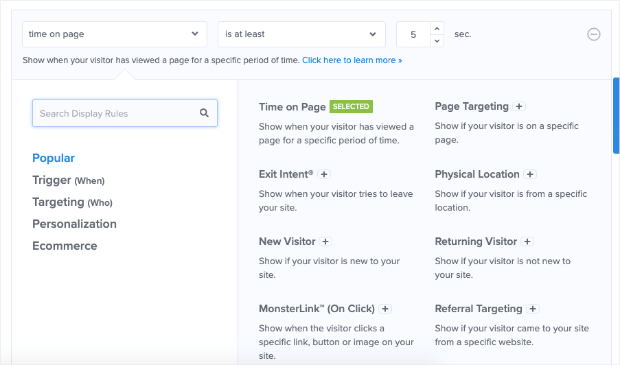
By default, your campaign will have two display rules set:
- Time on page is 5 seconds
- Your campaign will appear on every page
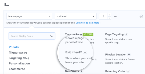
Click on the first rule (time on page) to pull up the display rule menu:
In the menu, locate and click Exit Intent®:
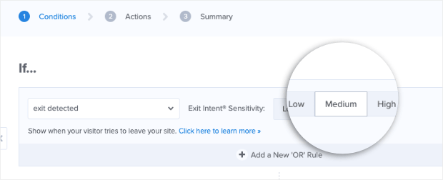
Remember, since you chose a mobile-optimized template, your campaign will only be shown to mobile devices by default. That means the next step is to set your exit-intent trigger’s sensitivity level.
For mobile devices, Low and Medium sensitivities will create a scroll up trigger. That means when a user scrolls up on their mobile device after reading your content, the campaign will appear.
High sensitivity, on the other hand, will make a back button trigger. That means your mobile popup will display when users click the back buttons on their phone.
Today, we’ll go with a Medium sensitivity level:
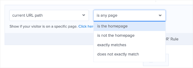
We’ll also leave the second default display rule the way it is. This means the mobile popup will appear on every page of your website.
But you can easily change this by selecting a different option from the drop-down menu in the second rule:
You can also add as many rules as you’d like by clicking the + AND button:
This level of personalization allows you to create the perfect optin campaigns for your audience. This leads to drastically higher conversions across your site.
Now that you’ve set your display rules, it’s time to sync your mobile optin campaign with your email service provider.
Step 4: Integrate Your Email Service Provider (ESP)
A popular use for mobile popups is to capture new leads in the form of an email address. To make this easier, OptinMonster natively integrates with over 30 of the most popular email service providers (ESPs).
That means you can segment and send your new leads directly to your email account. Once they’re in your contact list, you can create an email drip campaign to put your email marketing strategy on autopilot.
Plus, adding your ESP to OptinMonster is easy. Start by clicking Integrations at the top of your editor menu:
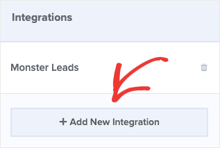
Then, in the left-hand side menu, click + Add New Integration:
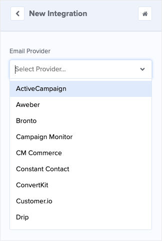
Now you can select your ESP from the drop-down list:
From there, the exact steps to connect OptinMonster with your ESP will depend on which platform you use. But, in most cases, it’s as simple as copying and pasting your email provider’s API key.
Don’t see your ESP on the list? That’s no problem. You can check out this helpful resource on how to OptinMonster with other email service providers.
All that’s left is to publish your mobile campaign to make it live on your site.
Step 5: Publish Your Mobile Optin Campaign
At this point, your campaign is designed, you’ve configured your display rules, and you’ve connected your ESP. Now it’s time to go live with your mobile popup.
Click Publish at the top of your OptinMonster editor:
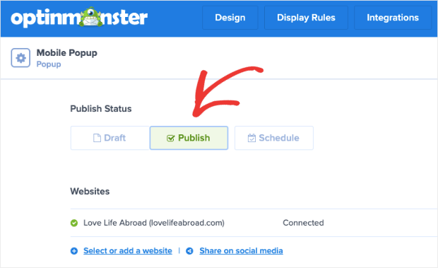
Then Save your campaign and switch the status from Draft to Published:
And that’s it! Your mobile optin campaign is now live on your site.
If you get a message that shows your site isn’t connected yet, no worries. You can follow this guide on how to connect OptinMonster to your website.
But if you’re using WordPress, the process is much easier with our OptinMonster plugin. For that, check out this resource on connecting OptinMonster to your WordPress site.
- How to Create Mobile Exit-Intent Popups That Convert
- The State of Mobile Email Engagement
- How to Engage Mobile Visitors by Showing a Popup After Inactivity
These resources will help you take your mobile marketing game to the next level.
Ready to get started with the world’s #1 lead generation software? Click here to start your risk-free OptinMonster account today!













Add a Comment