Are you wondering how to handle email accessibility better? You should be, because failing to send accessible emails is bad for business. Not only can it be illegal, but you’re ignoring a large audience who might not become your customers if you’re sending the wrong kind of emails.
In this guide, we’ll explain how to make emails accessible so that you can improve your email marketing by reaching a segment of your audience many people forget.
What Is Email Accessibility?
Email accessibility means making sure that people with disabilities, or who are using assistive technologies, don’t miss out on key information when receiving your emails.
These assistive technologies may include:
- Screen readers, software that provides an interface for visually impaired users to navigate computers, websites and email by reading out text or converting information to a Braille display.
- Magnifiers, which assist visually impaired users by making text larger.
- Joysticks, which provide an alternative to mouse-based navigation.
- Eye-tracking technology, which allows people to control computer interfaces with eye movements.
- Sip-and-puff technology, which allows people to control computer interfaces by inhaling and exhaling.
If your emails are designed only for people with uninmpaired mobility, vision and hearing, and for people using only the regular navigation tools, then people using the technologies above won’t be able to get all the information they need.
Why Is Email Accessibility Important?
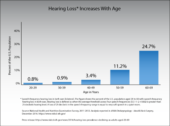
One of the main reasons creating accessible emails is so important is that accessibility issues affect millions of people worldwide. In the US alone, 15% of adults, or about 37.5 million people, say they have trouble with hearing.
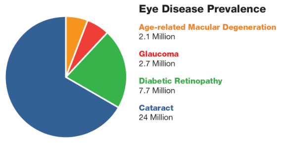
And the National Eye Institute says that by 2030 2.2 million Americans will be blind and 5 million will have low vision. Millions more suffer eye diseases which take a toll on vision.
Worldwide, the figures are even starker. According to the World Bank, 15% of the world’s population has a disability. That’s about a billion people, a number nearly equal to the population of China.
The World Health Organization says that 360 million people worldwide experience “disabling hearing loss”. That’s more than the population of the USA. Meanwhile, 285 million people around the world are visually impaired.
The loss of visual and hearing acuity also affects older web and email users. With people in many parts of the world living longer, it will be increasingly important to ensure that those affected by age-related impairments aren’t unduly disadvantaged when accessing the web and reading emails.
Good accessibility isn’t just for people with disabilities. As you’ll see, a lot of the changes you make to emails help to improve usability. That’s good for all your subscribers and visitors, which means it’s good for business.
Speaking of business, being non-compliant could also be costing you money. That’s because people with disabilities represent $1 trillion in disposable income, according to Return on Disability. Unless you handle email accessibility correctly, your business could be missing out.
Accessibility and the Law
Making content accessible is also a legal requirement in many countries. Around the world, there is disability rights legislation intended to ensure that people with disabilities aren’t unduly disadvantaged in their daily lives. In the US, these provisions, including accessibility standards, fall under the American with Disabilities Act (ADA).
Failure to be ADA compliant opens you up to possible legal penalties. In particular, if your business includes the provision of health services or public services, failure to comply could mean people miss out on essential information that’s vital to their health and well-being.
One aspect of accessibility is making sure website and communications are compliant, following web content accessibility guidelines (WCAG) laid down by the World Wide Web Consortium (W3C). Since your emails can also be viewed on the web, anything you do to comply with web accessibility guidelines will also look after email accessibility.
WCAG says your content should be POUR:
- Perceivable: available by sight, hearing and touch.
- Operable: able to be navigated and operated easily.
- Understandable, which applies to both the content and the interface.
- Robust: able to be used by multiple user agents, including assistive technologies.
3 Ways to Improve Email Accessibility
Let’s look at what this means for email accessibility and your email marketing strategy. We’ll cover typography and design, content, code, plus a few other tips. We’ll also show you a few examples of emails that get accessibility right.
1. Using Accessible Typography and Design
Let’s talk about color in email design. Some people can’t distinguish between reds and greens, and occasionally blues, and there are people who don’t perceive colors at all. These are all types of color blindness.
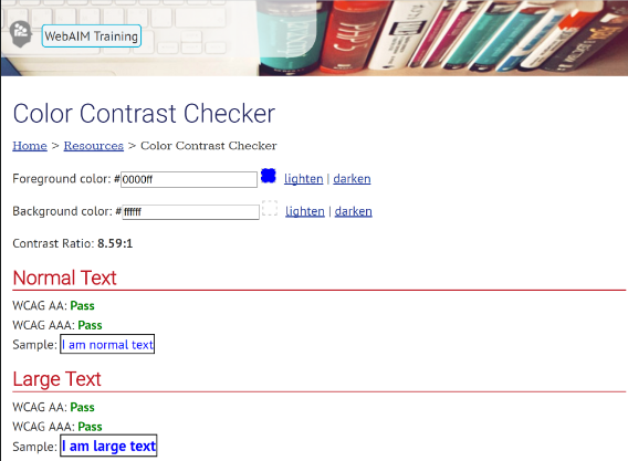
To cater for people in this group, it’s important not to rely on color to convey your meaning, and also to make sure that the colors you do use contrast enough so people with this visual impairment can distinguish among them. A good tool for this is the WebAIM color contrast checker.
Animated content can be a great attention-getter in emails, but it matters how you do it. Most moving objects are fine, but flickering, flashing and strobe-effect animations are best avoided, as they could trigger people with seizure disorders. Large images with bright flashes that occur more than 3 times a second are the worst culprits, so dial down those special effects.
While the WCAG are not specific about ideal text size, they specify that you must be able to resize content to 200% without losing content or function. Using relative rather than absolute font sizes will let users adjust text to their preferences, and a responsive email template will help, too.
It’s also good practice to:
- Use fonts that are easy to read.
- Avoid walls of text, balancing images with text to create a better user experience.
- Left align copy, as justified text is harder for people with dyslexia to read. People using screen readers may also find that text has huge gaps which make them need to scroll more.
- Ensure line spacing is at least half the height of the text, with paragraph spacing 1.5 times the height of text.
- Include a plaintext version of your email.
2. Creating Accessible Content
When it comes to content, it’s common sense that creating accessible emails is similar to writing accessible web pages. That means you need to:
- Ensure that essential information is in the text and not hidden in images.
- Use alternative text (alt text) with images to allow assistive technology to describe them accurately.
- Include text labels and descriptions on your optin forms.
- Identify media with alt text and provide transcripts.
- Avoid giving instructions that require people to see or hear to be able to follow them.
- Avoid putting time limits on accessing and using content.
- Providing easy to read content or explanations of complicated terms.
Content must also be readable and follow a logical structure. Make your email subject lines descriptive so people using assistive technologies will know exactly what to expect when they hear them.
Pay attention to links. Make sure they’re easy for people using assistive technology to follow. Also, avoid phrases like “click here” in favor of descriptive anchor text that tells people exactly where the link they are following will take them. And don’t turn subheadings into links; that can confuse some assistive technologies.
3. Coding Accessible Emails
Related to this, there’s a lot of work you can do with the HTML code for your emails. For example, using semantic elements like header tags (h1, h2, h3 and so on) indicates content hierarchy. This makes your emails more scannable and will help screen readers and other assistive technologies to render the content more accurately.
Other tips include:
- Making navigation logical, and including a link allowing users to skip navigation elements.
- Providing a descriptive page title.
- Using breadcrumbs and informative text to aid navigation.
- Identifying the page language so that screen readers will pronounce text correctly.
- Ensuring that your emails behave predictably (for example, if people are looking at them on the web).
- Making it easy for people to correct errors, for example, in your optin forms.
- Using valid HTML markup.
Make sure people can access all content via a keyboard. And pay attention to table formatting. Since screen readers read left to right and top to bottom, you may need to adjust rows and columns so the reading order makes sense for those devices.
Get to know which email clients your subscribers are using, because not all of them support all accessibility features. Since Apple Mail clients and Gmail account for the lion’s share of email readers, format your emails for those clients and you’ll probably meet the needs of most of your customers.
Testing Email Accessibility
If you want to be sure you’re sending accessible emails, the best thing to do is to check off the requirements and to test. Here are some tools to help you with that:
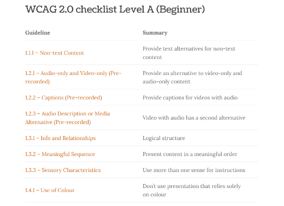
- Wuhcag has checklists for developers, covering beginner, intermediate and advanced WCAG 20 compliance.
- W3C has a detailed checklist, and so does WebAIM.
- There are also links to a whole bunch of accessibility testing tools on the W3C website.
- If you use Chrome, there are accessibility developer tools that can help you check your emails.
- Some email service providers also help you check emails for accessibility. MailChimp’s Inbox Preview is one example of this.
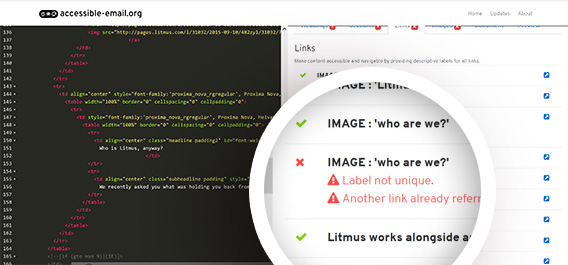
Accessible-Email.org also has an online checker. We tested an email from Litmus for compliance using this tool. First, we had to view it online, then go to “view page source” and copy the HTML code. When we pasted this into the tool, these are results we got.
Litmus scored pretty well for using alt text for images, using unique links and specifying the document title and language, though there were some tables that needed to be converted.
Now you know the ins and outs of email accessibility, you can create accessible emails for a more inclusive email marketing strategy. Our beginner’s guide to email marketing can help you get started. And don’t forget to follow us on Twitter and Facebook for more helpful tips.







Add a Comment