Are you looking for thank you page examples?
In the world digital marketing, every touchpoint with your audience matters. One often overlooked yet crucial touchpoint is the “thank you page.”
It’s not just a digital nod of appreciation; it’s a golden opportunity to enhance user experience and solidify customer loyalty.
Let’s explore its significance and draw inspiration from some stellar thank you page examples.
Why Every Business Needs a Thank You Page
- First Impressions Matter: The thank you page sets the tone for future interactions. A positive experience can lead to increased customer loyalty.
- Building Trust: A personalized thank you page assures users that their action was successful and appreciated.
- Upselling Opportunity: It’s a prime spot to introduce users to other products, services, or content they might find valuable.
How to Create a Thank You Page (2 Ways)
There are 2 different ways you can create a successful thank you page:
- Build a thank you landing page with SeedProd
- Create a thank you popup with OptinMonster
With SeedProd, the best landing page builder for WordPress, you can create a separate thank you landing page on your site.
With SeedProd’s drag and drop landing page builder, you can easily create a custom thank you page. Plus, SeedProd offers professionally-designed thank you page templates so you can get started quickly.
You can also customize your thank you page to generate leads and boost conversions with pre-built blocks like contact forms, giveaways, countdown timers, social profiles, and much more.
If you want to send users to a separate page to view your thank you message, SeedProd is the best option for that.
On the other hand, if you don’t want to create a separate landing page, you can create a thank you popup with OptinMonster.
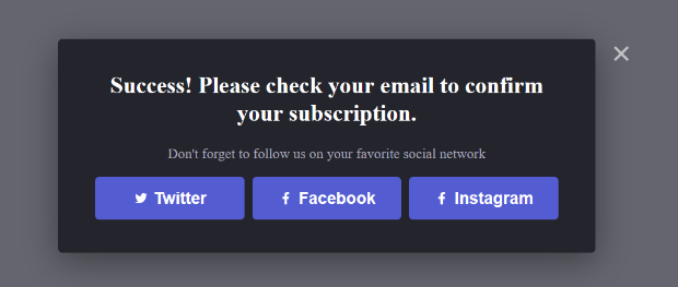
With OptinMonster’s success themes, you can eliminate the need for a separate thank you page because the success message and CTA appear right inside the optin box.
OptinMonster comes with several campaign targeting and trigger options to create a high-converting thank you popup on your site. Click the button below to start your 100% risk-free OptinMonster account today:
Are you ready to create the perfect thank you page? Let’s take a look at how to write a thank you page and what to put on your thank you page.
What to Put on Your Thank You Page (3 Essential Elements)
While some thank you pages are seen by new subscribers, and others are seen by new (or returning) customers, every thank you page must have these 3 essential elements.
If any one of these key ingredients is missing, then your thank you page will fall short of victory…
- A confirmation message
- A clear call to action
- Specific instructions on what to do next
Let’s dive into each of these elements in more detail.
1. Confirmation Message
For a good user experience, and to serve its primary function, your thank you page must include a confirmation that the user’s action was successful.
You need to actually spell it out for them, otherwise, you’ll risk leaving them confused or disoriented.
A simple, “Thank you for subscribing!” or “Your order is complete!” will do just fine. Just make sure that it is clear what just happened (and what they should expect to happen next, if necessary).
Unfortunately, this is where most thank you pages stop. If you want to stop leaving money on the table, you’ll need to get your users to take another action right away. (Read on to learn how…)
2. Call to Action
Now that you’ve confirmed their successful action (and you’ve explained what will happen next), it’s time to take your thank you page to the next level by adding in a call to action (CTA).
A very clear CTA will move your users to take the next step in your sales process.
This is the part where most thank you pages fall short, but adding this one thing to your thank you page will make the world of difference in terms of your conversions and sales.
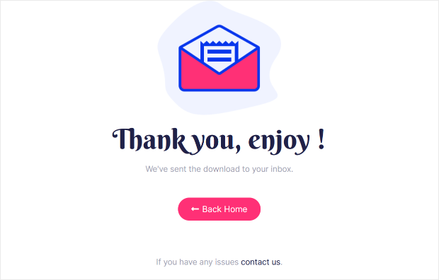
Your CTA could be as simple as asking your new subscribers to download their lead magnet.
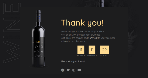
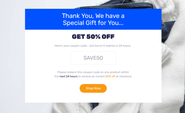
Or, it could be more complex, like offering a coupon code and encouraging users to start shopping, like in the thank you page example created with SeedProd below.
So what other CTAs can you include? Well, here are some great thank you page call to action examples…
- Ask them to whitelist your email address
- Ask them to share on social media
- Ask them to register for a webinar or event
- Ask them to purchase a low-dollar offer
- Ask them to purchase a related product
- Ask them to create an account
- Ask them to fill out a survey
We will go into each of these examples and more later on in this article, but all you need to know for now is that your thank you page needs to include a call to action.
3. Specific Instructions
The third thing to put on your thank you page is specific instructions on exactly what to do next.
You already have a call to action that gives users the next step. But in order to get users to actually take you up on it, you’ll need to get super specific about what they should do and how to do it.
For example, if your call to action is to ask subscribers to whitelist you, you could include a brief video tutorial or screenshots of how to do that.
Or, if you want new subscribers to sign up for your webinar, you could tell them to “Click on the blue button below to save your spot on the live call”. (See how these instructions are way more specific than simply saying, “Register for the webinar”?)
Your instructions don’t need to be lengthy. The point here is to be precise– people need instructions more than you may think.
OK, now that you know the 3 essential elements, let’s look at some thank you page examples.
These 5 types of thank you pages are highly effective at moving new subscribers and customers further along your sales funnel…
After-Optin Thank You Page Examples
When someone successfully opts into your email list, you can use your thank you page to accomplish one of three main goals:
- Drive more traffic to your optin
- Begin to nurture leads
- Acquire customers right away
These types of thank you pages work to generate more leads, nurture your newly acquired leads, and even generate some initial sales.
Here are some examples of after-optin thank you pages…
Thank You Page Example #1: The “Snowball Effect”
Did you know that your thank you page can actually drive more optins?
When you use your thank you page to drive traffic to your optin form, you’ll increase your optins, which increases your traffic, which increases your optins even more, and so on, creating a powerful snowball effect.
The way to create a snowball effect is to invite new subscribers to share your optin page with their friends. You can include social media sharing buttons to make this easy for your users.
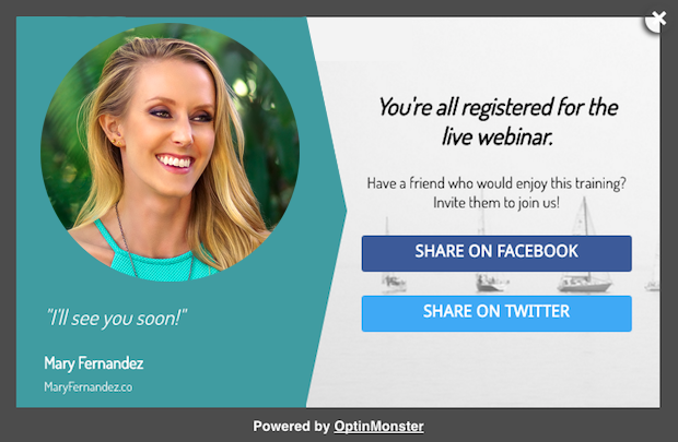
You can even include an extra incentive for them to share.
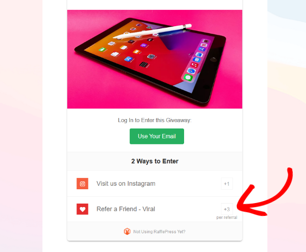
SeedProd seamlessly integrates with the best giveaway plugin for WordPress, RafflePress, so you can easily add a giveaway to your thank you page.
This is a fun and effective way to incentivize new subscribers to share your optin page.
With the verified bonus actions, you can reward users with extra giveaway entries for sharing your page.
Most users will be more than willing to share your optin page for a better chance of winning an awesome prize.
Thank You Page Example #2: The “Lead Nurturer”
You can also use your thank you page to begin the lead nurturing process right away.
After all, why wait? The more you can increase your touch points with a lead, the more likely they will become a customer.
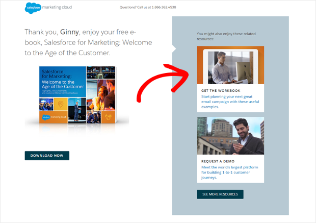
One way to nurture leads on your thank you page is by recommending posts on your blog that are related to the lead magnet they just received. This will keep them reading and browsing your site for longer.
Here’s a thank you page example where Salesforce included extra resources to explore.
You can also nurture your leads by asking them to register for a webinar or an event. They’ve downloaded your lead magnet, so now is a great time to get them to commit to a live event.
Here’s an example of a webinar registration thank you page from Wisita.
A third way to start nurturing leads right off the bat is by asking them to participate in your community. By bringing new leads into your community and social platforms, you’ll be able to have more of a dialog with them.
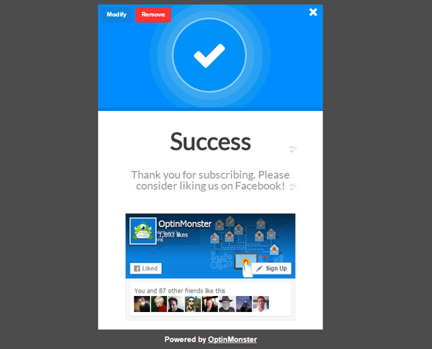
In this example, the thank you message includes a call to action to “like us on Facebook”.
Thank You Page Example #3: The Tripwire
After someone opts in with their email address, you can monetize your thank you page and use it to immediately turn that new lead into a customer. Here’s how to monetize your thank you page…
First, you’ll need to have a low-dollar offer, or a “tripwire”. A tripwire is an offer that is a complete no-brainer, somewhere in the ballpark of $1-$20.
Even though it’s priced so low, the tripwire offer still requires someone to pull out their wallet and become a paying customer. This is important because the first sale is the hardest. But when someone has bought from you once, it’s much easier to get them to buy from you again.
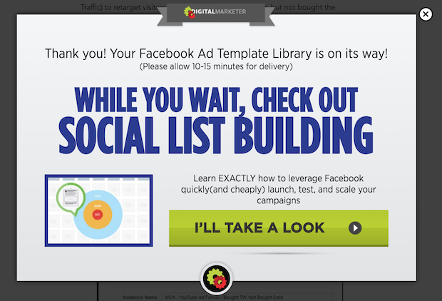
Digital Marketer is a great thank you page tripwire example. Their success message says that your lead magnet is on the way, and while you’re waiting for it to arrive, you should check out this other offer.
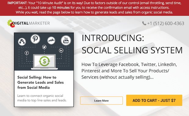
Once you click on the “I’ll take a look” button, you’ll be taken directly to the sales page with a $7 tripwire offer.
Now that we’ve seen some thank you page examples that are shown after an email optin, let’s look at some examples of thank you pages that are shown after the user completes a purchase.
After-Sale Thank You Page Examples
When someone completes a purchase, the goals for your thank you page are going to be a bit different. Your two main goals are probably going to be to…
- Maximize customer value
- Increase customer retention
Here are some examples of after-sale thank you pages…
Thank You Page Example #4: The “Value Maximizer”
If your goal for your thank you page is to increase the value of your customer, you can offer a cross-sell or an up-sell.
Here’s an example of how Amazon does it. After you check out with this acoustic guitar, you’ll see some additional options to add a 4-year warranty or add some guitar lessons.
For more ideas to increase customer value, check out our post on increasing your sales funnel conversion rate.
Thank You Page Example #5: The “Customer Keeper”
If your goal for your thank you page is to increase customer retention, then you could do a number of things. For instance, you could ask them to create an account with you.
The thank you page is the ideal time to ask someone to create an account because you don’t want it to be a speed bump in the purchase process. You should never require someone to create an account with you before the purchase has been completed!
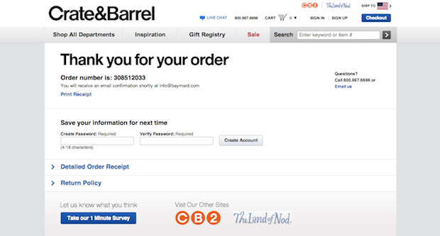
Crate and Barrel asks you to create an account on their thank you page by suggesting that you “save your information for next time.” This is a great way to word it because it presents the ask as a benefit to the user.
(Also note the blue “Take our 1 Minute Survey” button. Including a survey on your thank you page is a great way to gather market research and further improve your sales process!)
A second way to increase customer retention is by reinforcing the decision to buy. By emphasizing the idea that the customer just made a good purchase, your thank you page helps to eliminate buyer’s remorse, and increase the chances of a customer returning to make another purchase.
You could do this by including customer testimonials or even case studies on your thank you page. Any kind of social proof will help new customers to feel good about their decision to buy.
For more ideas on using social proof on your thank you page, check out our post on 11 ways to use social proof to increase your conversions.
How OptinMonster Can Enhance Your Thank You Page:
- Design Templates: Choose from a variety of professionally designed templates tailored for thank you pages.
- A/B Testing: Experiment with different designs and messages to see what resonates most with your audience.
- Seamless Integration: Connect with popular email marketing platforms to personalize the user experience further.
- In-depth Analytics: Understand user behavior on your thank you page to continually refine and improve.
With its intuitive design templates, robust A/B testing capabilities, and in-depth analytics, OptinMonster empowers you to create thank you pages that not only express gratitude but also drive action.
Whether you’re looking to upsell, gather feedback, or deepen the connection with your audience, OptinMonster is the partner you need. Elevate your post-conversion strategy with OptinMonster and watch your digital relationships flourish.









Add a Comment