What if I told you that there was one page on your website that continually receives a ton of traffic, but you’ve never yet thought to optimize it for conversions despite it’s potential?
Well, you’d probably tell me I’m unquestionably wrong. Because, c’mon, who doesn’t optimize a page that gets a major portion of their site traffic?
So what is this mysterious page?
Simple answer: your about page.
No, really. Hear me out.
Back in February 2014, Pat Flynn from Smart Passive Income (a huge brand in the Internet marketing space) revealed that he was surprised to find that one of his most highly-trafficked pages was his about page. However, he had never thought to optimize it for conversions because, well, who really takes the pains to craft a conversion-inducing about page?
More than likely, the story rings true with your site as well.
In this post, I’ve outlined the six most common about page mistakes that kill conversions along with how to fix each mistake, so at the end of this post, you should have a lot of actionable advice under your belt, ready to boost conversions on your own website.
1. You Don’t Have Opt-in Forms Visible
By far, this is the most significant about page blunder.
As we’ve already established, it’s very probable that your about page is one of the most popular pages on your site (home page aside).
But even if it isn’t getting as much traffic as the top 2-3 pages, there’s no doubt that it still is getting traffic.
All that traffic translates into a whole lot of eyeballs reading about you — eyeballs that belong to people who may never visit your site again…
…unless you include an opt-in form to get them to subscribe to your mailing list.
And once you have these readers on your email marketing list, you can send them relevant content and engage with them until they become customers.
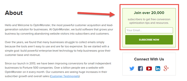
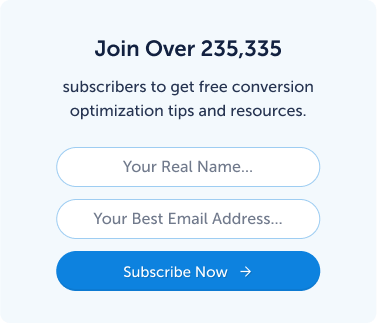
Make sure you’ve got an opt-in form somewhere on your about page. At OptinMonster, you’ll find such form stuck up high in the right sidebar above the fold.
2. You’re Not Leveraging Social Proof
As you are probably already aware, social proof impacts your conversion in a big way. Social proof can help to build trust with readers, increase company credibility, and boost brand recognition.
Top Tools AlertCheck out this list of social proof software you can use to make adding social proof to your site ridiculously easy.
If you aren’t using it on your about page, then you’re missing out on conversions.
There are many ways to go about including social proof on your about page. I’ve described a few below.
Let’s borrow another example from the OptinMonster about page. If you go over there, you’ll see a section on how OptinMonster’s popups interact with over one billion internet users every month. That’s one way to build social proof: by letting your readers know that your company’s product/service is widely used and appreciated.
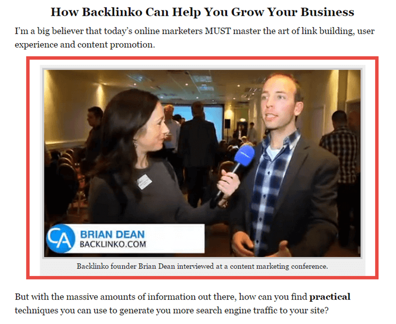
Another example can be found on Backlinko. On their about page, founder Brian Dean includes a picture of him being interviewed at a content marketing conference.
This is a great example of social proof because it does a great job of convincing readers that Brian is an expert in his industry (making them more likely to end up subscribing to his newsletter in the opt-in form directly below).
If you’re in the service industry, then you could also choose to highlight some of the well-known brands your company has worked with.
The possibilities are endless (here are some proven social proof examples to increase conversions)
Related ContentSocial Proof Statistics: Powerful Facts That Will Help You Boost Your Brand
3. You’re Not Incorporating a Visual Element
The human brain processes visual content 60,000 times faster than text (HubSpot).
Therefore, it makes sense to use visual content whenever it’s relevant—not only in your about page but also in your blog posts and content marketing strategy.
Brian’s about page, OptinMonster’s about page, Syed Balkhi’s about page all are a great example of this. Visitors who view the page are instantly drawn to the visual element (the picture), resulting in much better engagement levels.
4. You’re Not Linking to Landing Pages
Once a visitor has finished reading through your about page, the last thing you want them to do is just hit the back button or close the tab.
Even though they might have been engaged up until the end of the page, it’s all of no use if you don’t educate them about your product/service.
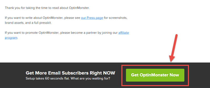
At the end of OptinMonster’s about page, you’ll find a clear call-to-action button inviting readers to take action now (notice the emphasis on urgency).
This is a great way to make sure that visitors transfer over to a meaningful landing page where they can either:
- subscribe to your mailing list
- become further educated about your product
5. You Haven’t Told Your Story
When people come to your about page, it’s typically because they want to learn more about you (duh!). Sure, social proof and opt-in forms are great, but at the end of the day, your readers want to learn about you.
So if you just continue to talk about your accomplishments as a company in boring ol’ corporate-speak, then your readers will probably turn away disappointed.
The solution?
Tell your story.
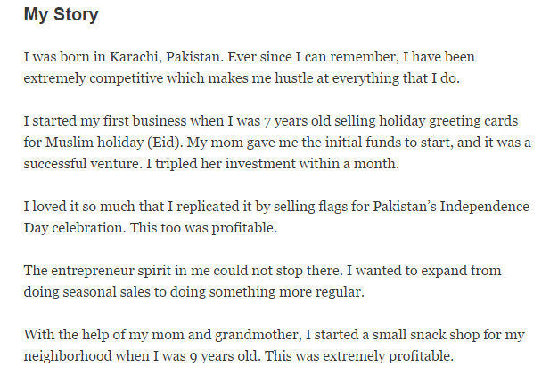
Here’s an example from Syed Balkhi’s website (co-founder of OptinMonster).
How did your company get started? Who are your founders? What gave them the idea to start the business? Do you have core values? What motivates you as a business?
Answer all these questions on your about page, and I guarantee your visitor engagement will be off the charts.
6. You Drone On and On
There is a caveat to the point we just discussed.
While you definitely want to tell your story, you need to tell it concisely, in as few words as possible.
Why?
Because your visitors are busy and have a short-attention-span. If you just drone on and on without stopping, you won’t be keeping their attention for long. Visitors will end up leaving your site without interacting any further.
Say what you need to say, then stop. Be impactful, be motivating, be inspiring, but be short.
Wrapping Up
Now that you’re aware of the six top conversion-killing mistakes you could be making on your about page, it’s time to go fix them! Be sure to take action on the advice you’ve read in this post.
Some of these tips just take 5 minutes to implement, so make optimizing your about page a priority for today.
Next, check out our post on email marketing mistakes.
How many of these mistakes do you think you’ve been making on your about page? What’s your plan to fix them? Got any more tips you’d like to suggest? Please feel free to add your input in the comments!





Add a Comment