Do you want to create the perfect opt in page to rake in more leads?
Landing and optin pages are an essential part of your sales funnel. In fact, a well-designed landing page can make or break your conversion rates.
If you’re a busy entrepreneur or marketer, you may think you don’t have time to create a stunning landing page that converts.
I’m here to help! At OptinMonster, we’re experts in converting web traffic into leads and revenue.
In this post, we’ll share a few of our favorite opt in page examples to help inspire your own. Then, we’ll also go through some of the best tools for creating and analyzing your opt in landing pages.
Then, you’ll be ready to create a stunning landing page to help you grow your email list.
What are Optin Pages?
Optin pages are web pages dedicated to generating leads by asking visitors to sign up. Often, they will offer some sort of lead magnet, such as a coupon code or free eBook, in exchange for opting into your email list.
They are also a type of landing page, which is any page on your website where you drive traffic to reach a specific goal, such as promoting a new product. For optin pages, that specific goal is gathering new leads through a signup call to action (CTA).
If you want to learn more about how to create a stellar landing page, then we highly recommend that you check out this resource: The Anatomy of the Perfect Landing Page.
In this article, we’ll focus on the specific type of landing page at hand: opt in pages. We’ll start with a few effective examples from around the web.
Examples of Well-Designed Optin Pages
1. Free eBook Optin Page from Taboola
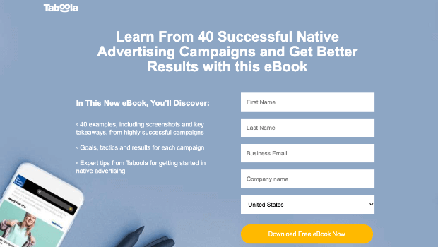
Advertising company Taboola has a great landing page for their lead magnet. This optin page is dedicated to generating new leads by offering a free ebook.
Features:
- Sleek, simple design.
- Large heading explaining the benefits of the ebook.
- Bulleted list with more details about the ebook’s contents.
- Extremely visible signup form with a CTA button in a high-contrast color
What You Can Learn From This Opt In Page:
Every aspect of your opt in page should be dedicated to encouraging visitors to sign up. Don’t include any extra content to distract from your main CTA.
One thing to note: this signup form has more fields than most forms should have. Usually, you only want to ask for a name and email address because you want the optin process to be quick and easy. Taboola asks for more because of the nature of business.
2. Hiten Shah‘s Opt in Page With a Testimonial
Tech entrepreneur Hiten Shah used this opt in page to offer his ebook, The Content Marketing Playbook, as a lead magnet.
Features:
- The headline establishes topic authority by showing experience.
- The testimonial from Hubspot’s cofounder offers powerful social proof.
- The signup form is simple here: just an email address field and a CTA button that says “Get the Ebook.
What You Can Learn From This Optin Page:
Adding a testimonial to your signup page can be an extremely effective way to grow your email list. Your quote can be from an industry leader or a happy customer. Either way, it’ll illustrate the quality of your content or product.
Learn more: 10 Creative Examples of Testimonials to Win Customers + Tips and Best Practices
3. 2-Step Optin Page From Bluchic
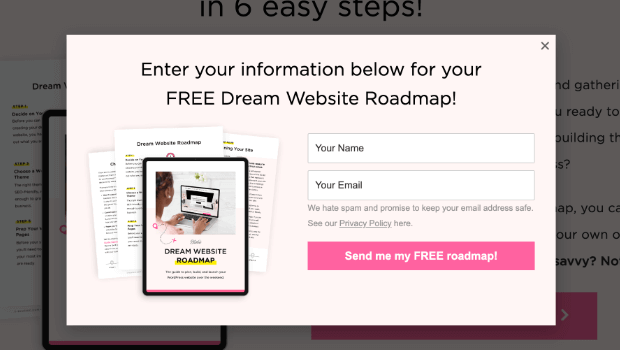
This sample opt in page is from the WordPress theme and design company Bluchic. Their landing page offers another led magnet, but Bluchic’s CTA is a bit different than our previous 2 examples. Instead of including the signup form fields on the landing page, there is a large CTA button that says “Send Me My Free Roadmap!”
When users click the button, they see this lightbox pop with the actual signup form:
Features:
- A 2-step optin where users click a button to trigger a sign-up form popup
- A color scheme that is consistent with the brand’s website
- Description text that promises beginners can use this guide to create a website in a single weekend.
What You Can Learn From This Optin Page:
2-step optins like this one take advantage of the Zeigarnik Effect, which states that people are more likely to finish a task once they start it. The button on the landing page doesn’t ask for any information, which lessens the user’s hesitation to click. Once they’ve taken the step of clicking the link, they’ll be more likely to follow through with signing up for the lead magnet.
Optin campaigns like this one are easy with Monsterlinks and lightbox popups from OptinMonster! Watch this quick video to see how it works:
Tools to Build & Optimize Your Optin Pages
Now that you’ve seen a few examples of well-designed optin pages, you may have a big question:
How can I make effective optin pages for my own site?
We’ve got a list of the best tools you can use for creating landing pages that will grow your email list.
We’ll separate them into 3 categories:
Best Tools to Build Your Optin Landing Pages
1. SeedProd
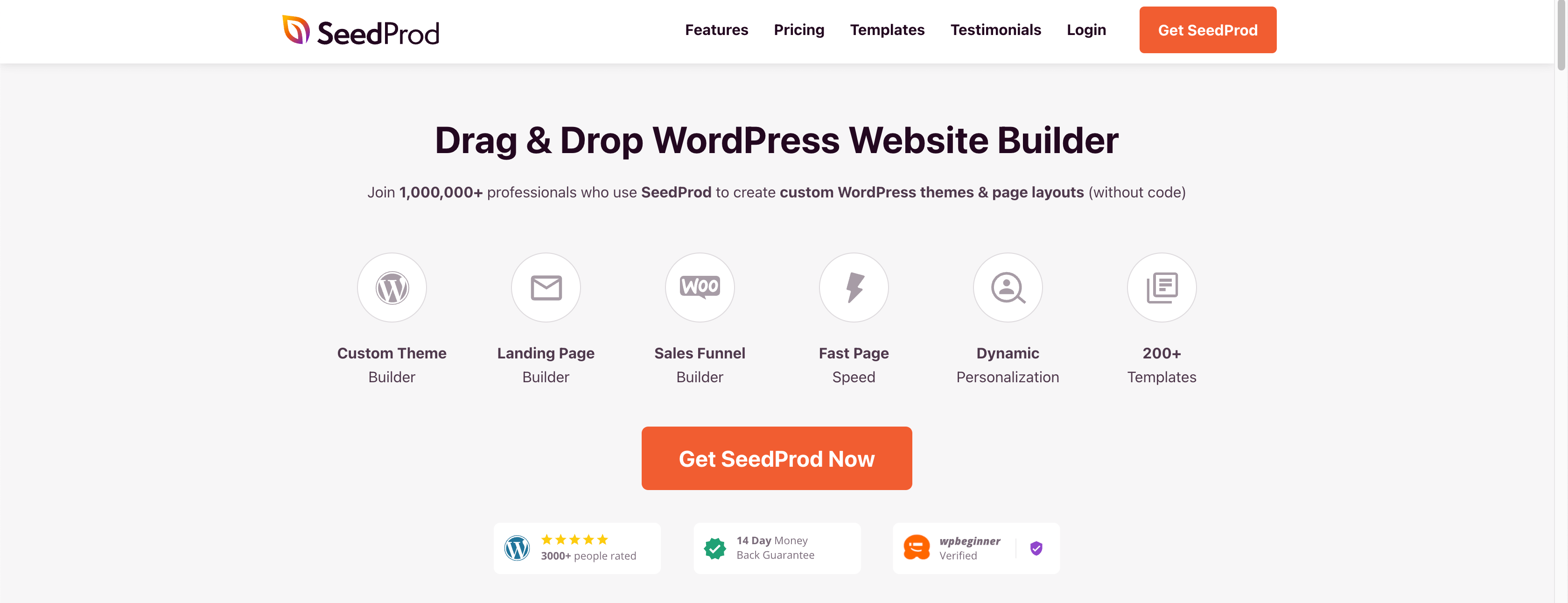
SeedProd is the world’s #1 landing page tool for WordPress. It allows you to create all types of high-converting landing pages, such as:
- Optin pages
- Sales pages
- Coming soon pages
- Maintenance pages
And much more.
You can build unlimited landing pages with SeedProd’s drag and drop editor. It allows you to quickly and easily design the perfect landing pages to reach your goals. Plus, there are loads of templates to help you save time, energy, and resources as you make the page’s design.
So if you’re looking for a landing page creation tool that’s easy to use, super responsive, and gets the results you want, then SeedProd is definitely the way to go.
Get started with SeedProd and start making high-converting optin pages!
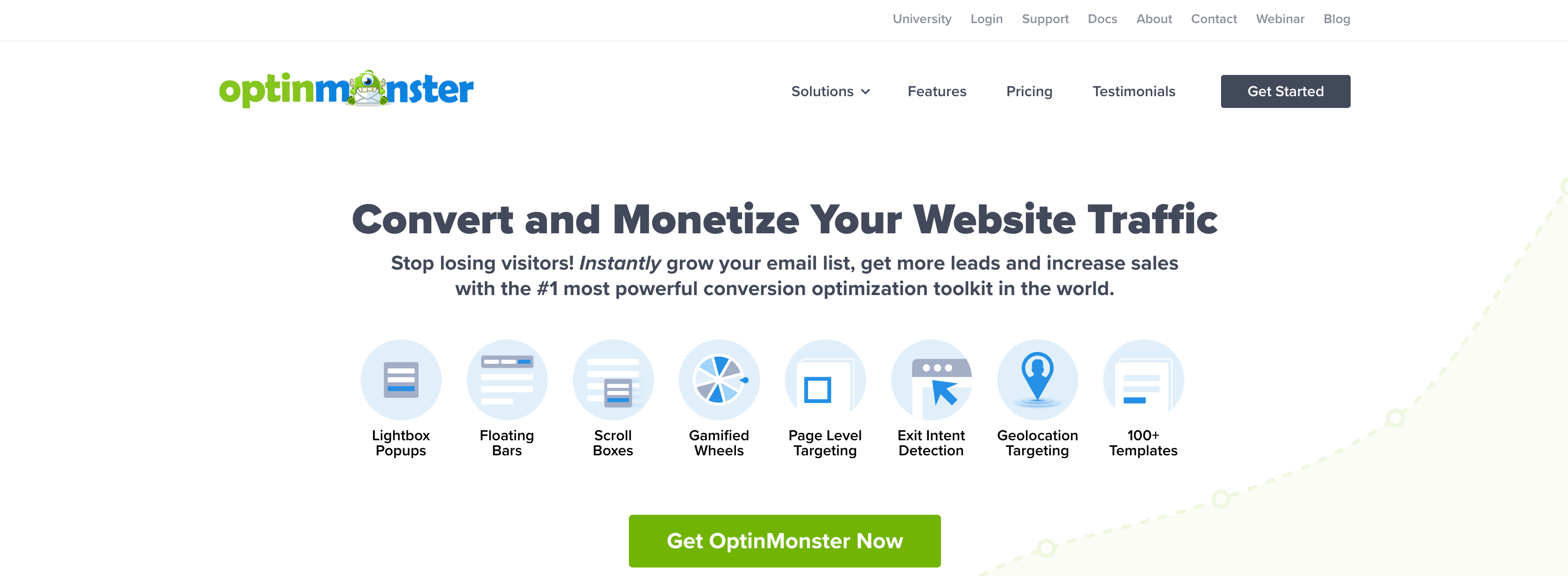
2. OptinMonster
OptinMonster is hands down the best lead generation tool that you’ll need to use on your landing pages to boost conversions. With OptinMonster, you can
- turn any web pages into an optin page with our fullscreen campaigns
- add 2-step optins to any page on your site.
- create exit-intent optin forms to re-engage abandoning visitors on your landing pages.
First, you can use fullscreen welcome mat campaigns to function like a landing page on your site. Even though you’re not sending traffic to a specific URL, you can build a fullscreen campaign with powerful optin forms to display on existing pages:
This gives you a dynamic fullscreen optin form that can be loaded with:
- Social proof
- Powerful copy
- Optin forms
- Video
And much more. This gives you a dynamic campaign which means you can show it to your existing traffic, rather than sending new traffic to a specific URL.
This leads to better personalization for your campaign and higher conversions for you.
Another strategy you can use is an exit-intent popup.
With OptinMonster’s Exit-Intent® technology, you can capture visitors as they’re leaving your landing page. This gives you one last chance to re-engage your audience so you can nurture that relationship over time.
Exit-intent popups are incredibly effective at keeping users engaged with your brand. In fact, it’s the same strategy that Crossrope used to grow their list by over 900%.
You can attach an exit-intent popup to your landing pages to ensure that you don’t leave any conversions on the table.
Click below to get started with OptinMonster risk-free today!
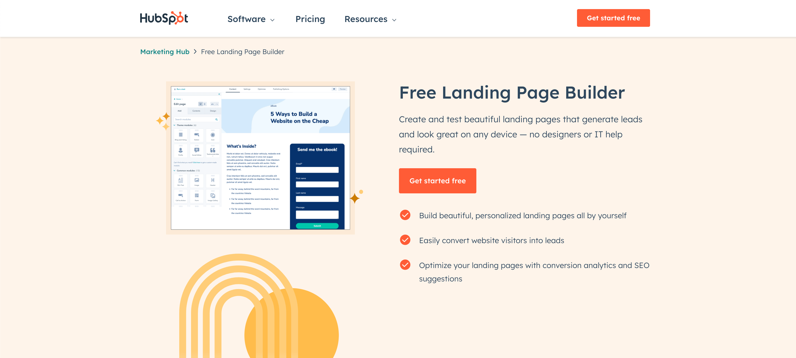
3. HubSpot
HubSpot is typically known as one of the best customer relationship management (CRM) tools on the market.
But many people don’t know that they also have a free landing page builder to make your offers even more appealing.
The best part about these landing pages is that they’re easy to set up and don’t require any coding skills.
There’s a “what you see is what you get” (WYSIWYG) editor that makes it simple to customize your pages. Plus, it comes with a lot of other marketing tools like:
- Blogging features
- Calls to action
- Email marketing campaigns
- Lead management
- Automation
- Powerful analytics
- And much more…
This makes HubSpot one of the most comprehensive marketing tools on the planet. That could be both a strength and a weakness.
If you’re already building your website with WordPress, for example, you’ll find it’s easier to just get started with a plugin like SeedProd.
But if you’re part of a larger organization that needs landing pages as part of a much bigger marketing strategy, then HubSpot is a great option.
Best Landing Page Creation Tools to Analyze Your Landing Pages
1. Google Analytics
Google Analytics is arguably the most robust free analytics tool available today. You can track demographic information about your landing page visitors as well as set up conversion goals to track your leads.
However, Google Analytics is also a very complex tool to use. For WordPress users, there is a simpler option, which we’ll cover next.
2. MonsterInsights
MonsterInsights is the best WordPress analytics plugin on the market. You can sync this tool with analytics software like Google Analytics, Google Search Console, and more.
Then, you can get all the data you need directly in your WordPress dashboard.
That means you can track your landing page’s success to see how it’s performing. From there, you’ll be able to use the data you have to optimize your landing pages and increase your conversions.
The more specific information you have about your site’s performance, the easier it is to improve your overall marketing strategy.
Want to learn more about how MonsterInsights can help you optimize your landing pages? See this post: Monsterinsights Review: Is This Analytics Plugin Worth It?
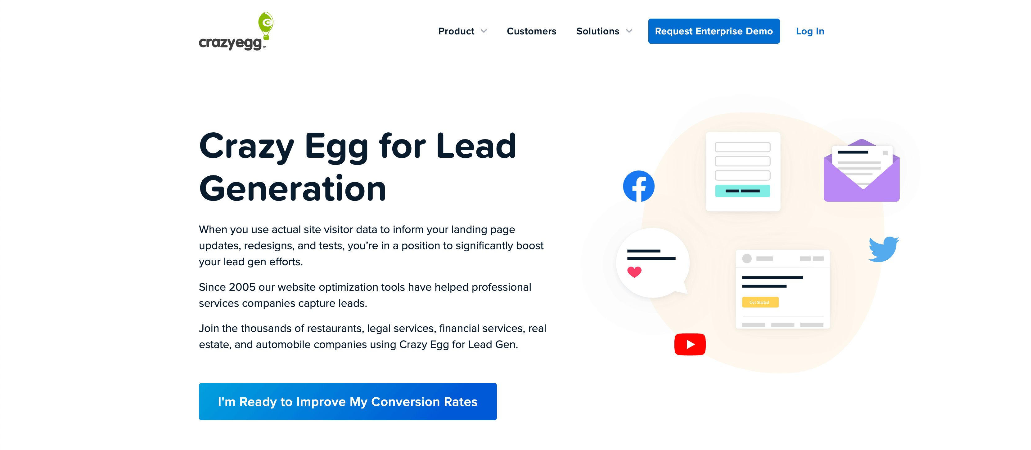
3. CrazyEgg
What if you knew why your site’s visitors were leaving your site? CrazyEgg is a really cool tool that helps you visualize where your visitors are spending their time and clicks by creating heatmaps of your website landing page.
This is a nifty tool for analyzing your optin landing pages, especially when combined with Google Analytics.
Best Tools For Making the Most of All Your New Leads
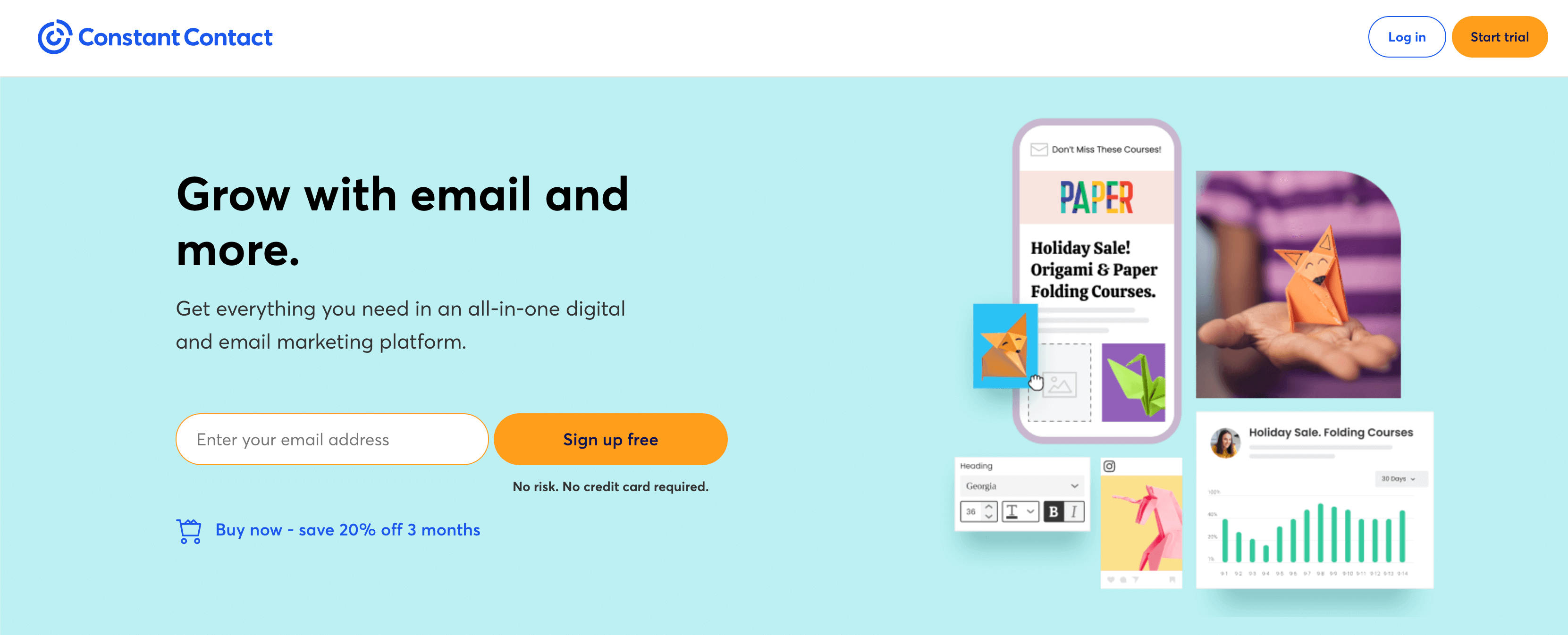
1. Constant Contact
If you’re looking for an email service provider that can handle a variety of customer personas and is able to deliver strategic emails, based on their particular needs and preferences, look no further than Constant Contact. With its lightweight, easy-to-use interface you can create complex, tailored autoresponder sequences and analyze their performance with in-depth reporting.
Pair Constant Contact with OptinMonster, and you can trigger those special sequences to occur based on user’s behavior on your optin landing pages.
You can get started with Constant Contact’s free trial to make sure it’s the right choice for you.
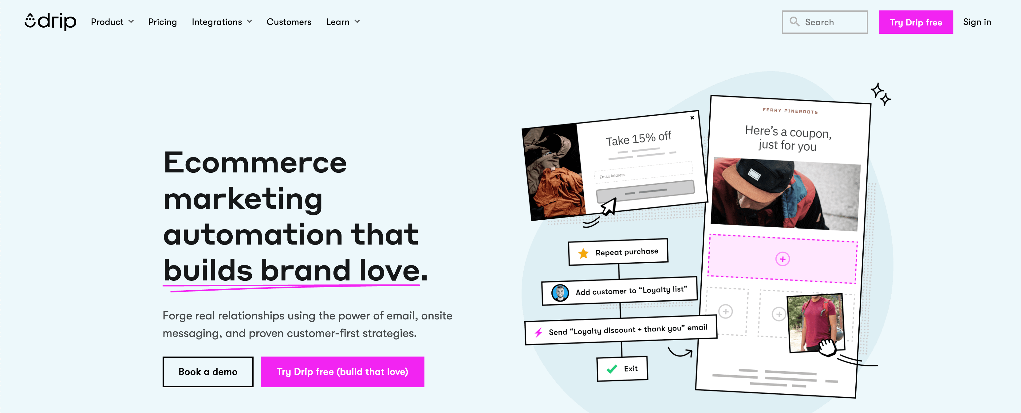
2. Drip
Drip is a robust marketing automation product. It comes bundled with tools that help you build personal and profitable relationships with your customers.
Drip helps you make the most of your segmented leads from your optin pages, as it lets you automate drip campaigns to move visitors through your sales funnel.
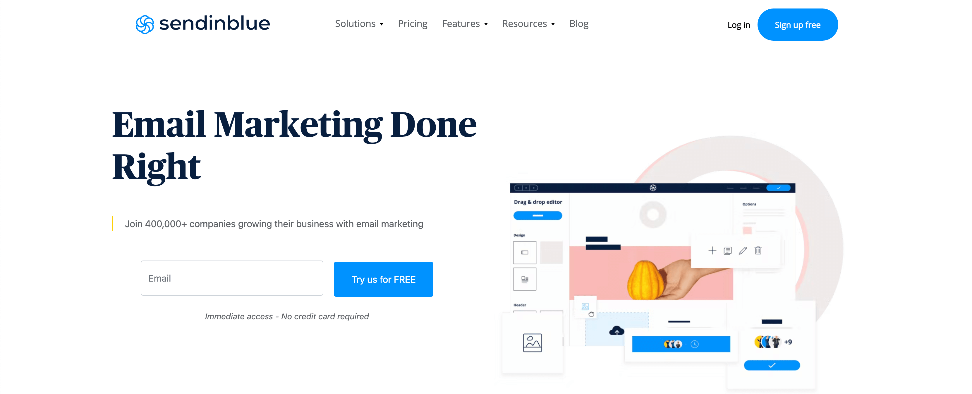
3. Brevo (Formerly) Sendinblue
Brevo is not only one of the best email service providers, but it also offers SMS and chat channels. So you can communicate with your customers on all platforms that they love.
Brevo comes with powerful marketing automation tools that help you segment your audience, schedule email marketing campaigns, and send targeted messages. And you can organize and manage it all in a single place.
Create an Optin Page and Start Growing Your List Fast!
Now that you’ve seen some optin page examples and learned about a few handy tools, we hope you feel ready to get started!
But if you still want to research more, we have some more resources for you
- How to Create a Landing Page the Converts
- Landing Page Ideas That Are Strikingly Simple
- 20 Easy Landing Page Design Tips to Boost Conversions
And no matter what design style and tools you choose, OptinMonster will take your signup pages to the next level!
With our lead generation software, you can easily create 2-step optins, exit-intent popups, and much more.












Add a Comment