Are you looking for an easy way to capture more leads on your website? Do you want to learn how to create a lightbox popup without spending too much time?
On average, popups convert anywhere between 1-8% on an average and lightbox popups are one of the best ways to grab visitors’ attention. Some OptinMonster customers who have used lightbox popups have improved their conversion rate by as much as 600%.
With a lightbox popup, you can:
- Drive traffic to your best content
- Grow your email list
- Increase sales
We have created this step-by-step tutorial for you on how to create a lightbox popup and help you improve your lead generation. In this post, we’ll go over the following topics:
- What is a Lightbox Popup
- Why Lightbox Popups Convert So Well
- How To Create a Lightbox Popup with OptinMonster
- Lightbox Website Examples From Real-Life Brands
If you are ready to create a lightbox popup, you can jump to the step-by-step tutorial right away.
What is a Lightbox Popup?
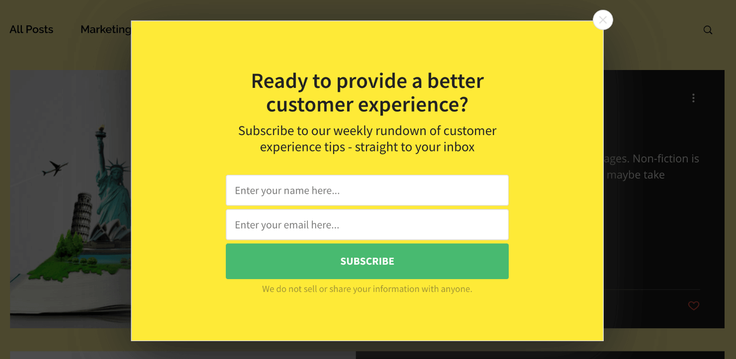
A lightbox popup is a design overlay that appears on a webpage you’re viewing. Like any other popup, the job of a lightbox popup is to attract visitors’ attention to a relevant offer with a call to action (CTA). Lightbox popups (also called modal popups or website lightbox popups) are most commonly used as optin campaigns for capturing email addresses.
But you can also use lightbox popups for other use cases, such as:
- Asking visitors to like your Facebook page
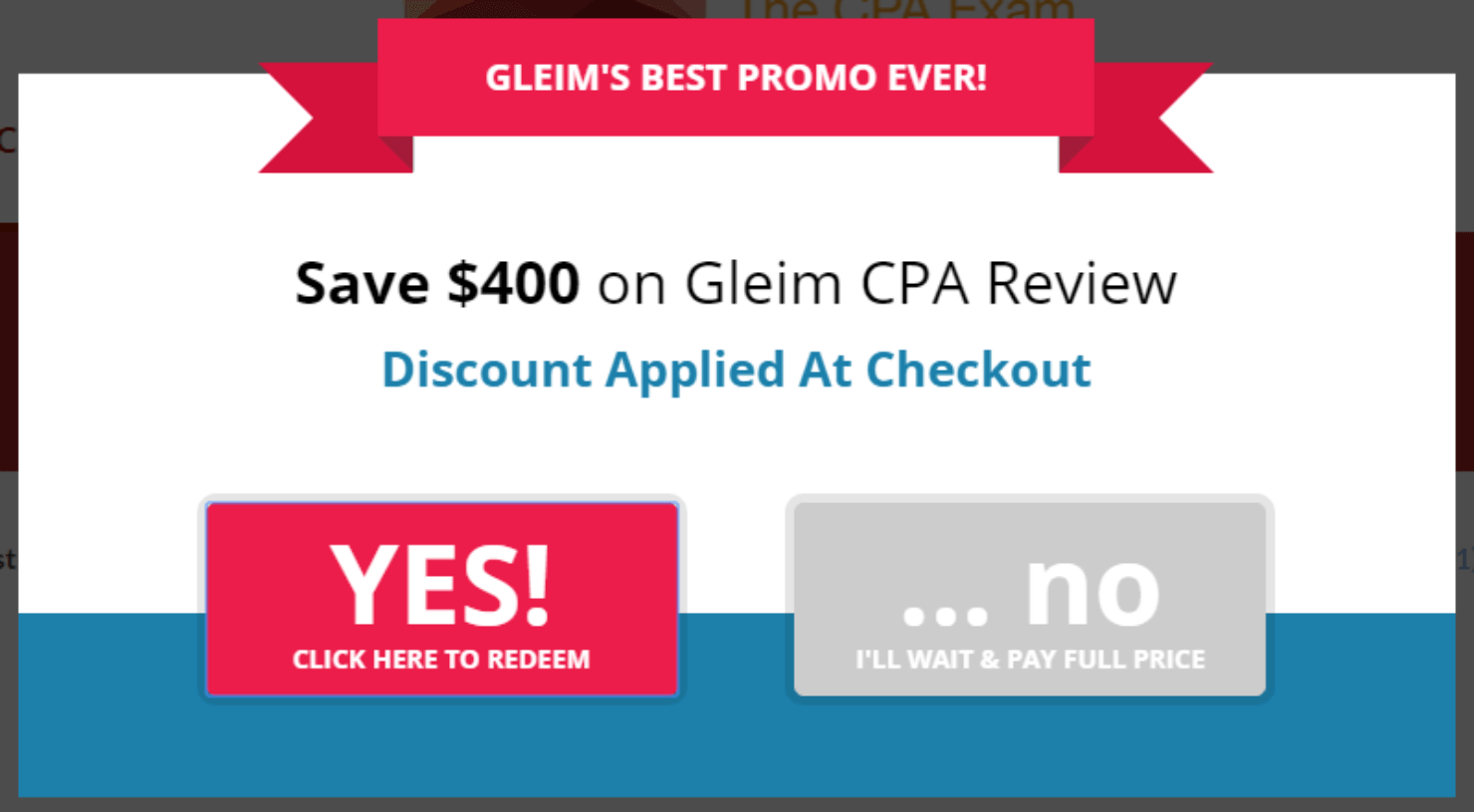
- Offering coupon codes to increase sales
- Showing a countdown timer to increase urgency
Think of lightbox popups like the movie screen in a theater. When the movie comes up, everything around you goes dark. This automatically leads the audience to bring their full focus to the screen.
It’s the same with lightbox popups. When it shows up on a page, the background goes dark, and the popup’s content stands out.
Here’s an example of the website lightbox popup that we will create today:
The best part about lightbox popups is that they convert like crazy! Crush Empire used the website lightbox popup below to convert 12.40% of its website visitors.
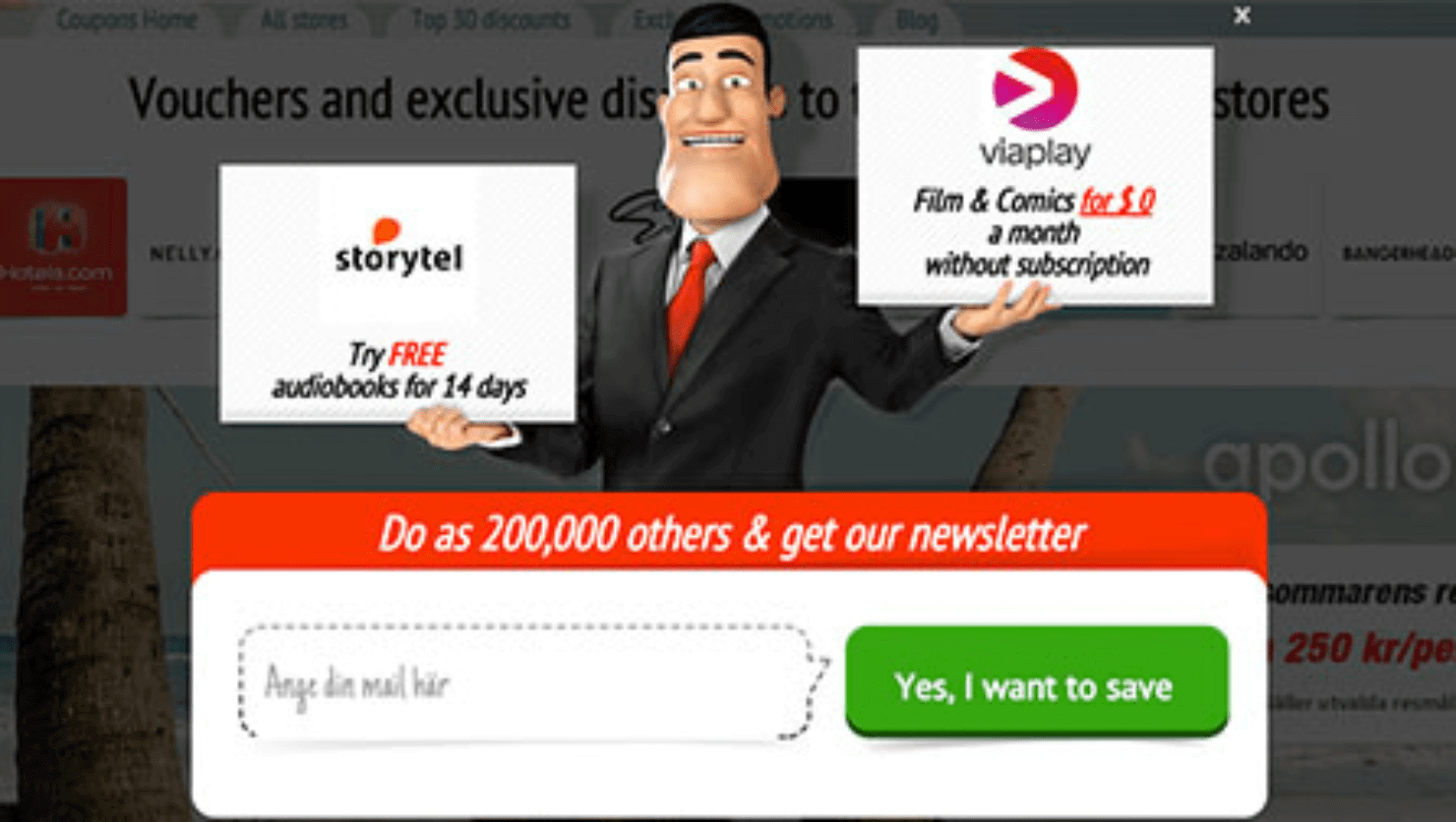
Kampanjjakt increased its conversions by 800% with OptinMonster’s lightbox popup forms along with its custom API:
So what makes website lightbox popups click? Let’s go over some proven facts.
5 Reasons Why Lightbox Popups Convert Well
Lightbox popups capture more emails than the traditional email optin forms. Here are the top 5 reasons why a lightbox popup is a great lead generation tool.
1. Lightbox Popups Are Eye-Catching
Lightbox popups are hard to ignore.
You can’t say the same thing about a website notification banner, an online ad, or a push notification. Research shows that buyers are getting used to ignoring online ads. People will ignore anything on their screen that’s not relevant, personalized, or attention-grabbing.
But lightbox popups are different.
For visitors to ignore a lightbox popup, they have to click on the cancel icon or outside the popup area. But they don’t necessarily have to make an effort to ignore other design overlays like notification banners, ads, or cookie consent notifications.
They can sit idle in one corner of the website without people taking notice.
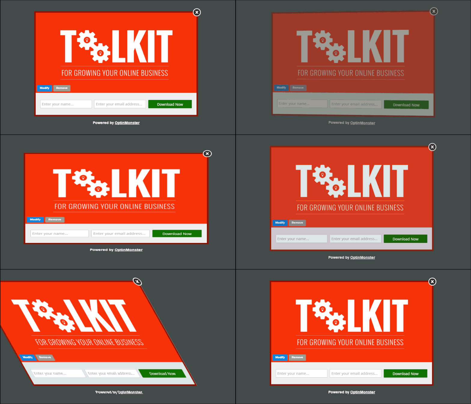
Website lightbox popups that use animations, like the one below, are even more engaging:
However, personalization is the key to making lightbox popups work better. You should always trigger them at the right moment, to the right visitors, with the right offer. We’ll talk more about personalization in just a bit.
2. Lightbox Popups Feature One, Clear CTA
Lightbox popups minimize distractions and bring visitors’ attention to a single CTA for them to click. Visitors who see a lightbox popup don’t have to deal with choice paralysis.
That’s because when a lightbox popup shows up on the screen, the background around it goes dim. By contrast, the content on the lightbox appears more prominent and eye-catching.
To make the conversion from lightbox website popups even better, make your offer attractive to your audience. If your goal is to grow an email list, use a copy that communicates the value of joining the community.
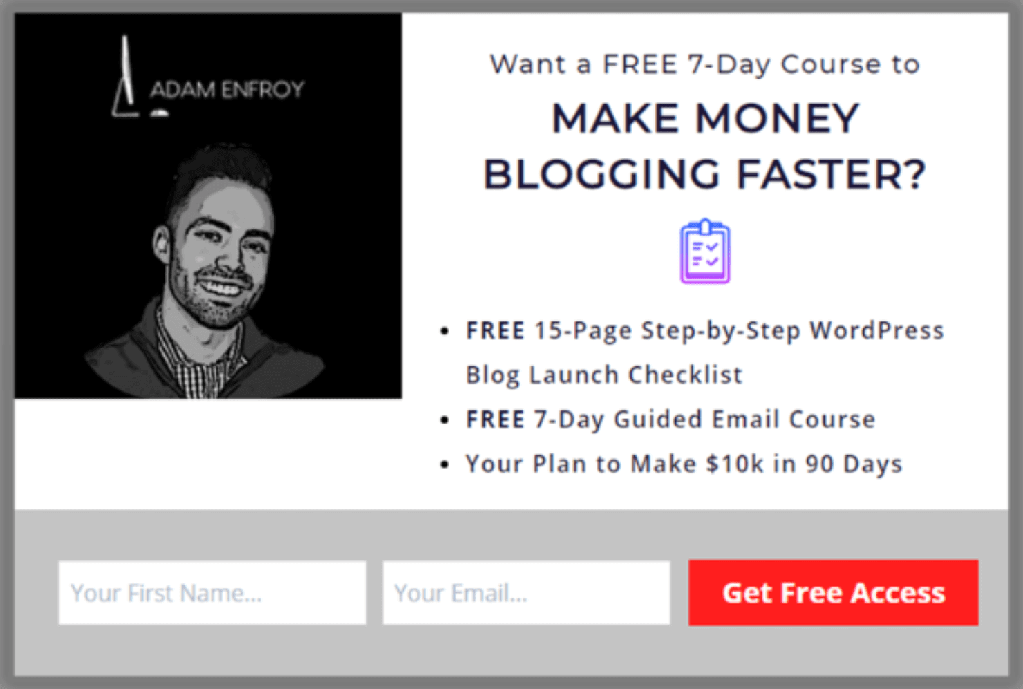
Here’s a lightbox website example from Adam Enfroy. This lightbox popup helped him gain 11,000+ email subscribers in just 1 year!
Pro-tip: Want to know what it takes to grow your email list with popups? Read our guide on email popup best practices and examples.
3. Timed Lightbox Popups Offer a Personalized Experience
Popups can be pretty annoying if they are irrelevant or interrupt your browsing experience. Like online ads and cookie consent notifications, people grow conditioned to ignore popups entirely if they become annoying. This is known as popup blindness.
But if you know when and how to use lightbox popups on a website, you can offer the site visitors an interactive, personalized user experience (UX). Research shows that personalization can encourage buyers to spend 38% more on average.
The good news is that you can trigger lightbox popups based on specific parameters or user behaviors. OptinMonster lets you launch lightbox popups based on several criteria:
- Time on site (or number of pages viewed)
- Scroll time (or time on page)
- Shopping cart abandonment
- Specific date or time
- User segmentation
- Returning visitors
- Exit intent
To make customer journeys contextual and fulfilling, you can control exactly when or where your lightbox popup appears. This, in turn, leads to higher conversions and increased sales.
The key to personalizing user experience is to think about your visitors’ intent or the page they are on at the time of their browsing.
Pro-tip: Want to create hyper-personalized lightbox popups? Check out our guide on how to use Smart Tags in OptinMonster.
Smart Tags are code snippets that allow you to add dynamic text to your campaign, such as a customer’s first name, previously purchased products, or their company’s URL addresses.
4. Lightbox Popups Go Well With Incentives
Coupon marketing is amazing, and it works really well with lightbox popups. Let’s look at some statistics on just how powerful coupons are:
- 66% of buyers admit to buying a product if they had a coupon, even if they didn’t have the intention to buy initially.
- Coupon codes influence the behavior of 83% of buyers.
- 96% of buyers look for promo codes before making a buying decision online.
- 80% of buyers say that they would try a new brand if it offered them a discount.
Offering coupons and discount codes is a great way to help people make up their minds about buying. Popup coupon promotions generally work better than sharing coupons via email or social media.
That’s because visitors can see and redeem popup coupons in real time. With popup coupons, there’s less time and friction involved between seeing a promo and applying it on the checkout page.
The context switching in popup coupons is also less. Context switching from one unrelated task to another is tiring. Customers can drop out between copying a coupon code from their email, leaving their inbox, and going to the pricing page.
But with popup coupons, you can add a CTA button that takes the buyers directly to the checkout page with the promo code already applied to their purchase.
5. Lightbox Popups Are Great for Recovering Abandoned Carts
70% of visitors who abandon your site never come back again. This means losing money in customer acquisition and wasting your marketing efforts.
You can turn things around with an exit-intent popup. OptinMonster’s Exit-Intent® Technology can help you convert 2-4% of your visitors into paying customers.
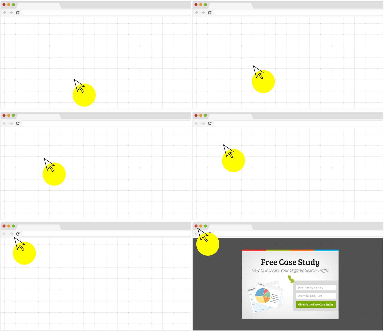
OptinMonster’s Exit-Intent® Technology tracks the mouse movement of your visitor. The lightbox popup appears when visitors move their cursor toward the top of the page, getting ready to close the window.
The Exit-Intent Technology works differently on mobile devices. Instead of tracking mouse movements, it launches a popup when users:
- Scroll up on their mobile screen
- Hit the back button on their mobile browser
Lightbox popups triggered right before a visitor’s exit can help them change their minds. It gives them one last chance to convert, which means additional sales from almost-lost customers.
Pro-tip: Want inspiration to design the perfect exit-intent popup campaign? Head over to our exit-intent popup examples gallery.
Now that you know why lightbox popups convert so well, let’s go over the step-by-step tutorial on how to create a lightbox popup.
How to Create a Lightbox Popup in OptinMonster
OptinMonster offers the easiest way to create lightbox popups on a website. OptinMonster is the best lead generation software and WordPress plugin that comes with powerful functionalities:
- 100+ ready-to-use templates
- Easy drag-and-drop designer
- Targeting triggers and campaigns
- Exit-Intent® Technology
- A/B split testing
- Actionable insights
- Integrations with all major marketing, eCommerce, and website builders
The level of personalization that OptinMonster offers can help you increase the user experience and drastically improve your conversions.
For today’s tutorial, we’ll focus on creating a simple lightbox popup.
If you want to learn how to create a lightbox popup visually, here’s a video tutorial:
If you want to follow a written guide, let’s get to it step-by-step:
- Step 1: Create a Campaign
- Step 2: Customize Your Campaign
- Step 3: Set Display Rules
- Step 4: Set Up Your Email Integrations
- Step 5: Publish Your Lightbox Popup Campaign
Step 1: Create a Campaign
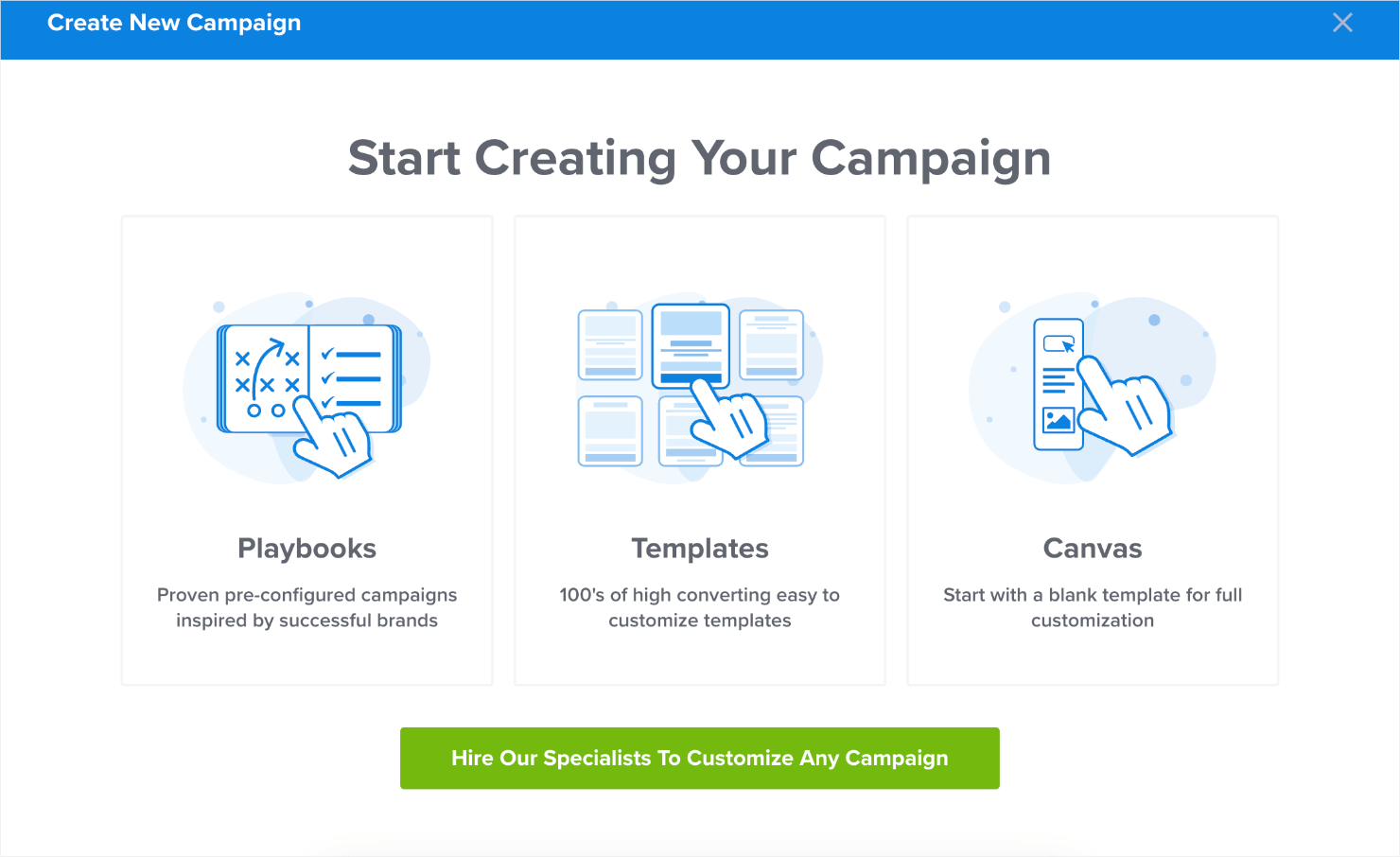
Start by signing up for OptinMonster or log in to your existing account. Once you’re logged in, click on the green Create New Campaign button:
You’ll see the following 3 options on your screen. Select Templates.
On the next screen, you’ll see different campaign options. To create a lightbox popup, we’ll choose Popup.
Here, you can choose from 100+ professionally designed popup templates for your website lightbox design.
For this tutorial, we’ll choose the Subscribe to Newsletter template to keep things simple. It’s the perfect campaign template for growing an email list:
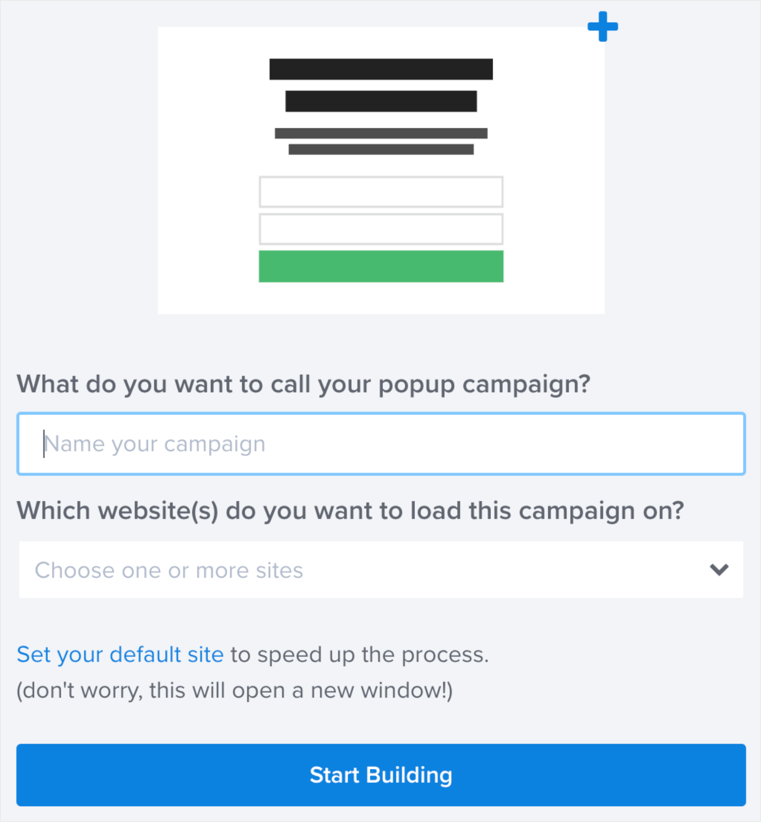
Now, give your campaign a name. The name is for your use only, and it’ll help you easily locate the campaign in your Campaigns dashboard.
At this point, you can also add the website where you plan the popup to appear. Or, you can skip it for now and select the website before you publish your campaign.
Finally, click on Start Building when you’re ready to create the campaign. This will take you to OptinMonster’s campaign editor.
Step 2: Customize Your Campaign
Customizing your campaign is important (and fun) because you can design it to reflect your website’s brand colors, font types, and other aspects of the brand personality.
So how do we do that in OptinMonster? Just point and click. It’s that simple.
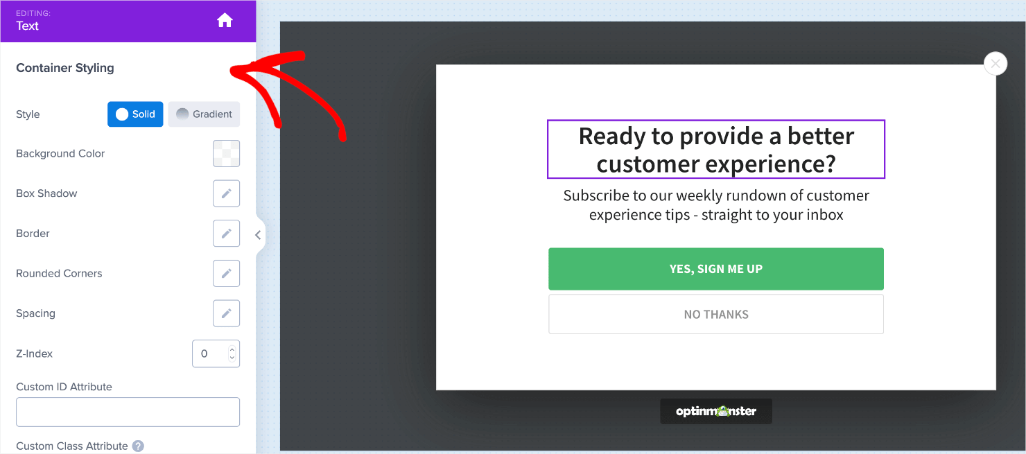
For editing a text field, go over the desired text area and click once. You’ll also see plenty of menu options for customizations on the left sidebar:
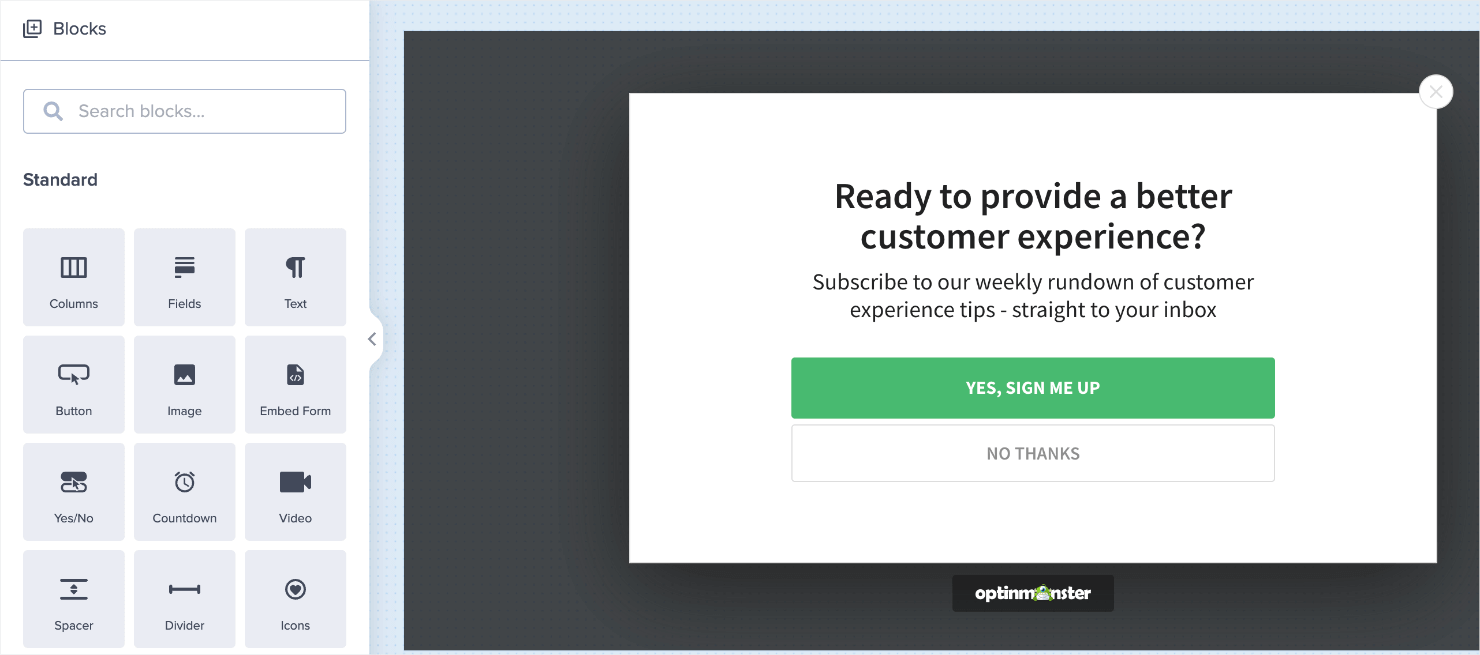
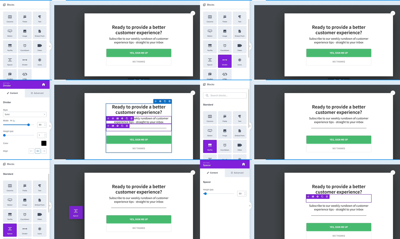
You can add other elements to your popups, like columns, images, embedded forms, countdown timers, videos, HTML widgets, or custom CSS. For that, you need to click on the home icon at the top-right of the menu.
To add new elements, click and drag a block from the menu and drop it into the editing canvas. Here, we added a divider and spacer widgets just for demo purposes.
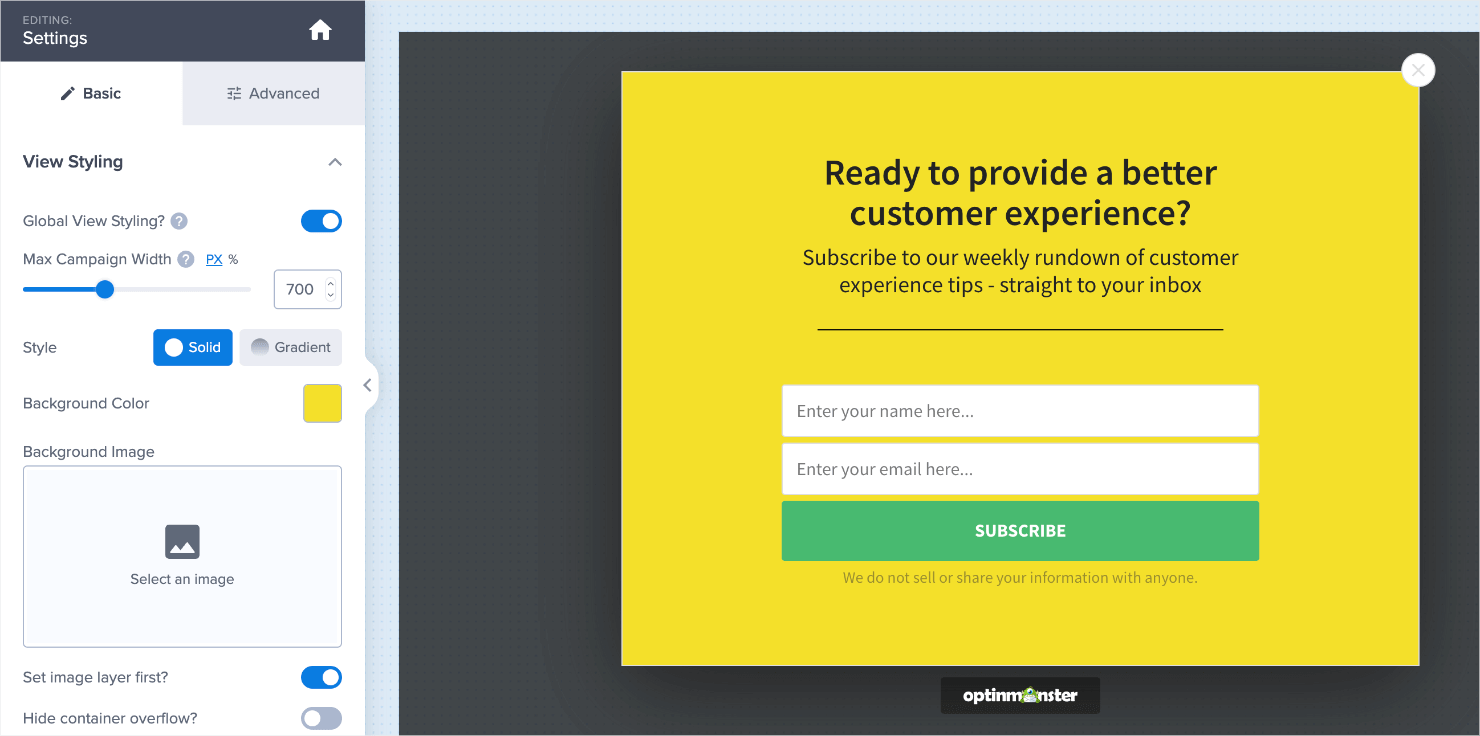
We’ll change the popup’s text fields and replace the CTA button to make it suitable for a newsletter subscription popup. We’ll also change its background color to make sure it stands out:
Don’t forget to hit Save on the top-right of your screen to make sure you don’t lose the customizations you’ve made so far.
Once your campaign looks the way you want, you’re ready to set your display and targeting rules.
Step 3: Set Display Rules
Display rules let you control who sees your lightbox popup campaign on your site, where it shows up, and when.
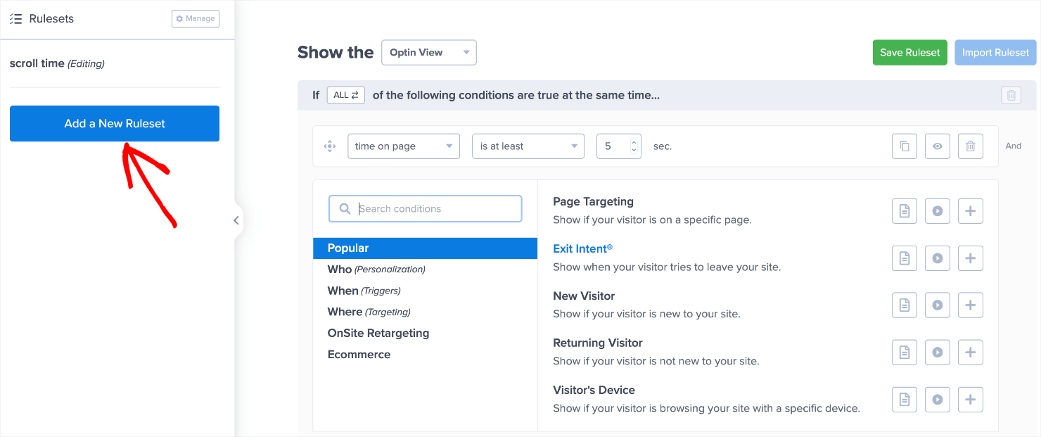
By default, all campaigns are set to display on any page after 5 seconds.
To edit the default settings, click on the Display Rules tab on the top of your screen and click on the Edit button:
You can either click on the drop-down menus to edit the default ruleset or on the Add a New Ruleset button on the left to create your own rulesets.
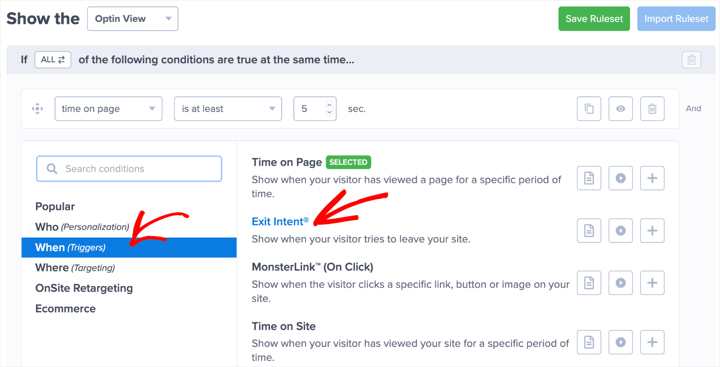
For this tutorial, let’s choose the Exit Intent® rule from the When (Triggers) option.
Most of our customers have had great success with exit-intent popups. Here are a few case studies:
- Scott Wyden used exit-intent popups to recover 21% of its abandoned carts.
- BrianTracy.com used them to recover 11.8% of abandoning visitors.
- Crossrope used them to convert 13.71% of abandoning visitors.
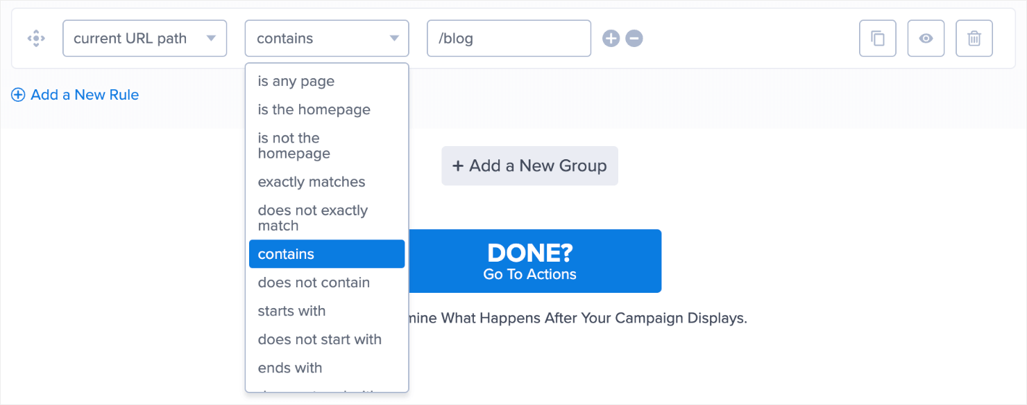
Next, we’ll pair exit detected with on desktop devices only since a lot of people don’t prefer reading newsletters on mobile devices.
Similarly, we’ll select the current URL path and contains to pair them with the /blog URL suffix.
This ensures that the lightbox popup only appears on your blog page when the visitors are about to exit it from their desktop browsers.
It’s important to carefully select the display rules so that you don’t annoy your visitors with irrelevant popups that interfere with their user experience.
There’s so much you can do with OptinMonster’s Display Rules engine, from creating follow-up campaigns to setting up onsite retargeting.
Pro-tip: Don’t want your existing subscribers to see the lightbox popup? Read our guide on how to hide popups from your existing subscribers.
When you’re ready, we’ll move on to setting up an integration with your preferred email marketing software.
Step 4: Set Up Your Email Integrations
When your lightbox popup starts collecting leads, you’ll need someplace to store them.
OptinMonsters integrates with all the top email marketing platforms so you can automatically push new leads to your existing email database.
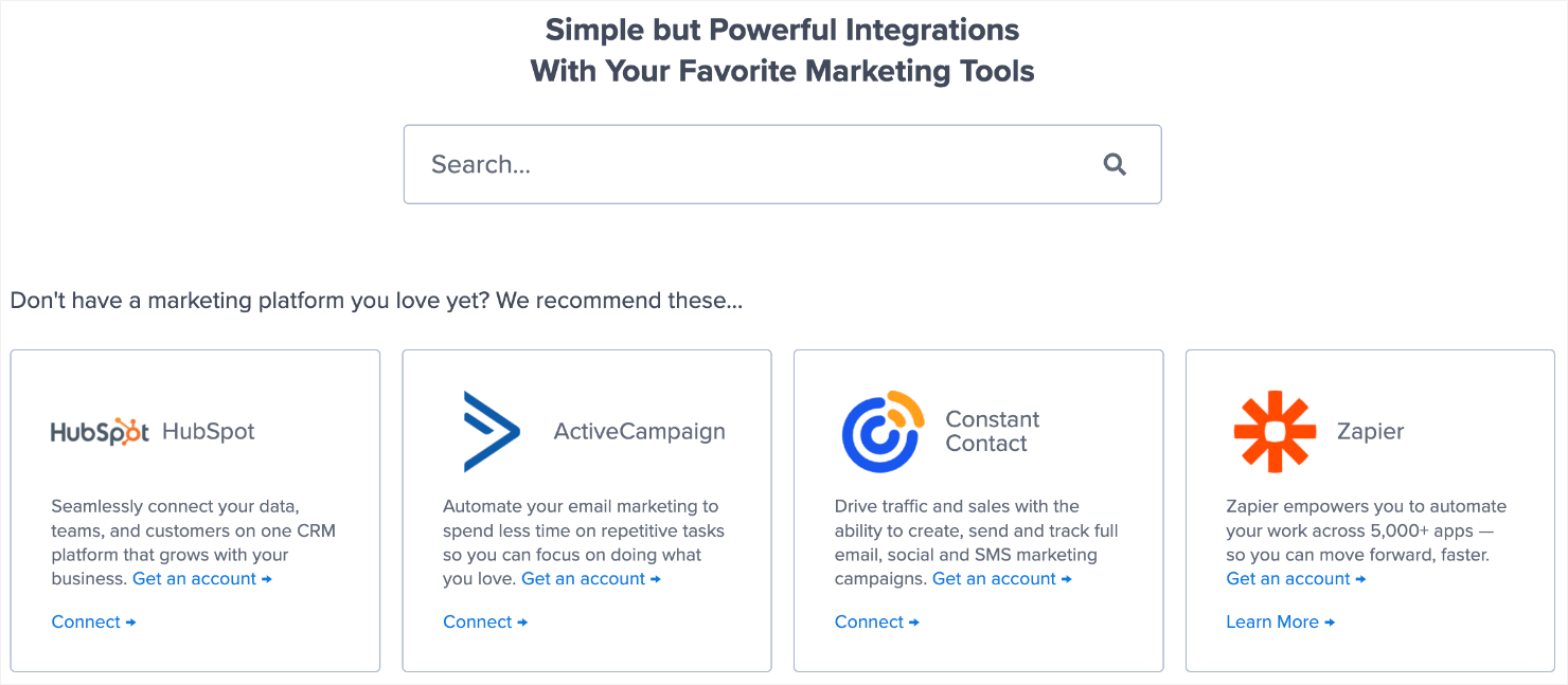
To do that, go to the Integrations tab from the menu at the top.
Next, you can either search for your email marketing platform or scroll through the page to find it.
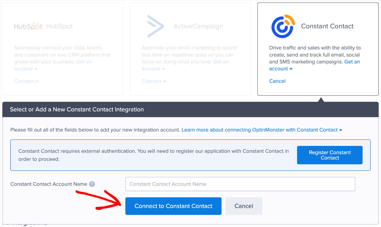
If you use Constant Contact, for instance, you’ll need to log in to your Constant Contact account to proceed with the integration.
But what if you don’t use an email marketing platform? You can connect with Monster Leads.
Monster Leads is a lead storage tool built right within OptinMonster’s dashboard. It allows you to manage leads without buying an email marketing service provider.
While you can’t use it to send emails to leads, Monster Leads lets you send them via your own email client.
To make the most of Monster Leads, read our guide on how to connect Monster Leads with OptinMonster.
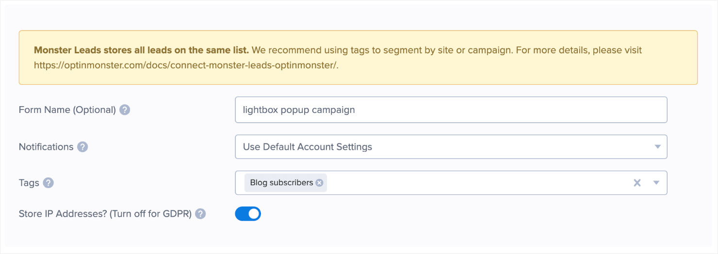
When you click on Monster Leads from the Integrations page, you’ll see the following fields:
Once you’re done updating the form fields, click Save to activate Monster Leads for your lightbox popup campaign.
You’re almost ready to publish the lightbox popup on your website!
Step 5: Publish Your Lightbox Popup Campaign
Click on the Publish tab from the menu.
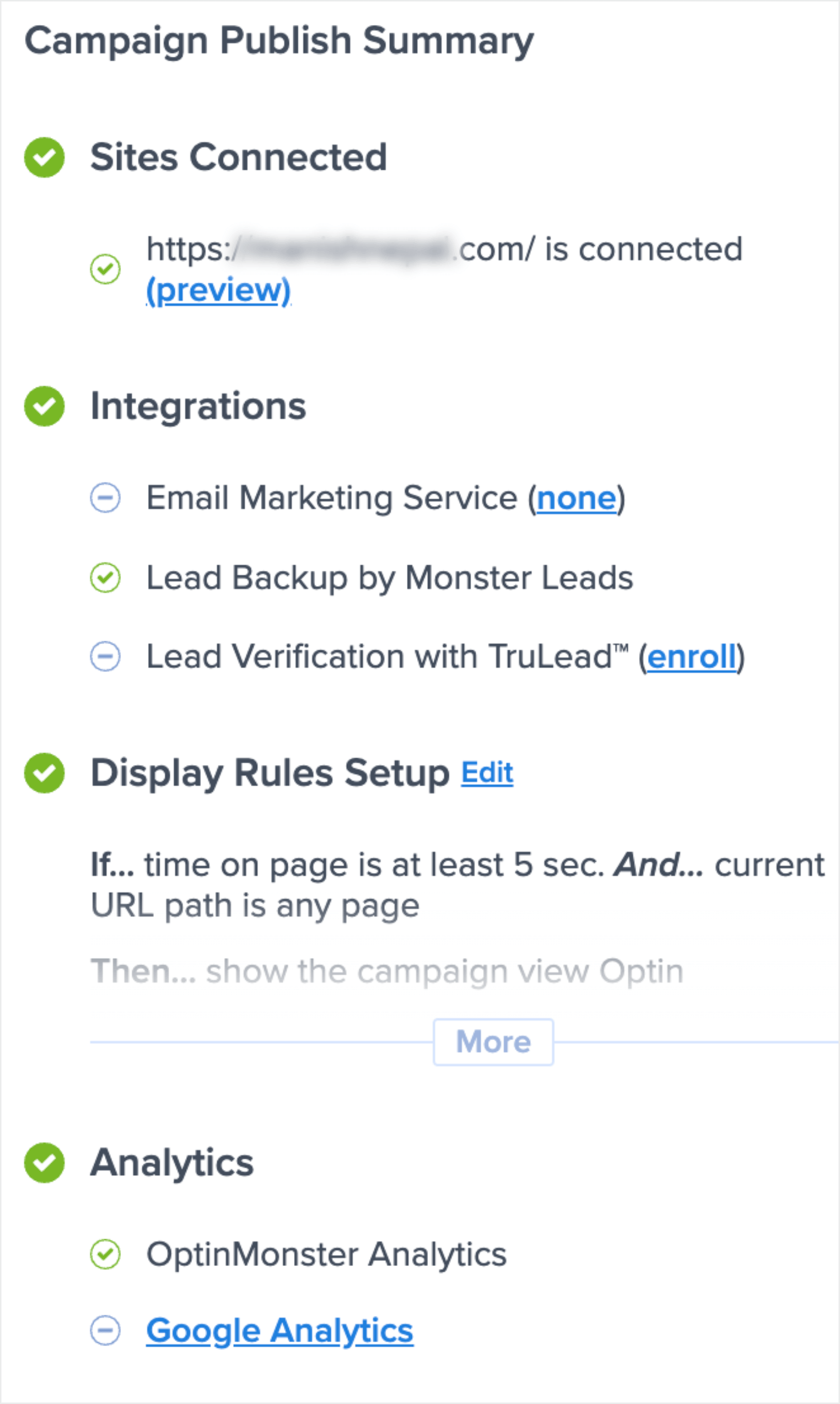
You will see the campaign summary on the right sidebar. Take a minute to double-check if your settings and display rules are set the way you want.
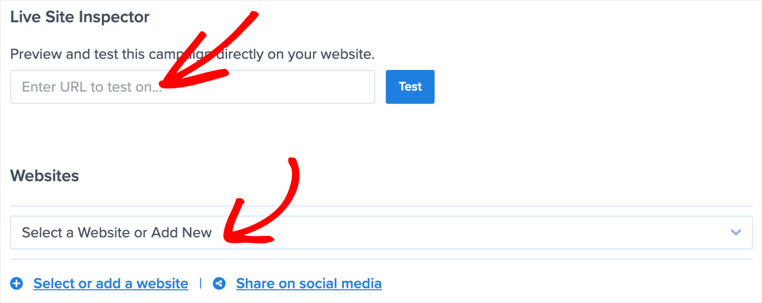
Here, you can enter one of your website’s URLs to test the lightbox popup. Or, you can select or add a new website for the popup to show up on.
Once you add a website for the popup to launch, hit the Publish button or schedule the campaign to show up between a specific date and time.
If you want to learn the nuances of embedding the popup across your site or only in specific places, read our guide on how to embed your campaigns on your site.
And that’s it! Here’s how the lightbox popup looks on a website after we published it!
Next, let’s go over 6 lightbox website examples so that you can decide what’s best for your site.
6 Lightbox Website Examples to Consider
Here are 6 real-world lightbox website examples that can help you decide what kind of popup campaign you want to run on your website.
1. Promotional Lightbox Popup
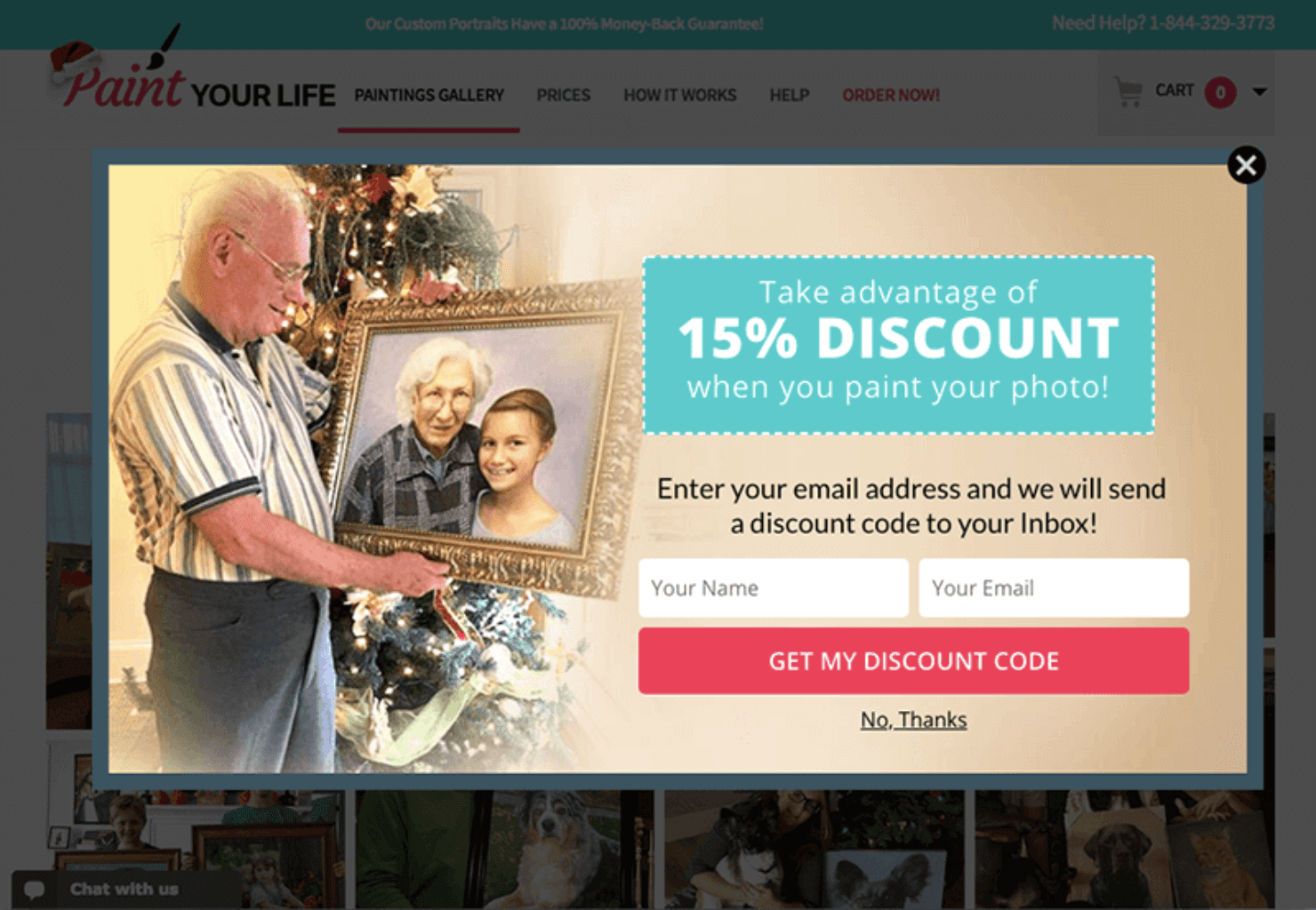
Paint Your Life uses a promotional lightbox popup campaign to drive signups for its website. With this particular lightbox, Paint Your Life converted 28.57% of website visitors to email subscribers.
2. Mobile Lightbox Popup
Google is known to penalize rankings of websites that use interstitial ads or popups on their mobile sites.
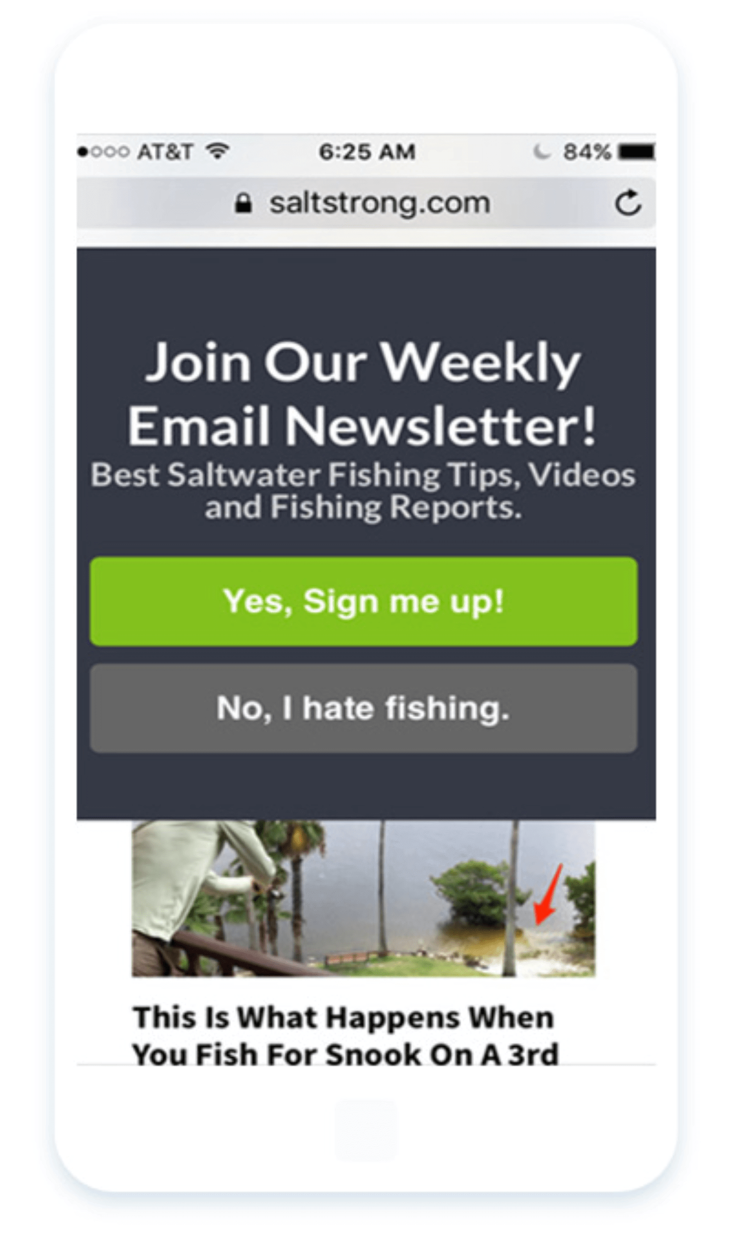
Salt Strong was already using popups on its desktop website to generate leads. But the fear of Google’s penalty was holding it back from replicating this strategy on mobile websites.
After learning that OptinMonster optins passes Google’s mobile penalty test, Salt Strong created the following mobile lightbox popup. The campaign helped them convert 3.8% of mobile readers.
3. Email Newsletter Lightbox Popup
Brands asking visitors to sign up for their email newsletter is one of the most common uses of lightbox popups. It’s the most effective way to engage with your target audience and grow your email list.
The popup that we’ll cover in the tutorial today is also an email newsletter signup popup.
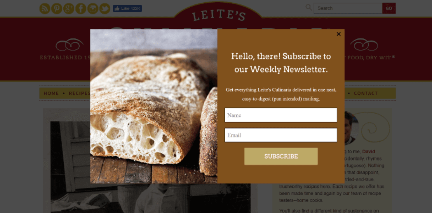
Leite’s Culinaria uses a similar lightbox popup to persuade its website visitors to sign up for a weekly newsletter.
4. Lightbox Popup Form
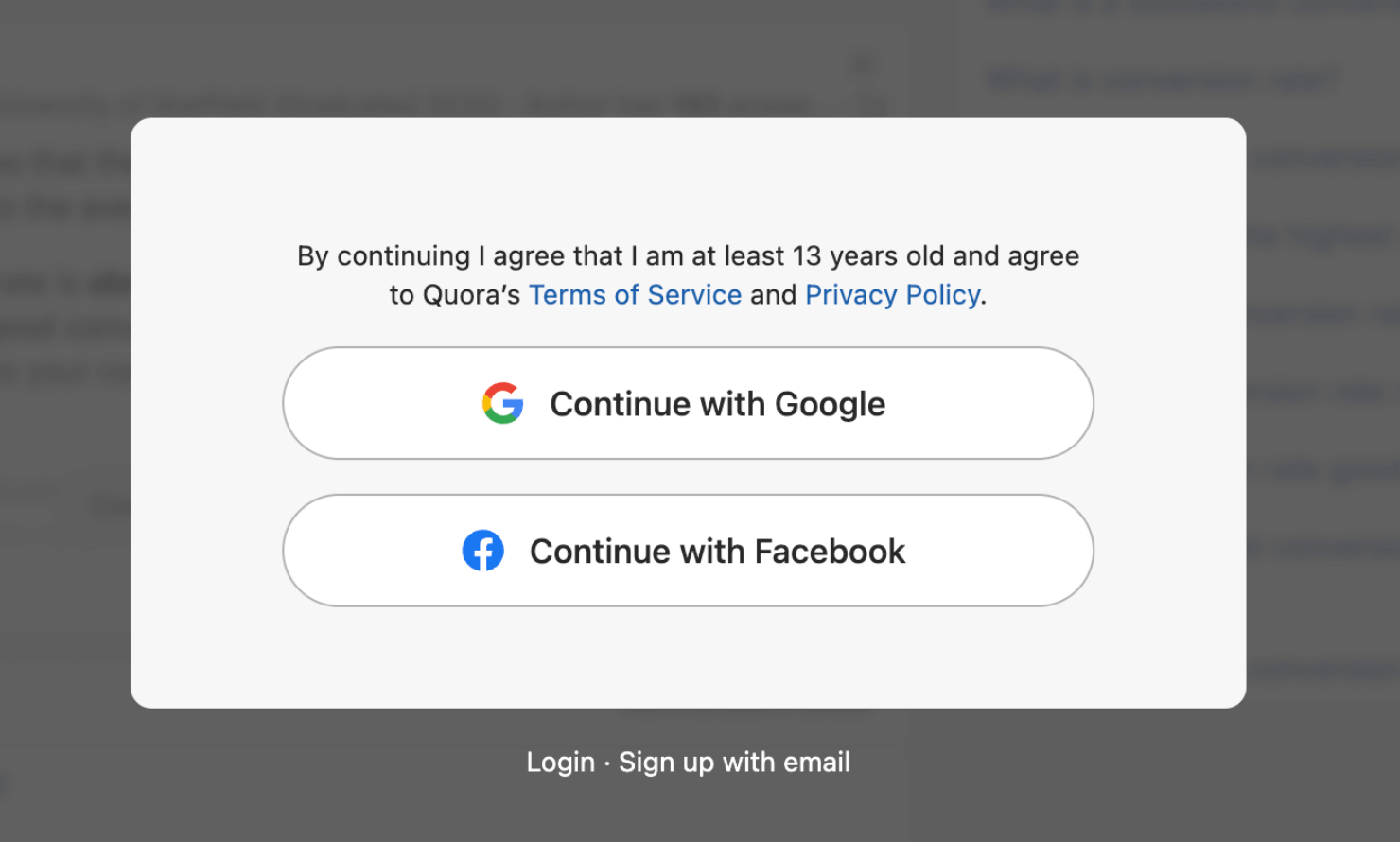
While it’s rare for online businesses to use lightbox popups for signup forms, it’s not completely unheard of. Quora uses a lightbox popup form for visitors who want to read, upvote, or reply to threads.
Pro-tip: Want to apply a similar feature to your blog page? Check out OptinMonster’s Content Lock feature. It lets you lock your most sought-after content pieces and incentivizes visitors to sign up for your site. To learn more, read how to use OptinMonster’s Content Locking feature.
5. Content Upgrade Lightbox Popup
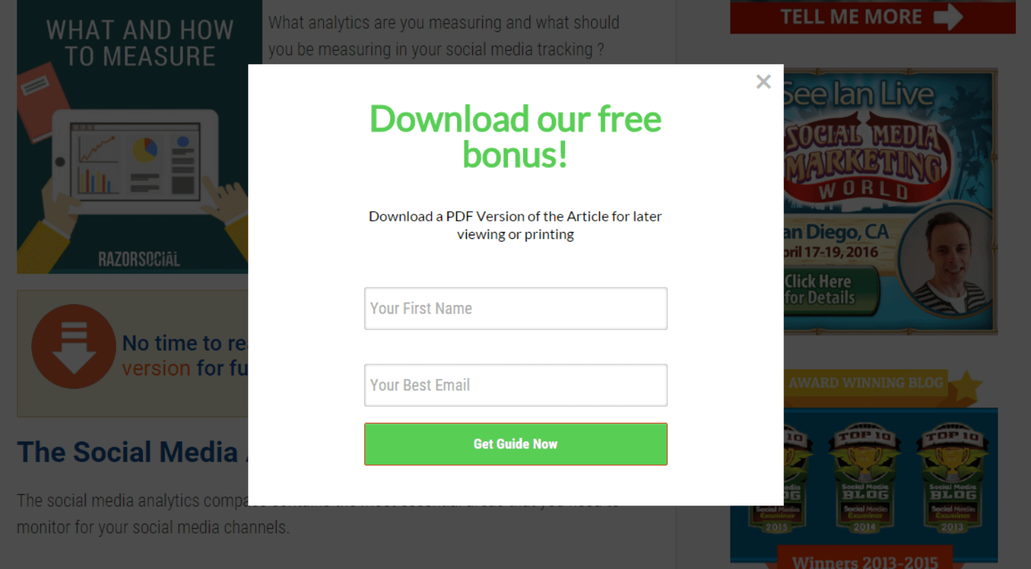
Like a lead magnet, a content upgrade is a piece of bonus content you offer to site visitors in exchange for signing up.
Here, you can see Razor Social’s lightbox popup example on their website. The popup campaign got them over a 520% increase in conversions.
6. Exit-Intent Lightbox Popup
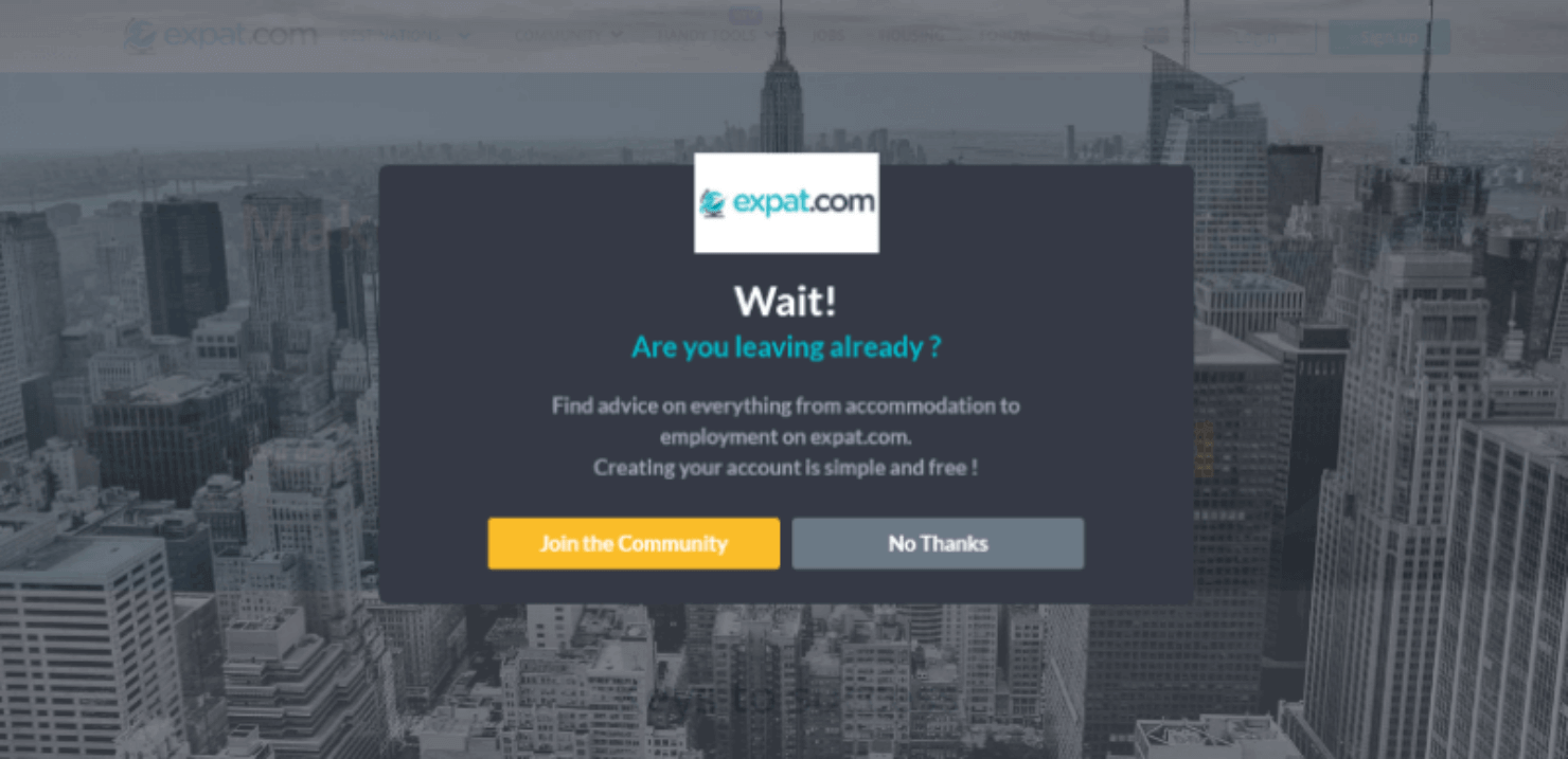
Expat.com created this exit-intent lightbox popup on their website and converted 2.09% of abandoning visitors.
It might not sound like much, but this campaign helped them add tens of thousands of visitors to their community each month.
Ready to Illuminate Your Site With a Lightbox Popup?
Now you know all about lightbox popups and how to create one using OptinMonster! Do you want to create a lightbox popup and publish it on your website? Sign up for OptinMonster today.
If you enjoyed this article, check out these resources on how to use popups for higher conversions:

















Add a Comment