Are you getting loads of traffic to your site but struggling to get people to sign up for your offers? If so, you might want to consider giving 2-step optins a try. They’ve been proven to help many companies convert traffic into loyal customers.
And who knows? They may be just the conversion tool you need to get the same results.
So in this article, we’re going to cover why you should be using 2-step optin forms and how to easily create them with OptinMonster.
After reading this post, you’ll have everything you need to create optin forms that not only drastically boost your conversions but can also bring awesome increases in revenue.
But before we get into all that, let’s first talk about what we mean by 2-step optin forms.
What Are 2-Step Optin Forms?
A 2-step optin form is a way of easing the visitor into the process of handing over their contact information. Rather than your popup immediately asking for an email address, it adds a buffer step to grease the wheels.
And that’s what makes optin forms so powerful. They’re really effective at growing your email list.
Now, if you’re a regular reader of OptinMonster’s blog, then you know how big we are on email marketing. More than any other channel or platform, email marketing is the best way to increase your revenue. Why?
Because unlike social media, no one can shut it down. And unlike other outbound marketing strategies, you’re only contacting people who’ve already given you permission to.
So if email marketing is the ultimate win-win strategy for merchant-client communication, then optin forms are the all-star quarterback. And if that’s true…
…then 2-step optin forms are like the all-star quarterback on steroids.
Not only have 2-step optin forms been shown to increase conversions, but their success is also rooted in some scientifically proven psychological behaviors.
It’s called the Zeigarnik effect. And it’s awesome.
Without getting too deep into the details, the Zeigarnik effect is the idea that people have a tendency to finish tasks they’ve left unfinished. When one of your visitors gets a popup that immediately asks for an email address, you (the business owner) have started a process.
Not the client.
But when the client sees a popup asking if they’d like to receive an offer and they voluntarily click “yes,” then they (the client) have started the process. And once they’ve begun, they’re more likely to finish.
Ok. Enough of the Psychology 101 crash course. Let’s get to how you can put 2-step optin forms into action. There are two methods for taking advantage of the Zeigarnik effect and increasing your conversion rates.
Two Ways to Create a 2-Step Optin Form with OptinMonster
1. Activate the Yes/No Feature in Your Campaign for a 2-Step Optin Form
Like we said, 2-step optin forms work because you’re adding a buffer step to let your client begin the optin process. That means rather than diving into the optin, you simply add a Yes/No view to your campaign.
The good news is that, with OptinMonster, building a Yes/No campaign is as easy as it is effective. Here’s how to get started:
First, log into your OptinMonster dashboard:
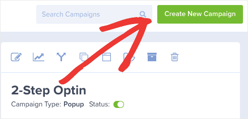
Then, on the top right-hand corner of your dashboard, create a new campaign:
Choose which type of campaign you want:
In this demo, we’ll use a popup.
Now select a template:
Today, we’ll use a template called Boost.
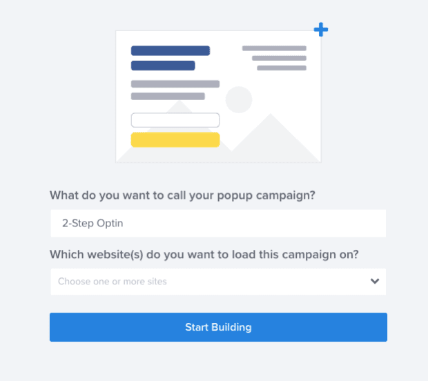
Name your campaign and choose which website you want it to appear on. Then click Start Building:
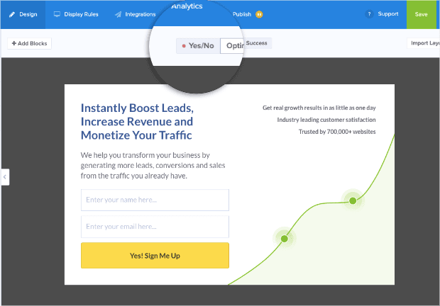
At this point, you have your template in the editor. On the top of the page, there are three view options for your campaign: Yes/No, Optin, and Success.
Click Yes/No:
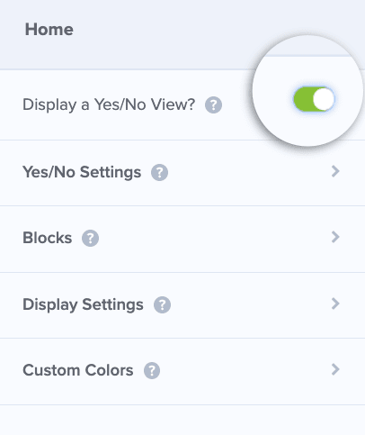
Turn your attention to the left-hand side menu, and you should see an option to Display a Yes/No View. By default, this is turned off and the toggle appears in red:
Click the toggle to activate this feature. It turns green when activated:
Now the Yes/No view (the first half of your 2-step optin form) should be displayed in the editor.
Customizing Your Yes/No Form
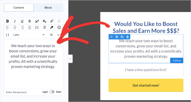
You can click on any of the blocks in your campaign template to customize them. Start with the text blocks. Remember to keep your main headline short, catchy, and to the point.
You may even want to throw in some power words to create an emotional trigger.
Your subheading should be more informative, though still as concise as you can make it:
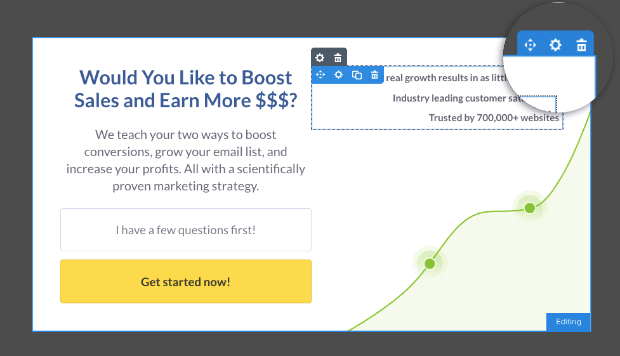
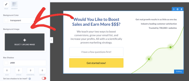
You can also customize the background image by clicking the gear wheel on the background block.
Then you’ll have a place on the left-hand side menu to upload a picture of your own:
Or, you can stay with the templated design. It really depends on your site and your overall goals.
For this tutorial, we’ll keep the template design.
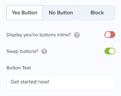
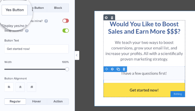
Now it’s time to customize your Yes/No buttons. Click on the optin block with the two buttons (“I have a few questions first” and “Get started now”). Then you can start editing your Yes button:
Editing Your Yes Button
With OptinMonster, you can pretty much change anything in your template. Even the buttons. A good place to start is your Yes optin button.
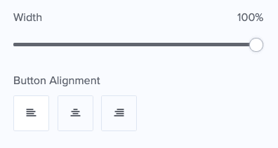
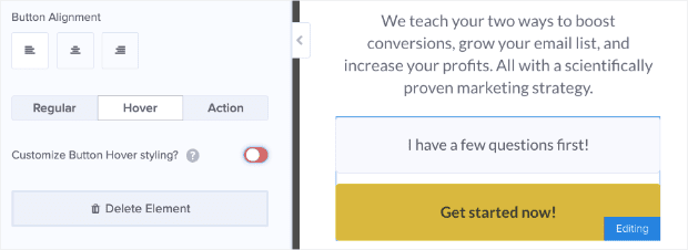
In the left-hand side menu, you can customize the button’s width or realign it to be far left, center, or far right:
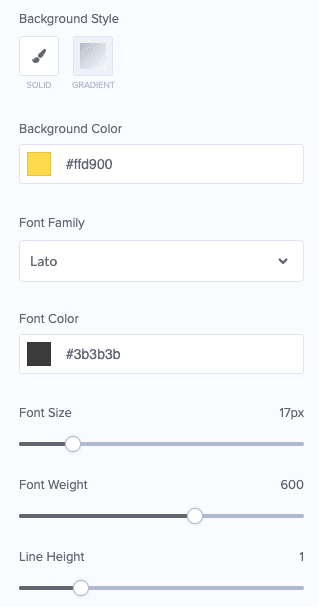
And you can edit the appearance of the button (button color, font, font color, and so on):
Again, OptinMonster makes it easy to tailor every aspect of this view to your brand’s design.
One feature that is often overlooked is deciding what your button should look like when a visitor’s mouse hovers over it.
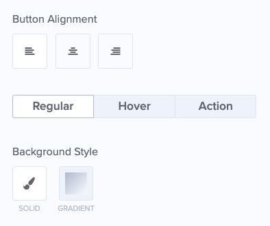
If you look under Button Alignment, you should see Regular, Hover, and Action.
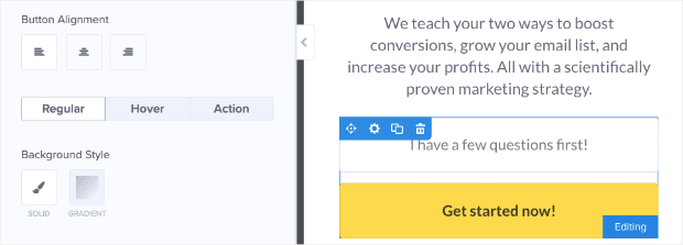
The Regular feature is what your button looks like on the page when it isn’t in use:
The Hover feature refers to when a cursor rests on the button but before any clicking happens. By default, the hover design simply lightens or darkens the button as the cursor scrolls across it:
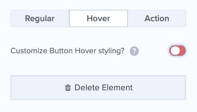
However, you can further customize how this looks by clicking the toggle next to the phrase Customize Button Hover styling. Again, the toggle is red when it’s deactivated:
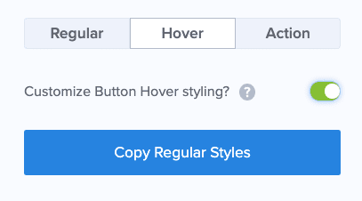
And green when it is activated:
Customizing the hover feature is done in the exact same way as when the button appears in regular mode. That means you get to decide what to change (but the default setting is usually fine for most merchants).
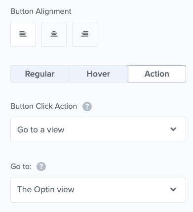
Next up is the option to customize Action. This refers to what happens when the user clicks each button. For your Yes option, the default action sends your visitor to the optin view where they put in their email address.
Since we’re focusing on 2-step optin forms in this tutorial, we don’t need to change anything here. However, it is good to know that you can customize the action depending on your needs.
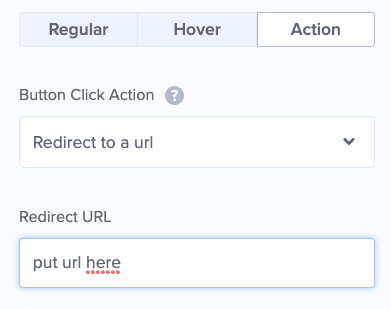
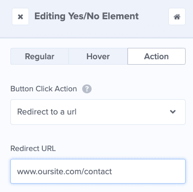
If you wanted to send a visitor to a pre-sell page on your site, for example, you simply click Action and choose Redirect to a URL in the first field. In the field just below that, you would input the URL where you want to direct your visitors:
Ok, now that we’ve covered the Yes option for your 2-step optin form, let’s customize your No option.
Editing Your No Option
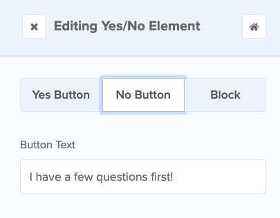
Scroll up to the top of the left-hand side menu. On the top, you should see Yes, Button, No Button, and Block.
Click No Button:
What you want to focus on here is the text. You want the text in your No option to do one of two things:
- Remind the visitor why No is the weaker of the two options
- Allow the visitor to click No but still stay on your website
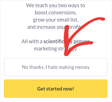
If you decide to remind users that No is the less appealing option, that’s fine. Just don’t insult their intelligence. A lot of users have grown tired of a No option that is too over-the-top:
This kind of web copy is offputting.
Instead, we recommend going with the templated text, “I have a few questions first.” While the user won’t be opting in to your offer right now, they’re still more likely to stay on your site.
Or you can send them directly to another page where they can get their questions answered.
We already saw how this works with choosing an action for your Yes option. Simply click Action to define what happens when the user doesn’t optin to your offer.
One action you may consider is sending users to an FAQ page or a Contact page so clients can get a hold of the answers they’re looking for.
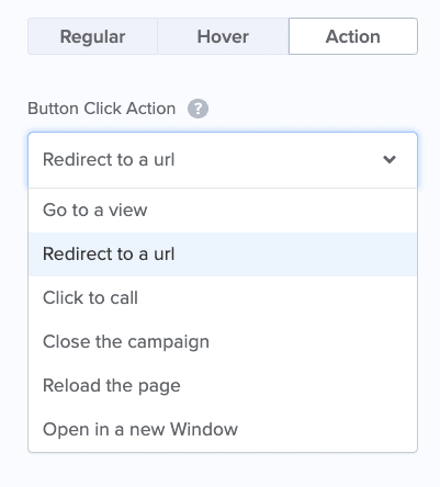
Simply open the field under the Button Click Action field and choose what you want to happen when a visitor clicks the No option.
You could then, for example, insert a URL under the Redirect to a URL field to send your visitors to your Contact page:
This is just one of the many actions you can choose for your No button.
However, it’s important to note that the default action when creating your campaign simply closes the landing page or popup on your visitor’s screen and allow them to continue browsing your site.
This action is useful for the majority of campaigns. That said, feel free to play around until you find the right balance for your company.
Once you’ve nailed your Yes/No view, it’s time to move on to the next step.
Customizing Your Optin Form
Now that the first phase of your 2-step optin form is completed, the rest is easy. You just need to customize your Optin view.
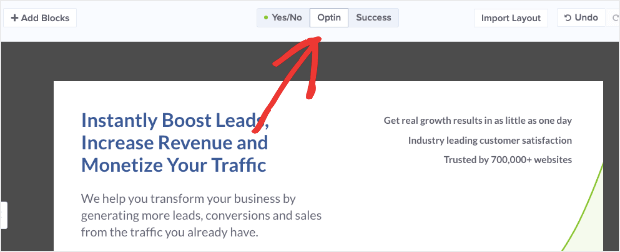
At the top of your editor, you have the main heading Yes/No, Optin, and Success.
Click Optin.
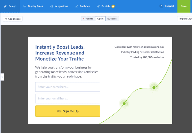
Your optin view should now appear in the editor:
Like you did in your Yes/No view, you can customize this view to include everything you need.
NoteAgain, make sure your headline text is powerful and concise, but different from your Yes/No view. Your subheading provides more information about your offer.
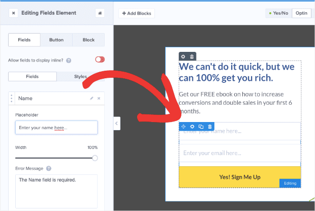
And now we can click on the optin fields block to customize it:
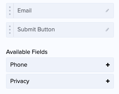
On the left-hand side, you should now see Fields, which allows you to add, delete, or customize the fields that are part of your optin. By default, the fields for this template include Name, Email, and a Submit button:
You can also add Phone and Privacy. That last one simply lets users know that you won’t share or sell their personal information (though you can custom the text for that, too).
For most users, the default options (name, email, and submit button) should be enough. It’s good to keep these forms as short as possible. That said, if you need more information in the future, you can try progressive profiling.
Progressive profiling is a way of collecting a lot of user information in smaller chunks over a longer period of time. It feels less intrusive and builds customer trust.
But, again, getting an email address should be enough for most of your marketing strategies.
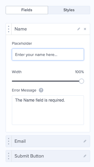
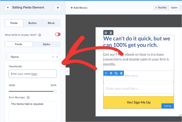
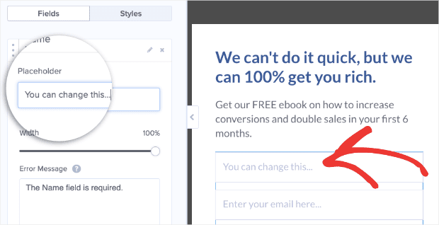
It’s important to know that for each field, you can customize the text your visitor sees. For example, if you want to change the phrase “Enter your name here…” in the name field box, simply click on Name in the left-hand menu:
This allows you to customize the text, set the text width, and even write a personalized error message in case your users try to submit without entering information in the field:
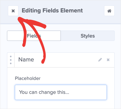
Now exit Editing Fields Element at the top of the left-hand menu:
Now you can customize your optin view.
In the past, we’ve written extensively on how to change various aspects of your campaign, so we won’t go over everything in this post.
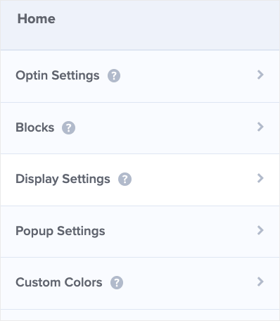
One thing we should point out, however, is to play around with and test Display Settings:
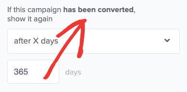
Display settings should be set so that you don’t show the same campaign to someone who has already converted to your offer:
This small feature makes a big difference in user experience.
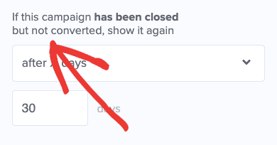
Also, if someone decided not to optin to your offer, you may want to wait a while before showing them the campaign again. That way they don’t feel like your optin is being too pushy every time they visit your site:
When you’ve decided on your optin layout, design, and display settings, you can move to the success view.
Editing Your Success View
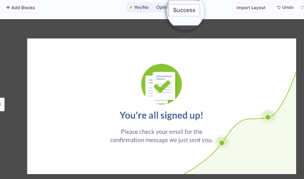
All that’s left for the editor is your success view. At the top, click Success.
Your success view should serve as a confirmation message that your visitor has signed up. It’s also a good practice to let your new subscriber know what’s going to happen next.
If they signed up for a free ebook, for example, you would tell them where they can find it on the success view. You need to customize this view according to your lead magnet.
And that’s it!
Your 2-step optin form is now complete and nearly ready to go live. But first…
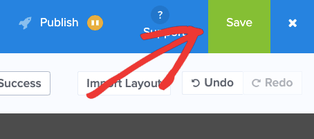
…hit save. ?
You’ve now completed the first method for making a 2-step form with OptinMonster. The second technique is a little simpler but just as effective.
2. Using MonsterLinks™ to Create a 2-Step Optin Form
Another way to create 2-step optin forms without activating a Yes/No view is with MonsterLink™. This feature allows you to embed the first step of your optin as a clickable link directly on your site or in your content.
Plus, it’s super simple to make.
First, go to your OptinMonster dashboard and begin creating a campaign just as you did above. For this tutorial, we’ll use the same template.
Once you’ve named your campaign and designated which website you want it to work for, you’ll be taken to the editor:
Instead of activating the Yes/No feature, you’ll start by customizing the optin view and the success view as we did earlier in this tutorial.
And now you’re ready to get your MonsterLink™ up and running. Click Display Rules at the top of your editor:
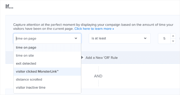
Once there, set your display rule by clicking the first drop-down menu under the word “If…”. Scroll down and select the option visitor clicked MonsterLink™:
Then click Copy MonsterLink™ Code:
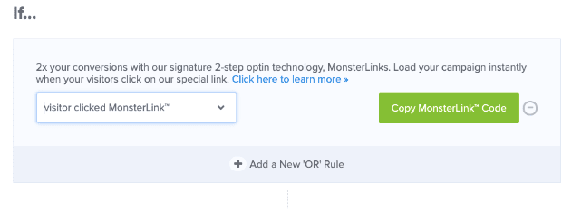
You now have a link to embed anywhere on your site. The link is copied in HTML form:
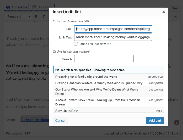
But if you want to embed your MonsterLink™ directly in your content, use the URL found in the HTML MonsterLink™:
Then embed the link into your WordPress editor (like you would any other link):
Now you have a clickable link to your optin directly in your content:
When a visitor clicks on the link, they’ll see your optin campaign and will have already started the process of converting:
Thanks again, Zeignarik.
Like we said, making a 2-step optin form with MonsterLinks™ really couldn’t be easier.
Final Thoughts for the Real Pros
Today’s post focuses on how to create a 2-step optin. But once your optin form is created, you should take some time to set specific display rules for your landing page or popup.
Your display rules allow you to customize when your visitor sees the campaign you’ve created. For an in-depth tutorial, check out our documentation on how to use display rules to customize when campaigns appear.
Or check out our video tutorial on display rules.
Now you have a totally custom 2-step optin campaign that boosts conversions and increases sales.
If you enjoyed this post, you may also be interested in reading this article, How to Add Multi-Step Popups to Boost Conversions.
And guess what? We would love to hear about your success.
So as you sit back and watch conversion rates skyrocket, let us know about it on Facebook or Twitter.
Ready to create your own 2-step optin? Join OptinMonster today!












Add a Comment