Do you want to make more sales from your product pages? Out of all the pages to optimize on your e-commerce site, your product pages set the stage for that pivotal moment when a shopper decides to become a customer, or leaves your site for good. If you want to have high converting product pages, start with these 18 ingredients…
1. Breadcrumbs
According to a study by Baymard Institute, e-commerce sites should have two types of breadcrumbs: hierarchy and history-based breadcrumbs.
Without hierarchy breadcrumbs, it’s difficult for shoppers to browse a collection of products because there’s no way to go a step up in the hierarchy. It’s kind of like using your browser’s “Back” button… without it, you’re either stuck, or you have to make a drastic jump to find what you’re looking for.
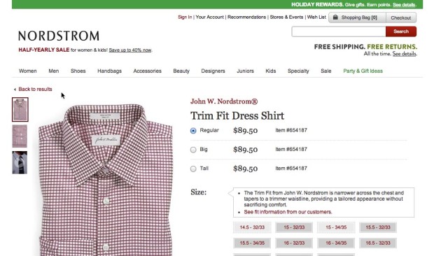
However, unlike the “Back” button which is history based, hierarchy-based breadcrumbs do not allow you to return to what you were just looking at a minute ago. That’s where a “Back to results” link like this one from Nordstrom comes in handy:
Keep in mind that shoppers can land on your product pages in a variety of different ways. Sometimes they will need to find other related products in the same category, and sometimes they will want to go back to a previous search result. That’s why it’s important to use both hierarchy and history-based breadcrumbs on your product pages.
2. Product Title
Technically, it shouldn’t really matter what you call your product. More often than not, the name of your product isn’t going to affect your conversions.
However, a catchy title that delights, or a sophisticated title that adds to the perceived value, will give you some bonus points in that arena.
For SEO purposes, make sure your title tags are unique for each product page. To make sure each page is unique, you could include the product name, brand, model, item type, etc. in your titles.
3. Images
Detailed images are a must for any e-commerce product page. People need to be able to see what they’re buying, and see it as completely as possible.
These images should be prominent, quick to load, with options to zoom in and get a closer look at the detail.
The more images that you have, the better, so show off your product at different angles and in different contexts. Your users want to see your product in action.
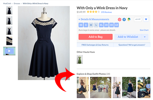
ModCloth shows off their customer photos for each product, in addition to their official mannequin photos.
4. Videos
Videos are an extremely powerful way of convincing shoppers to purchase. With a video, it’s almost as if you’re shopping in person!
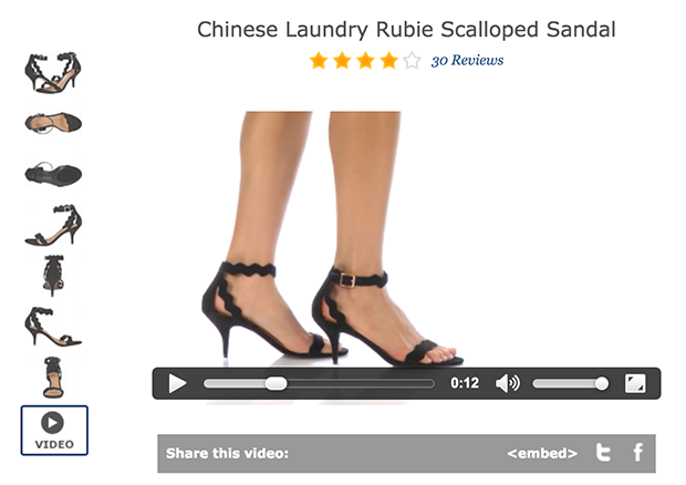
Zappos uses product videos to show what their shoes look like on real people. As the models walk back and forth, the shopper can get a much better idea of what the shoe looks and fits like.
5. 360° Views
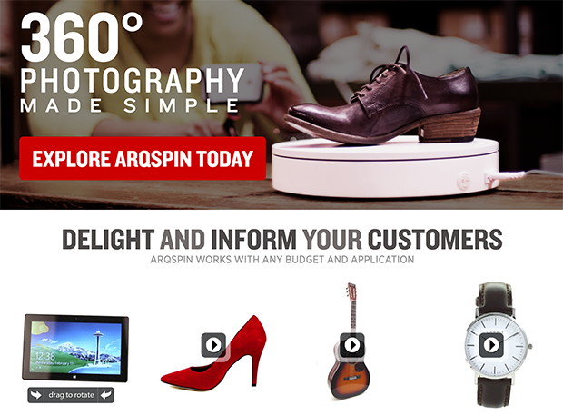
Your shoppers may not be inside your physical store, but you can still give them a 360° view of your products. And it’s not as hard to do as you might think.
Services like Arqspin allow you to use the camera you already own to capture and create 360° “spins” of your products and upload them to your site in minutes.
6. Product Description
The best product descriptions are the ones that help the shopper to envision their life being better with your product.
The more descriptive you can get the better, and avoid using stock descriptions from the manufacturer: by creating your own original descriptions for your products, you’ll not only have an easier time convincing shoppers to convert, but you’ll get some SEO ranking benefits in the process.
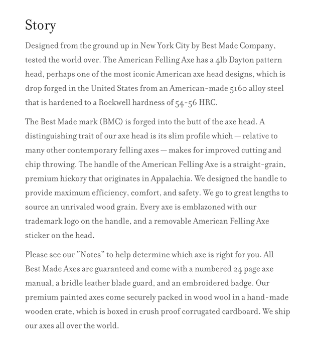
Best Made Co. ditches conventional product descriptions altogether and tells the “story” of their product. This is how they describe one of their products, an “American Felling Axe”:
You could purchase a similar axe for about $50, but Best Made Co. charges $350 for this one. How are they able to charge such high-end rates for such a basic utility tool?
Note the amount of detail they include about the 5160 alloy steel they used to forge the axe head, how they sourced the 35″ fine grain Appalachian hickory, and emblazoned their trademark logo on the handle. Sounds pretty amazing, right?
7. Product Detail
Aside from the product description, what other details, specs, dimensions, materials, etc. can you use to describe the product? Answer any questions shoppers might have about your product, and you’ll prevent them from leaving because they didn’t understand your product.
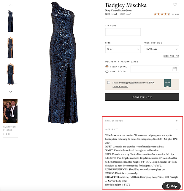
Rent the Runway does an excellent job of going the extra mile to answer shopper’s potential questions. They not only include a detailed “Size & Fit” guide, but they also suggest what undergarments should be worn with this item.
Similarly, you could include tips about how to use your product.
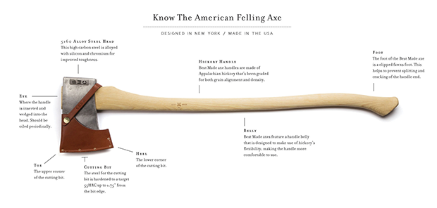
Best Made Co. explains how to care for your axe by oiling it, which serves a dual purpose: it provides the customer with valuable information, and it re-enforces the idea that their axes are high-end.
8. Product Options
Does your product come in different sizes, colors, or styles? Make sure it is easy for shoppers to choose between your options.
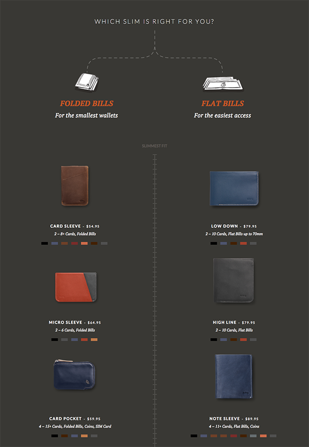
Bellroy does an amazing job of laying out each of their different wallet options. By displaying photos of each option side-by-side, shoppers can come to a much quicker decision about which wallet they want to buy.
They even ordered each wallet option on a scale from the slimmest to the most fully-featured.
9. Price
Regardless of what you decide to charge for your products, there are a few pricing techniques you can use to help them sell better.
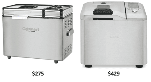
One technique is to offer a premium version of your product and make sure that shoppers see the two products side-by-side. This provides contrast, and helps make the lower priced product appear to be more of a “good deal”.
Williams-Sonoma was having trouble selling their $275 bread maker. So, they introduced a similar bread maker (which was only marginally better) and put a $429 price tag on it. They placed the two bread makers next to each other in a print ad, and sales for the $275 bread maker skyrocketed and nearly doubled.
Another strategy is to use the left-digit-effect, which shows that consumers generally pay the most attention to the leftmost digit when looking at a price tag. This means that you can charge $0.01 less for an item, and people will be more likely to buy it.
So instead of charging $30, try charging $29. Split test it, and see which works best for you.
10. Urgency & Availability
If shoppers are hesitant to buy, they’ll usually leave your product page, never to come back. One of the best ways to combat this is by adding a sense of urgency to your page: if they don’t act now, they may never get to buy.
Two especially effective ways to add urgency on product pages are by limiting time or quantity.
For example, you could display a ticking clock that counts down until a special deal expires. Or, display the limited quantity of items you have left available.
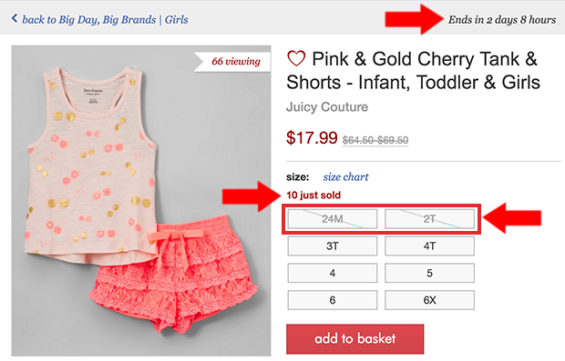
Zulily does an excellent job of including both forms of urgency on their product pages. They have a countdown timer to when the deal expires on the upper right-hand corner of the page. They also show how many items were recently sold, and which sizes are already all sold out.
They even show how many other shoppers are currently viewing the item, adding to the urgency.
But, what if a product is already sold out? All is not lost! Here’s how to win more sales with “out of stock” pages.
11. “Add to Cart” or “Buy Now” Button
If your “Add to Cart” or “Buy Now” button doesn’t stand out, people aren’t going to click it. Make sure the color of your button stands out from the rest of your page, and don’t distract with clutter or other competing design elements.
Also, make sure that the copy you use matches the actual action of the button. “Buy Now” should take shoppers to a checkout page, whereas “Add to Cart” should take them to a shopping cart page or simply display a message that the item has been added to their cart.
12. Live Chat
If a shopper still has questions after looking at your product page, they will rarely end up making a purchase. They will usually convince themselves that they can buy later and end up leaving, often never to return.
To prevent this from happening, use a live chat option on all of your product pages, so shoppers can get any lingering questions answered promptly.
Some great options for adding live chat to your e-commerce site include:
- SnapEngage – starts at $60/month for up to 4 agents
- PureChat – starts free for up to 15 chats per month, with integrations starting at $15/month
- Zopim – starts at $11.20/month
- ClickDesk – starts at $16.99/month
- Comm100 – starts at $29 per operator per month
- Kayako – $24 per agent per month when billed annually
- Velaro – starts at $29.95 per month per agent
13. Ratings & Reviews
Consumers place a lot of trust in one another. A company will tell you whatever it takes to sell a product, but a peer will tell it like it is.
Offer user-submitted testimonials in the body of your product page, and add in an option for users to submit their own reviews as well.
Don’t be afraid if you get the occasional bad review. So long as good reviews outweigh them, this can only be a beneficial addition.
14. Add to Wishlist
Inevitably, some shoppers are just not ready to buy yet. But if you give them an easy way to save their item for later, you’ll have a much better chance of making the sale (rather than losing them to a competitor).
Wishlists are a great way to do that. The shopper adds the item to their wishlist, and they can save their list and come back to it at any time.
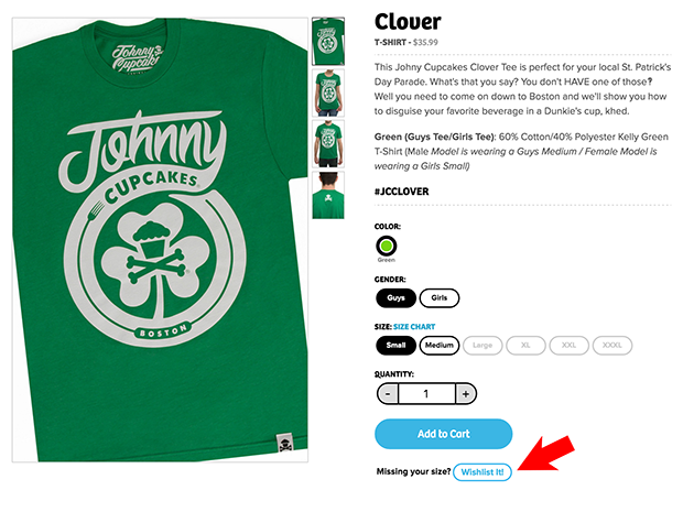
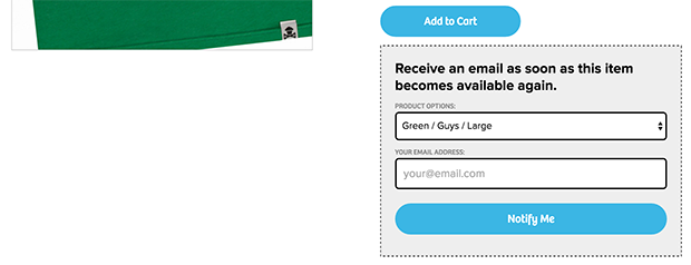
Johnny Cupcakes takes the wishlist one step further by including the option to add items (sizes/colors) to the list that are currently unavailable. Then, when the item does come available, the shopper is notified via email.
15. Social Sharing Buttons
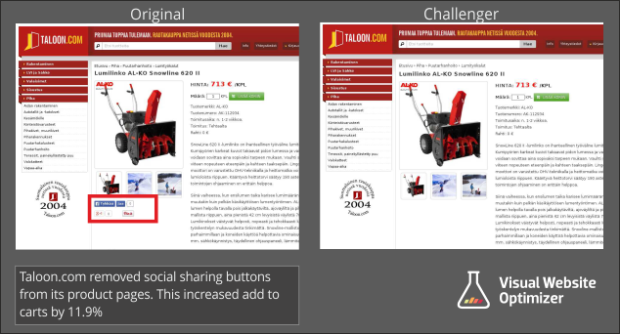
You may want to integrate social media sharing buttons to give people the chance to share your products. However, according to a study from Visual Website Optimizer, social media buttons on product pages had 11.9% lower conversions than product pages without social media buttons.
Another reason to avoid social sharing buttons on product pages is that shares tend to be low on these pages, and when the share count is low this can cause shoppers to distrust the company and the quality of the product.
Instead, integrate social sharing buttons on the confirmation page, immediately after the purchase has been completed. This is the best time to encourage sharing.
16. Views or Likes
If you have a good number of views on your product pages, show it off! You might even add the ability for shoppers to “like” products, and show off those numbers as well.
However, you should only use this technique if your numbers are worth bragging about. Until you reach that point, keep your numbers under your hat.
17. Cross-Sells & Recently Viewed Products
If one product isn’t right for your shopper, you at least want them to stay on your site looking at other products as much as possible. A great way to do that is by presenting related products (cross sells).
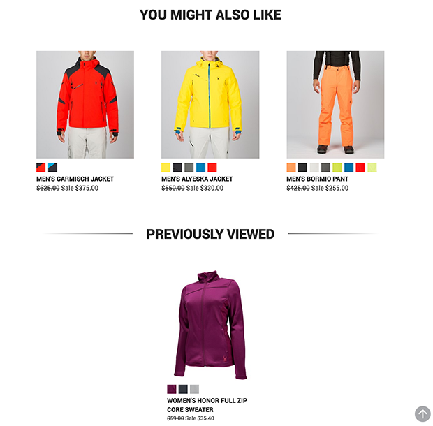
Spyder includes related items and previously viewed items too, so it’s easier for shoppers to go back to an item they might have been on the fence about.
18. Up-Sells
This last section of your product page is also a good place to offer higher-end products related to the item (upsells).
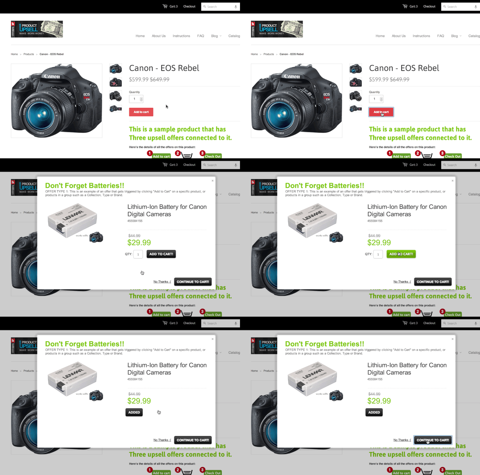
Product Upsell allows you to create and display relevant upsell offers and add-on products bases on shopping cart content, total cart value or a combination.
We hope this article has given you some ideas for increasing the effectiveness of your product pages. Take one of these ideas and run a split-test to see if it indeed improves your conversion rate.
Chances are, if you follow these tips, you will be looking at many more sales from your product pages.







Add a Comment