Do you want to boost conversions on your website? Did you know that making even small but meaningful changes to your website design can have a significant impact on your conversions?
Most marketers talk about the importance of search engine optimization (SEO), email marketing, and creating lead magnets to increase conversions.
However, they often overlook the role of website design in improving conversions. One Adobe survey found that people would rather read something beautifully designed than something plain if given a choice.
Good web design isn’t just about window-dressing a website. Applying website design conversion optimization principles can make or break your conversion rates.
Here are a few conversion rate optimization (CRO) stats about why web design is important:
- The average conversion rate for eCommerce companies is 2.86%.
- You have only 8 seconds to capture a visitor’s attention once they land on your website.
- 92.6% of buyers say a website’s design affects their buying decision.
- 75% of consumers judge a brand’s credibility based on the website design.
- 38% of people will abandon a website if it’s unattractive.
You can’t afford to overlook website design conversion optimization principles if you’re serious about growing your online business.
In this post, we’ll share 11 web design principles to help you boost your conversion rate.
- Follow Hick’s Law
- Leverage the Rule of Thirds
- Optimize Your Website For Speed
- Use Negative Space to Your Advantage
- Consider F-Layout in Your Web Design
- Use Colors Meaningfully
- Remember to K.I.S.S.
- Use the 8-Second Rule
- Remember the Gestalt Similarity Principle
- Use Faces to Build Familiarity
- Use High-Quality Images
1. Follow Hick’s Law
Hick’s Law says that the more choices you give people, the longer they will take to make a decision.
Adding more design elements to your website enables a paradox of choice or analysis paralysis. Think about all the choices a user has to make on your website.
- Deciding whether to use the navigation bar or scroll down the page more.
- Skimming the headlines to see which blog post to read.
- Deciding whether to download your lead magnet or watch a demo video.
- Choosing between creating an account, reading reviews, or browsing for more products.
It’s overwhelming for potential customers to decide what to do when faced with so many choices.
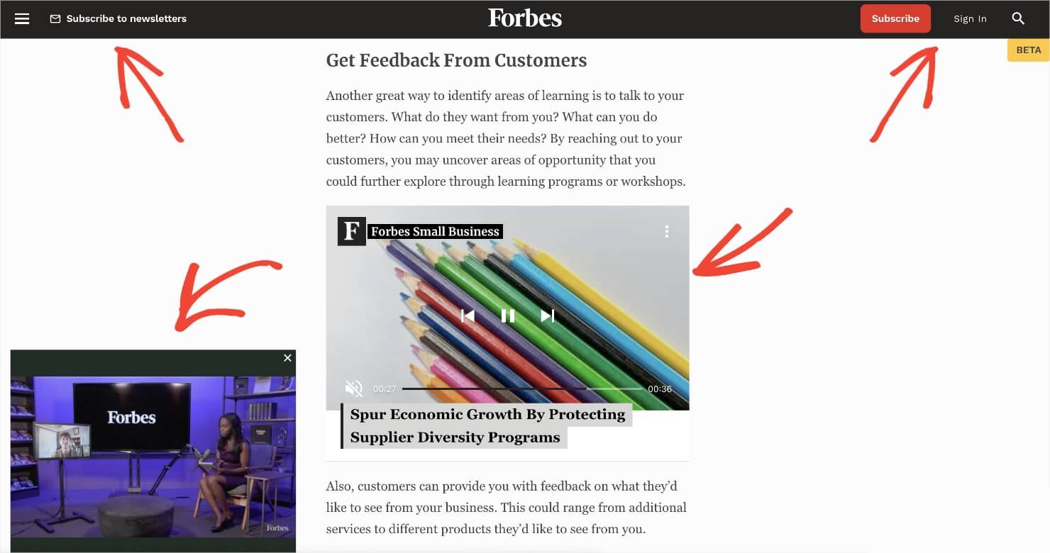
Here’s an example of a bad user interface (UI) design that goes against the Hick’s Law. The page has too many calls to action that demand a visitor’s attention.
A cluttered website usually leads to an increase in bounce rate or people taking a long time to perform a desired action.
You can boost conversions by limiting the number of choices on the website. For instance, cut back on the number of call-to-action (CTA) buttons on your website.
Or, clear the clutter around the CTA buttons to add more white space. This can help you improve conversion rates by up to 232%.
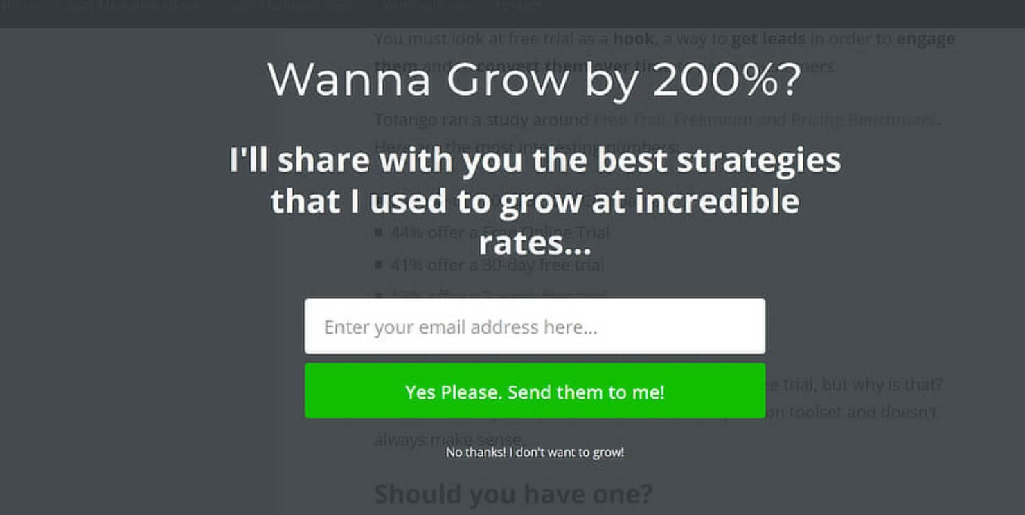
There’s one more simple way to use Hick’s Law in website design: Add a fullscreen welcome mat.
You don’t want to overwhelm the visitors with too many choices. But you also want to convert visitors into customers, right?
Adding a fullscreen welcome mat on your homepage can help you strike a balance between both.
A welcome mat covers the entire screen with a single call to action. With welcome mats, the users only see one choice available to them at a time.
This allows you to minimize distractions while still using the opportunity to convert your visitors meaningfully.
When applying Hick’s Law to your website, you should have clarity on what actions are most important for your conversion goals.
Do you want your target audience to opt in for your lead magnet? Or, do you want them to add a product to their shopping cart? Every page on your site should aim to achieve one specific objective.
The fewer options you can offer to your visitors, the easier it is for them to use your website. And this can skyrocket your conversions.
2. Leverage the Rule of Thirds
The rule of thirds is a popular photography principle that can also inform your digital marketing strategy.
The rule of thirds suggests that, for best visual compositions, you should divide an image (or a website real estate) into thirds. It also states that you should place your main subjects in the left or right third of the entire image and leave the other two-thirds freer.
Here are a few examples:
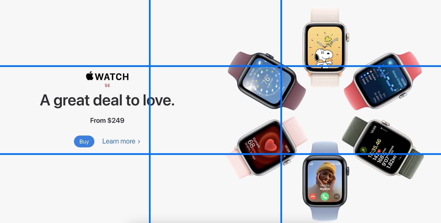
Apple’s website has the most important element, the product images, placed on the right-hand-side grids. This design arrangement gives its copy and CTA button enough attention.
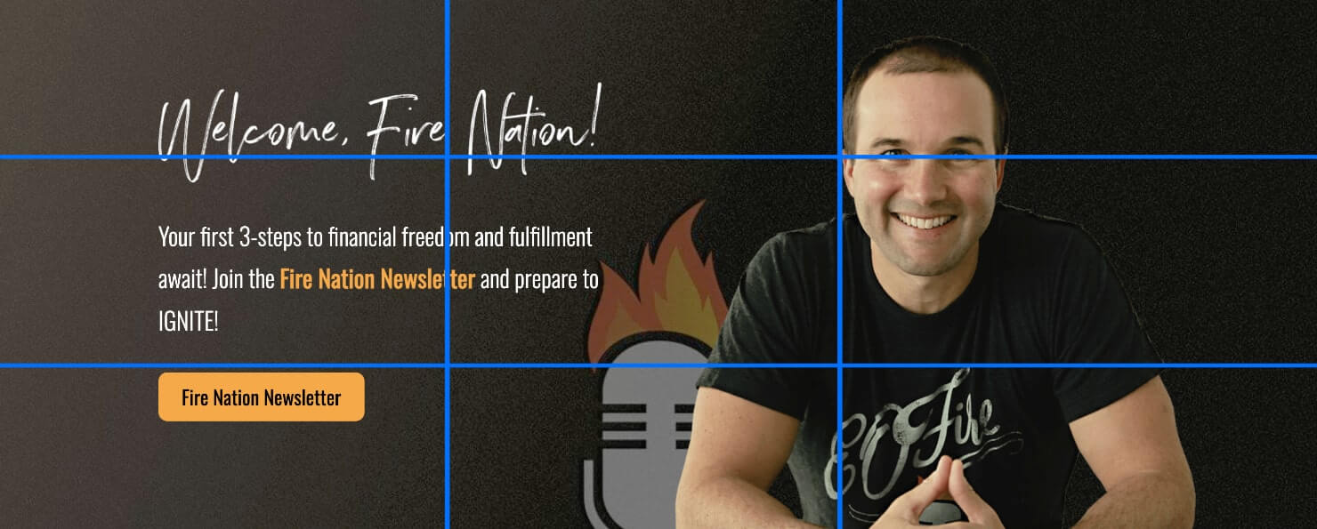
Entrepreneurs on Fire website’s hero image contains a call to action button right on the bottom left grid:
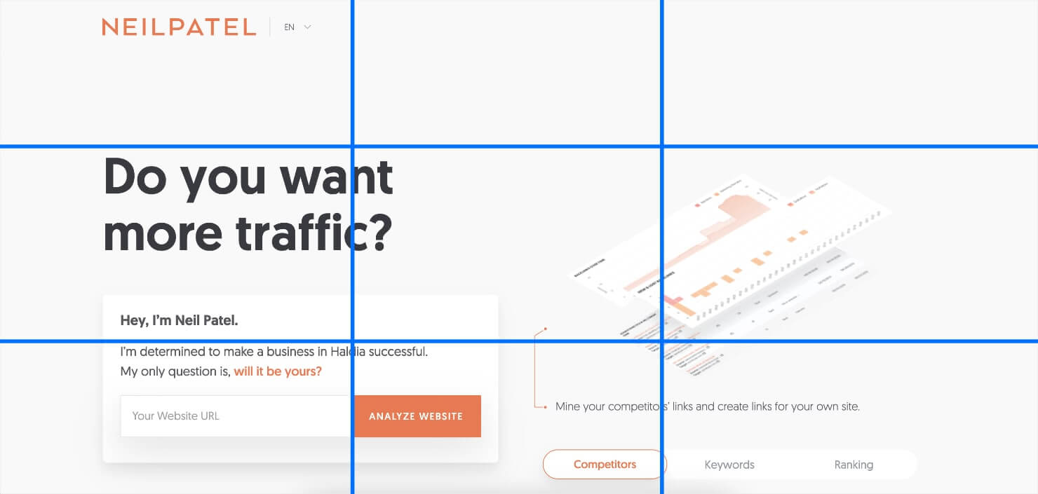
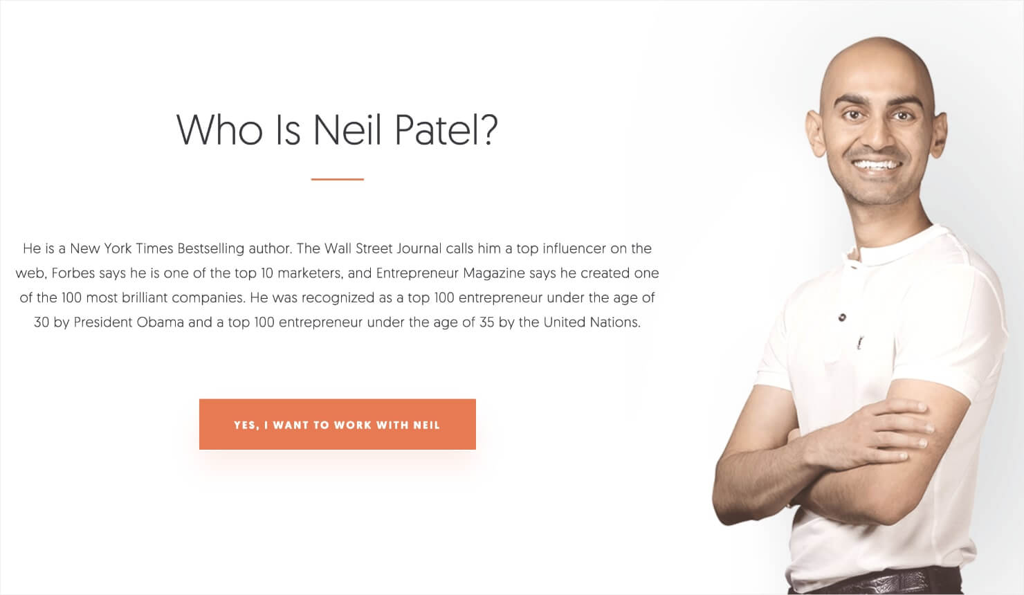
Neil Patel’s website also places the main header and copy jumbled to the far-left grid:
Notice none of these websites have a navigation bar inside the grids. This is to ensure visitors stay focused on the main call to action rather than being distracted in all other directions.
You don’t have to design your entire website by the rule of thirds. But it’s a good website design conversion optimization rule to use when you want to highlight a value proposition or a specific product functionality.
Pro-tip: Want to check if your website follows the rule of thirds principle? Take a screenshot of your website just above the fold or just your header section. Don’t capture the entire page length in the screenshot because that’s not how visitors see a website.
Next, divide the screenshot into nine equal quarters. Based on what you find, you can re-design your website to place the most important elements in either the left or right intersections.
3. Optimize Your Website For Speed
Customers can be impatient, particularly when they are navigating a website.
According to a study by the Akamai, a 1-second delay in page load time can result in a 7% reduction in conversions.
This means you should check your page speed and troubleshoot the issues that slow it down. Here are 5 free tools that you can use to check your website’s page speed:
When optimizing your website for page speed, don’t overlook mobile responsiveness. Make sure your website is user-friendly and optimized for mobile devices.
4. Use Negative Space to Your Advantage
In web design, whitespace is often referred to as negative space. Positive space is the space that contains visual elements on your site, like texts, images, and CTA buttons. Negative space is the empty space in between.
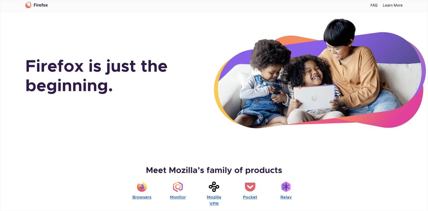
Firefox makes excellent use of negative space to make its website look clean and inviting.
Despite the name, negative space is actually a positive thing in web design. Lack of negative space can make your website insufferable for your visitors.
Using negative space well keeps everything legible, scannable, and easy on the eyes. It’s particularly important to make your website scannable because that’s how most people browse websites.
The more scannable your website is, the higher your number of conversions.
Here are 5 tips to make the most of negative space to improve website design:
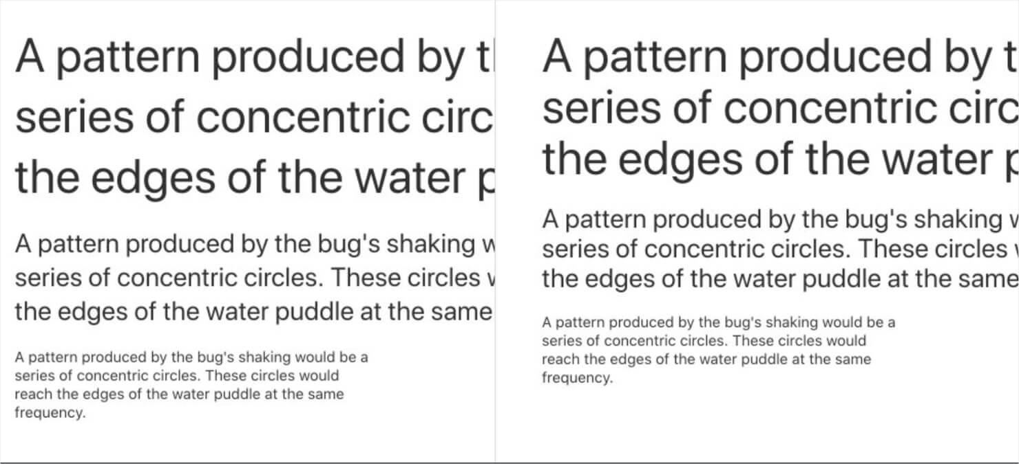
- The smaller your font is, the more space you need in between letters.
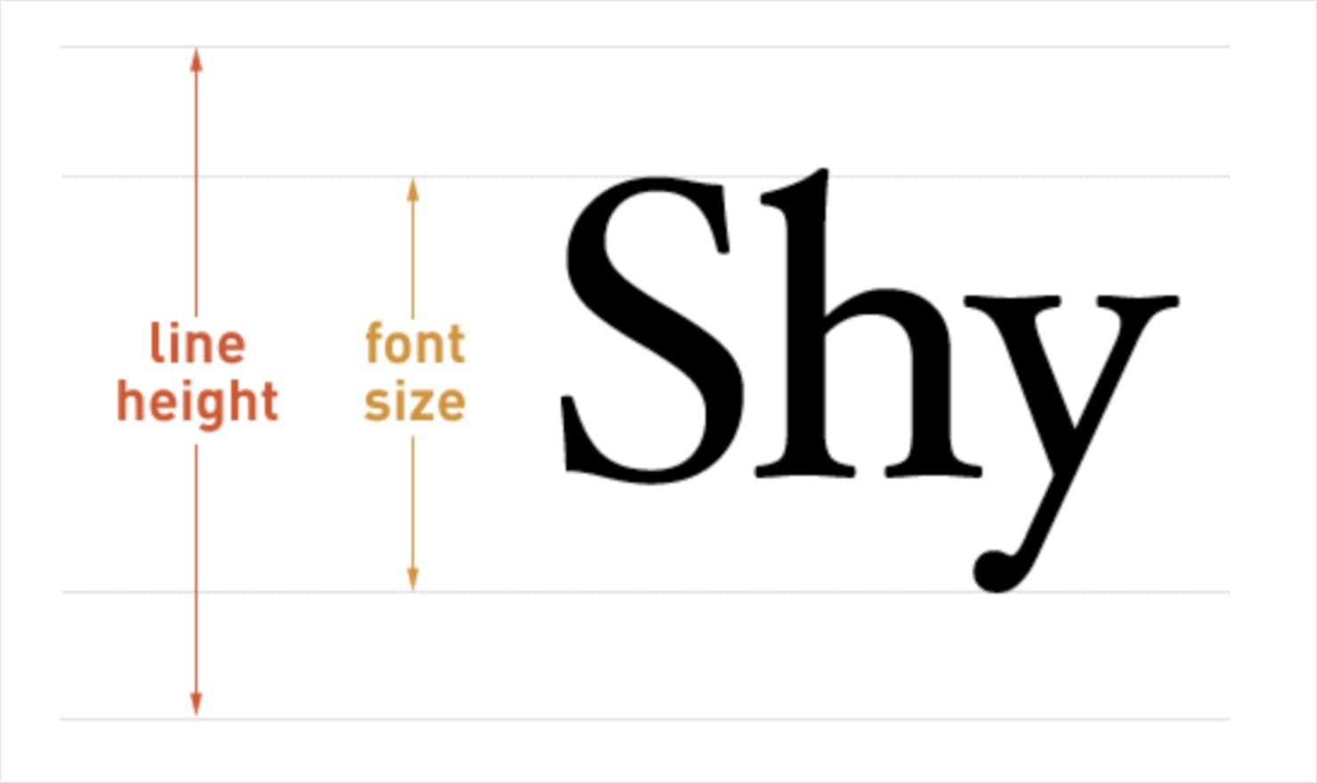
- Your line height (defines the space above and below lines of text) should be approximately 150% of the font size for the body copy (in CSS, this would read: line-height: 1.5).
- Smaller fonts need more line heights. Notice the difference that a larger line height makes in the body paragraphs in this image:
- Break up large text blocks into smaller paragraphs to increase the negative space between them. This makes your website’s content easy to scan.
- Use extra margins and padding on your site to add more white space between the larger elements (sidebar, header, body, or footer text).
5. Consider the F-Layout in Your Web Design
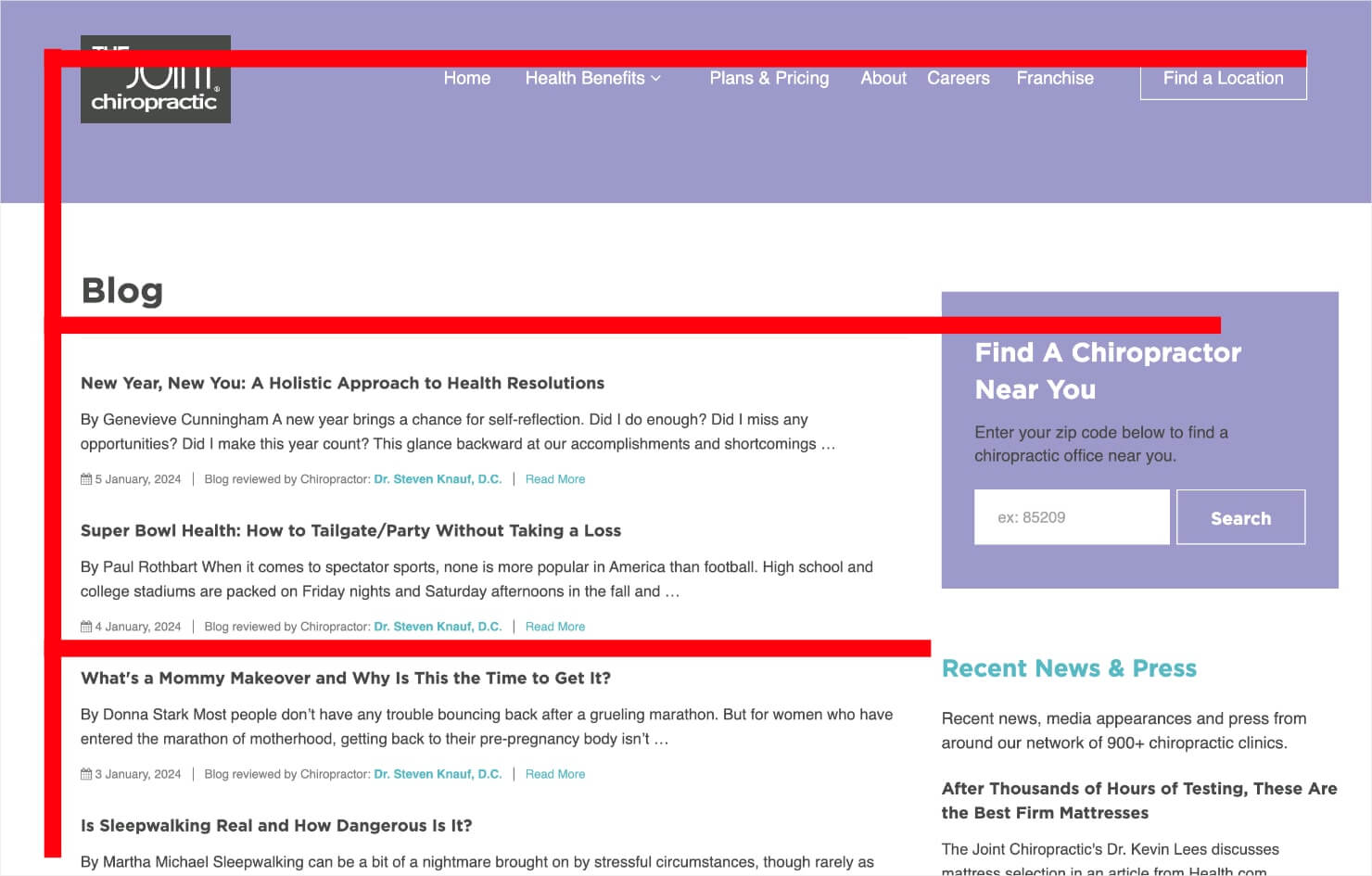
Research has found that the average user follows the ‘F’ pattern of screen reading.
Here is an example of an F-layout in a website:
This means people first look from left to right at the top of the screen. They then scan the page downwards, making small forays into the content. The area of a page that gets the least amount of visibility is the bottom right.
What does this mean for conversions? You should place the most important elements and calls to action across the F-shape lines, and place less important objects in lower visibility areas.
For instance, you can place your main call to action at the top of the page towards the left-hand side because that is where most users will look first.
If you want your user to stick around to read your latest blog posts, place the headlines down the left-hand side of the page. Lesser important information, such as sponsored ads, can go in the sidebar on the right-hand side of your page.
The least important information, like your cookie policy, can go to the bottom right-hand corner of the page.
Pro-tip: Want to check if your site visitors follow the F-style navigation? Use heat mapping and CRO tools, such as CrazyEgg, MouseFlow, or PTEngine.
6. Use Colors Meaningfully
“Colour is an often underrated aspect of web design. But it can play a very important role in usability, in conveying the overall meaning of a brand, and in setting the overall mood of the website. Different color combinations can evoke different emotions and reactions,” says designer Tom Kenny.
The bottom line: When choosing a color scheme for your website, make sure to choose a combination that evokes the emotion that you want your brand to convey.
A great way to do this is by using Pinterest’s functionality to curate color schemes that reflect your brand’s vision. Once you’ve selected your color scheme, there’s one more thing to keep in mind: contrast.
Use contrast to keep text, headlines, and call-to-action buttons noticeable and readable. For instance, design your font and button colors in high contrast (e.g. black or navy blue) against the background (e.g. white or light yellow).
The elements that you want to highlight (e.g. subscribe buttons) should be in a color that stands out from the rest of your site.
Let’s look at an example. Which elements of this site draw your eye the most?
Of course, the image on the left with the woman is very eye-catching. But notice the orange call-to-action button that’s unlike any other element on the site. That’s because it’s in stark contrast to all other elements on the page.
Pro-tip: Want to know what colors to choose for your CTA buttons? Check out our article on which color button converts best.
7. Remember to K.I.S.S.
The “Keep it Simple, Stupid” mantra is a popular design principle that reminds you not to complicate your website design.
Simplicity is crucial for conversions. When you’re building a website, ask yourself if there’s a way to make it simpler. If you can simplify the design, the result is usually more aesthetically pleasing and better for conversions.
K.I.S.S. has overlapping principles with Hick’s Law. But simplicity is more than just reducing options. You also need to create a clean, uncluttered design that minimizes distractions.
People can process only so much information at a time. If we see too much stuff all crammed into one page, it overwhelms our senses. Creating a great user experience (UX) on your website means getting rid of redundancies.
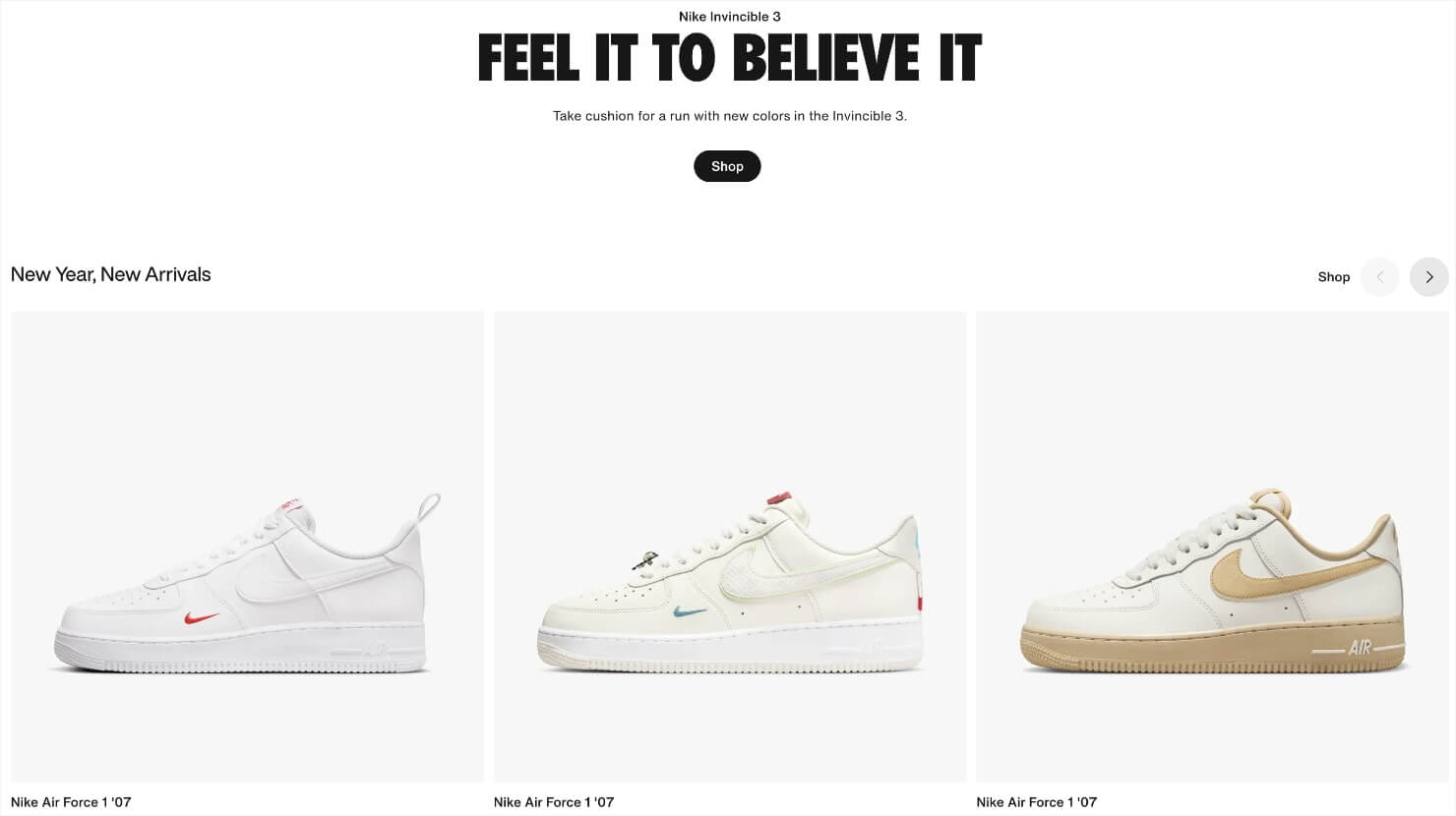
Like Apple, Nike is another brand that’s known for simplicity in web design. Its design (and copy) is so good that countless brands follow its suit.
8. Apply the 8-Second Rule
You might have heard of this before: you only have 8 seconds to get a visitor’s attention because that is the average human attention span today. That’s less than the attention span of a goldfish!
The point is that you have a very small window of opportunity to engage users once they land on your site. Therefore, you have to make every second count!
Here are some tips for grabbing attention and boosting conversions within the first 8 seconds:
- Use large, succinct, benefit-driven headlines.
- Follow copywriting best practices to grab people’s imagination.
- Use eye-catching images to draw attention to your main call to action.
- Use larger, simpler, and descriptive signup buttons.
- Use power words to make your copy more enticing.
- Use multimedia content such as video or GIFs to explain things visually.
- Use animated exit intent popups or sound effects to re-engage visitors about to leave your site.
Pro-tip: If you’re already running multiple marketing campaigns, run a split testing experiment to compare which one is converting the best. From the CRO point of view, split testing offers more accurate data than Google Analytics or other analytics tool.
Learn more about the split testing best practices to improve conversions.
9. Remember the Gestalt Similarity Principle
Gestalt psychology is a school of psychology about human perception. The Gestalt principle has 6 individual laws that revolve around:
- Similarity
- Continuation
- Closure
- Proximity
- Figure
- Symmetry and order
Its first law, the Gestalt similarity principle, states that humans group similar things together. It’s a mechanism that allows us to make sense of things and to organize noisy environments.
In website design, you can leverage this law by grouping items that you want to be associated with one another, such as testimonials, signup buttons, or images.
For example, let’s say you have a great testimonial that you want to use as social proof. You can place it directly below your opt-in form to improve conversion metrics.
The customer testimonials placed next to your CTAs are also known as doubt removers. And they can help you increase conversions by up to 124%.
Here’s an example of grouping a CTA and customer testimonial together.
Gestalt’s similarity principle is also important from the UX design point of view.
Grouping the main signup elements (e.g. the headline, description, and opt-in button) together helps users process the information quickly and in a more organized way.
This is great for conversions, especially considering our 8-second attention span.
10. Use Faces to Build Familiarity
People love buying from people.
Include people’s faces (and names) in your blogs, case studies, landing pages, checkout pages, and pricing pages to humanize your brand.
According to designer Sabina Idler:
“When we see a face, we are automatically triggered to feel something or to empathize with that person. If we recognize content on a website — such as a problem, dilemma, habit or whatever else — we feel connected and understood.”
It’s easy to apply this rule for entrepreneurs who are the face of their brand. Just look at how Neil Patel, Chris Lema, or John Lee Dumas leverage their personal brands to grow their businesses.
If you want to leverage your personal brand on your website, keep these 2 important tips in mind:
- Get a professional photoshoot done.
- Make sure you have plenty of horizontal shots that use the rule of thirds.
Here’s an example from Melanie Duncan:
If you aren’t the face of your brand, you can hire models or use stock photos.
Just make sure the faces you choose represent your brand accurately so that users can relate.
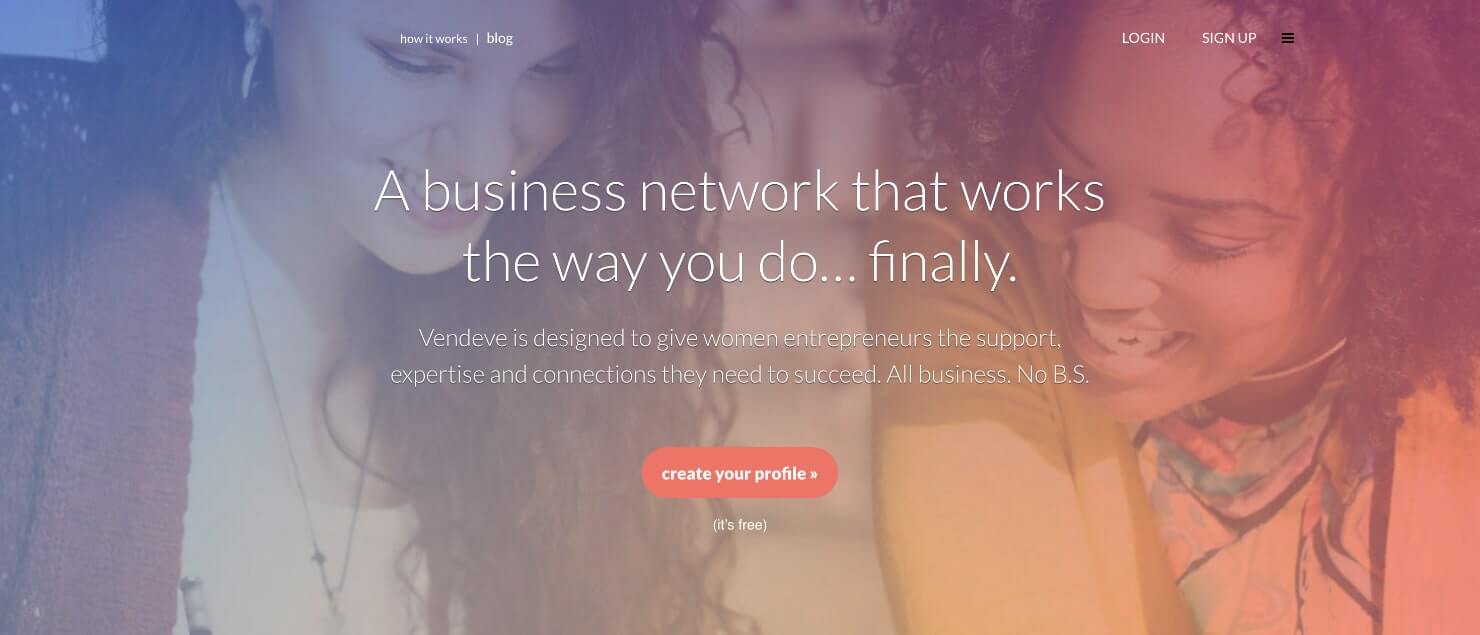
Vendeve, a social network for female entrepreneurs, does a great job of this by using generic but relatable female faces that represent their target audience.
11. Use High-Quality Images
Using high-quality images on your website makes a great first impression on your customers.
Surveys find that 60% of buyers are willing to interact with brands that include images. Another 23% of people are more likely to contact a business that has an image attached to its listing.
But low-quality images can drag down the credibility of your website. Low-quality images may look pixelated, blurry, or disproportionate. In contrast, high-quality photos evoke positive associations and feel personal.
Here are some of our favorite places for finding free stock photography that is high-quality and personal:
- Adobe
- Shutterstock
- Pexels
- Death to Stock
- StockSnap
- Unsplash
- Negative Space
- Gratisography
- Little Visuals
- Picjumbo
- Kaboompics
A word of caution: don’t use bland and lifeless stock photos for the sake of quality. People like brands that they can relate to. If your images look overly corporate or generic, you’ll turn your visitors away.
Turn Your Website Into a Conversion Machine
Now that you’re familiar with the 11 website design conversion optimization tips, put them to good use. Take a good look at your existing design and identify the opportunities to apply the principles we discussed.
In most cases, you can easily fix a design problem with just a few tweaks. You can also run A/B tests to see where your site lacks.
If you’re looking for more tips to improve your website design, here are a few other resources:
- What Is Conversion-Focused Web Design
- 4 Design Tips for Improving Website Conversion Rates
- 20 Easy Landing Page Design Tips to Boost Conversions
- 17 Stunning Examples of Above the Fold Content to Hook Your Visitors
Once you’re confident about your website’s design, step up your conversion game with OptinMonster. Choose from 100+ design templates to launch engaging campaigns and capture more leads.










Add a Comment